Rebuilding An HTML5 Game In Unity
Last year, we released a mobile game named Quento. It was written entirely in HTML5, wrapped in our proprietary PhoneGap alternative and launched in many app stores with mild success.
The game caused me to jot down a few spinoff ideas. One that I particularly liked was a game with a stack of numbered tiles in which the player has to clear a level by combining numbers and tapping groups to make them disappear. I created a prototype in HTML5, Quento Towers, so that I could run it by a few coworkers in the office by simply handing them a mobile phone with the game running in a browser.
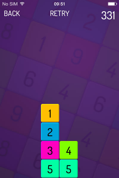
Move 1 to the right to land on 4. Merge 1 and 4 and merge 2 and 3. Then, tap the 5s to clear the level. (Large version)
Those who played the prototype really liked the idea, so I spent quite a few evenings and weekends designing levels and experimenting with new features. The gameplay was coming along nicely, and I even added a built-in level editor using localStorage to save levels, which was very helpful during commutes. Yes, Web technology was definitely of great value during this phase.
Fun note: You can play the prototype in a browser (tested on Safari and Chrome). It even has the level-editor functionality.
The Art-Direction Pivot
I was pretty happy with the minimalist style, which was similar to Quento’s. It would keep development time down and enable us to release quickly, allowing Quento to become our brand of math games — something I seem to have an affinity for, and the reason the team calls me He-who-makes-grid-with-numbers-games.
Meanwhile, our artist, Richard, had secretly prepared a pitch on art direction that he thought would make the game stand out. One morning, he showed this:
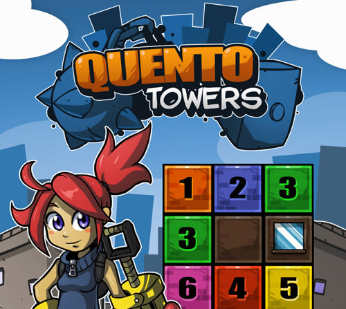
Possible title screen for Quento Towers.
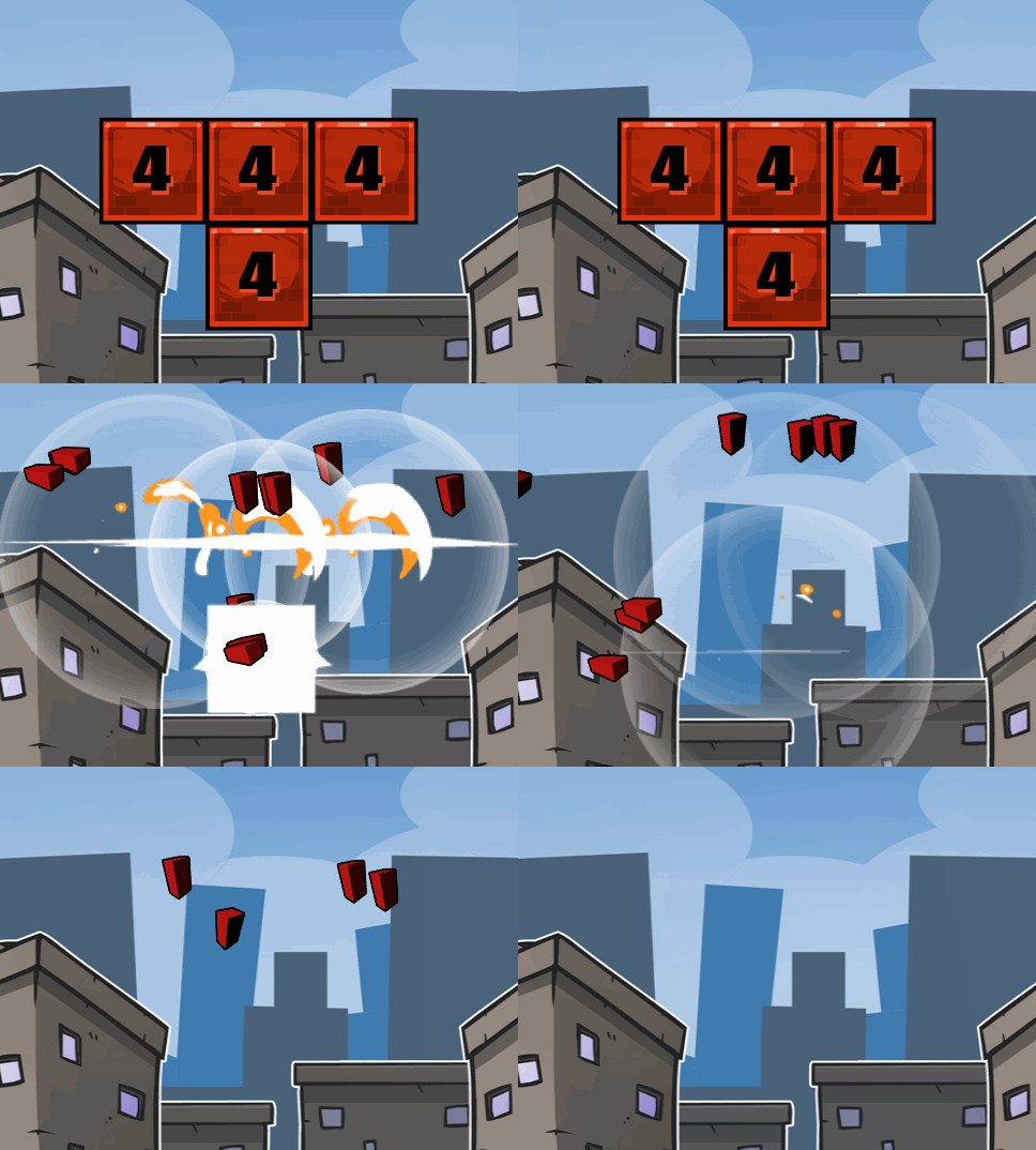
Fancy explosions.
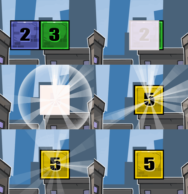
Merging effects.

Wacky characters.
It was spot on. I saw that the effects and cutesy characters, combined with the unique gameplay, could really set this game apart. It wasn’t long before Richard was producing more artwork and we had a suitable soundtrack. Benjamin, one of our iOS engineers, was working on our own PhoneGap alternative because we had had some performance issues with PhoneGap. And I was putting it all together for an internal demo prior to our annual company trip.
The game even had a new name: Numbers. Demolition. Get it? Oh, and the word had zero hits on Google at the time.

A new name for the game.
The Internal Launch
On the day of our internal launch, the game looked like this:
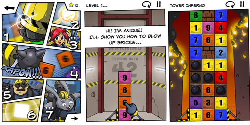
Three screenshots of the HTML5 version of Numolition. (Large version)
It ran on iOS and Android, its resolution was fixed to 640 by 960 pixels, and it had been tested only on WebKit browsers. This approach had worked before, and we wanted to streamline the gameplay before making it more responsive or tweaking it for other resolutions and devices.
Note: Our approach was to support just a few resolutions, like 3:4 and 2:3, and then scale up using CSS and fill the remaining space with white to match the comic panels.
In hindsight, setting an internal launch date was a logical next step after prototyping, because the game now had an audience and was an actual release.
The play test that followed during this trip was very informative. Everyone still loved the game, and not only did they enjoy the normal levels, but people seemed to prefer the special tower modes that we added. And we learned that all 50 nerds were comparing their high scores with one another, which made us decide to add a leaderboard of some sort.
However, we also saw a lot of problems from the Web-based DOM and CSS nature of our game. You see, with so many Android devices at hand, we noticed that some devices showed permanent movement artifacts, rendering glitches, problems with Web fonts, missing elements and many other issues that weren’t simple “bugs” that could be fixed.
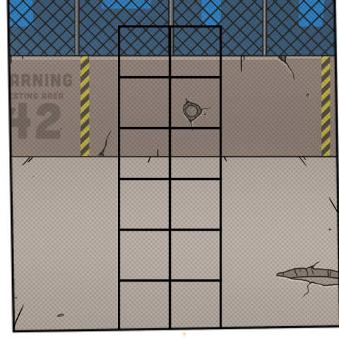
One Android device was missing tiles.
Rather, these issues were caused by how a particular device’s browser component handled the rendering and offloaded parts to the GPU. We couldn’t fix the problems with code alone. We would only be able to work around them using obscure CSS tricks, which often have side effects.
Trying Out Unity
Back at our company, Q42, we evaluated the current state of Numolition. The core gameplay was good enough be released, which felt really good. What didn’t feel good were the rendering glitches and performance on some devices. Even though most people at Q42 had pretty new Android models and we weren’t doing anything crazy in the code, we wanted the game to run a bit more smoothly than it was.
Note: Our Web version of the game was built using the DOM and CSS, not canvas. Had we used canvas, we wouldn’t have had many of the rendering differences between platform. However, cross-platform performance, especially on old devices, was not likely something that canvas (hardware-accelerated or not) could solve out of the box.
Moving forward and releasing the game as is was one option. Rebuilding with canvas was another. A third suggestion, given by Benjamin, was to give Unity a try, for the following reasons:
- Although Unity was built for 3-D games, its developer was working on a promising native 2-D engine, which has since been released.
- Its free license seems to allow for development and distribution of mobile apps at no charge, requiring only a splash screen and missing some Pro features that we felt we could live without.
- Cross-platform comes out of the box: desktop, iOS, Android, Windows Phone, Windows 8, BlackBerry.
- It allows for development in C# or UnityScript (often referred to as JavaScript, even though it is more akin to Microsoft’s JScript.NET). Both languages are familiar to the team.
- Using it would be a great learning experience.
- It would offer us valuable comparative insights.
And, hey, how hard could it be? We decided to give it a try for two weeks and see how far we could get.
Not very far, it turned out. Still, the results were interesting.
Unity From An HTML5 Developer’s Perspective
We chose to go with C#, instead of UnityScript, because of its class-based nature and friendly and familiar syntax. We started by literally porting existing methods that dealt with the computational engine, instead of the visuals. For instance, a fragment of the JavaScript that detects which tiles are affected by a given tap was converted from this…
// returns an array of [$tile, $tile, $tile] that match the value of the given tile
// optionally (depending on GameOptions) bombs will explode surrounding tiles,
// and if those tiles are sets of numbers, they will chain a larger explosion

this.getMatchingTiles = function(x, y) {

    // create an array of tiles to check and put the current one in there
    var tilesToCheck = [],
        had = {},
        added = {},
        valueToMatch = that.getCurrentTileValue(x, y),
        matchingTiles = [];

    _lastMatchingBombCount = 0;

    // helper function to add new tiles to the checking queue
    function addTileToQueue(x,y, fromDirectMatch, value) {
        var id = 'tile-' + x + '-' + y + '-' + value;

        // if x and y are within the frid and this tile hasn't been checked yet
        if (x >= 0 && y >= 0 && x < that.tilesX && y < that.tilesY && !had[id]) {
            had[id] = true;
            if (that.existsTile(x, y)) tilesToCheck.push([x, y, fromDirectMatch, value]);
        }
    }

    addTileToQueue(x, y, true, valueToMatch);
}
… to this in C#:
public List<Tile> GetMatchingTiles(Tile tile) {

    // stack of tiles to check
    Stack<CheckTileSetting> tilesToCheck = new Stack<CheckTileSetting> ();

    // hash of positions (and their value) that were already checked
    HashSet<string> had = new HashSet<string> ();
    List<string> added = new List<string> ();
    List<Tile> matchingTiles = new List<Tile> ();
    lastMatchingBombCount = 0;
    lastMatchingStarCount = 0;

    // adds a title to the stack to check, only if the tile exists
    // and not already checked (for this value)
    addTileToQueue addToQueue = delegate(CheckTileSetting cts) {
        string hadId = "Tile-" + cts.col + "-" + cts.row + "-" + cts.valToCheck;
        if (!had.Contains(hadId)) {
            had.Add(hadId);
            Tile tileToCheck != null) {
                tilesToCheck.Push(cts);
            }
        }
    };

    // add the initial tile to the stack
    addToQueue (new CheckTileSetting { col = tile.col, row = tile.row, valToCheck = tile.val, fromDirectMatch = true });
}
In the first few weeks of working with Unity, I had quite a few head-scratching newbie moments. I had to forget things like pixels and relative positioning and get used to cameras, scaling, GameObjects, meshes, renderers and shaders.
A Short Overview of How Unity Works
Projects in Unity start with an empty scene that can be used for a menu, for a single level or even for an entire game. It’s a 3-D container, and a camera is positioned towards its center: 0,0,0 (yes, three axis: x, y and z). You can then add GameObjects from within the editor or hook up scripts that do this by code. A GameObject only has a position within the scene, and it can be a void container acting as a relative position to its children, or it can be a flat pane, or it can be any mesh (shape) ranging from a simple cube to a castle. This is all component-based: A mesh is a component, but a script is, too, and you can add them to any GameObject. Then, you add materials (the textures), which is when it starts to look like a game.
Any object may be moved or animated — relatively or absolutely — and you can control the camera, too. So, for Numolition’s menu system, we drew the comic panels only once and then pan the camera from left to right to navigate between them.
All objects that you instantiate and place in a scene may be viewed in the hierarchy panel that shows the entire tree, which is Unity’s equivalent of the DOM. While the game is running, you have real-time access to this hierarchy to inspect items, but you can also freely move through the 3-D space that represents your current game. This free view is different from the actual game view and allows you to see what’s going on from multiple perspectives. This came in handy for us on several occasions when we noticed that items were invisible because of their 3-D position in space (due to being placed behind other objects).
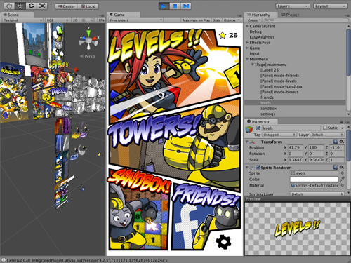
The Unity IDE with Numolition running. (Large version)
Overall, the Unity IDE offers scene and property inspectors that are solid, visual and real-time, and in some cases the 3-D approach works better than a flat Web view, but I also found myself missing Chrome’s WebKit inspector from time to time, including its flexibility and especially the script console.
But what I felt was lacking the most was a mechanic like CSS: a language to declaratively describe the look and feel of objects that have a certain name, ancestor path, context or behavioral class. Sure, Unity provides a theming mechanism for its GUI layer, but it’s not the same and hardly as flexible as CSS, one of the pillars of the Web.
This was, however, all part of the learning experience. The upside after the first few weeks was that the basics of the game had been reconstructed quite rapidly, and it wasn’t long before we had a playable version.
Managing Images For Cross-Platform Usage
A nice aspect of our way of working was that Unity allows visual artists to easily contribute. Richard didn’t simply provide us with new artwork — he built and tweaked explosion sprite sheets and added particle effects. All we had to do was hook them up to the corresponding event in the game.
Another fine aspect of working with Unity is the fine-grained control you get to manage your assets. We didn’t have to prefabricate all of the different images that we were going to use for each platform. Instead, this happens compile-time, based on the raw originals that you have included in your project. You can control default compression, override it for particular platforms, apply it to multiple images or per image, set maximum resolutions, compress results by a factor of 2 for memory optimization, etc.
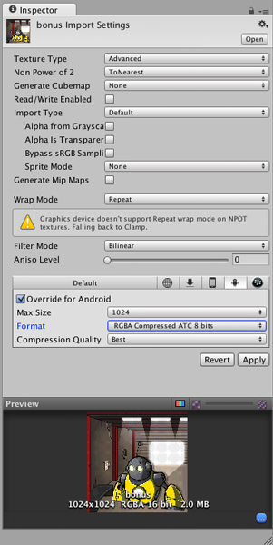
Image management in Unity. (Large version)
This truly removes a big hurdle that is still present in the Web space today, with the responsive image format still being worked on over multiple iterations. Sure, it’s all coming with HTML5, and you can accomplish it today if you know the ins and outs, but with Unity it’s just there, today, designed with mobile games in mind.
Evaluating Our Unity Game
Because the game had reached the point of being better and more feature-complete than where we left the HTML5 version, we decided to take a moment to evaluate the process and results so far.
We were surprised. The game ran smoothly on any high-end device that we tested it on, and older devices running the likes of Android 2.3 did really well. Sure, the frame rate wasn’t the same, but here’s the big difference: With our HTML5 (i.e. DOM and CSS) version of the game, the differences between devices and resolutions were mainly rendering glitches, device-specific hiccups or bugs. With our Unity version, the only differences were frame rate and memory usage on low-end devices.
We hadn’t written any code to optimize how the game would run. If the device was running Android 2.3 or iOS 6 or higher, it just worked. At the same time, we decided to submit a test build to the Amazon Kindle Store — despite not having an actual Kindle to test on or even having tried to run the game in a Kindle emulator. That’s how confident the results made us.
Note: Because the game wasn’t completely finished, we didn’t publish it to the Kindle yet. Since then, we’ve been able to pick up a Kindle Fire at a local store. And guess what? The game runs brilliantly!
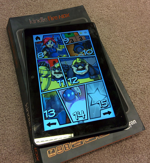
Numolition running on a Kindle Fire. (Large version)
A huge disappointment in the realm of Unity, however, is the Asset Store. Nothing is wrong with charging for add-ons, such as vector drawing and tweening libraries, but it sets the standard for others to charge for their code and is the complete opposite of the realm of the open Web, which everybody is trying to push forward.
Instead of using social coding to make things better, the Unity forums are full of developers presenting their one-off packages to solve specific problems, requests from other users for features, and bug submissions, with each individual developer hopefully fixing them. And because there is no trial for these add-ons, we ended up purchasing about eight of them and throwing away five or six because they simply weren’t very good.
Windows Phone Trial Mode
Towards the end of our development process, we learned of trial mode for Windows Phone. This allows players to download the game for free and purchase it later, but it differs from an in-app purchase because it doesn’t require the developer to specify a purchasable item for each particular app store and then handle each purchase in-game. When a user purchases an app that is on trial, they go through a regular round-trip purchase, as if they had bought the game in the store directly, and then are taken back into the game.
Unity offers support for this through a simple API:
UnityEngine.Windows.isOnAppTrial
UnityEngine.Windows.PurchaseApp()
We learned that users almost expect trial mode for Windows Phone games, so Unity offering such a feature out of the box is a real treat. Implementing it took us less than a day, and it might have contributed to Microsoft’s choice to feature our game on the front page of its app store in several countries, as well as the positive reviews.
A downside is that Unity does not offer a similar basic API for performing in-app purchases. To do this, developers still need either to build it themselves or to go with one of the third-party plugins available in the Asset Store.
Why It Took Us So Long
We started rewriting the game around September 2013, and the game was released in March 2014. The reasons why it took us this long are threefold, and not specifically related to either Unity or Web technology.
First of all, we decided to go with a comic book design, and so our panels needed to stretch.
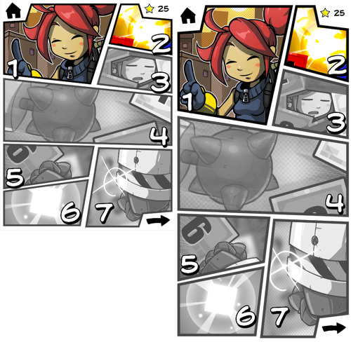
Responsive comic book panels in Unity.
Because we were rebuilding the game in Unity, we thought we’d tackle the responsive side of the menu system, which consists of comic book pages with panels. The idea was to draw these panels proportionally to the screen in order not to stretch any lines, which would have looked awkward.
This took us multiple attempts to get right. It involved creating the panels in code through meshes (i.e. shapes) generated on the fly, loading and scaling materials and doing a whole lot of math.
Secondly, we wanted to integrate Facebook leaderboards. This wasn’t difficult, but it just took time. We needed to sort out how to properly support both users who have installed the Facebook app and those who haven’t. And because the Facebook SDK for Unity is still in development, we struggled here and there. But we feel that the result justifies the time spent on this.
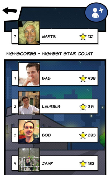
Facebook leaderboards. (Large version)
Thirdly, fragmented planning. We simply had many other projects and cool stuff going on, so sometimes we couldn’t touch a line of Numolition code for a few weeks — although we still had weekends and evenings.
A Comparison
I sat down with the Numolition team to draw a list of the pros and cons of developing a mobile game with Unity and with HTML5 (although focused on the DOM and CSS with the latter). The list is as subjective as can be, but it might be helpful if you’re thinking about developing your next game in Unity.
Unity, The Good
- Performance is great.
- Publishing is cross-platform and highly reliable.
- Management and control of assets is easy.
- Artists can easily contribute.
- C# syntax is still very friendly.
- Camera positioning is easy (compared to left/top, DOM reflowing, etc.).
- It’s proven for professional games.
- Behaviors are built in (gravity, collision, etc.).
- Scene and level editors come out of the box.
Unity, The Bad
- 2-D is still 3-D. It relies heavily on meshes, renderers and all of the other 3-D stuff. (It would be like using WebGL and Three.js to make a 2-D game.).
- Unity’s equivalent of the DOM is a hierarchy. A mechanism such as CSS to style items generated through code would be welcome.
- Doing things like coding my own alpha grayscale shader still gives me nightmares.
- The commercial Asset Store loses to the open Web and Git for being trial and error and for not pushing technology or usability forward.
- There are small annoyances. For example, touching code and saving while the game is running makes the game crash, which seems avoidable.
- In case you need all of the Pro features, the commercial license is expensive: $4500 per developer to support iOS and Android.
- MonoDevelop is the default code editor, and it does the job, but it’s not fantastic. (You may use any other editor, of course, such as Visual Studio on Windows, but for code completion on a Mac, you’ll find yourself sticking with MonoDevelop for some time.)
HTML5, The Good
- It’s made for 2-D (with the DOM, CSS and canvas).
- CSS is extremely powerful — you’ll miss it.
- The WebKit inspector!
- Having no compilation step during development is a true win.
- Just use your favorite text editor and start partying — no IDE or software required.
- It’s ideal for prototyping.
- Web fonts are flexible (shadows, outlines, etc.).
- Visual styles and behaviors can be declared separately and applied at runtime.
- The Web is open and moving forward, thanks in large part to the community.
HTML5, The Bad
- The performance of mobile games when using the DOM and CSS isn’t on par with Unity.
- Performance from canvas is much better with third-party hardware-accelerated solutions, but you’ll lose support for quite a few old devices, and the available solutions are flakier than just having this one tool do the job for you.
- The visual results are unreliable and differ a lot between devices when relying on a browser component wrapped in native code.
- A native wrapper is required to publish a mobile app.
- Using Web fonts for a mobile game falls under “redistribution” in some cases and would have incurred hefty licensing fees in our situation.
Conclusion
So, does Unity beat HTML5? No, nor is this post intended to answer that question. The purpose of this retrospective is to provide insight into what it’s like for an HTML5 developer who strongly sides with the DOM and CSS to get into Unity game development.
You see, I still feel that HTML5 is… well, friggin’ awesome! Without it, we wouldn’t have been able to build a website such as Rijksmuseum’s, one of the projects we are very proud of. HTML5 is getting better every day, and we will be using both HTML5 and Unity again for future projects. For mobile games, we think that the Web and its lineup of third-party tools, wrapping technologies and hardware-accelerated canvas solutions still have a way to go, whereas Unity offers quite an interesting alternative right out of the box.
Simply put, we are really happy with the current state of our game, and giving Unity a try provided a valuable lesson. Unity’s great performance, fine-grained control over asset management and the ability to deploy to multiple platforms so easily are big advantages of Unity over vanilla HTML5.
Having stepped into the world of Unity as a Web developer, I think it’s safe to say that a lot is to be learned from Unity’s approach. On the other hand, Unity could benefit from the way the Web works — for example, the openness and the separation of the declarative rendering mechanism from the logic. Both Unity and the Web could learn and benefit from each other.
Now that you’ve read all about how our game came to be, you might be interested in experiencing it for yourself. Technical details aside, it is a challenging puzzle game. You can drop by Numolition for more information—but you don’t have to, of course.
The Numolition launch trailer. (Watch on Youtube)
Further Reading
- Principles Of HTML5 Game Design
- How To Design A Mobile Game With HTML5
- What Web Designers Can Learn From Video Games
- Finger-Friendly Design: Ideal Mobile Touchscreen Target Sizes


 Get a Free Trial

 JavaScript Form Builder — Create JSON-driven forms without coding.
 Enterprise UX Masterclass, with Marko Dugonjic
 Register For Free

