A Roadmap To Becoming An A/B Testing Expert
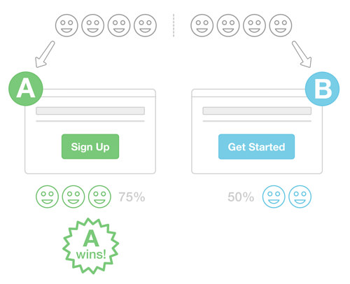
A/B testing, also known as split testing, is the method of pitting two versions of a landing page against each other in a battle of conversion. You test to see which version does a better job of leading visitors to one of your goals, like signing up or subscribing to a newsletter. You can test two entirely different designs for a landing page or you can test small tweaks, like changes to a few words in your copy.
Running A/B tests on your website can help you improve your communication with visitors and back up important design decisions with real data from real users. With the multitude of tools available (detailed later), split testing has become easy for even non-technical people to design and manage.

When To Start Testing
Start testing only when you have enough visitors and enough conversions to run the test in a timely manner (a conversion happens when someone completes one of your goals). What does that mean?
The ideal number of visitors will vary according to your typical conversion rate. Plan on at least 1,000 visitors for each variant, and 150 conversions for each variant. For some websites this might take four hours to complete, for others an entire month.
To find out exactly how many visitors you’d need to run a test, plug a few basic metrics into Evan Miller’s sample-size calculator.
You could run a successful business with 80 visitors a month, but you wouldn’t be able to run a statistically significant A/B test. Don’t start A/B testing before you’ve done any marketing. Get a steady flow of people to your website before doing any optimization.
Keep in mind that you don’t have to build your product before starting A/B tests. You can test a splash page and find out how future customers respond to planned features and pricing tiers.
Your First Test
For your first A/B test, keep it simple. Tweak your existing landing page to get your toes wet. Focus on low-hanging fruit:
- copy in
h1andh3headings; - copy in call-to-action buttons (for example, “Try it free” versus “Sign up” versus “Get started”);
- the color, size and position of call-to-action buttons;
- a short page versus a long page (by hiding long sections).
You can run multiple variations at one time, so dream beyond just two tweaks. You can also run multiple A/B tests at one time, but focus on one at first to get the hang of it.
Run the tests anywhere from a couple of days to a month. Your A/B testing tool will declare the statistically significant winner. Once a winner has been declared, make the winning variant part of your permanent website by updating the underlying code.
Then, clear the way for more A/B tests.
Where To Go From Here
Low-hanging fruit is a perfect place to start, but A/B testing isn’t all about that. Sure, testing button colors and heading copy will improve your conversion rate, but think beyond how a page looks. Think outside the box:
- Highlight features versus benefits. Are you pitching features of your product in a checklist? Try illustrating the benefits of the product by describing a dream scenario for the customer.
- Accelerate page-loading. Keep the landing page super-simple, and make it load in under a second.
- Show a big video with someone talking. Try removing the big screenshot and dropping in a big video that demonstrates your product, perhaps one in which you’re talking to the camera. Make a personal connection.
- Survey new customers. Talk to new customers to see what made them sign up and what has been most valuable to them so far. Highlight these in a test.
- Find out what confuses new customers. Ask new customers what confused them about the website or what questions they had that were left unanswered. Incorporate your answers into an A/B test.
- Add testimonials. Use social proof in the form of testimonials. Try putting an avatar or company logo next to each name.
- Change the writing style of headings and main content. Change the style of headings and content on your blog to see how it affects newsletter subscriptions. Try writing two versions of the same article.
- Experiment with pricing tiers and your business model. Change your pricing structure, even if only on your public-facing page, to see how potential customers respond.
- Make the sign-up form super-short. Remove any unnecessary steps in your sign-up form.
- Radically change the design. Try a different approach with your landing page, like what Campaign Monitor did with its big modal for new visitors.
Remember that conversion isn’t a one-time deal. When you say that you want more registrations, what you’re really saying is that you want more lifetime customers. When you say that you want more podcast listeners, you’re really saying that you want a larger dedicated audience that won’t stop telling their friends about you.
Monitor how your A/B tests affect your long-term goals.
Tools To Use
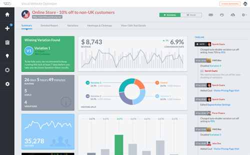
To run A/B tests, I recommend using VWO (Visual Website Optimizer). You won’t need to edit your website’s code for each test and redeploy. Instead, you would use the tool’s WYSIWYG editor.

With VWO, you can do split URL testing, which tests two completely different pages, as well as multivariate testing, which tests more than two variants at a time — think of it like A/B/C/D/E/F/G testing. VWO uses statistical significance to declare the winner. A new version of the software is coming out soon, too.
Optimizely is another simple WYSIWYG tool, and Google Analytics Content Experiments is a solid free option. If you’re looking to A/B test an email campaign, use Campaign Monitor.
To set up your first test with VWO, install the code above the closing <head> tag in each page that you’re going to test.
The only other step is to define your goals. Complete this sentence: “I want more…” Perhaps you want more people to sign up for your free trial, subscribe to your newsletter, download your podcast or buy something from your store. Your goal will determine which variant in the test is the winner.
Taking It Too Far
A/B testing is not a silver bullet. Optimizing the conversion rate will make a good landing page better, but it won’t fix a product or company that has fundamental problems.
Narrowly focusing on A/B testing will turn your customers into mere data points. Your customers are not conversions that you push down a funnel. They are real people with real problems, and they are looking to your website for a solution.
Don’t sell out your visitors for short-term gain. Putting a giant red “Try it free!” button will increase conversions, but your business won’t be any better off in 12 months. Keep the long game in mind.
The goal of A/B testing isn’t to mislead potential customers into buying something they don’t want, but rather to clarify how you should communicate a product’s benefits and to make sure that customers understand the language you’re using.
As long as you’re confident that the product is great, then just use A/B testing to tweak how you present it to customers. If you know that the product is helpful, then don’t try to manipulate visitors through your funnel. Always put the product first.
Finally, don’t ignore your gut. You can use data to back up your instinct, but rely on your experience in the industry. Don’t become 100% data-driven.
Other Resources
- “Split-Testing 101: A Quick-Start Guide to Conversion Rate Optimization,” Conversion Rate Experts Everything you could ever want to know about multivariate testing, including plenty of inspiration on what to test.
- “Confidence in Your Business,” Leo Babauta Remember that your visitors, readers or listeners are people. They are not to be manipulated.
- “741 Conversion Rate Optimization Tips (and Counting),” Oli Gardner, Unbounce If you’re ever not sure what to test next, check here.
- “How We Grew Conversions 100% by Rethinking Our Design Strategy,” Alex Turnbull, Groove Groove doubled the conversion rate for its home page by focusing on a simple design and using feedback from real customers.
- “The 10 Commandments of Landing Pages That Work,” Steven Lowe Copyblogger Print these out and stick them on your office wall. Remember them before every new A/B test.
- “The $300 Million Button,” Jared M. Spool, User Interface Engineering See how Amazon increased revenue by $300,000,000 by allowing people to check out as guests.
- “Does Optimization Ever End? How We Grew Crazy Egg’s Conversion Rate by 363%,” Conversion Rate Experts Does optimization ever end? Crazy Egg and Conversion Rate Experts don’t think so.
- “Google Has 200 Million Reasons to Put Engineers Over Designers,” Alex Hern, The Guardian Google got flack from designers for testing 41 shades of blue links years ago, but the results speak for themselves. If your team ever disagrees about a design choice, an A/B test could help you decide. But it’s possible to become too data-focused.
- “Experiments at Airbnb,” Jan Overgoor, Airbnb An in-depth look at Airbnb’s custom A/B testing tools, including how the company test its own system and a few A/B testing errors it has run into.
- “Optimization at the Obama Campaign: A/B Testing,” Kyle Rush Obama’s marketing team used 500 A/B tests over 20 months to increase donation conversions by 49% and registrations by 161%.
Further Reading
- The Ultimate Guide To A/B Testing
- Multivariate Testing 101: A Scientific Method Of Optimizing Design
- In Defense Of A/B Testing
- Establishing An Open Device Lab


 Register For Free
 Get a Free Trial
 JavaScript Form Builder — Create JSON-driven forms without coding.
 How To Measure UX and Design Impact, 8h video + UX training
 Devs love Storyblok - Learn why!

