The Current State Of E-Commerce Search
When e-commerce search works, it’s fast, convenient and efficient. It’s no wonder that so many users prefer searching over clicking categories. Unfortunately, our recent large-scale usability study and top-50 benchmark of e-commerce search finds that search often doesn’t work very well.
On-site search is a key component of almost any e-commerce website. That’s why we at Baymard Institute have invested months conducting a large-scale usability study, testing the e-commerce search experience of 19 major e-commerce websites with real-world end users.
We’ve boiled our findings down to 60 usability guidelines for e-commerce search design and logic. Based on these findings, we’ve benchmarked the search experience of the 50 top-grossing US e-commerce websites, rating each website across all 60 search usability parameters. In this article, we’ll present some of the findings from this vast research data set and explore the state of e-commerce search.
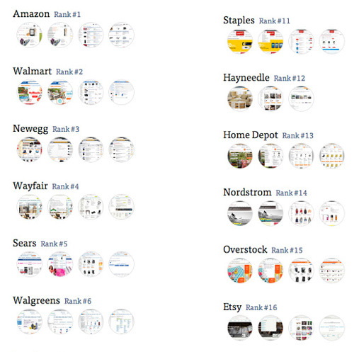
Benchmarking the search experience of the 50 top-grossing US e-commerce websites reveals a surprisingly grim state of affairs. Here’s a walkthrough of just a handful of the most interesting statistics:
- 16% of e-commerce websites do not support searching by product name or model number, despite those details appearing on the product page! An additional 18% of websites provide no useful results when the user types just a single character wrong in the product’s name.
- 70% require users to search by the exact jargon for the product type that the website uses, failing to return relevant products for, say, “blow dryer” if “hair dryer” is typed, or “multifunction printer” if “all-in-one printer” is typed.
- Searches with symbols and abbreviations are not supported by 60% of e-commerce websites. For example, the websites do not map the double quotation mark (often substituted for the double prime symbol: ″) or “in” to “inch.”
- Autocomplete suggestions are found on 82% of e-commerce websites. While some implementations greatly enhance the search experience, 36% of implementations do more harm than good.
- Only 34% allow users to easily iterate on their query by prefilling it in the search field on the results page, despite the fact that, according to our tests, users frequently need to iterate on their query — on average, 65% of test subjects required two or more query attempts during testing.
- Only 40% of websites have faceted search, despite it being essential to e-commerce search because it is the foundation of contextual filters.
- While an e-commerce website eases navigation by offering two types of breadcrumbs, 92% of the top-50 websites display only one breadcrumb type or none at all.
Below, we’ll walk through each of the above statistics and provide insight on how to improve the search experience and success rate on your e-commerce website. We’ll round the article off with a general analysis of the current state of e-commerce search.
1. 34% Do Not Support Users’ Searches By Product Name
At the heart of a good e-commerce search experience is the search engine’s ability to return relevant results for the query. While our usability study identified 12 unique types of search queries that users make on e-commerce websites, let’s stick to the most basic ones here, because even those prove troublesome for a significant portion of the top e-commerce website.
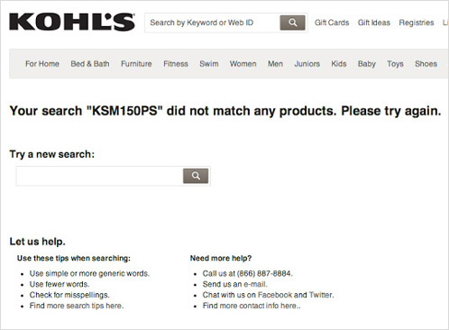
The simplest query type is an exact search, whereby users search by a specific product name or model number. Yet 16% of the top benchmarked e-commerce websites do not support searches for product names or model numbers that appear on the respective product pages. The reason is probably that the search logic of these websites is based entirely on matching the user’s keywords against the product title or main product description, instead of the full data set. Whatever the reason, it makes for a poor experience, with grave consequences.
During testing, users would (rightfully) conclude that a website that displays no results for a query so specific means that the company doesn’t carry the product. And if you’re wondering how many users actually searched by product name or model number, they frequently did during our testing. Multiple test subjects began their initial product research on an external website, starting with a Google search, or on a manufacturer’s website, a review website, etc. Only when they had decided on one or more products did they copy and paste the product’s name or model number directly from the external website into the search field on one or more e-commerce websites.
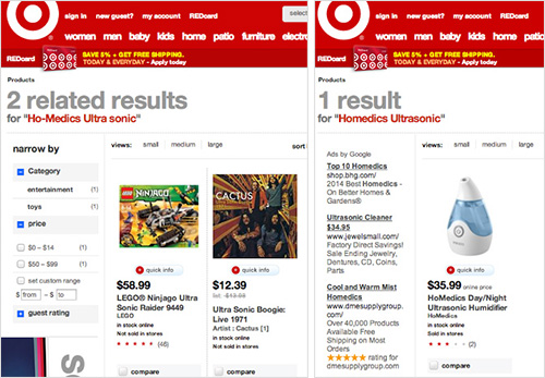
Another search pattern for exact searches that is ill-supported by the top e-commerce websites is phonetic misspellings. 18% of websites handle phonetic misspellings so poorly that users would have to be able to pass a spelling test in order to get relevant results. For example, the query “Kitchen Aid Artysan,” rather than “KitchenAid Artisan,” yields no results. While misspellings can occur in any scenario, phonetic misspellings are particularly common when users have only verbally heard a product’s name and later try searching for it. This isn’t unusual in the discovery process, if we consider how often products are recommended by friends and colleagues. Suggesting the correct spelling on the results pages is recommended, then. And if the search engine automatically processes the query when it finds no matches or a few poor matches for the user’s spelling, even better.
Implementation Tip
Assuming that users will spell perfectly is unreasonable. And it’s important that the search logic broadens the query’s scope and looks for closely related spellings, especially if only a few results of low relevance would be returned. Furthermore, the logic should search the entire data set of products to include matches for product names and model numbers.
2. 70% Require Searches In The Website’s Jargon
Another common search query type in e-commerce is the product type query, whereby a user knows the type of product they want but doesn’t know of or hasn’t decided on a particular product. So, they simply search for, say, “blow dryer” or “multifunction printer,” two queries that often lead to no results because the “correct” name for that product type is “hair dryer” or “all-in-one printer.”
To fully support product type queries, the search engine’s logic must go beyond the exact titles and descriptions of products, and look to the categories that products are placed in, as well as take product synonyms into account.
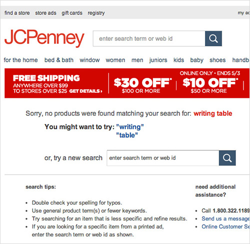
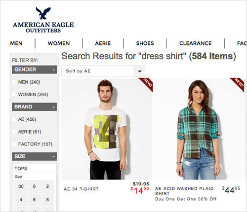
However, only 30% of e-commerce search engines include keywords from each product’s parent category or map a set of synonyms to product titles, product types and category names. As a result, users have to use the website’s exact jargon for their product type queries on 70% of websites, as seen in the two examples above.
Product type synonyms were observed to have a particularly large impact on the user’s search experience during testing, because it can be very difficult for users to tell whether they are using a wrong term, and even more so to guess what the “correct” term is. Therefore, a lack of synonym support was observed to be a direct cause of website abandonment, because users assumed that the website doesn’t carry the products that they searched for.
Implementation Tip
At the very least, manually map common product type synonyms to the actual product types and category names. A better long-term solution would be to build keyword synonym logic, because this can more easily be updated, tweaked and even personalized on a regular basis.
3. 60% Don’t Support Searches With Symbols And Abbreviations
Some products have specifications that are vital to the user’s purchasing decision. When searching for such products, our test subjects frequently included those specifications directly in their search queries (for example, “13″ laptop sleeve”), making them feature queries.
But do users usually search for “13 inch laptop sleeve” or “13″ laptop sleeve”? Of course, both queries should present exactly the same results, because users have no way of knowing how each website denotes such units of measurement, and all ways are equally “correct” and used interchangeably across the Internet. In case you think we’re stating the obvious here, 60% of the top e-commerce websites do not support searches with symbols and abbreviations. So, users will miss out on perfectly relevant products if they search for “inch” and the website uses the double prime symbol (″) or the abbreviation “in,” or vice versa.
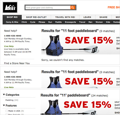
Breaking down such technical hindrances and mapping common symbols and abbreviations is important, so that users find the products they are looking for and get the same results regardless of what a website or its suppliers have decided to use. Most websites are small enough that synonyms, abbreviations and full spellings could be manually mapped for the most common units.
Implementation Tip
Map all common symbols, abbreviations and full spellings to each other, so that all results are shown regardless of how a query is written. A quick way to identify candidates for mapping is to look for units of measurement in all product titles. A more thorough way is to compile a list of units of measurement by going over all product specifications.
4. Auto-Suggestions Found On 82% Of Websites
Auto-suggestion is a convention of e-commerce search, with 82% of large websites offering it.
The value of autocomplete suggestions isn’t that they speed up the typing process, but that they guide users to better queries. When auto-suggestions are done well, they teach users the types of queries to make, show them correct domain terminology, help them avoid typos and assist them to select the right scope in which to search.
During usability testing, autocomplete suggestions directly influenced and altered what the test subjects decided to search for. While this is their purpose, it also means that autocompletion can do more harm than good if not implemented carefully.

Among the websites that do have autosuggest, 36% of them have implementations with severe usability problems. Two problems frequently observed in testing are query suggestions that either are repetitive or lead to a dead end.
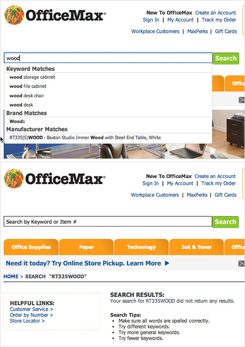
While avoiding dead ends might seem obvious, such suggestions were observed multiple times during benchmarking. They were often the result of auto-suggestions being based on the prior searches of other users or old catalog contents, regardless of whether they proved to be useful. Developers should at least internally query all suggestions on a regular basis and weed out those without any results.
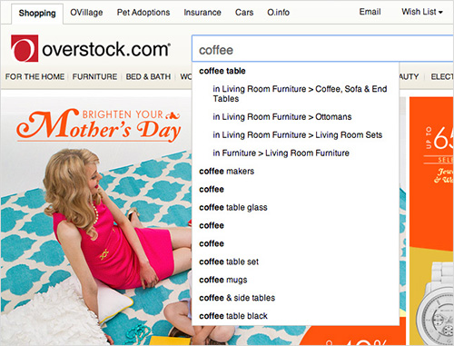
To provide high-quality search suggestions, look at how suggestions are generated. Many suggestions that are redundant, of low quality or typos are likely the result of developers sourcing suggestions from the website’s search logs. If this strategy doesn’t take into account the success of those queries (that is, whether a decent percentage of users found and purchased products after performing those searches), then it is flawed.
Unless you track the success of search queries, don’t use search logs to generate auto-suggestions because that would result in redundant and low-quality suggestions. Aside from outright duplicate suggestions (as seen in the Overstock.com example above, which could easily have been filtered out), redundant suggestions are ones that overlap and make it difficult for the user to select one over the other. Notice in the Overstock.com example how five variations of “coffee table” are suggested, despite the user having only typed “coffee” at this stage. These nuances might have made sense if the user had typed “coffee ta–.”

We also found that copying a suggestion to the search field when the user focuses on it with their keyboard (as illustrated above) is an important detail in autocompletion design because it enables users to iterate on a suggestion.
(We identified eight autocomplete design patterns during testing.)
Implementation Tip
Given that autocompletion design and logic will directly alter what most users search for, ensuring the high quality of suggestions by weeding out dead ends and being selective in the inclusion of suggestions is vital. Suggestions based on other users’ past queries should be carried out with special care or avoided entirely; ideally, any machine learning should be based on the success rate (or conversion rate) of each query.
5. Only 34% Prefill The User’s Query On The Results Page
During testing, 65% of all test subjects’ attempts at searching consisted of two or more queries in the same search. However, only 34% of e-commerce websites allow users to easily iterate on their query by prefilling the query in the search field on the results page.
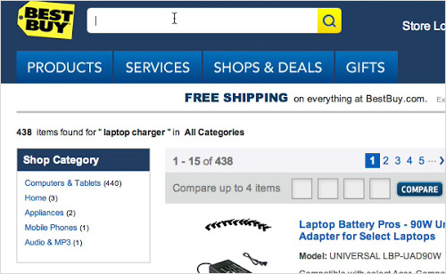
On websites that do not persist the user’s query in the search field, the iteration process became needlessly cumbersome and easily frustrated subjects. Not persisting a query introduces friction at the worst possible time because redundant typing is added to the already disappointing experience of not receiving relevant results.
The amount of time that test subjects spent retyping their query is insignificant, but as observed in all of our prior usability studies that involve filling out forms (see the second point in “Exploring 10 Fundamental Aspects of M-Commerce Usability” and the fifth point in “The State of E-Commerce Checkout Design 2012,” both on Smashing Magazine), the user has a negative perception of a website that forces them to retype the same data within a short timeframe, which often sparks remarks such as “Tedious,” “Idiotic” and “Do you think they’ve tried using their own website?” This is especially true on touch devices, where typing is particularly taxing.
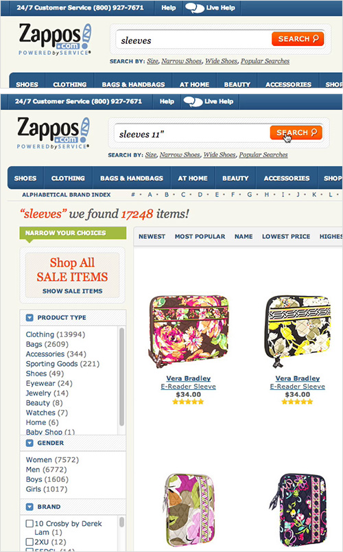
The picture was completely different on those websites that persist queries on the search results page. Here, test subjects weren’t forced through a needless halt-and-retype process each time they wanted to iterate on their query, but instead made swift changes by adding or removing a word or two from their original query, as seen in the Zappos example above, where the user simply added “11″” to his prior query.
Implementation Tip
Given how relatively simple this is to implement, persisting the user’s query in the search field on the results page can be considered low-hanging fruit in search optimization.
6. Only 40% Have Faceted Search
In a perfect world, we would have little need to filter and sort search results because users would make precise queries, knowing exactly what they want, and the website’s search logic would return just the right results.
This is far from reality, however; filtering and sorting are vital ways that users find the right product among the results. This is partly due to the challenge of getting search logic and design just right (as we’ve hinted at in the preceding five points), but also partly due to how and when users search. Users will not always be able to perfectly specify their queries, simply because many still haven’t fully decided or realized what they are looking for.
In both cases, being able to modify search results by filtering and sorting is a powerful and important tool. During testing, the quality of the filtering and sorting features and their design often meant the difference between success and failure in the subjects’ search experience.
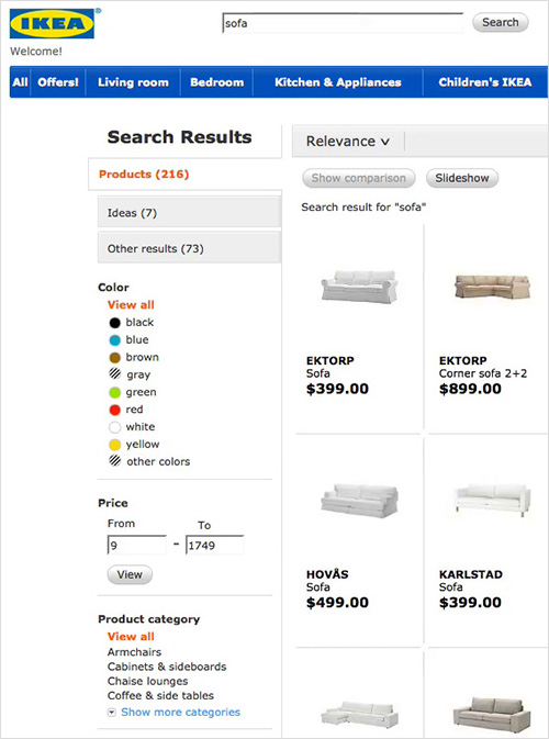
Our testing confirmed that the foundation of a contextual filtering experience in e-commerce search is faceted search. With faceted search, the user is presented with a list of filters for product attributes, filters that apply only to a part of the search results. For example, the search results for “Tom Hanks” could have a “movie duration” filter even though the results include books, and the search results for “down filling” could have a filter for “sleeping bag temperature rating” even though the results include other product types.
The traditional way of suggesting only generic scope filters (categories) and site-wide filters (price, brand, availability, etc.) for site-wide search results is insufficient for a good experience. Product-specific filters based on the user’s query must be suggested, too. However, only 40% of e-commerce websites currently do this via faceted search filter suggestions.
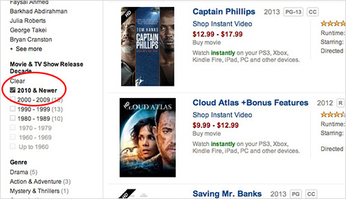
While faceted search is a crucial component of search filtering, it doesn’t make for a good filtering experience on its own. Also crucial are the filtering types (such as thematic filters), the filters’ design details and the filtering logic (for example, avoiding mutually exclusive filters, as explained in the third point of “Best Practices for Designing Faceted Search Filters”).
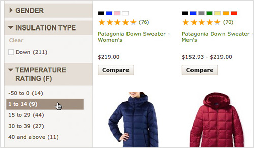
Furthermore, faceted search filters were observed to have usability issues of their own. One challenge is that when the filters also invoke a higher-level scope, they need to clearly indicate this in their label. Otherwise, users will likely be misled because they have no way to accurately predict the implications of applying the filter, as illustrated in the REI example above.
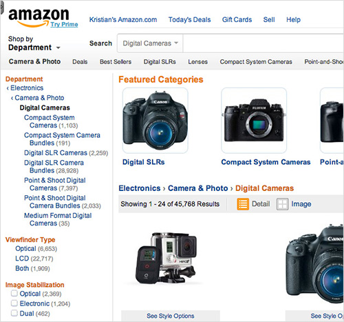
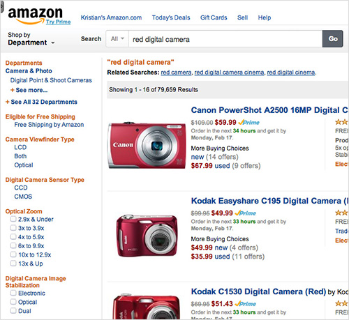
Faceted search’s labelling issues aren’t solved simply by including the filter’s context in the filter label (for example, permanently having the filter read “Sleeping Bag Temperature Rating”). That would hinder users who have already applied a search scope (and users who are using category navigation) because it would make the labels needlessly difficult to scan due to a lack of front-loaded information and a poor signal-to-noise ratio. Therefore, if faceted search filters invoke a scope, then a dynamic labeling system is needed to keep the filter labels concise and scannable when the user has already selected a context (for example, navigated to a category or applied a search scope) and then dynamically rename the filter labels to indicate the scope-related implications of applying that filter. Such a dynamic filter labeling system is illustrated in the example below:
Implementation Tip
Don’t simply rely on generic site-wide filters, such as category, price and brand. Rather, provide product-specific filters that relate directly to the user’s query (through faceted search). If the faceted search filters invoke a scope, then the filter labels need to be dynamically renamed to indicate this. Also, consider whether sufficient filtering types are available. For example, thematic filters such as style, season and usage context often map closely to users’ purchasing parameters.
7. 92% Have Only One Breadcrumb Type Or No Breadcrumbs At All
During testing, breadcrumbs proved to be helpful for test subjects when navigating both search results and when looking through categories to find just the right product. Interestingly, testing also revealed that e-commerce websites need two different types of breadcrumb links — namely, hierarchical and history-based breadcrumbs. Yet, 92% of the 50 top-grossing e-commerce websites display only one breadcrumb type (72%) or no breadcrumbs at all (20%).
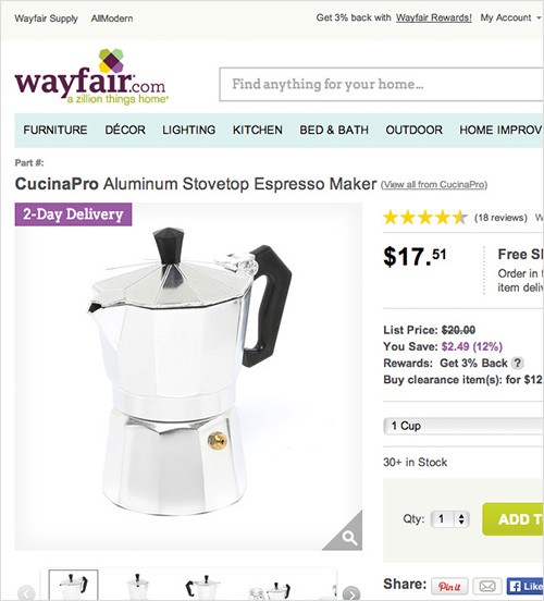
Without breadcrumbs on the product page, users will find it difficult to efficiently browse a collection of products, because they have no way to go one level up in the hierarchy to the product category or to return to the search results page. In practice, this often forces users to make a drastic jump in scope, such as selecting a generic top-level category, or else perform a new search or remain stuck on the product page.
With traditional hierarchical breadcrumbs, any user who doesn’t find a particular product to be a good match can use the breadcrumbs to traverse up the website’s hierarchy and navigate to a related category. This is paramount for non-linear navigation such as search, because it enable users to see other products in the same category as an item in a search result. The hierarchy essentially acts as a cross-navigation link for finding related products, regardless of whether the user has accessed the category from a completely different part of the website. (The same non-linear behavior was observed to hold true for all external traffic landing directly on product pages.)
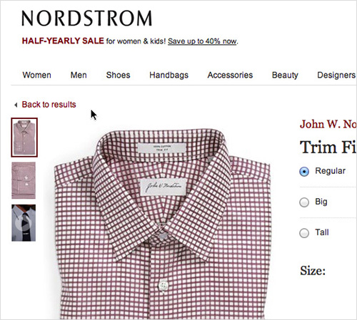
During testing, it quickly became evident that most subjects had a strong desire to go “one step back” after exploring a product page. This typically meant going back to the search results list, which history-based breadcrumbs are well suited to. History-based breadcrumbs are, as the name implies, based on the user’s history, giving the user a way back to previously visited pages.
While this functionality is also available in the browser’s interface via the “Back” button, test subjects repeatedly got stuck or were misguided on websites that offer only one type of breadcrumb. For example, when only hierarchical breadcrumbs were available, many subjects confused them as a way back to their search results. As a consequence, they unwittingly switched their product-finding strategy and lost any filter or sorting settings they had applied, thinking the last hierarchical breadcrumb link would take them back to the search results page.

A simple “Back to results” link alongside the standard hierarchical breadcrumbs enables users to seamlessly go back to their search results, with filters and sorting choices intact. History-based and hierarchical breadcrumb links are an ideal combination, allowing users to efficiently continue their current search session or switch to a new navigational mode.
Implementation Tip
Implement two types of breadcrumbs on product pages: hierarchical breadcrumbs, which allow users to infer and jump to categories that contain the current product, and history-based breadcrumbs (such as “Back to Results”), which minimize misinterpretation of hierarchical breadcrumbs as a way back to the search results. Testing confirms that history-based breadcrumbs can be both appended (as on Macy’s) and prepended to hierarchical breadcrumbs.
The State Of E-Commerce Search
To give you a more general analysis of search performance in the e-commerce industry as a whole, we’ve summarized the entire benchmark data set in the scatter plot below.
Each of the 3,000 benchmark scores is divided into the six major areas of e-commerce search usability: query types, search form and logic, autocompletion, results logic, results layout, and results filtering and sorting. Thus, each gray dot represents the summarized score of one website’s score across the 6 to 15 guidelines within that area.
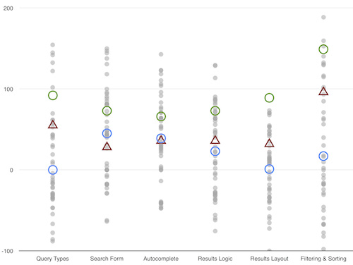
The blue circles represent the actual benchmark average for each column (an average of the gray dots). The red triangle and green circle are reference scores that we’ve created for comparison:
- The green circle represents the score for what is to be considered a “good” search experience — here defined as a website that partly adheres to all 60 of the search guidelines. That is, the green circle represents the standard that an e-commerce website should reach (or, better yet, surpass) in its search experience.
- The red triangle represents the score for a “mediocre” search experience — here defined as a website that partly adheres to 48 of the 60 guidelines. That is, search engines and designs that reach this standard can be assumed to directly hinder (or even obstruct) users as they search.
Besides noting the very scattered score distribution in each column, the columns to pay attention to are those that show the industry average (blue circle) significantly below a “mediocre” search experience (red triangle). This is the case for query types, results layout, and filtering and sorting — all areas of the search experience where the vast majority of e-commerce websites have significant room for improvement.
Query are the very core of e-commerce searchtypes, yet support for the 12 essential query types is lackluster at best. Points 1, 2 and 3 of this article are just the tip of the iceberg (you can find all 12 query types in a white paper that we recently published), but they clearly demonstrate poor support:
- 16% of e-commerce websites do not support searches by product name or model number.
- 18% handle misspellings so poorly that users would have to pass a spelling test in order to get relevant results.
- 70% require users to use the jargon of the website, failing to return relevant results when users search with common synonyms.
- 60% do not support searches with symbols or abbreviations of units of measurements (or vice versa).
Given its key role in the search experience, query types are an area that sorely needs to be prioritized on the vast majority of e-commerce websites, and they should be seriously considered and evaluated in any optimization project. When evaluating the resources required, remember that improvements to search engine logic would benefit all platforms (desktop, mobile, tablet, etc.), whereas layout changes are typically platform-specific.
Testing revealed that the results layout is a balancing act of designing a clean overview of search results and providing sufficient information for users to accurately evaluate and compare results. However, the benchmark of this metric tells a grim story, with the best websites doing merely OK, and the other half of websites performing poorly.
A common cause of poor results layout is that the website relies on the same (static) layout for both search results and category product lists. From our testing, search results clearly need a more dynamic layout that adapts to the user’s query and context. This could include altering how much and which information is displayed for each result, which product thumbnail is displayed, how large the thumbnail is and so on. All of these elements should dynamically adapt to more closely match the user’s query and expectations. To some extent, this also includes the product page’s layout, which could have dynamic links, such as history-based breadcrumbs, along with the traditional hierarchical breadcrumbs (see point 7 in this article).
Optimizing the results layout is a relatively manageable project, which mainly entails switching from reusing the static (category) results layout to a dedicated and slightly more dynamic search results layout. It should, therefore, be considered low-hanging fruit, given the large impact it can have on the overall search experience, especially during the product-selection process.
Filtering and sorting search results is a somewhat overlooked area. Notice the highly scattered plot in its column and the fact that nearly all websites miss out on important aspects of it, as indicated by the threshold for a “decent” search experience (red triangle). Just like the results layout, filtering and sorting features should adapt to the user’s query and context.
For example, while faceted search (see point 6 in this article) is the foundation of a contextual filtering experience, only 40% of websites have it. Worse, the multiple elements of sorting site-wide search results that we identified during testing are overlooked entirely, with more than 70% of websites lacking key sorting types, and 90% having no scope options or suggestions when users try to sort site-wide results.
Given that filtering and sorting are much less resource-intensive to get right than query support, they should be a part of almost every optimization project for e-commerce search. Moreover, many of the improvements are manageable enough to be implemented and optimized on an ongoing basis, and much of it can be reused to improve the sorting and filtering experience in category navigation. (For more, see “An E-Commerce Study: Guidelines for Better Navigation and Categories.”)
Search: A Competitive Advantage
The gloomy state of e-commerce search doesn’t mean that users cannot perform and benefit from search on the benchmarked websites. However, it does clearly indicate that e-commerce search isn’t as user-friendly as it should be and that users’ success rate could be improved dramatically on most websites — even those of these 50 e-commerce giants.
While catching up with the few websites that have done really well from years of focused investment would require a serious prioritization of the search experience, it is achievable. Furthermore, because the poor state of search is industry-wide, most websites have an opportunity to gain a truly competitive advantage by offering a vastly superior search experience to their competitors’.
A good start would be to look into the seven points we’ve presented in this article:
- If few results of low relevance are returned, the search logic should broaden the scope and look for closely related spellings (18% of websites don’t). Furthermore, the logic needs to search through the entire product data set, to include matches for product names and copied-and-pasted model numbers (16% of websites don’t).
- Map common product-type synonyms to the spellings used on your website to ensure relevant results for a query such as “blow dryer” if you refer to it as a “hair dryer,” or a query such as “multifunction printer” if “all-in-one printer” is used (70% of websites don’t).
- Map all commonly used symbols, abbreviations and full spellings to each other, so that all results are shown regardless of how something is written in the product data. For example, map “inch” to the double quotation and double prime symbols and to the abbreviation “in” (60% of websites don’t).
- Be cautious about auto-suggesting based on other users’ past queries because that often leads to low-quality and redundant suggestions. Furthermore, regularly check that auto-suggestions don’t lead to a dead end (36% of the websites with autocompletion don’t do this).
- Allow users to easily iterate on their query by prefilling it in the search field on the results page (66% of websites don’t).
- Implement faceted search to suggest filters that match the user’s query more closely. For example, suggest product attribute filters that apply to a subset of the search results (60% of websites don’t do this).
- On product pages, provide both traditional hierarchical breadcrumbs (to support non-linear patterns of search) and history-based breadcrumbs, such as “Back to results” (72% of websites offer only one type).
Because a poorly performing search experience can look as good aesthetically as a high-performing search experience, gauging one’s own or a competitor’s search experience requires extensive testing and evaluation. The fact that search experience and performance are heavily influenced by non-visible factors, such as search logic and product data integration, is actually good because the competitive advantage you would gain from investing in them cannot be easily copied by competitors (unlike, say, a home page redesign). So, while creating a truly great search experience will probably require substantial resources, it’s also an opportunity to create an equally substantial and lasting competitive advantage, one that competitors cannot easily piggyback on.
As a final note, the findings from our usability study give owners of small e-commerce websites a fair shot at improving their search experience, because roughly half of the 60 guidelines relate to user interface. This is especially true of the results layout and the filtering and sorting experience, which are areas that are usually easy to change but whose performance on most websites is currently below expectations.
If you’re interested in exploring the search experience of each of the top-50 websites and seeing how they compare to each other (and not having to review the over 3,000 elements that our team spent months analyzing), then see our free search usability benchmark database.
You can find all 60 e-commerce search usability guidelines in our report “E-Commerce Search Usability” (not free).
Further Reading
- Principles Of Effective Search In E-Commerce Design
- The Current State Of E-Commerce Filtering
- An E-Commerce Study: Guidelines For Better Navigation
- Designing The Holy Search Box: Examples And Best Practices


 Register For Free
 Devs love Storyblok - Learn why!
 JavaScript Form Builder — Create JSON-driven forms without coding.
 Get a Free Trial


