It’s The Smashing Birthday Party, And You Are Invited (With Goodies!)
Exactly 9 years ago we published the very first article on this very website. Many things changed since then, but one thing remained the same: our obsession for publishing valuable, practical quality content. We proudly stand behind our work — the books, the eBooks, the conferences; our craft is ours, but our work serves the community and belongs to everybody. As a team, we are happy and privileged to do what we truly love, and we know that this wouldn’t be possible without your kind and generous support. So thanks for sticking around.
Now, a birthday calls for a birthday party, so we’ve prepared a little something for you to celebrate the day: a chapter on responsive design patterns (free PDF), a Mystery Riddle, a new free eBook and a birthday special: if you grab the hardcover of the Smashing Book 5 today, you’ll get five Smashing eBooks as a gift for your kind support.
Smashing Book 5: Real-Life Responsive Web Design
We love taking up challenges, and with every new book we nudge ourselves a little bit harder to get the most relevant content out there. Looking back at last 9 years, every Smashing Book feels like a very special milestone, and the new “Real-Life Responsive Web Design” isn’t an exception.
Now, responsive design is a default these days, but we are all still figuring out just the right process and techniques to better craft responsive websites. That’s why we created a new book — to gather practical techniques and strategies from people who have learned how to get things done right, in actual projects with actual real-world challenges.
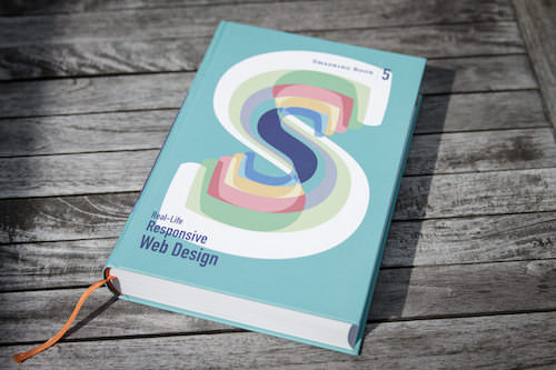
Neatly packaged in a gorgeous hardcover, the book features practical front-end techniques and patterns from well-respected designers and developers. The book isn’t concerned with trends or short-lived workarounds — it should stand the test of time and as such, it’s focused on actual techniques used today in real-life projects. The techniques that you could apply to your websites today, too. Book reviews are pretty damn good, and photos, too! You can check testimonials and reviews as well.
About The book
Smashing Book 5: Real-Life Responsive Web Design is our brand new, upcoming book with smart front-end techniques and design patterns derived from real-life responsive projects. With 13 chapters on responsive workflow, SVG, Flexbox, Web fonts, responsive images, responsive email, content strategy, debugging, performance and offline experience, this is just the book you need to master all the tricky facets and hurdles of responsive design.

Once again, the book is going to be quite thick, and obviously both hardcover or digital editions (eBook in PDF, ePUB and Kindle) will be available. So if you want to get your hands on the book, you better don’t wait too long. We know it — you’ll love the book as much as we do. Free worldwide shipping.
Table Of Contents
We invited respected designers and developers who know a thing or two about responsive websites. The chapters have also been reviewed by active members of the community such as Jake Archibald, Dmitry Baranovsky—just to name a few.
| AUTHOR | CHAPTER | DETAILS |
|---|---|---|
| Vitaly Friedman | Preface | |
Summary • As designers and developers, we solve problems for a living. Yet, these problems are often quite tricky and complex, and the context of these problems requires us to be creative and flexible in our workflows. With responsive design, we are prompted to create scalable design systems that work well in unpredictable environments. To do that, we need to be pragmatic and find solutions that work well within given constraints. That’s why we created this book: to find techniques that have actually worked in real-life projects with real-world challenges. Keywords • design systems • scalability • bulletproof solutions • front-end techniques • real-world challenges | ||
| Daniel Mall | Responsive Designer’s Workflow | |
Summary • In practice, responsive projects usually require more time, more skills, more testing and hence more flexibility in budgets. Addings changes late delays projects immensely, and process involving designers, developers and clients is usually tiring to say the least. Keywords • responsive workflow • element collage • style tiles • tools • deliverables • performance budget • interface inventory • sketching • planning • manifestos • hypothesis • atomic design • designing in the browser • Photoshop | ||
| Vitaly Friedman | Responsive Design Patterns and Components | |
Summary • So, how do we deal with complex tables when building responsive websites? What about advanced interface components? Dashboards? What about the behaviour of web forms, navigation, mega-drop down menus, filters? Can we utilize vertical media queries and portrait/landscape orientation change? In this chapter, Vitaly will provide an overview of clever practical techniques for improving UX of responsive sites, with innovative approaches to designing "responsive modules" such as mega-drop downs, tables, calendars, accordions, maps, sliders, responsive PDF and responsive iconography — and a dash of anti-patterns to avoid as well. Keywords • design patterns • navigation • smart front-end techniques • priority+ pattern • improved off-canvas • lazy loading • autocomplete • filters • responsive PDF • portrait/landscape mode • sliders • country selector • responsive iconography. | ||
| Eileen Webb | Structured Content For RWD | |
Summary • Content created by one department is never updated by the next. Services get renamed in the navigation, but are still referenced by the old name in the body text. Important information is buried in the murky depths of flowery prose. Keywords • structured content • content consistency • content models • structural audit • editorial content • content types • content relationships • data-driven gaps • feature-driven gaps • authors and editors • CMS • content maintenance | ||
| Sara Soueidan | Mastering SVG For RWD And Beyond | |
Summary • This chapter has hands down on everything you need to know in order to start designing and building flexible components and visual assets with SVG. Sara will take you on a journey through SVG syntax, SVG accessibility, SVG viewport and viewBox, creating and exporting SVGs, embedding SVGs, building SVG sprites, creating SVG icon systems, using SVG Data URIs, optimizing SVG for performance, SVG conditional processing, clever SVG tricks and techniques and making SVG cross-browser responsive with CSS. Yep, everything you need to know about SVG, as promised. Keywords • SVG • syntax • accessibility • viewport • viewBox • exporting • embedding • sprites • icon systems • data URIs • performance • smart SVG techniques • responsive iconography • cross-browser fallbacks | ||
| Zoe M. Gillenwater | Building Responsive Components With Flexbox | |
Summary • We can use Flexbox for a while now. In fact, Flexbox solves a lot of CSS shortcomings and makes building responsive layouts much easier than with floats or positioning. It gives you more control over the things you care about in a responsive layout (such as order, alignment, and proportional sizes of your boxes) and lets the browser figure out the rest; the math-y stuff that computers are good at, like the exact dimensions that are needed on the boxes to perfectly fill the available space. Keywords • syntax variants • | ||
| Bram Stein | Web Fonts Performance | |
Summary • By default, web fonts block rendering, hiding content from the user. The only way to make content accessible as soon as possible is by treating web fonts as a progressive enhancement. This doesn’t mean web font performance is not an issue. You still need to load web fonts as quickly as possible so that users experience your site exactly how you designed and built it. Let's fix this. Keywords • font formats • font loading • font-rendering • FOIT and FOUT • Font Loading API • fallback fonts • inlining fonts • simulating swapping • promises • asynchronous loading and caching • prioritized loading | ||
| Yoav Weiss | Using Responsive Images, Today | |
Summary • So you want to serve different images to different screens. Perhaps a Retina image (only) to Retina screens, or an art-directed image to small screens, or a portrait image for portrait orientation, or perhaps .webp to browsers supporting the format — without performance hits. Since images are the heaviest assets on the web, dealing with them intelligently is both our responsibility and opportunity for more dynamic layouts. That's what native responsive images are for. Keywords • CSS pixel and DPR • Retina displays • fixed-width images • variable-width images • srcset and sizes • art direction • <picture> element • separation of concerns • image format fallback • accessibility • background images • image optimization • WebP and JPEG-XR • compressive images • deployment • common pitfalls | ||
| Fabio Carneiro | The Dark Side Of Responsive HTML Email | |
Summary • Explaining responsive HTML email is always an uphill battle, because just about every single designer and developer hates it. But there’s a lot of great, forward-looking innovation going on in the email design world. In fact, melding of responsive design techniques is absolutely possible. Keywords • email landscape • CSS in email • market share • navigation and CTA buttons • foundational markup • reset and client-specific CSS • fluid containers • pattern-based development • layout techniques • Microsoft Outlook • Windows Live Mail • Apple Mail • Mozilla Thunderbird • Outlook.com • Yahoo! Mail • AOL • iOS Mail • Gmail | ||
| Tom Maslen | Testing, Maintaining And Debugging RWD | |
Summary • We talk a lot about designing and building responsive websites, but not so much about maintaining and testing them. Speaking from his experience at BBC, Tom has built up a way of working that minimizes the pain points that responsive web design has. Keywords • "cutting the mustard" • predictable, simple CSS • naming conventions • BEM and class names • Sass organization • debugging media queries • lazy loading • content-out media queries • separation of concerns • exploratory testing • functional testing • visual regression testing • automated testing • dealing with false positives • common dependencies • troubleshooting bugs on mobile | ||
| Andrew Clarke | Counting Stars: Creativity Over Predictability In RWD | |
Summary • Our responsive designs lack soul. You can think of many websites that are well presented, easy to use, triumphs of UX and technically competent, but few that might be remembered for years to come. Why do you think this is? Why are so few websites memorable? Could the design processes we’ve come to rely on, particularly in relation to responsive design, have hindered our creativity? Our modern web design magazines are full of advice about process, techniques and tools, but little about creativity, about humanity, or about ideas. Keywords • advertising • user experience design • creative hijinks • allergic to research • process and predictability • building blocks of creativity • intoxicated by process • platform for creativity • creative brief • line between control and chaos • buying creativity • copywriting • creative teams • creative direction | ||
| John Allsopp, Matt Gaunt | Beyond Responsive: Optimizing For Offline | |
Summary • What if we told you that as a user, you don’t have to be online to use the web, and a website or a web application would respond to this accordingly? Think Offline First: "We can’t keep building apps with the desktop mindset of permanent, fast connectivity, where a temporary disconnection or slow service is regarded as a problem and communicated as an error." John and Matt cover main technologies and practices that you’ll need to use to make your apps work as well offline, as they do online. We’ll discuss how to detect if we are online or not, HTML5 Application Cache, WebStorage and offline events, but most importantly Service Workers and how we can use them today to not only make content available offline, but also significantly improve performance and create snappy, fast experiences in (almost) no time. Keywords • navigator.onLine • online and offline events • HTML5 Application Cache • cache manifest • fallbacks • AppCache gotchas • Web Storage • localStorage • Service Workers | ||
| Ben Callahan | Efficient Responsive Process With Clients | |
Summary • Design deliverable is one thing, an efficient collaboration between teams and stakeholders is a different beast entirely. This chapter provides strategies for keeping this collaboration sane and focused. Keywords • collaboration • estimates • spiraling • "one-deliverable" workflow • efficiency • content priority guide • style comparisons • testing the aggregate • content prototype • wireframes • style prototypes • pattern libraries • happy teams | ||
| Vitaly Friedman | Performance Optimization Roadmap | |
Summary • If somebody tells you that responsive websites are bloated, heavy and slow by default, and that it's very difficult to make them fast, don't believe them — they are liars. If you set the priorities right and build the website with progressive enhancement in mind, you can create extremely fast responsive websites that work well across devices: with one code base working everywhere. Keywords • mobile first • jQuery dependence • dealing with IE8 • advertising • refactoring • code inventory • front-end optimization • performance budget • SpeedIndex • deferring web fonts • critical CSS • smart font fallback • dealing with JavaScript • asynchronous loading • SPDY/HTTP 2.0 • core content/functionality priority lists • responsive images | ||
Technical Details
- 582 pages (91 extra pages in the eBook), 16.5 × 24.0 cm (6.5 × 9.5 inches).
- Quality hardcover with stitched binding and a ribbon page marker.
- The eBook available as PDF, EPUB, and Amazon Kindle.
- Free worldwide airmail shipping from Germany.
- Get the printed hardcover (and goodies for free!) today.
Free Download: “Responsive Design Patterns And Components”
To give you a feeling of what the book is about, we’re happy to release a free excerpt of the book — a chapter on responsive design patterns and components by yours truly. How do we deal with complex tables when building responsive websites? What about advanced interface components? Dashboards? What about the behaviour of web forms, navigation, mega-drop down menus, filters? Can we utilize vertical media queries and portrait/landscape orientation change?
In this chapter, we’ll look into clever practical techniques for improving UX of responsive sites, with innovative approaches to designing “responsive modules” such as mega-drop downs, tables, calendars, accordions, maps, sliders, responsive PDF and responsive iconography — and a dash of anti-patterns to avoid as well. Available for free download, in PDF, ePUB, Amazon Kindle formats.

The Book Gallery
Obviously nothing can replace the feeling of holding the books in your own hands, but here are a few photos to give you some idea of what the book feels like. But frankly: it’s as beautiful as it is valuable.


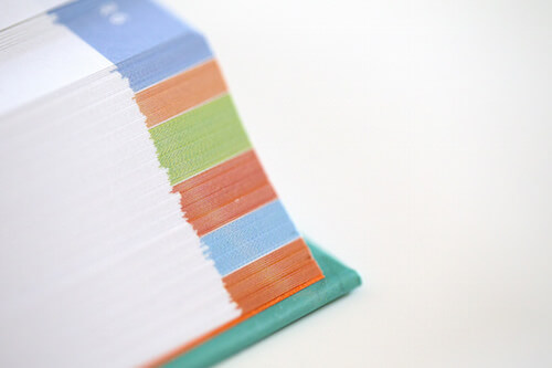


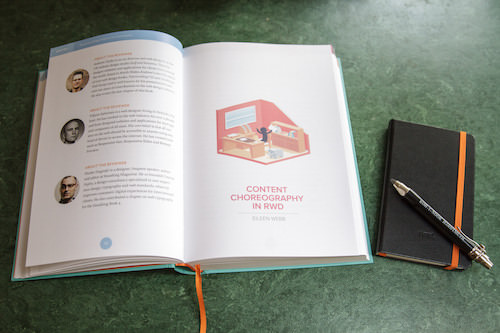
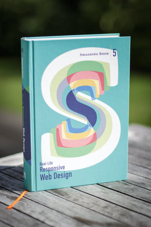
Image credits: Marc Thiele and Stefan Nitzsche.
Testimonials And Reviews
"It’s almost as if each author made a promise that you would not leave their “class” with any questions being left unanswered. That’s how in-depth the chapters are to me. The new Smashing Magazine book is outstanding. If you're designing or building responsive websites, it's a must-buy. Smashing Book #5 is now your RWD bible. Stop searching, buy this book, and spend a weekend filling your brain with the most useful, technical information on RWD you can find anywhere."
—Paul Scrivens, “Smashing Book #5, A Review”
“Smashing Magazine’s fifth book is everything I've come to expect from the productions of Freiburg’s finest: Extensive, in-depth and beautifully rendered. But best of all it is wise; unafraid to step back from technicalities and take in the bigger picture. This isn’t just a book about how to do responsive design, but about what it really is and what it really means. So many web design books are mere manuals. This is a great deal more.”
—Heydon Pickering
"A few years ago, my wife and I pushed Microsoft to embrace responsive design. Selling responsive design to an organization like Microsoft isn’t easy: it takes not only tact and diplomacy to overcome the inertia of habit and fear, but also a brand new skill set. For the latter, we did what we felt was best at the time—we pointed everyone at Ethan’s book, Responsive Web Design, and sheepishly nudged, “There’s more information about Responsive Design on the Internet.” Today, we’d have given each of them a copy of Real-Life Responsive Web Design instead of telling them to just “google it”.
—Nishant Kothary, MINKY (and former Microsoft Web Strategist who championed Microsoft’s responsive home page)
"The chapters of the book are complimentary to each other, so the entire book is a collection of topics that go extremely well together, giving you a set of diverse topics that are sure to come in handy for any responsive design project you work on."
—Sara Soueidan , “Chapter 4, Smashing Book 5”
"It’s not often I read a book twice but I’ll definitely be going back to re-read these chapters. They’re packed. So, good book? Yes, very good!"
—David Bushell , “Real-Life Responsive Web Design”
"The book itself is a monster, a beautiful monster. At nearly 600 pages, printed in hardback with glorious typography and beautiful illustrations, it's one of the most eye-catching web-dev books I've ever read."
—Matt Hill , “Chapter 4, Smashing Book 5”
"Reading the new Smashing book, which is timely as I'm spritifying some SVGs, and it's easier than flying @SaraSoueidan over to do it for me."
— Bruce Lawson
"There is a chapter on SVG for RWD by Sara Soueidan that kind of made me feel stupid, not because of how it was written, that was great, but because it introduced me to so many new things about SVG. What the heck have I been learning all of these years?"
— Mike Rundle
Smashing Birthday Special: Only Today
Well, we can’t invite you all to our little party, but we’d be more than happy to celebrate our special day with a little birthday special. If you get a printed Smashing Book 5 today, you’ll also get five Smashing eBooks as a gift for your kind support: the Smashing Book 4, The Mobile Book, Mobile Web Handbook and a free eBook with a few chosen articles from the 9 smashing years. Thanks for sticking around all this time. We wouldn’t be Smashing without your kind and generous support.

Further Reading
- Picture Perfect: Meet Pixo, A Photo Editor For Your End Users
- How To Become A Better Speaker At Conferences
- Accessible Target Sizes Cheatsheet
- Understanding Privacy: A New Smashing Book Is Here


 Register For Free


 How To Measure UX and Design Impact, 8h video + UX training
 Bring your design to life
 JavaScript Form Builder — Create JSON-driven forms without coding.

