Using WebP Image Format Today
They say a picture is worth a thousand words. But online, a picture can be worth a thousand kilobytes or more! HTTP Archive shows that images make up 64% of a web page’s total size on average. Given this, image optimization is key, especially considering that many users will abandon a request if it doesn’t load within a few seconds.
The problem with image optimization is that we want to keep file sizes small without sacrificing quality. Past attempts to create file types that optimize images better than the standard JPEG, PNG and GIF formats have been unsuccessful.
Enter WebP
WebP is an image format that was created in 2010 and is currently being developed by Google. This format delivers lossless and lossy compression for images. Several big names are campaigning for WebP, most notably Google, Facebook and eBay.
At our company, we always experiment with techniques that improve website performance. So, we ran a few A/B tests to understand WebP’s impact on image quality and how best to implement it in our clients’ projects.
A major reason why we started implementing WebP is the smaller file size. According to Google:
- WebP lossless image files are 26% smaller than PNGs.
- WebP lossy images files are 25% to 34% smaller than JPEG images at an equivalent structural similarity (SSIM) index.
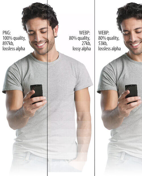
- WebP supports lossless transparency (also known as alpha channel), with just 22% more bytes.
Our tests have uncovered pros and cons to the WebP image format:
| Pros | Cons |
|---|---|
| Smaller file size | Weak browser support |
| Improved compression algorithm | Artifacting has plastic appearance |
| Smoother color gradations | Poor exporting interface |
| Alpha channel mask |
Image Quality
WebP uses a new compression algorithm, so artifacting (i.e. distortion or degradation) looks different than with other file types. WebP does a nice job of maintaining crisp edges in a photo – but, of course, it loses detail and texture, as you would expect in a lossy file. Whereas a comparable JPEG file exhibits jittery artifacting in solid areas, WebP boasts smooth gradations down to the lowest quality settings. One downside of this is that human faces can take on a plastic or posterized appearance at low settings.
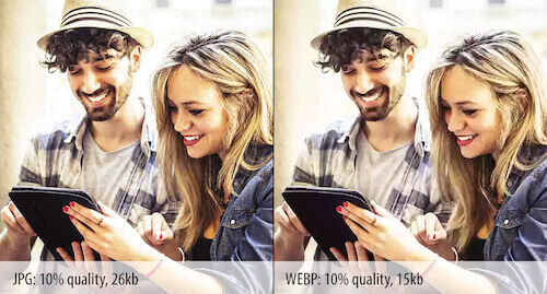
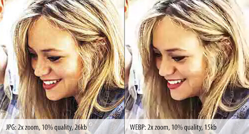
We have a few other things to consider with the WebP image format. Compression settings don’t match up one-to-one with JPEG. Don’t expect a 50%-quality JPEG to match a 50%-quality WebP. Quality drops pretty sharply on the WebP scale, so start at a high quality and work your way down.
Another game-changing plus is the ability to add an alpha channel mask, much like a PNG. Unlike its lossless counterpart, however, you can often squeeze a usable WebP image to around one tenth the size of its PNG equivalent. This is a real standout use for WebP, allowing for a host of options and features that would otherwise bring a website to a crawl with unwieldy file sizes. One real-world example saw an 880KB PNG (24-bit with alpha channel) compressed down to 41KB – a saving of 95%. While this is not the norm, it does illustrate the possibilities.
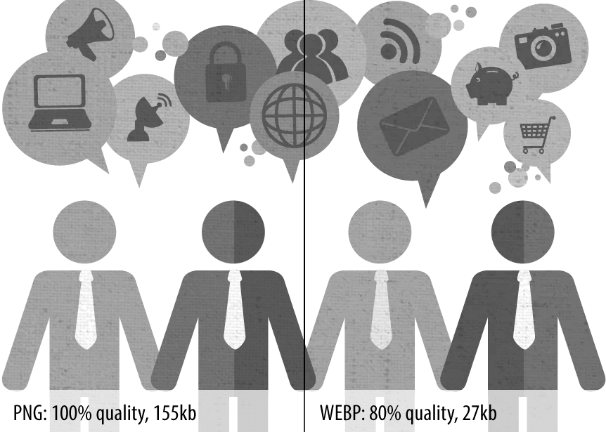
To further reduce the file size, we could omit metadata by unchecking “Save Metadata” in the “Save” dialog in an image editor. For even further compression savings, we could select “lossy alpha channel.” Quality settings for the alpha channel mirror those of the image. For example, a 50%-quality image will have a 50%-quality lossy alpha channel. In our testing, we expected artifacting around the masked edge, but there were also noticeable compression changes to the entire image. We certainly consider it an option to further shrink file sizes, but we would closely monitor the image quality when doing so. Also, watch for unwelcome banding in the alpha channels with gradated fades.
We were quite excited to discover that there is a Photoshop plugin for the WebP support. This makes it easy to dial in quality settings for WebP images. The interface of the plugin leaves something to be desired – it hasn’t been fully adopted by Adobe. At present, you cannot preview an image to assess quality settings, which is a downside.
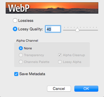
As a workaround, Google’s Chrome browser allows for a quick comparison of files. Accessing the “Save” dialog is also a bit awkward in Photoshop. To save time, we’ve set up a keyboard shortcut and hence avoid repeated visits to the “Save as” dropdown menu. In spite of these caveats, it’s still worth the trouble.
With significant file size savings, good quality and the alpha channel, WebP seems like a real contender among image formats. While test results were promising, oddly there was no clear winner between formats. WebP often ran rings around the other formats, but JPEG and 8-bit PNG still occasionally beat WebP in size or quality, or both. Be sure to do plenty of testing on your own before implementing WebP, because it might not be ideal for your needs.
Implementation
Once we determined that WebP would be an efficient tool to use in our process, we turned to our developers to test implementation. WebP is natively supported in Chrome, Opera, Opera Mini, the Android browser and Chrome for Android. Firefox, Internet Explorer and Safari don’t have native support, although Firefox has quite a history with WebP. Luckily, there are a few workarounds for the lack of browser support.
Through our research, we found three viable options for supporting the WebP format. We wanted to make sure that we use the best option for page size, keeping in mind that speed index is a key metric, and taking into account any JavaScript polyfills needed.
We ran four tests to consider which direction to go in. The first test used a normal JPEG as a control, and the other three tests implemented the options listed below. We used a JPEG image and a WebP image of similar quality (269KB for JPEG and 52KB for WebP). The results of all four tests are available in a PDF.
In the second test, we included WebPJS, a 67KB polyfill developed by Dominik Homberger. It provides the WebP support for all major browsers, even in IE6 and up. The polyfill is helpful because it doesn’t require you to change the syntax of the <img> element in existing code – just change .jpeg or .png to .webp, and the polyfill will do the work for you.
Our next approach was to use Picturefill, a polyfill that allows the use of <picture>, even when <picture> is not natively supported. This allows developers to use <source> for WebP if the browser supports the format, and to fall back to JPEG, PNG or another image type if WebP is not supported. (Obviously the <picture> element holds other amazing powers, too.)
The fourth test used code in the .htaccess file on the server to implement WebP. This option was devised by Vincent Orback. Using this approach, the .htaccess code looks for a WebP version of each image on the page. If the browser supports WebP and a WebP image is available, it uses the WebP image, rather than the JPEG or PNG. This is helpful and saves considerable time because you don’t have to change the syntax of the <img> element in the code or change the extension of images to .webp.
After reviewing the data, we determined that the WebP polyfill (from test two) is the most lightweight solution that works in all browsers, but we weren’t quite impressed with the speed index metric resulting when using this method. The WebP polyfill seemed to load images visually worse than the JPEG control test and the other implementations, except on iOS.
We also noticed that on iOS devices, file sizes were 100KB larger than on other devices. In our tests, we noticed that in iOS5.1 and on IE8 and 9, the WebP image gets downloaded three times. While the two extra requests are not ideal, this is still smaller than the JPEG equivalent. We haven’t tested this in updated iOS versions, so this might have been resolved. We are inclined to use this implementation initially because of the better browser support.
Looking Ahead
Our team has decided to implement the method used in test three, using the <picture> element to serve a WebP image for browsers that support it, and serving a JPEG or PNG when WebP isn’t supported. We believe this is the best route for progressive enhancement and still allows for a fallback image. We originally went with the implementation of the WebP polyfill but found the outcome not to be ideal.
WebP won’t push JPEG or PNG out of the picture, but it is a superb tool to add to your arsenal. Get ready to welcome WebP, and be prepared to do some of your own testing and comparison with each new project!
Further Reading
- Responsive Images Done Right: A Guide To
And srcset - Leaner Responsive Images With Client Hints
- Automate Your Responsive Images With Mobify.js
- Front-End Performance Checklist


 Smart Interface Design Patterns, 45 lessons + UX training
 Devs love Storyblok - Learn why!
 JavaScript Form Builder — Create JSON-driven forms without coding.
 Get a Free Trial


