Why Performance Matters, Part 2: Perception Management
Time can be analyzed from two different points: objective and psychological. When we talk about time that can be measured with a stopwatch, we’re talking about objective time, or clock time. Objective time, though, is usually different from how users perceive time while waiting for or interacting with a website or app.
In part 1, we talked about objective time and some techniques for managing it. We reviewed the ideas behind several widely adopted industry standards, such as page-loading time and system response time. We also got a guideline for setting a performance budget, and we came to understand how to deal with time when we have to improve the performance of a website or match that of a competitor’s. However, objective time is defined by technical means whereas every such mean has its limits like financial, technical limits or implementation time that become insuperable at some point.

In addition to technical limits, the absolute values of objective time, even though an indispensable part of what we call “performance,” have one issue: The values do not constitute a “performant” website on their own. To prove the point, below are the absolute time values for a couple of websites. (To keep the intrigue, their names are hidden for now.)
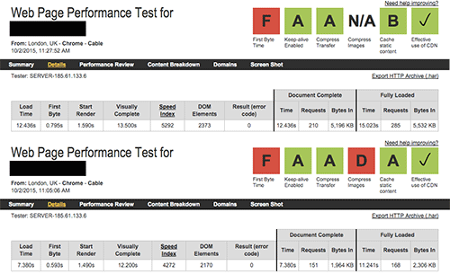
A loading time of 12.436 seconds? Visual completion in 12.2 seconds? The numbers don’t look impressive at all, do they? Considering these numbers alone, we might conclude that the performance of these websites is in desperate need of improvement. But would you believe that these very websites brought almost $89 and $19 billion in revenue in 2014, respectively? How can that be?
Don’t worry. Just type amazon.com or ebay.com in your browser’s address bar (yes, these time values were measured for these very websites) and watch them being rendered much faster than you would have otherwise guessed from looking at the figures above. We will review how to achieve this a bit later.

Performance is never about milliseconds, kilobytes or number of requests; it is not about mathematics. Performance is all about perception and psychology.
In this part, we will get a different perspective on performance:
- What is psychological time?
- How do users perceive time?
- How can we manage and influence this perception?
Psychological Time: Perception Management
"Imagination is the only weapon in the war against reality."
— Cheshire Cat in Lewis Carroll's “Alice’s Adventures in Wonderland”
The way our brain perceives time might be and usually is different from the time that we measure with a stopwatch. The perception and value of time fluctuate according to many factors, including level of anxiety, age, time of day and even cultural background. The time perceived by our brain is called psychological time.
To understand how we perceive time, we need to review some of its essential properties.
In 1927, German philosopher Martin Heidegger wrote in his book Being and Time that, “Time persists merely as a consequence of the events taking place in [space].” According to Heidegger, time is finite, has a start and end and consists of myriad of events with their own starts and ends, which constitute what we call “time”. Let’s picture a simple event:
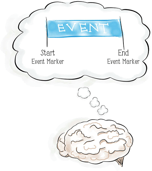
We will call the beginning of an event the start event marker or, simply, start marker. The moment when the event is finished will be, accordingly, the end event marker, or end marker.
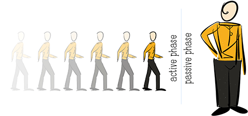
In addition to the finite nature of time, almost any event can be expressed by two different phases: active and passive. The active phase, or active wait, is characterized by the user’s mental activity. This could be some physical activity or a pure thinking process, like solving a puzzle or finding a way on a map. The period in which the user has no choice or control over the waiting time, such as standing in line or waiting for a loved one who is late for the date, is called a passive phase, or passive wait. People tend to estimate passive waiting as a longer period of time than active, even if the time intervals are objectively equal. A study by Jacob Hornik, followed by extensive research by Richard Larson, whose nickname at MIT is Dr. Queue, shows that, on average, people in passive wait mode overestimate their waiting time by about 36%.
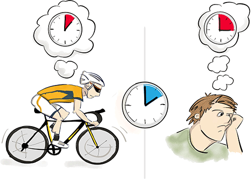
So, the two main principles of time that will guide us further in the article are these:
- Every event has start and end event markers.
- Almost every event has active and passive phases.
It will come as no surprise to hear that, in general, we don’t like to wait, except in some edge cases. But when we talk about waiting too long, what we really mean is just the passive phase of the wait; in most cases, the active phase is not considered a wait at all, due to the mental activity exerted. Hence, to manage psychological time and make the brain perceive an event as lasting for less time than it really does, we should reduce the passive phase of the event as much as possible, usually by increasing the active phase of the event. There are multiple techniques to achieve this, but most boil down to two simple practices: preemptive start and early completion. Let’s review both of these.
Preemptive Start
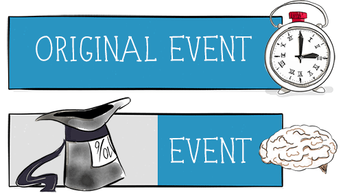
The technique of the preemptive start is the process of opening your event with the active phase and holding it for as long as possible before switching the user to a passive wait. All of this is done without affecting the duration of the original event. As mentioned, most people do not consider the active wait to be waiting at all; hence, to the user’s brain, a preemptive start means virtually shifting the start event marker closer to the end (to when the active phase is over), which will help the user perceive the event as being shorter.
The active phase in the beginning could be of a different nature and can be achieved by some trickery. For now, we will call it magic; your users don’t need to know about. Let’s visualize this process and get to some examples.
In 2009, the management team at an airport in Houston, Texas, faced an unusual type of complaint. Passengers were not satisfied with the long waits to claim their baggage upon arrival. In response, executives at the airport increased the number of baggage handlers. This decreased the waiting time to eight minutes, which is a very good result compared to other airports in the US. Surprisingly, this did not drop the number of complaints.
The executives researched the problem and figured out that, indeed, the first bags took about eight minutes to show up on the baggage carousel. However, passengers took only one minute to reach the carousel. So, on average, passengers would wait seven minutes before the first bags appeared. Speaking in psychological terms, the active phase was only one minute, while the passive wait was seven minutes.
Using their knowledge of perception management, executives came up with a nontrivial solution. They moved arrival gates further away from the main terminal and routed bags to the furthest carousel. This increased walking time for passengers to six minutes, leaving only two minutes for the passive wait. In spite of the longer walk, complaints dropped to nearly zero.

Baggage handling at the Houston airport (as pretty much at any airport) can be viewed as an example of the preemptive start technique. From a psychological point of view, starting the handling process as early as possible, while passengers are experiencing the active phase of the wait, “moves” the start event marker for passengers from the real start (when they leave the aircraft and baggage handling begins) to a new point on the timeline. This is what we call the preemptive start: starting work before the user realizes it.
To deal with complaints, the Houston team was left with the only option of increasing the active phase of the wait (making passengers walk for longer), while reducing the passive wait (standing by the carousel). And it worked without changing the objective time of the baggage handling.
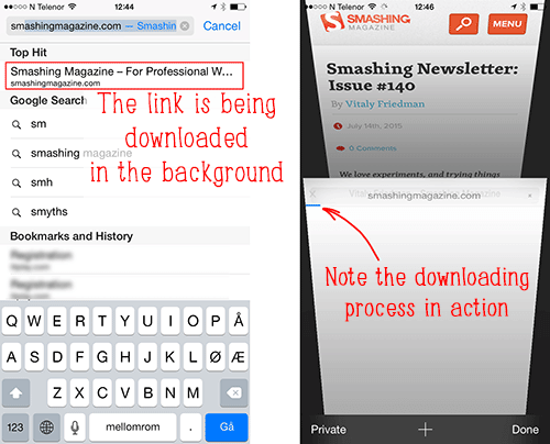
Another example of this technique can be found in mobile Safari on iOS. As you type a URL, the browser suggests pages for you, drawing from pages you have been to or top results from a search engine. There is a special link in that list called “Top Hit.” Not many people realize that, as Safari suggests this top hit, it starts preloading the page in the background, so that it can be delivered as quickly as possible once you select it. You can enable and disable this preloading behavior by going to “Settings” → “Safari” → “Preload Top Hits.”
The same is true when you open a link in a new tab: mobile Safari animates the tab turning as it preloads the page in the background, so that the page can be delivered almost instantly.
We can use the same technique on the web — in a search function, for example. Let’s assume that a search field appears on all pages, but the search results page itself requires some heavy duty functionality (sorting, filtering, maybe some additional modules from a server). Instead of loading this functionality for all pages, where it might not be needed, we could load it only for the search results page; however, this might slow down the loading of the results page unnecessarily.
Instead, we could start preloading the required functionality once the user starts typing in the search field; this anticipates that the results will be the next page that the user sees. This way, the functionality will probably be delivered to the browser by the time the user arrives on the search results. You can also use this technique to start prefetching resources on a landing page for the shopping cart page, or in the first checkout step prefetch scripts that will be used in the second checkout step, so the transition between these pages will be almost immediate.
To optimize performance in the browser, a group of industry experts, led by Google’s web performance engineer Ilya Grigorik, are working on a W3C specification named “Resource Hints.” The specification will eventually cover technical solutions for browsers to natively support the preemptive start technique. As Ilya writes in his book High-Performance Browser Networking, we will be able to “embed additional hints into the document itself to tip off the browser about additional optimizations it can perform on our behalf.”
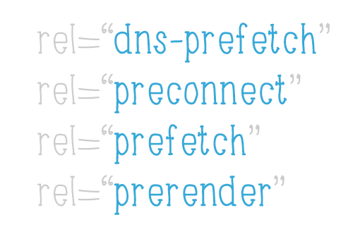
All of these hints should be placed in the document’s <head> element to enable preloading of resources as soon as possible. Let’s briefly review the hints:
dns-prefetch
This is useful for pre-resolving domain names that are found lower down on the page. It can also be used to pre-resolve domain names behind redirects.
For example:<link rel="dns-prefetch" href="//name-to-resolve.com">preconnect
This hint is used not only to pre-resolve a domain name, but to initiate a full connection handshake. The optionalcrossoriginattribute is used to configure the CORS requests; check the comment by Ilya Grigorik for a better explanation.
For example:<link rel="preconnect" href="//cdn.example.com" crossorigin>prefetch
This hint has the lowest priority and is used to prefetch assets or resources required for future navigation. The optionalasattribute is used to optimize the fetching process for the specified type of content.
For example:<link rel="prefetch" href="/library.js" as=”script”>prerender
This enables background pre-rendering of an entire page, with all of its assets. This might be useful for when a user is navigating a website, to instantly return a page once they need it. However, because yet another page has to be loaded, use it with caution.
For example:<link rel="prerender" href="//example.com/next-page.html">
For more details and to see the eventual optional arguments for these hints, read the working draft of the specification. To better understand the thinking behind these hints and for more examples of their usage and support, make sure to check out Ilya Grigorik’s slides “Preconnect, Prefetch, Prerender” or the article “Prefetching, Preloading, Prebrowsing” by Robin Rendle on CSS-Tricks.
Furthermore, the “Preload” specification joins the family of resource hints in the W3C “Editor’s Draft.” It defines the preload hint, which is almost the same as the prefetch hint mentioned earlier:
<link rel="preload" href="/styles/other.css" as="style">However, there is one essential difference between the two: Whereas prefetch has the lowest possible priority and is intended for resources that the user will need as they navigate, preload is meant for critical resources that should be fetched with the highest possible priority. Also, note that preload supersedes the subresource hint that you might encounter in other articles.
Returning to the preemptive start technique, we could summarize this as follows: We open the event with the active phase and keep the user in this phase for as long as possible before switching to the boring passive phase of the event.
Early Completion
Similar to how we can move the start marker in the preemptive start technique, early completion moves the end marker closer to the start, giving the user the feeling that the process is ending quickly. In this case, we would open the event with the passive phase but switch the user to the active phase as quickly as we can.
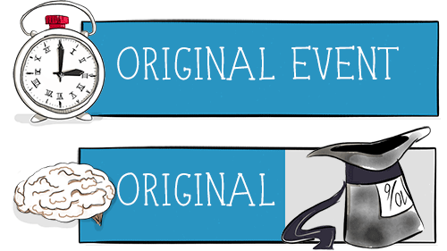
The most familiar use of this technique on the web would be on video-streaming services. When you click the play button on a video, you aren’t waiting for the whole video to download. Playback starts when the first minimally required chunk of video is available. Thus, the end marker is moved closer to the start, and the user is provided with an active wait (watching the downloaded chunk), while the rest of the video downloads in the background. Easy and effective.
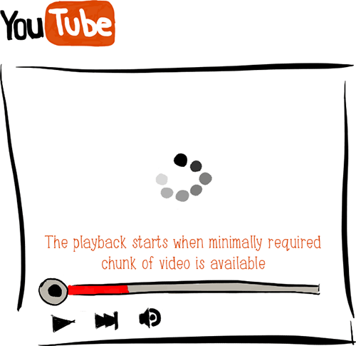
We can apply the same technique when dealing with page-loading time. In the interval between when a page is requested and gets rendered in the browser, the user is waiting, with no control over the process and no option other than to close the tab. This tells us we are dealing with a passive wait — and people hate the passive wait. So, we should alter it somehow.
One acceptable solution would be to start rendering the page once essential pieces, such as the DOM, are ready to be shown. We don’t need to wait for every asset to download if it won’t affect rendering. We don’t even need all of the HTML elements; we can inject those that are not immediately visible, such as the footer, later with JavaScript. Now we can recall our Amazon and eBay examples. Let’s look at the rendering process of Amazon using a film strip:
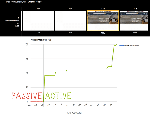
Here, we can see that, in spite of being visually complete in a minimum of 7 seconds, the Amazon page moves the user into an active wait in as soon as 1.1 seconds by starting the rendering process for the top (i.e. visible) part of the website once essential assets for that part have downloaded.
The suggestion to prioritize visible content that we see in Google’s PageSpeed Insights and similar optimization tools has to do exactly with this early completion. Give users something as soon as possible; make them think that the page is loading faster than it actually is by splitting the load into a short passive wait at the beginning and then an active wait once the initial information has been loaded and rendered. In anticipation of this, it is very useful to control such parameters as “Start render“ in tools like WebPageTest, which give an idea of how fast a website is to the user’s perception.
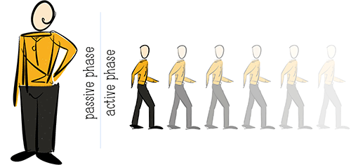
Perception management that employs active and passive phases is very effective and does not necessarily require expensive or labour-intensive solutions. It works great in most cases using the most powerful tool at our disposal: the human brain.
Conclusion… For Now
As web developers, we should aim to deliver fast and reliable web services to make users feel comfortable. We can use technological means to control the objective performance of a website. However, as we’ve seen, the absolute values of time, while an important aspect of performance, are not the only factors in a performant product. The user’s brain decides whether a website is fast enough given current circumstances such as their mood, their line of thought and maybe even the time of day. Technology and resources eventually hit a limit, at which point it becomes difficult to change objective performance. Then, we have to aim to exploit what psychology and neuroscience tell us.
To summarize our discussion in the two articles in this series and to give you some strategies to deliver faster projects, below is a list of the theories and tools at our disposal:

- “Why Performance Matters, Part 1: The Perception of Time”
- “Objective Time”
- “The Need for Performance Optimization: The 20% Rule”
- “Neutralization, or Chasing the Leader” (to level the competition)
- “Psychological Time: Perception Management”
- “Preemptive Start”
Keep the user in the active phase as long as possible before switching to the passive wait. - “Early completion”
Give the user something to work with by switching from a passive to active wait as soon as possible. - Part 1: Perception of Time
- Part 3: Tolerance Management
- Getting Ready For HTTP/2
- Everything You Need To Know About AMP
- Progressive Enhancement
- Improving Smashing Magazine’s Performance
From this article:
You could employ some or all of these techniques in your job. Still, the attentive reader might feel that this list is not comprehensive; there are still questions to answer. What do we do when the technical means reach their limit yet the event is a purely passive wait, with no active phase at all? Also, is there such thing as a product that is “too fast”? Ladies and gentlemen, let’s meet in part 3 to find the answers.
Further Readings


 Devs love Storyblok - Learn why!
 Register For Free
 Get a Free Trial
 Smart Interface Design Patterns, 45 lessons + UX training


