A Guide To Simple And Painless Mobile User Testing
The incredible growth of mobile and the proliferation of mobile devices has made the UX designer’s job more challenging and interesting. It also means that user-testing mobile apps and websites is an essential component of the UX toolkit.
But unlike the desktop environment, no out-of-the-box software packages such as Silverback or Camtasia are specifically designed to record mobile usability tests.
Even if you’re not developing a mobile app, chances are that a large proportion of your website traffic is coming from mobile. Running regular mobile usability tests is the only way to gauge how well this channel is working for your customers.
A bit of hacking is required. And, after years of experimentation, we think we’ve figured out the best hack available yet. If you want to test iPhone or Android experiences, this solution is simple, cost-effective and high quality.
The Old Hack: Wires And Duct Tape
In days gone by, we used a “sled” to mount a smartphone and camera into a position where we could record what users were doing on screen. (To create the sled, we bought some acrylic in a hardware store and bent it into shape over a toaster. Fun.)
We attached a webcam to the sled with duct tape and mounted the phone with tape and some velcro strips. Looking back, the device was pretty crude. It wasn’t a natural experience for users, who would often cradle the phone in two hands to keep the sled steady.
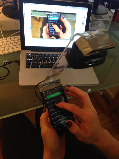
Technically, it wasn’t reliable. Because we were using two cameras on one laptop (the camera on the sled and the laptop’s built-in camera), we had to have two camera apps open at the same time. This led to flaky performance. Either setting it up would be a stressful time or we’d get a blackout in the middle of a test — or, often, both.
And there were other issues, such as screen glare and camera focus. Overall, it was time-consuming to set up, with unreliable performance and a suboptimal testing environment. It was particularly stressful if clients were around, but it was the best solution we knew at the time.
A Better Way: Wireless
Ideally, testing equipment and software should be invisible to the users. We want as natural an environment as possible, just the users and their smartphones — no wires, sleds, cameras or duct tape.
For the UX team, the focus should be on learning and insight. We don’t want to be sweating over the setup or worrying about blackouts.
I’d like to introduce you to a simple setup that achieves all of these goals. It allows the UX team to focus on what really matters, and lets users focus on their phones. And it’s so reliable that we regularly use it in front of clients and during our training classes.
We’ll focus here on testing usability on smartphones, using a MacBook as the recording device. But the approach works with Windows PCs, too.
Step 1: Install Software
The magic ingredient in this setup is Apple’s wireless AirPlay technology. This is the software that lets you stream music or videos wirelessly to an Apple TV.
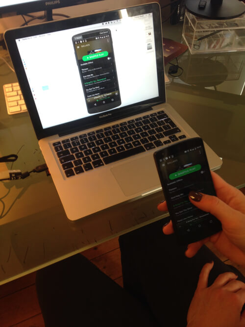
So, the first software you’ll need to buy (for $15) and install is Reflector, which converts your laptop into an AirPlay receiver, just like an Apple TV. This allows us to mirror the user’s smartphone screen onto the laptop: Whatever is on the user’s smartphone will also be seen on the laptop.
Now we have a scenario in which we don’t need an external camera to record the user’s smartphone screen. We just need screen-capturing software to record the smartphone on the laptop. My personal favorite is ScreenFlow ($99), for two reasons. It’s reliable, and it uses the laptop’s camera to record the user’s face during the session, an essential component of any usability test.
Step 2: Set Up Monitor
This step is optional, but I like to use an external display so that the facilitator and notetaker don’t have to peer over the user’s shoulder to see the action. It also minimizes distraction for the user; they won’t see a giant version of their smartphone on the laptop in front of them — it will be on the monitor instead.
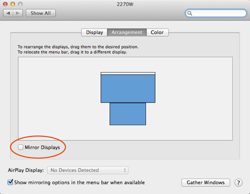
So, run an extension cable from your MacBook to the monitor. If the monitor and the laptop are showing the exact same thing, that means they’re being mirrored, which we don’t want. Open up “System Preferences” and select “Displays,” and make sure the box for “Mirror Displays” is unchecked.
Step 3: Set Up Reflector
To start beaming the smartphone to the laptop, open Reflector on your Mac. You’ll see the Reflector icon in the toolbar in the top left of your screen.

Step 4: Mirror Your Smartphone
Now we come to the magic part. If you’re using an iPhone, swipe up from the bottom of the screen, and enable AirPlay. Then select your MacBook from the list (in this example, it’s “Colman’s MacBook Pro”). Finally, flick the “Mirroring” switch to active (green).
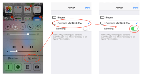
Your iPhone should now appear in the middle of your external monitor. Magic! (If the iPhone appears on your MacBook’s screen, just drag it onto the external monitor.)
For devices with Android 4.4.2 or higher, swipe down from the top of your screen to access the settings. Select the “Cast screen” option, and then select your MacBook.
Note: Your smartphone and MacBook need to be on the same Wi-Fi network for any of this to work. It’s the first thing to do when troubleshooting if you can’t get it to work right away.
Step 5: Set Up ScreenFlow
To start recording, open ScreenFlow; the new recording configuration box will appear. You’ll need to adjust the following three settings:
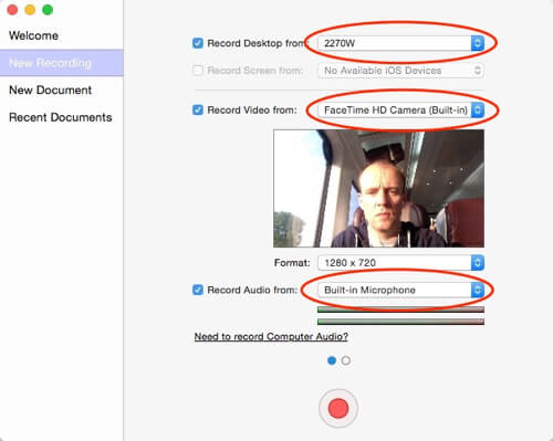
- “Record desktop from” Check this and make sure to select the external monitor from the dropdown menu (“2270W” in the example below).
- “Record video from” Check this and select “FaceTime HD Camera (Built-in),” which is the default option.
- “Record audio from” Check this and select “Built-in microphone.”
Step 6: Start Recording The Test
Position the user directly in front of the MacBook. You should see their face in the ScreenFlow preview. Then, press the large red record button. That’s it — you are now recording.
As you and the notetaker are watching the action on the monitor, the user will be sitting in front of a blank laptop, using their smartphone as they normally would — no wires, duct tape, cameras or intrusive mounts.
In the screenshot below, I’m playing around with Spotify on my iPhone. You can see that, as well as capturing the smartphone’s screen, ScreenFlow also provides a picture-in-picture display of the user, perfect for usability testing.
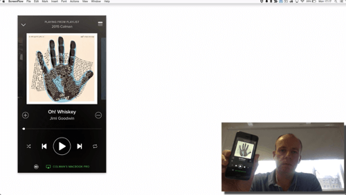
Granted, the recording won’t show the user’s fingers interacting with the device. But the overall benefits of this technique are so numerous (see the list below) that the trade-off is justifiable.
Overview Of Setup
To be clear, let’s review what your setup should look like. The user should be sitting in front of the MacBook, with the smartphone in their hand. And the facilitator and notetaker (if you have one) should be sitting nearby, looking at the external monitor.
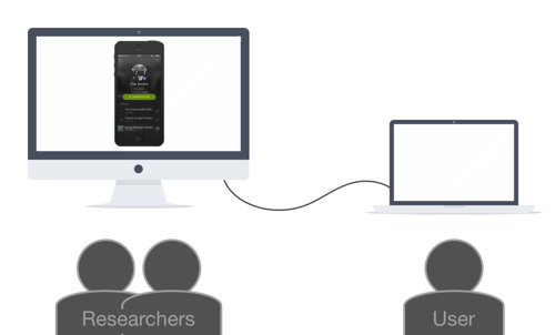
Keep the monitor pointed away from the user. It can get distracting seeing their smartphone flashing on the big screen.
Conclusion
There are so many advantages to this approach that it would be worth listing them:
- Simple. After your first time getting things together, setup takes about five minutes the second time.
- Reliable. It’s not perfect, but crashes and setup issues are rare. With the sled-and-camera approach, however, problems were par for the course.
- Cost-effective. You can have this solution in place for less than $200 if you’re using a MacBook. (By comparison, Morae, the high-end usability testing software, sells for $2,000.)
- Professional. The output is high-quality and professional. It doesn’t look like a hack. We’ve shared our recordings with clients, executives, everybody.
- Flexible. The solution works with the major platforms: PC, Mac, Android and iOS.
- Convenient. Finally, because you don’t need any duct tape or velcro, test participants can use their own phones. This makes your tests even more natural and effective.
More Resources
- Reflector For converting your laptop into an AirPlay receiver. Mac and PC versions available.
- ScreenFlow For screen recording and picture-in-picture on your Mac.
- Camtasia For screen recording and picture-in-picture on your PC.
- “Quick Tip: Make Your Own iPhone Usability Testing Sled for £5,” Harry Brignull The original blog post.
Further Reading
- A Field Guide To Mobile App Testing
- Testing Mobile: Emulators, Simulators And Remote Debugging
- Where Are The World’s Best Open Device Labs?
- Applying Participatory Design To Mobile Testing


 Smart Interface Design Patterns, 45 lessons + UX training
 Devs love Storyblok - Learn why!
 Register For Free
 Get a Free Trial

