Building A First-Class App That Leverages Your Website: A Case Study
Mark Zuckerberg once said, “The biggest mistake that we made, as a company, is betting too much on HTML5 as opposed to native… because it just wasn’t there. And it’s not that HTML5 is bad. I’m actually, long term, really excited about it.” And who wouldn’t be excited by the prospect of a single code base that works across multiple platforms?
Unfortunately, Facebook felt that HTML5 didn’t offer the experience it was looking to build, and that’s what it’s really about: the experience. I believe what Mark was really trying to say was that their biggest mistake was making a technology-driven decision instead of a user experience-driven decision. At the end of the day, we should be making decisions that deliver value to our customers, and sticking to a particular technology is generally not the best way to achieve that.
For our client Beyond the Rack, an online-only e-commerce retailer, our primary goal was to build an app with a great user experience. Like Zuckerberg, we also wanted to take the HTML5 route — the “write once, run everywhere” approach to apps that are written in HTML5 web interfaces is extremely attractive. But in today’s world, where apps are becoming the primary way that users interact with your product, performance isn’t just a nice to have — it’s a competitive advantage.
It’s almost never the case, however, that all features of your app need to be built with completely native interfaces. For example, while it might be hard to make navigation animations feel native on the web, a web page that contains little to no complex animation could easily be used in the app while still feeling native. This is all that really matters to the user. What’s required then is a “maybe write once, maybe run everywhere — it really depends on the feature…” strategy.
In short, don’t choose between native and web interfaces. Use both.
In this piece, I’ll guide you through our experience in building an app for Beyond the Rack in which we mix native and web content to create an app that “feels” native.
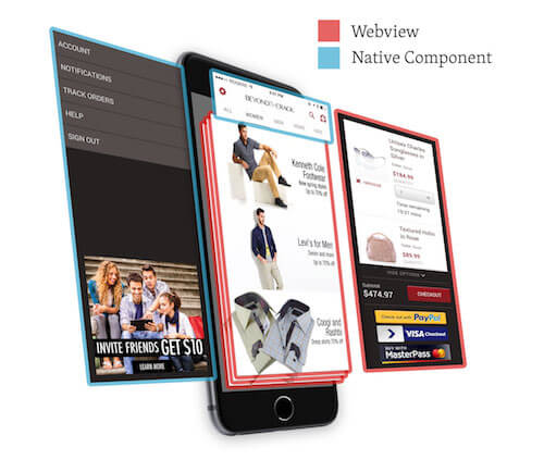
Case Study: Building An App For Beyond The Rack
Obviously it was important to determine what problems Beyond the Rack was looking to solve for itself and its customers with its app. The choice of whether to go native or web for each feature would come naturally from that.
We realized that to build a great app, we needed to do a great job with all three of the following things:
- Shopping interface
Beyond the Rack is an online-only retailer; so, having a great interface for browsing sales and making purchases is crucial. Because we were building a native app, we had an opportunity to go above and beyond what the web experience can offer. - Shareability
Because a large revenue driver for Beyond the Rack is customers sharing various sales items with friends, we needed to make sure that sharing between iOS, Android and the browser is as seamless as possible. - Discoverability
Beyond the Rack provides limited-time sales to its users; so, being able to reach out to users quickly is very important. Push messaging offers the best way to engage those loyal customers, and it was ultimately the biggest driver in the decision to build the app.
Let’s dive right into how we built some of the most important features of our Beyond the Rack iOS and Android apps: which features of the app were built using web technology, which features are fully native, and how they all work together.
The Shopping Interface
The Native Bits
We had built a responsive website for Beyond the Rack on tablet and mobile — one that we were proud of. But it wasn’t enough to simply throw the website into a web view and call it a day; the website by itself does not feel like a native app. A big reason for that is navigation. In a browser, you have back and forward buttons and a URL bar. In iOS and Android apps, users have very different expectations of how to navigate, and we wanted to match those expectations so that our app feels consistent with each platform.
We made a prototype that dynamically loads content via AJAX and manages the navigation and transitions in web languages, but we could not get it to feel as silky smooth as the transitions you see in native apps. The navigation animations on iOS and Android are quite difficult to match using web technology, and any jank in navigation would make our app feel less native. If your app isn’t running at 60 frames per second, users will notice.
We came up with an approach that we felt combines the best of both worlds: load the main content from the web, but use native navigation elements:
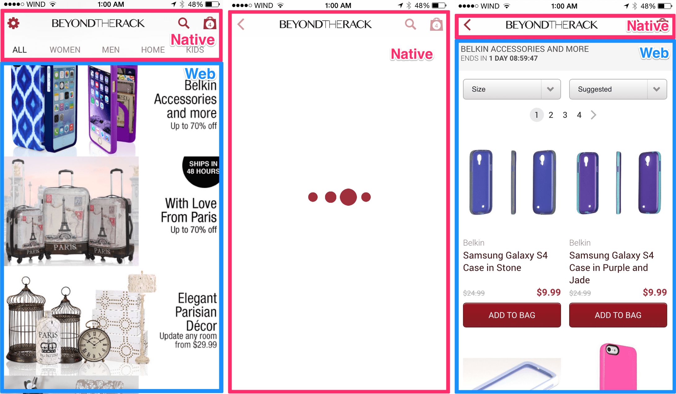
On iOS, implementing this was really quite simple. We leveraged the navigation controller, which manages a stack of views, as well as a navigation bar for controlling navigation between each view. In our case, the stack of views is really just a stack of web views — any time a navigation occurs, rather than navigating to it in the web view itself, we instantiate a new web view, push it to our UINavigationController and navigate to the new destination. Using stacks of web views also means that whenever the user goes back, they do not have to wait for the page to reload, which is great for their experience. If in the future we decide to replace a feature with a native view, we would simply push a native view onto the stack, rather than the web view version of that feature.
On Android, the equivalent of the navigation controller would be to use stacks of activities. We decided not to use multiple activities and fragments, because they both call for extremely complex lifecycle management. We ended up managing our own stack of web views for the app and writing custom native animations to transition between each view.
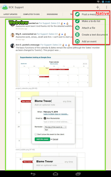
A number of other apps leverage native navigation elements to conform to OS design patterns. Check out this image of Basecamp’s Android app, which leverages a native navigation bar:
Also, compare Amazon’s app to its mobile website:
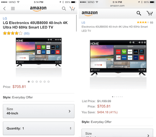
With this approach, we found our sweet spot of having an experience that feels familiar to the platform, while still leveraging a great core shopping experience from the web.
This might be a surprise to many, but the developers of the Facebook app are also constantly finding the sweet spot, leveraging native or web when it makes sense for each feature. According to an article written by a Facebook engineer: “For areas within the app where we anticipate making changes more often, we will continue to utilize HTML5 code, as we can push updates server side without requiring people to download a new version of the app.” It seems as though Facebook is taking the same approach advocated for here: Choose the technology for each feature based on performance, the development effort required and how fast you need to get it out the door.
For your app, consider case by case whether building a feature natively or leveraging web content makes more sense. Given the difficulty of building navigation that feels native, it probably makes sense to at least build that using native components.
The Web Bits
Today, almost everyone agrees that it’s a good idea to progressively enhance websites: Use one markup base for the lowest common denominator of browsers, and layer that with functionality and enhancements using JavaScript and CSS, depending on the context — no separate code bases or templates for different devices required. Just like how it doesn’t make sense to create separate templates for the mobile and desktop web, we wanted to use the live website templates within the app itself. The app is just another context.
I call this building “app-aware” responsive websites. By building our website with the app’s context and performance in mind, we’ll be ready to ship to all of our users across various platforms sooner than later.

app class — one piece of the puzzle to progressively enhance a website to be app-aware.Websites need to be able to detect the app context in three places: CSS, JavaScript and the server. We created an app class to write conditional CSS and an isRunningInApp method to write conditional JavaScript, and we appended App to the user agent for conditional server-side logic.
An example of where we used progressive enhancement within the app is on our product display page. We optimized it by adding a fixed-position “Add to cart” button only for apps:
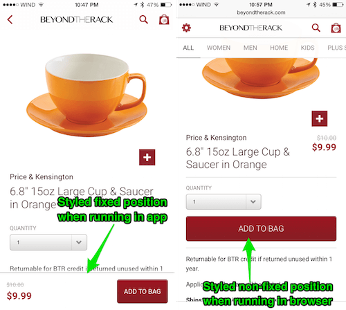
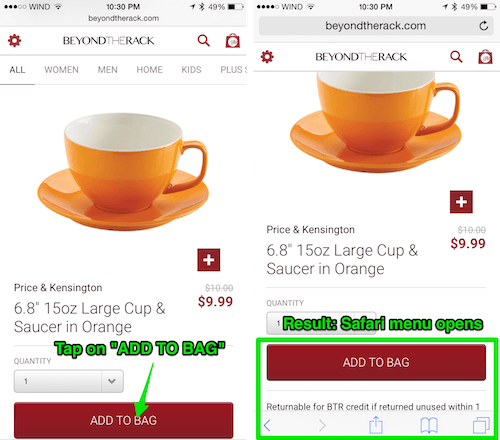
We could have added a fixed-position “Add to bag” button in the browser, too, but we didn’t because, in Safari, clicking near the bottom will actually open Safari’s navigation bar. Having this bar accidentally open when the user attempts to add a product to their cart would be an unacceptable usability flaw, despite the advantages of having a persistent “Add to cart” button at the bottom of the page:
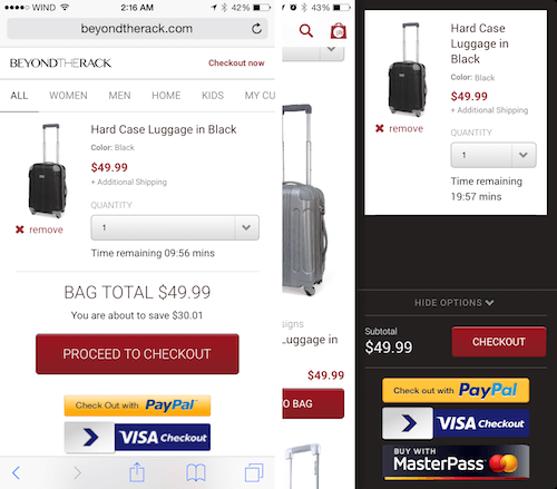
Another area where we made app-specific tweaks to the website is in the shopping cart. Cart logic is typically one of the trickiest aspects of any e-commerce website, and because we were quite pleased with the cart experience on mobile, we decided to reuse it in the app, although with a slightly modified look and feel:
Shareability
The ability to share links and to open shared links is a critical feature that has to work well for Beyond the Rack. We wanted sharing to be seamless. If someone shares a link from their desktop, and their friend opens it in the app, the link needs to open correctly; likewise, if someone shares a product from the app, it has to open correctly on the desktop; and if the friend is on mobile but doesn’t have the app installed, it should open in the browser. We were determined to make this an awesome experience because this is typically something that apps are weak at.
Making content shareable between web and app can be difficult. To do it successfully, you’ll need to map your app links and web links. This was painful in the pre-responsive days, when opening a desktop URL would take you to the home page of a mobile URL, due to redirects and such. We are seeing the exact same problem today with apps — banners in Safari and Chrome ask you to open a link in an app, only for the app not to show what you were looking for, leaving you to search for it all over again. Fortunately, handling web links in Beyond the Rack’s app is a breeze, because all we need to do is load that URL in a web view. We just have to make sure that web links take users to the app instead of the browser.
On Android, opening a URL in an app is simple. You just need to set up an intent filter to load the app whenever a user attempts to load the specified URL (in our case, www.beyondtherack.com). Once the app is installed, users will be given the option to open the URL in the app or in the browser:
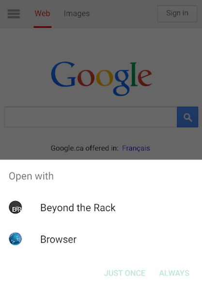
www.beyondtherack.com. (View large version)iOS has had a slightly rockier road to enabling web URLs to open directly in apps. Previously, iOS only allowed you to register an app schema for each app (for example, beyondtherack://). Because it was impossible to know which apps were installed, the only choice was to open a given link in Safari and, from there, attempt to open that link in the app. This came with a minor annoyance: If the app wasn’t installed, the user would get an annoying error message, “Safari cannot open the page because the address is invalid.” Thankfully, a hack allows you to suppress that error using iframes. If you want to support deep linking on iOS 8, this is the best option.
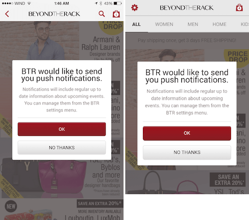
Thankfully, iOS 9 introduced universal linking, which allows apps to intercept web links before the links go through Safari. ## Discoverability Timeliness is extremely important for a company like Beyond the Rack. Traditionally, the company’s primary way of informing customers about sales was through email campaigns. But with apps, it is able to **communicate directly with its customers about sales**, which is very powerful. (Of course, push notifications are slowly arriving in browsers, with [Chrome leading the charge](https://gauntface.com/blog/2014/12/15/push-notifications-service-worker). But for older Android devices and for iOS, the choice of whether to use native or web technology was already made for us.) Just like with sharing, our decision to leverage web content directly in the app made it a breeze to set up **push notifications**. Because every product and sale can be identified by the same URL both on the website and in the app, educating marketers on how to push notifications to their customers is simple — all they need to do is share the same URLs that they are used to sharing in email campaigns. One interesting difference between iOS and Android is the **permission system** for push notifications. On iOS, permission for notifications is controlled by the operating system, whereas permission is not needed on Android. Still, we felt that requesting permission was the right thing to do from a customer service perspective. So, when the user logs into the app for the first time, we ask if they’d like notifications:
Results
After the release of the app, we wanted to compare its performance to the browser experience. Directly comparing their analytics wasn’t enough, because in our experience, anyone who had installed the app was likely a more loyal customer and, thus, would likely convert better. To avoid selection bias, we set up an A/B test; half of the users were kept in the app and half were kicked over to the browser, which ensured that the only participants in the experiment were users who had the app installed (the more loyal users).
- Transactions per unique visitor were 76% higher with the app experience than with the web.
- Unique daily users of the app were 20% more likely to convert.
- App users spent 63% more time browsing than web users.
Quick Performance Wins
Making an app that loads web content and feels native doesn’t come out of the box on iOS or Android. Here are a couple of the performance challenges we faced that are worth sharing:
- On iOS, the scrolling momentum in a web view does not the match scrolling momentum in a native scroll view. This was uncovered in user testing. Here is a one liner to resolve that:
webview.scrollView.decelerationRate = UIScrollViewDecelerationRateNormal; - Be careful when resizing web views. We ran into issues where resizing them caused entire repaints, which killed scroll performance on older devices.
- Dealing with hundreds of different web view implementations on Android can be painful. The most painful issue we ran into is a known web view bug in Android 4.4.2, which throws a fatal exception in Chromium that causes the app to crash. Removing
transform: translate3din that Android version seems to do the trick. Alternatively, you can use Crosswalk to ship your own compiled web runtime with your app (we didn’t do this, but we plan to for future projects). - Use FastClick, not only because it removes the 300-millisecond click delay, but also because it fixes a web view click bug introduced in iOS 8.4.1. For us, the bug manifested itself by not allowing the page to change if the click was too slow.
- Do everything you can to make scrolling feel amazing. You can debounce scroll events, avoid unnecessary repaints and more. If scrolling isn’t running at 60 frames per second, users will notice, even more so in an app than on the web.
- Do everything you can to make pages load in under 1000 milliseconds.
Tools To Build An App Leveraging Your Website
You have a number of options for building an app that leverages your existing website. The approach we’ve taken is to build the app specific to each platform (using Xcode and Android Studio), leveraging web views or native views whenever necessary.
When loading a web view for a particular feature, we recommend integrating the Cordova web view, rather than directly using the web view libraries provided by iOS and Android. This will give your web views a number of features that you would otherwise have to build yourself, such as a web-to-native bridge to communicate from JavaScript to native code and vice versa, the ability to access lifecycle events, as well as access to a wealth of Cordova plugins. Alternatively, a few other web-to-native bridges are available for the various platforms if you want to avoid depending on Cordova.
A few frameworks are out there to help you build apps in this way, such as Supersonic and Astro, a native app framework we’re building to make it easier to manage the complexity of building apps using both native and web interfaces.
Conclusion
With Beyond the Rack, we set out to build an app in which we could easily ship value to users without sacrificing the experience. By following an approach that puts technology in the back seat, allowing us to use the right technology for the task, we believe we have achieved just that. With any change to or introduction of a feature, we will always ask ourselves, “What experience do we want to design here that will best solve the user’s problem? Does that experience require the use of advanced performance or animations?”
The answer to that question will determine whether we build the feature with web technology and reuse it in the browser and on Android and iOS or build it custom for each platform.
Ultimately, I believe that this is how apps should be built. But it’s going to take a shift in mindset. Instead of trying to determine whether the web will triumph over native or become a relic of the past, we should embrace the best of both. We should recognize their respective advantages and disadvantages and use the technology that makes the most sense for the given feature.
Further Reading
- A Beginner’s Guide To Progressive Web Apps
- The Building Blocks Of Progressive Web Apps
- Creating A Complete Web App In Foundation For Apps
- Accessible Target Sizes Cheatsheet


 JavaScript Form Builder — Create JSON-driven forms without coding.
 Register For Free
 Get a Free Trial
 Devs love Storyblok - Learn why!
 How To Measure UX and Design Impact, 8h video + UX training

