Content-First Prototyping
Content is the core commodity of the digital economy. It is the gold we fashion into luxury experience, the diamond we encase in loyalty programs and upsells. Yet, as designers, we often plug it in after the fact. We prototype our interaction and visual design to exhaustion, but accept that the “real words” can just be dropped in later. There is a better way.
More and more, the digital goods we create operate within a dynamic system of content, functionality, code and intent. Our products and services drift and spill into partner websites, social media feeds and myriad electronic aggregators, all seeking to shape visitor behavior and understanding. Systems build on systems, and, in short order, we’ve cobbled together a colossus the breadth of which sends minds a-boggling.
Though we’ve been pretty good at figuring out simple systems in the past (think static websites and intranets), it turns out that large dynamic systems are quite a bit more complicated — and quite a bit less predictable. As systems grow, they become exponentially more complex, and as they increase in complexity, their behavior becomes increasingly nonlinear and difficult for us, poor monkeys, to anticipate. In large systems, rounding errors at the thousandth decimal point can radically change outcomes (Mitchell 33). As the Internet approaches a trillion nodes, this is the world for which we all now design.
Those simple systems that we’re used to, however, can provide a key to designing for more complex spaces. As systems theorist John Gall puts it, “A complex system that works is invariably found to have evolved from a simple system that works.” In the space of digital design, if we ensure that our simplest dynamic systems of content, structure and meaning-making work as intended at a foundational level, then we can lay the groundwork for larger, more complex systems that also work as intended.
One way we as designers can keep our complexity ducks in a row is to bring our content into the prototyping process at the beginning. A content-first approach encourages us to confront the constraints and opportunities of our content earlier, and to functionally test our proposed solutions with real-content-hungry users before major design decisions have been made.
In this article, I will show you how to use a simple set of open-source tools to introduce real, dynamic content into your prototyping process from day one. This approach allows you to focus on how users understand your content from the very start of a project and to subsequently build structural, visual and technical elements atop that foundation of understanding.
A White Box Model For Content
One of the tools that systems researchers use to understand the behavior of dynamic systems is called a “white box” model. Systems scholar Gerald Weinberg writes that, whereas the behavior of a black box model is “perfectly hidden,” the behavior of a white box model is “perfectly revealed.” For complex systems, this transparency is important: Weinberg further notes that “even the simplest systems sometimes contain surprises for their builders” (172).
The goal of content-first prototyping is to create a white box model for our content, its internal structure and its supporting information architecture. This will allow us to discover early in the design process how our end users build meaning from the structured content that our digital systems offer. By taking the time to get the structure of our content systems correct at their core, we set the stage for these simple systems that work to be integrated into larger, more complex systems that work.
In order to create a white box for digital content, we need to account for three things:
- the content itself, composed of content packages of varying levels of granularity, depending on the content’s type and purpose;
- structure, both at the local page or screen level and at the global website or application level;
- user involvement in the context and posture (desktop, tablet or phone) in which our content will ultimately be consumed.
In order to remain “perfectly visible,” this model also needs to be transparent in its functionality so that members of the design team can understand why the model behaves as it does. This last piece — transparency, in combination with user involvement — is crucial to the white box model: We’re not building a prototype simply to demonstrate functionality, but rather to learn, revise and refine our underlying content structure based on how the words and structure we use are interpreted by their intended audiences.
A content-first prototyping approach is useful when you’re designing for existing content, but it’s also a good way to engage an editorial team in the process of content creation. Getting real words, images and assets in front of users early in the project allows everyone time to fine tune, adjust or pivot in order to meet the project’s goals. If your project plan is to follow a fill-in-the-words-later strategy, content-first prototyping gives you the chance to get a few content variations in front of users — and then get user reactions in front of stakeholders.
A Content-First Prototyping Framework
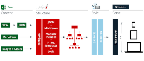
Taking the principles and goals described above, I have put together a starter framework for creating this kind of prototype. Much in the spirit of systems thinking itself, this tool relies on a loose coupling of simpler systems that each performs a simple primary task well.
For this framework, I’ve assembled Excel, Jekyll, ZURB Foundation and Browsersync, and linked them all together with a Gulp script. I chose these particular applications and frameworks because they are widely available, are open source (mostly), have active support communities and have excellent documentation.

You can download a copy of the example project discussed below and a content-first prototyping framework starter kit from the project page on GitHub. Let’s go over how the pieces fit together and what each of them does.
Excel
Excel — or any spreadsheet program that saves to the XLSX format — is used to create and edit structured content and categorization systems. Each time you save the document, each package in your content set (represented by a row in the spreadsheet) is exported as both a Jekyll page and a JSON document. This allows you to execute both page and global operations on your content and to propagate changes in content to the entire website with a single “save” command.
Jekyll
Jekyll is an open-source static website generator and is used to articulate the dynamic structure between content packages, pages and categories. Jekyll represents the content you save in the spreadsheet as variables and allows you to perform operations on those variables to create structure. Jekyll also provides “if/then” tags for applying conditional logic and for loops for cycling through and filtering content sets.
Foundation
ZURB Foundation, an open-source mobile-first front-end framework, is used to articulate information hierarchy and to structure responsive behaviors. Foundation’s grids, style definitions and responsive behaviors allow you to create just about any standard web layout pattern simply by applying classes to your HTML elements.
Browsersync
Finally, Browsersync serves your prototype to the browser and updates CSS and pages as you make changes. Browsersync also allows you to access the prototype from any device connected to the same network. This means you can see automatic updates on a phone and tablet as you’re making edits on a laptop.
Linked together, these tools allow you to build prototypes in an environment similar to the dynamic systems that will make up your eventual production environment, but without having to suffer the databases, cloud services and network latency that would slow you down when you need to move quickly to try out ideas.
If You’re Panicking Because This Involves Code…
Don’t panic. These tools are designer-friendly and have excellent support communities. You don’t need to be a front-end developer to bring your ideas to life. You do need to know the basics of HTML and CSS. These languages are not hard — and learning them will not destroy your ability to do good design work. In the words of type design legend Erik Spiekermann, “You have to learn if not to code at least to appreciate code, to understand code. Because code is what nuts and bolts were a hundred years ago.” The best way to get started is to dive in.
A Content-First Prototyping Example: The Green Lake Community Center
To get a better sense of what content-first prototyping looks like in action, let’s take a digital content collection from the real world.
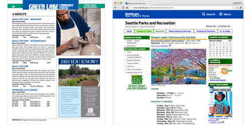
Here’s the scenario. The Green Lake Community Center offers classes, programs and events to community members in the Green Lake neighborhood. Unfortunately, all of its current class, program and event information is available online only via PDF, which in turn is available only from the center’s fixed-width desktop-optimized website. Behold:

In an effort to reach community members who are increasingly trying to access class, program and event information via their mobile phones, the center has decided to launch a mobile-first programs website. This initiative will eventually serve as a catalyst for a city-wide responsive website for parks and recreation.
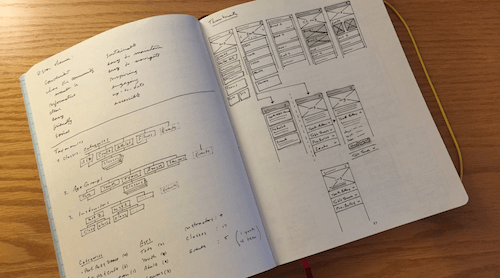
Like any other design project, I’ll begin with heuristic and competitive analysis and by looking at available traffic and user data. If stakeholders and end users are available, I’ll be sure to talk to them as well. Once I feel like I have a good sense of the website’s purpose, I’ll explore some basic high-level information architecture and user interface ideas on paper.

As an initial design approach begins to take shape, I can use a content-first prototyping workflow to get my initial ideas — and, more importantly, the content those ideas are meant to serve — into the context in which they will ultimately be consumed — in this case, the browser. Let’s go over what this process looks like in detail.
Capture Content
In this example, you can see how the structured content I capture in a content-first prototyping framework spreadsheet is automatically written to a page template each time I save my _data file. Here I’ve used the “catalogue” sheet to structure the content. “Title,” “description,” “category” and “tags” variables are already included in the page template, so those values update right away. You can add as many other columns to a content row as you’d like — just be sure to include the corresponding variable in the template (more on this below).
“Directory” and “feed” sheets are also included in the starter kit and include different categories (columns) for their respective content types. Each sheet exports content to its own folder (in these cases, “catalogue,” “directory” and “feed”) and to its own JSON file. You can add as many other sheets as you need — just be sure to update your Jekyll configuration file so that it knows to pull them in (see the “Jekyll Data Pages Generator” plugin documentation for full details).
Add More Content Packages
As I add content packages (rows in the spreadsheet), new pages are automatically added to the prototype. Each row represents a single page, and each column in that row represents a variable that Jekyll is filling in in the template as it builds a page. In this example, the content from the “Community Center” catalogue is fairly uniform, but if the item descriptions varied wildly in length, you could easily see (and experience) how that variation would affect the layout of the page. Perhaps you might then decide to chunk the content differently or add new elements, such as summaries or slugs.
This system also lets you easily experiment with labels, categories and tags. By changing the values in the “category” column, you can test how different architectural approaches affect the user’s ability to easily find a given piece of content. In this example, for instance, I’ve created organizational systems based on class type and on a participant’s age group. This allows me to easily test different navigational approaches in the menu and on the home page as the prototype takes shape.
Add Structure And Hierarchy With HTML
Once I am happy with the content in place, I’ll begin wrapping that content in markup so that its structure makes sense to users. Treat the variables here like text, and mark them up as you would mark up text in a “flat” HTML file. The results here should look pretty predictable (that’s a good thing).
Jekyll’s templating system will take the page templates you’ve created and wrap them with a global template containing the header and navigation icon. This is what the “layout: default” means: We’re calling the “default” template as this template’s wrapper. You can nest templates as deep as you want, although more than one or two levels of templates is usually unnecessary. To accommodate repeated elements, such as page lists and global links, you can also use “includes,” which insert a particular piece of code in the template when the website is rendered. Check out Jekyll’s official documentation for more about templates and includes.
Add Logic With Jekyll’s Markup Tags
Jekyll lets you add basic logic by including basic tags that are specific to its templating system. Here, I use a for tag to cycle through the Green Lake Community Center’s class list (which was created when I added the multiple content packages above), and I render each community center class in the list as a link:
You can also use if statements to create conditions. Here, I’m using an if statement to hide the link to the class page I’m currently on:
If your head just exploded, please don’t panic. Adding logic is kind of an advanced feature. Your prototype will work just fine if you stick to content variables and HTML. Jekyll’s templating system is, however, very human-readable and easy to pick up.
Add Style And Responsive Behavior With Foundation’s CSS
Once a first draft of the HTML structure is in place, I can add style to the prototype simply by including CSS classes and saving the document. ZURB Foundation’s front-end framework, which is already linked up in the starter kit, provides style classes for a wide range of web and native application patterns. In the example shown here, simply by dropping in two different classes, I’ve given my mobile prototype a more “tappable” feel and introduced a much clearer sense of visual hierarchy. These changes automatically propagate to all of the content that uses this template.
Foundation also makes it easy to include mobile-first responsive behavior and to use dozens of prebuilt layout, container and media components. Because it’s all CSS, you can modify and fine tune everything to your own taste. For these examples, I’ve modified Foundation’s base color palette to a “monochrome wireframe” style, but you can adapt Foundation to any style you like. Learn more about using Foundation by browsing its documentation or tutorials or by taking a class (the classes are excellent, by the way).
Get Feedback Early And Revise As You Go
Once the content is in place, creating and testing multiple variations of the structure is easy. Labels, categories, keywords and other metadata can be changed directly in the content spreadsheet. Likewise, variations to page structure, flow and display are just a matter of creating alternate versions of your Jekyll templates. All of these changes will cascade instantly across the prototype the moment you hit “Save.”

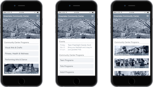
To finish off a first version of the Green Lake Community Center’s prototype, I’ve created three variations of the mobile home page. In this case, all I needed to do was rearrange elements in the home page template and swap data sources for the two navigation elements (i.e. the full-width buttons and the image tiles).
Though I’ve presented all of these steps in sequence, keep in mind that Gulp (the JavaScript task runner that links all of our simple systems together) updates changes every time you save a document. This means you can go back to any step at any time and make adjustments based on user response, stakeholder feedback or new discoveries about content or context.
This flexibility allows you to easily test different screen hierarchies and content treatments with users — and it allows you to use real content in those tests, content that your audience can experience (and react to) firsthand. Because the prototype’s final form is HTML, CSS and JavaScript, you can gather user feedback with whatever testing tool you’re most comfortable with (I like UserTesting and Lookback).
The prototype’s format of HTML, CSS and JavaScript also means that your work will more readily inform parallel and subsequent efforts. If your eventual product will be built on an existing CMS platform, for instance, then the content, structure and display requirements you are able to articulate will help you evaluate CMS options. Likewise, your prototype can serve as a specification document for design decisions involving the grid, hierarchy, headings, link behavior and fonts for your front-end developers.
Don’t forget, however, that the goal of content-first prototyping isn’t simply to design in the browser: The goal is to use the browser and your users’ feedback to fine tune the organization of your content in order to build simple structures that work well.
This method’s strength is in allowing you to quickly modify the systems that your categories, labels and navigation paths create. This provides a distinct advantage over static content modeling. If you find that you’re using a lot of extra CSS in order to make your dynamic content work the way you want, go back to the source. Can you chunk the content differently to make it work better? Add (or remove) a set of classes or tags? Try different variations until you find the simple, elegant solution that makes everything else seem to fall into place.
Systems Thinking Beyond The Web
The basic example shown here illustrates how a content-first prototyping approach can help us create simple content systems that work — systems that, in turn, set the stage for larger, more complex systems that work. Content-first prototyping helps us discover places where minor adjustments in the content model, hierarchy, categories and labels can lead to cleaner, more elegant solutions for our users’ information needs.
Though this tool is built on web technologies, the way we structure content for understanding transcends individual tools, technologies and platforms. If your content in its most basic form, stripped of the requirements and constraints of particular implementations, makes sense to its audience and accomplishes your communication goals in simple, elegant ways, then you have already built a foundation that scales beyond individual technological implementations. You have built content that doesn’t need a particular platform or script to make sense; it is a content set that wants to be understood in a certain way.
When we place content at the core of the design process, we begin to solve not for a particular implementation, but for understanding. Everything else is an intermediary step. By recognizing that the final platform for which we design is the human mind, we can identify the simple structures that give rise to understanding and can work to strengthen those structures throughout the entirety of the design process.
Works Cited
- Complexity, A Guided Tour, Melanie Mitchell (New York: Oxford, 2009)
- An Introduction to General Systems Thinking, Gerald Weinberg (New York: Dorset House, 1975)
Further Reading
- Optimizing Your Design For Rapid Prototype Testing
- Choosing The Right Prototyping Tool
- Content Prototyping In Responsive Web Design
- Resurrecting User Interface Prototypes


 Register For Free
 Get a Free Trial
 JavaScript Form Builder — Create JSON-driven forms without coding.
 Enterprise UX Masterclass, with Marko Dugonjic


