On Design Systems: Sell The Output, Not The Workflow
So how do you sell a design system to the client? How do you establish a shared commitment within the company to put a pattern library on the roadmap? As designers and developers, we often know and see the benefits of an overarching system that radiates consistency throughout the different experiences of a company. But sometimes it’s seen as a very unpredictable investment, and the value isn’t necessarily visible right away.
In his article on Selling Design Systems, Dan Mall suggests to illustrate how fractured an organization is by printing out its different presences online and putting them on a large board as an example of all the wasted money and effort that goes into making sites from scratch, one-by-one, needlessly reinventing the wheel every time.

Making inconsistency visible is helpful for revealing and highlighting the underlying issues, but how do we drive the point of introducing consistency with a modular design system that’s built out of modules, not pages? What I learned from my experience is that trying to focus on the workflow or the process is never as helpful as focusing on tangible benefits that the client will get as a result.
Clients usually don’t want to hear about atomic design and modular design and standalone patterns, but they love seeing the output, be it working prototypes or a page with all components on them.
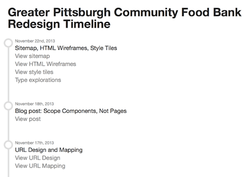
One way to display the output better is by using a project hub — one central place with all the important assets all collected in one place, sorted chronologically, and always up to date. As a result, the client can come to the site at any time and see the progress right away. You could even add the contenteditable attribute to make text editable in your responsive prototype, so if a stakeholder wants to adjust the text, she can do it in every browser, and then resize the window to see how it works on narrow screens, too.
Whenever we work with companies, we never try to sell atomic design, and we rarely sell design systems. Instead, we’re selling the ability to quickly see output with a new approach that — accidentally (or not) — includes modular design methodology. We’re “selling” project hubs and quick turnarounds, and often establishing a design system is a major part of the conversation with designers and front-end developers, but not what drives the conversation forward with clients.
Strategies For Putting A Design System On The Roadmap
Sometimes it’s not about selling the consistency to clients at all though, but rather establishing it as a clear priority within the entire team, from marketing to content managers to support team. And focusing on output can be helpful here, too; especially since the output can be slightly more than just a set of working prototypes. In his recent talk at the Clarity conference (wonderfully orchestrated by Jina Bolton), Nathan Curtis suggested a few tactics that, in his experience, often ensure that design systems take root at an organization.
In his experience, to ensure that a design system is successful within a team, it’s absolutely critical for it to be efficient, i.e. help all parties involved to save time and get to results, faster. But how do you convince a client of the value of something that doesn’t exist yet? Well, by creating this value. What if additionally to a board with current, inconsistent experiences, put up another board displaying what consistency could potentially look like? What if you redesign the basic shell of the page (perhaps just a header and a few critical buttons) to work across all experiences, print them out, too, and put the two boards against each other? Before you know it, designers and developers might be excited to normalize even more of the UI components.
Measure Design And Provide Actionable Data
Obviously, visual design is extremely subjective, so bringing in metrics and data — e.g. on conversion rates — helps convey an argument more efficiently than anything else ever could.
Define a user journey that involves different experiences (e.g. a user landing on a landing page, then browsing the shop, then checking out, then checking the state of delivery in the native app on their phone), record the interview and show it to stakeholders — or, even better, invite them to observe the session as it happens. Then conduct another session with users using a quick prototype with the “consistent” navigation, compare results, and outline them clearly. If results are way below your expectations, it’s probably better to keep iterating on the design until you have something promising to show.
Focus On Pain Points
If this strategy doesn’t work or isn’t applicable, try to focus on the pain points within the organization. The existence of visually different experiences is often an indicator of different systems — often quite dated systems — used behind the scenes. Of course, these systems do have to be connected somehow, even if it’s just for sales monitoring or quality assurance.
Alternatively, we sometimes spend some time reviewing the backlog and technical/design debt dusting up in the customer support department: usually a quick coffee break with seasoned customer support employees is extremely valuable for uncovering common pain points that hurt conversion or user engagement. You could try to target the pain points specifically and figure out a way of resolving some of the issues with a consistent design system. Again, focus primarily on the output, not the workflow.
Approach Less Visible Levels Of Consistency First
However, neither stakeholders nor loyal users like major, disruptive changes, and “big-bang”-redesigns — nevermind how impeccably consistent they might be — often bring more harm than good to customers who’ve been using the website for years. So what if instead of suggesting a major overhaul, we look into ways of defining and introducing various levels of consistency? These levels could range from less visible (padding, typographic scale) to more visible ones (buttons, icons, layout), and, frankly, you don’t even have to mention the “visible” levels at the very start of the project.
Short Design Sprints With User Interviews
That first level of consistency is often not that difficult to achieve across a set of critical pages. However, depending on the complexity of the project, it might seem daunting to embark on the journey of that scale. In the end, it’s all about being efficient, and there is no better way to get to results faster than with design sprints: a five-day process for answering critical business questions through design, prototyping, and testing ideas with customers.
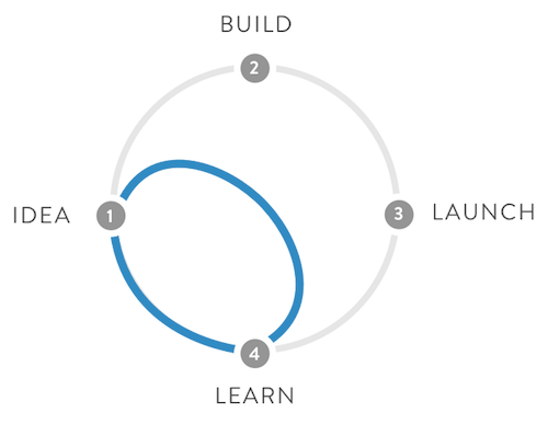
Whenever we’re brought in companies to solve problems, be it streamlining UX or front-end optimization, we don’t have a lot of time to produce meaningful results. Depending on the context, we tend to set up user interviews early on, and often the third day includes 4 user interviews scheduled within a short period of time between each other.
The principle is easy: eliminate distractions and create constraints to be creative in-between user interviews. Ideally, we run a 15-min interview at 1PM, and then spend 1:15h improving the design — based on our gut and the user session, because we have another 15-min user interview scheduled at 2:30PM. After the second interview, we have exactly 1:15h to come up with the next iteration because we have another interview scheduled at 3PM. It means that nobody in the team can afford spending more than a few minutes deciding on what’s getting done within the next micro-sprint. Because you rely on getting things done before the user testing, the entire team is dedicated to roll out results on time.
Obviously, you might need to use a timer to ensure that you don’t mess up with the schedule. Also, while users are already here, you might run a few other tests while the team is working on the next iteration.
Radiate Consistency From Web Apps
But how do you strategically choose the components to start a sprint with? Well, if a company provides a variety of experiences across different systems, ranging from content-driven websites (e.g. presenting a hotel) to task-driven web apps (e.g. booking rooms, account management) to native apps (e.g. booking rooms, account management), what’s the best way to start bringing consistency to the entire set of “properties”? According to Nathan Curtis, it’s more efficient to “radiate influence from web apps” as they are often the most trackable, transactional, utilitarian assets and prove to be good candidates for leading the design system creation. Or, to rephrase, “radiate influence for marketing sites and native apps from core product”.
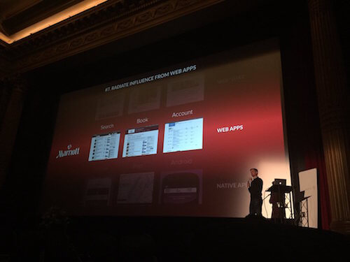
It actually does make sense. Web apps have more in common with both native apps and the website than, let’s say, a content-driven marketing website has with the feature-driven native app. By targeting the components within the critical core, or essence, of your website, you automatically target modules that will be repeated throughout the entire range of experiences, “radiating” throughout all “properties”. Could be worth trying out.
PDF Worksheet For Design Systems
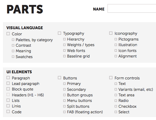
To get started, we need to build a shared commitment to designing and building a design system first. And to get there, we could define parts, products and people first, just by completing a two-page PDF worksheet (or INDD) collaboratively. The goal is to collect data that will inform system strategy and priorities. Obviously, the worksheet would need to be applied in a workshop.
Component Cut Up Workshop
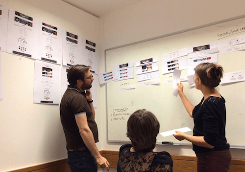
Now, to achieve that goal, Nathan suggests to get as many people involved in the project as possible in the same room, and run a Component Cut Up Workshop — print out the screens, ask everybody to identify and cut the components, then group and name the components, thus establishing a shared vocabulary. Alla Kholmatova, an interaction designer at FutureLearn, encourages to involve both designers and front-end developers in the workshop.
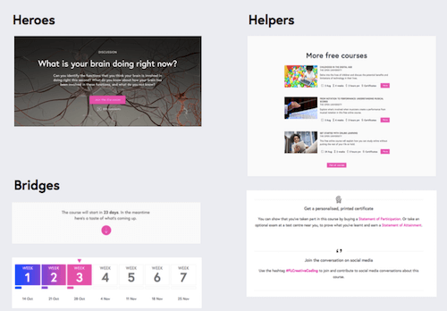
Beyond cutting and naming the components, Alla suggests to arrange components into abstract buckets to indicate priorities and functionality, ranging from “helpers” (components that can’t exist on their own, e.g. the “reply” button) to “bridges” (components which act as connectors, e.g. breadcrumbs or pagination) to “standalones” (components that can be viewed as self-contained units, e.g. a “hero”-box).
You could even create a Slack channel to drop a component and ask the entire team to name it and assign it to a pre-existing family of components. You could even go as far as involving users into cutting, organizing and naming components, even if it’s as informal as a quick session in the nearest Starbucks.
Summary
But is it actually worth it? Does every website need a design system? Do we absolutely need to follow our obsession with consistent, predictable design patterns that beautifully keep repeating across different UX touchpoints? I don’t know.
What I do know though is that in many situations modular responsive approach can be extremely beneficial for companies that a) share many similar components across various experiences, and b) struggle with fragmentation of mobile devices and maintenance issues. This is where design systems shine.
Frankly, I’m yet to encounter a client that would be genuinely, passionately excited about the atomic design methodology or a module naming workshop. However, everyone does get passionately excited about time-saving features and better, faster output that they can engage with. With project hubs, actionable data, addressed pain points and non-disruptive iterations. Next time you encounter somebody not seeing the benefits of a modular approach, try to convince them of the tangible benefits and the output, not the workflow you’re using. You’re much more likely to succeed this way.
Further Reading
- How Creating A Design Language Can Streamline Your UX Design
- Efficient Responsive Design Process
- The Atomic Workflow — Making Design Systems Happen
- What I Wish I Knew About Working In Development Right Out Of School


 Get a Free Trial


 Register For Free
 JavaScript Form Builder — Create JSON-driven forms without coding.
 Devs love Storyblok - Learn why!

