Improve Your Designs With The Principles Of Similarity And Proximity (Part 1)
The perceptual process enables us to perceive the world through our senses of sight, smell, sound, taste and touch. In particular, our visual system processes vast amounts of information in its environment. Rather than perceiving elements separately, our brain organizes patterns, objects and shapes into whole forms that we can understand.
The gestalt grouping principles of visual perception describe this organization as a set of principles that explain how we perceive and organize this huge amount of visual stimuli. The gestalt principles — similarity, proximity, closure, figure-ground, continuance and common fate — are a popular tool used by designers for visually organizing information. As a visual designer, and now an interaction designer, I apply these principles on a regular basis to create relationships and differences between elements in my designs. Understanding how these principles work, and how to use them in your designs, produces stronger and more engaging work.
Are you ready to improve your designs? Let’s begin by digging into similarity.
Similarity
The gestalt principle of similarity says that elements that are similar are perceived to be more related than elements that are dissimilar. Similarity helps us organize objects by their relatedness to other objects within a group and can be affected by the attributes of color, size, shape and orientation.
Using Color To Assign Relationships
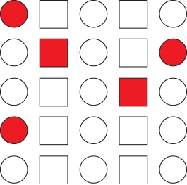
Similarity is particularly affected by color. In the example below, notice how the colored shapes have a strong effect in assigning a grouping or relation, even when different shapes are included.
Using Size To Assign Relationships
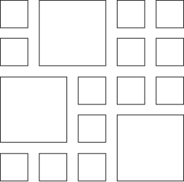
Size is another useful tool we can use in creating similarity. In the example below, similarity in size causes the larger shapes to stand out and form a group, even though all the shapes are the same.
Using Shape To Assign Relationships
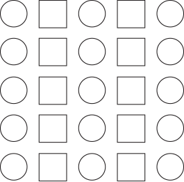
Shape is useful in grouping by similarity, but it has the weakest grouping effect when compared to color and size. In the example seen here, shape causes us to interpret elements as columns of circles and squares, as opposed to rows of alternating circles and squares.
Using Orientation To Assign Relationships
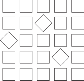
Orientation can be used to group by similarity as well. By turning some of the squares in this group by 45 degrees, a separate grouping is made that is perceived as being related. They almost appear to be moving together in a similar direction in comparison with the shapes around them. This actually touches on the gestalt principle of common fate, a principle we’ll get into in a future article. But feel free to jump ahead and Google it (after you read this article, of course!). It’s a fascinating principle that happens frequently all around you.
More On Color
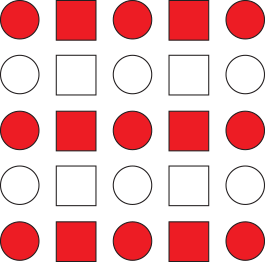
As mentioned earlier, similarity is particularly affected by color and can override other attributes. For example, we can override the example of similarity in shape by adding color. Now we perceive alternating rows of red and white shapes as opposed to columns of circles and squares. Give it a try. Try to see the columns of circles and squares. Possible but pretty tough now, isn’t it?
Additionally, color can override size. When we add color to the example of similarity in size, we create two groupings separate from each other. Now we perceive the large red squares as one group and the single large white square as a separate, unrelated (and lonely) group.
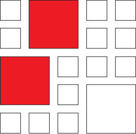
These two examples illustrate just how powerful color can be in assigning relationships between elements. Try using color in your work to differentiate elements and you’ll be amazed at how much stronger your groupings are.
Similarity In Practice
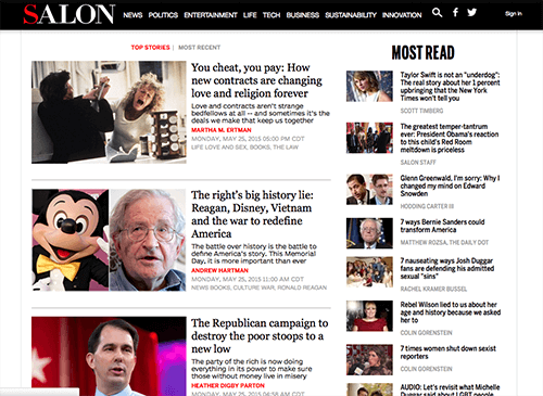
When we’re designing we can use similarity to convey organization and associations by showing which elements are related, or not related, to one another. For example, the two sections shown on Salon’s site below are grouped by their relative sizes. We clearly perceive two separate groups, with top stories on the left and most read on the right. Even though both sections provide the same function — displaying articles to read — grouping by size assigns more salience to the left grouping, which allows Salon to guide attention to their top stories.
In contrast, the lack of size differences in this example from Amazon doesn’t assign any particular importance to any one section. Despite this, similarity is still achieved through the use of repetition of similar size and shape, causing us to perceive rows of items.

Similar Color Use
We know that color is a strong indicator of similarity, helping to organize and make content understandable. In this example from Cars.com, similar color use helps us differentiate between what is a heading, body copy, and link text. (Full disclosure: I work at Cars.com as an interaction designer.) By using distinct colors for each of these elements, we expect them to function similarly and, in the case of the blue link text, to behave similarly.

Proximity
The gestalt principle of proximity says that elements that are closer together are perceived to be more related than elements that are farther apart. As with similarity, proximity helps us organize objects by their relatedness to other objects. Proximity is the strongest principle for indicating relatedness of objects, helping us understand and organize information faster and more efficiently.
The examples of circles below show how proximity can be used to help us perceive objects as being related. As we see here, the circles are spread out, exhibiting no relation, with each being perceived as a separate object.
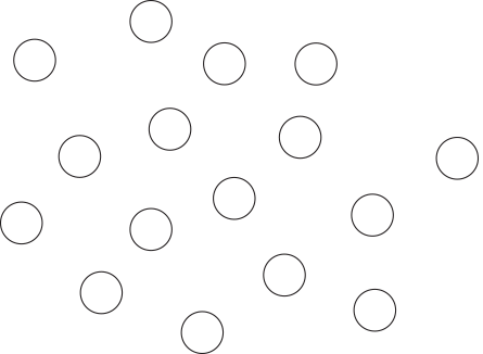
However, when the circles are pulled into close spacial proximity to one another, they are assigned a relation and are no longer perceived as separate objects.
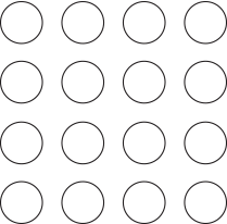
White Space
White space is an invaluable tool for creating proximity. Taking the same group of circles and adding whitespace helps us perceive things differently. Now, on the left, the proximity of the shapes causes us to perceive the two groups as columns, each its own group. On the right, the proximity of the shapes causes us to perceive the two groups as rows, again each its own group. Use white space in your designs to strengthen groupings as well as to differentiate them from other elements.
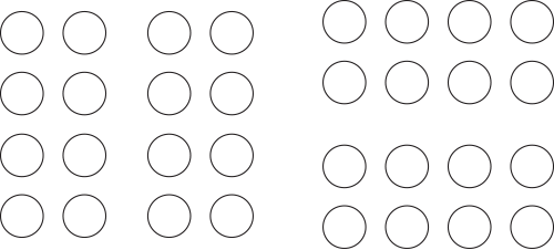
The Power Of Proximity
Proximity is strong enough to overpower other elements of variation. Notice how proximity still wins out even when other attributes, such as color and shape, are added. Try as they might, color and shape do not overpower proximity here and each grouping is still perceived as a separate element.
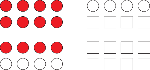
Proximity In Practice
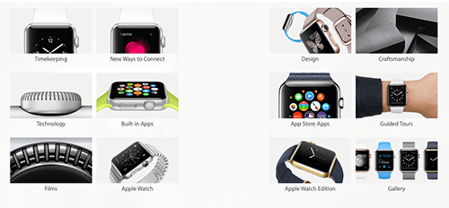
When we’re organizing information in our designs, we can use proximity to create relationships between elements to aid in understanding the information presented. For example, by grouping these images from the Apple Store together in close proximity, we assign a relationship to the whole group. We perceive them as being related and expect the content to be similar.
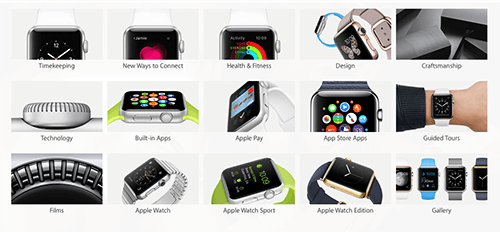
However, when we remove the center column, we suddenly perceive two separate groups and have an expectation of different content between them.
Combining Proximity And Similarity
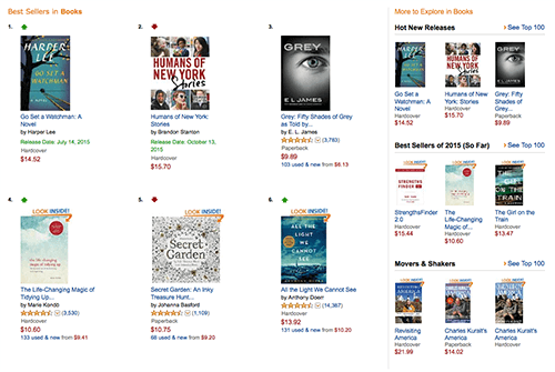
Grouping by proximity can also be combined with similarity to create stronger relationships. Seen in this example from Amazon, grouping by proximity and similarity in size causes us to perceive two separate groupings and assigns more prominence to the left group.
Proximity And Hierarchy
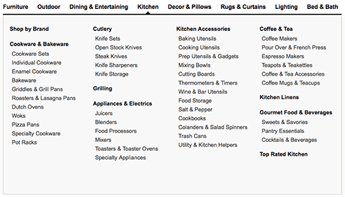
Proximity is excellent for organizing hierarchical elements. In this example from Crate & Barrel, options are grouped together under common headings, creating relationships, which makes scanning and finding information much easier.
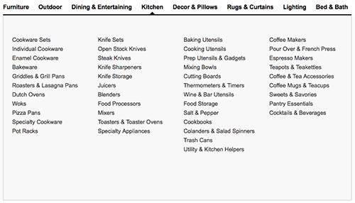
When the headings are removed and the options are grouped without proximity, we lose the relationships that were created and it becomes much more difficult to quickly scan and find the information wanted. Try it yourself. Go ahead and see how quickly you can find coffee mugs in the grouping with headings versus the grouping without headings. A bit more difficult to quickly jump to it, isn’t it?
Conclusion
Understanding how to use similarity and proximity to affect the relationships between elements in your work will help you create designs that enable easier organization and improve the usability of your work. Use similarity and proximity to create both relationships and differences between elements in your designs. Experiment with the use of white space, color, size, shape and orientation of elements and mix both principles together to produce very strong and engaging relationships.
In the next part of this series, we will look at closure and figure-ground, and explore how these two gestalt principles use positive and negative space to create simple yet powerful relationships.
Resources And Good Reads
- Gestalt principles on Scholarpedia.
- “Laws of Organization in Perceptual Forms”: Text of Max Wertheimer’s seminal paper from 1923.
- Universal Principles of Design Revised and updated: 125 ways to enhance usability, influence perception, increase appeal, make better design decisions, and teach through design, by William Lidwell, Kritina Holden and Jill Butler. Rockport Pub, 2010.
- Information Visualization: Perception for Design, by Colin Ware. Elsevier, 2012.
Further Reading
- Design Principles: Visual Perception And The Principles Of Gestalt
- Connecting And Separating Elements Through Contrast And Similarity
- Compositional Balance, Symmetry And Asymmetry
- How To Improve Your Email Workflow With Modular Design
- Improving User Experience With Real-Time Features


 JavaScript Form Builder — Create JSON-driven forms without coding.
 Enterprise UX Masterclass, with Marko Dugonjic
 Register For Free
 Get a Free Trial


