The Making Of “Melody Jams”
After months of hard work, I’ve finally gotten my side project, Melody Jams, into the App Store. It’s been quite the adventure, and I’m thrilled to see it in the store. Seeing it live makes me reflect on the process that got us there: our failures and successes, some of the crazy stuff we figured out and what our hopes and dreams are.
To give you some context, I worked with five other people completely remotely. Most of us still haven’t met in real life. In spite of that, we designed, programmed, animated and submitted the app in four months. It works on iPhone 4s through iPhone 6s+ and iPad 2 through iPad Pro. We also tested it with over 30 kids, ranging from nine months to nine years old, in that timeframe.
How in the world did we manage to pull this off? How did we even get started?
I want to share it all with you. So, I suppose the best place to start is at the very beginning.
Subject: Kids Music App!
Hey Jamie!
Hope this email finds you well.
My name is James Bartley and I’m a friend of Jay Quercia. He spoke very highly of you and shared your contact as I’ve been looking for a developer for a project I’ve been working on. It’s a music app for kids that hopefully could be fun for all ages.
I know most of you guys are already super busy but I’d love to work with a friend of a friend if possible. I have a limited budget, but if you’re interested in the project I’m sure we can work something out.
Here’s a link to a video I put together to show some of the elements I hope to bring together. If you get a chance, let me know what you think. I’ve kept this project pretty hush hush till now and I’d like to keep it that way till its close to finished so please don’t share this. I look forward to hearing from you!
Thanks!
That email, sent at the end of August 2015, kicked off one of my most cherished projects of my career. Together and alongside our friends Nathan Mckee, Georg Fischer and Matt Cook, we had our team. It’s not just that we think the game is beautiful, fluid and fun. It isn’t simply that everyone we show it to loves it. What makes me so proud of it is the challenges we invited ourselves to overcome in order to make it happen.
I run a distributed agency out of San Francisco named Arbitrary. I’m used to hiring groups of amazing people from around the world on fun projects. At the time, I had one developer, Georg, on a retainer contract but idling. My trusty producer, Matt, was ready to manage the timeline. James brought himself and his musician friends Nathan and Hani to the party.
Still, the full team has never been in the same room together. James and I still have never met in person. James’ background is in motion graphics, and he’s never designed an app before. Georg had limited experience programming for iOS and lives in Bavaria. I’m in San Francisco, 9000 kilometers away from him. Matt, James, Hani and Nathan are all on the east coast of the US, 5000 kilometers between us. There was no budget, and our team had to treat this like a side project rather than our main focus. And none of us had ever made a game before.
But we decided we were going to do it together. We all agreed to try to put this together between October and Christmas. We had our work cut out for us.
Building Trust Together
Setting Up for Remote Working
Introductions aside, the first barrier we had to get over was one of trust over long distances. To do that, we set up a standing optional 12:00 pm EST meeting via Google Hangouts. This allowed everyone across the world the chance to sync with one another during the week, but didn’t put pressure on anyone to actually do so. Project decisions would largely be made in those meetings; so, if you missed them, you’d have to roll with it, but there wasn’t any inherent pressure to be there.
In the early goings, that meant James and I were bouncing ideas off of one another on how it could work. On Fridays, Georg and I would meet up and do code reviews. Sometimes Matt and James would get on the same page about PR or contract issues, and sometimes all of us would get together and accomplish nothing. Many times we stretched over our allotted hour. We had an anti-meeting mentality: have a rough agenda but just learn how to enjoy talking to one another. This started a bit like online dating but became very natural over time. In retrospect, I think the biggest reason this working relationship was successful is that everyone wanted it to be successful. Simple as that.
Slack, Dropbox, Google Drive and Hangouts were our day-to-day tools. We set up four separate channels internally, each with different groups in them: “melody-jams-dev,” “melody-jams-design,” “melody-jams-music” and “melody-jams-pr.” Georg and I could wax for as long as we wanted on Swift issues while Nate and Matt debated marketing strategies without interrupting one another. One issue with this setup was that design became our de facto “general” chat. We used Dropbox to share design assets and Drive to edit documents. Sometimes this would get muddy, and we’d have to dig through files across Slack or Drive or Dropbox to find the latest file. Part of that, I think, was that Georg and I wanted strict file name conventions for the sake of the project, whereas James was a little more free form from his media days. The key was not to get frustrated with one another. With the distance and time zones between us, learning to be patient with each other’s habits was crucial.
Making, Not Meeting
The only thing close to a formal meeting process we had was a scheduled daily 12:30 pm EST check-in for 30 minutes. This meeting was optional, and sometimes it went longer and sometimes shorter. We set very light agendas and talked about whatever was important to us on that day. We used GitHub issues to track features and problems as we went along.
Beyond that, our decision-making process was guided by our creation of things we were interested in. For example, James kicked off the project with a couple of ideas of what he thought it might look like when finished.
This felt really fun, but it felt far too complex compared to the original video. We stuck with what we knew.
Now, you might think that all of this animation was a waste of time. Was James jumping the gun? Should we have sounded the alarm bell because that’s not the way projects are supposed to waterfall?
We didn’t think so. For James, spending time in After Effects making a high-fidelity artifact felt more valuable than talking about how it could work. In fact, the video was so compelling that it was hard to argue against his general creative direction. He provided vision through a prototype, and that process would guide us for the rest of the project.
Of course, it wasn’t perfect. Could we animate that many characters on the screen at once? Was locking monsters the way to go for making money? Matt and I worked together to poke holes in the video — but rather than asking questions, we drew up documents like the wireframe below.
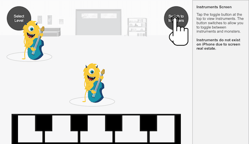
Here, we were able to find holes in the user flow and resolve issues that James couldn’t see as an animator. For example, James hadn’t really accounted for what happens when you tap the “Home” icon. That raised questions about the full breadth of the functionality of the app, and about whether we even needed that button.
In fact, even wireframes didn’t solve all of our problems. We thought we wouldn’t have instruments on smaller devices, as pictured above. We wound up supporting that. We also thought users would swipe to switch instruments, but later on we found out that that would conflict with the simple act of playing the keyboard. In retrospect, a big takeaway was that wireframes didn’t solve everything, anymore than videos or designs or meetings did. We solved issues together by making new things and looking at them together.
All of this allowed us to create a road map detailing the full-functionality specification for version 1 of Melody Jams.
Again, this process had us working almost perfectly backwards from how one traditionally would think of making software. We started with design, then went to wireframes, then a flow chart and then a road map document. But why should it matter? The process felt natural for the way we worked together. We were moving forward, constantly creating and revising artifacts together. Natural efficiencies emerged.
Prototyping From The Outset
Once we had a general consensus of the app we wanted to create together, we got to the act of making the app. We started that by prototyping things we knew we needed to know about but didn’t know how to do. For Georg, that was playing with particle systems and learning how in-app purchases work. For me, I built rough prototypes benchmarking how many sounds I could play on iOS at once and dragging squares around and changing their colors when they got close to one another.
We created a prototypes directory in our GitHub repository to test out ideas. In all, 50 prototypes were created during the life cycle of the project. Each of them tested a single idea or forked an idea. By keeping these prototypes isolated, we could learn very quickly from one another’s research. We effectively cut out a lot of the “theory” of iOS development, leaving just the “practice” for us to learn from one another.
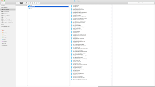
prototypes directory (View large version)We also spent time researching Swift code style guides, like Ray Wenderlich’s. From those, we not only invented our own best practices, but learned a lot about the syntax of the language without needing to read every last line of documentation. If we weren’t sure of an example, we’d hit Google or Stack Overflow.
Progress on these prototypes would be shared with the team through the duration of the project. By the time we started moving from prototypes to the full app, we felt fluent enough in the language to be able to build something “correctly.”
The Warty Parts
Managing The Monsters
The beautiful animations James created is what makes Melody Jams so good. Here’s a render of Moe, our violinist in The Garage.
James would send us files like these in our shared Slack channel, and they inspired all of us to keep pushing. But getting them in the app? Gosh, was it ever hard work to get these things to work correctly. Among our challenges:
- How do we keep the monsters and loops perfectly in sync?
- How many monsters can we load without crashing the app?
- How do we handle different kinds of animations?
We spent right around a month on these problems, and in the process got a hard lesson in how computers work.
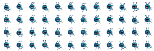
To start, James gave us a PNG sequence rendering of the animations. We loaded that in and found it immediately crashed the iPhones just from loading too many assets – it was too memory-intensive. So, we switched to a library that exports After Effects data to JSON. That worked great but slowed down after two or three monsters — we were counting on the processor (i.e. the CPU) to render the monsters in real time, and it just couldn’t draw that much all at once. We thought about porting the library to the graphics processor (i.e. the GPU), but that felt too risky for our timeline, so we abandoned it. Finally, we settled on the texture atlases outputted from TexturePacker.
The final version of Moe looks like this:
Slicing Assets For Devices
Our most special nightmare in building Melody Jams was reserved for figuring out the final sizes of assets — keeping James up to speed on the final sizes of everything. In fact, this was confusing for everyone. We built this as a universal app, meaning the code base for iPhone and iPad is the same. We knew we wanted to support as many old devices as possible because kids are often given hand-me-downs to play with. As you probably know, devices come with a range of pixel densities, like Retina displays and what have you. We had to deal with that without the benefit of media queries. That meant keeping track of a host of specifications in a chart that looked like this:
| Device | Resolution | Pixel density | Actual resolution | Aspect ratio | Memory |
|---|---|---|---|---|---|
| iPhone 4S | 480 × 320 | 2 | 960 × 640 | 3:2 | 512 MB |
| iPhone 5 | 568 × 320 | 2 | 1136 × 640 | 16:9 | 1024 MB |
| iPhone 6 | 667 × 375 | 2 | 1334 × 750 | 16:9 | 1024 MB |
| iPhone 6+ | 640 × 360 | 3 | 1920 × 1080 | 16:9 | 1024 MB |
| iPad 2 | 1024 × 768 | 1 | 1024 × 768 | 4:3 | 512 MB |
| iPad 3 | 1024 × 768 | 2 | 2048 × 1536 | 4:3 | 1024 MB |
| iPad Mini | 1024 × 768 | 1 | 1024 × 768 | 4:3 | 512 MB |
| iPad Mini Retina | 1024 × 768 | 2 | 2048 × 1536 | 4:3 | 1024 MB |
| iPad Air | 1024 × 768 | 2 | 2048 × 1536 | 4:3 | 1024 MB |
Keeping all of this in mind, we had a number of complex problems to solve for to make the game fluid everywhere.
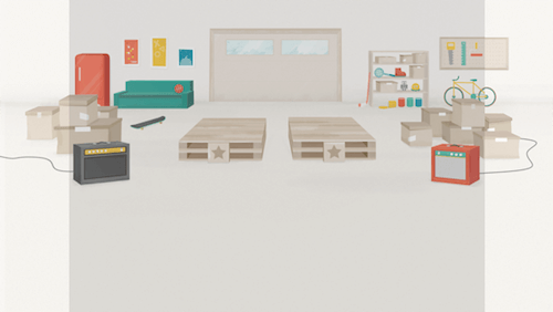
First, aspect ratios. An iPad is 4:3, newer iPhones are 16:9, and the iPhone 4S is… well, it’s doing its own thing. We didn’t want to squish the graphics on one device to make it look good on another. Creating Sketch files like the one below helped me wrap my head around the positioning of elements in a more visual way.
Managing graphics was another doozy. Here’s one for you: If Moe is supposed to be 100 × 100 on an iPhone 4S and shows up at 0,0 on an iPhone 5, then what’s his width, height and position on a Retina iPad?
Again, Sketch was our savior. Sometimes a calculator just doesn’t do it. I picked a single size from the chart above and then figured out the math to convert to any other size. A simple rule of thumb is that iPads are 2.4 times the size of iPhones at 1×. In pseudo-code:
var heightOfIpad = 768;
var heightOfIPhone = 320; // used the iPhone 5 as my reference.

var aspectRatio = heightOfIpad / heightOfIPhone // 2.4
With the Sketch file and this calculation in hand, I was able to build a utility class to move and position stuff much more straightforwardly.
If you look at that chart again, you’ll start to notice that there’s very little deviation in RAM from device to device. For example, an iPhone 5 has the same amount of memory as an iPad 3. A lot of voodoo goes into memory management for apps, but research online and some benchmarking led us to this rule of thumb: Your app will crash if you use memory too quickly or exceed half of the device’s total memory.
You don’t have to be a computer scientist to see the next challenge we had to overcome. Assets on iPads are 2.4 times the size of assets on iPhones, but we have the same amount of memory to work with. Our monsters take up a fair amount of memory, and we found that adjusting assets for iPhone crashed everything on iPad, and vice versa. Sometimes it would work great on iPad Pro and fail on iPhone 4S, and sometimes the reverse. Our collective brains felt like they were going to explode. For a while we even thought about giving up on one set of devices just to make the room stop spinning. Even to this day, James either asks me a lot of math questions or just sends me really big files to cut up.
In the end, we came up with a strategy whereby we could change the frame rate (and, subsequently, the number of textures needed) as well as the overall size via a custom game configuration JSON file we created. We could tweak this per device, monster by monster. After that, it was just a matter of trial and error.
(Apple supports something similar to this now, called app slicing, but it’s only available for iOS 9. It’s also really tough to manage the volume of assets we were creating for our game, so we rolled our own solution.)
I’m pretty sure the rest of the team still doesn’t understand all of this voodoo, and the math led to some pretty hilarious glitched-out versions of the app.
Resolving Disputes
Conflict resolution in a project like this is as important as the technical details. Again, it starts with manufacturing trust. Everyone had to set aside their ego and just believe that all of the other people involved would do whatever work was required to make the app great. We didn’t start that way, so it was contrived in the beginning. But from the get-go, the biggest factor was faith that everyone’s intention was to help one another succeed.
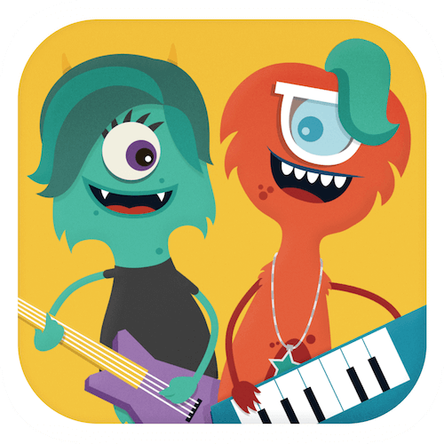
As an example, I’ll talk about one of our toughest disputes. Here’s our app icon:
James really wanted to do something more along the lines of this:
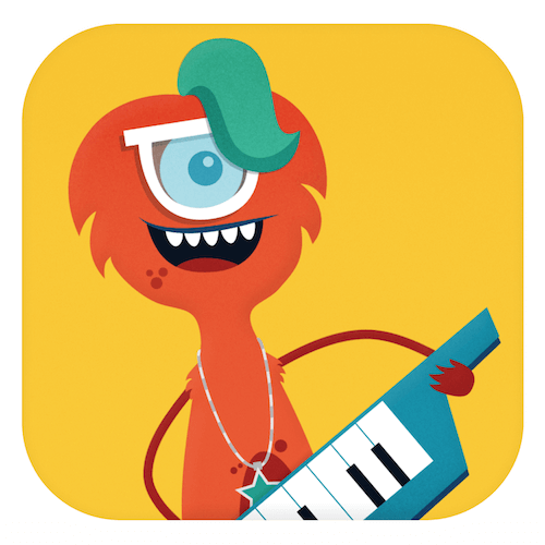
Matt, Nathan and I all felt really strongly that the app needed to be gender-neutral. We didn’t want to limit Melody Jams’ audience to boys. But James’ second icon is compelling. It’s visually less noisy, especially on a smaller screen.
We tried switching to one of the female monsters, of course, but we felt that was exclusionary in the other direction. Both genders needed to be represented in the icon.
I give James a lot of credit here. He didn’t have a client, and he didn’t have to defer to our instincts. Nobody could make him design another icon. He believed in us and valued our opinions.
One reason I think this worked is that, again, we put a premium on making things and responding to them. Iterating on the icon didn’t cost James a lot of time. We looked at dozens of attempts for an icon together. He felt safe to share his process, and we felt safe to comment on it. That concept is empowering to teams of any shape, size or location.
The Business Of Melody Jams
Support And Maintenance
Of course, Melody Jams is software, and that requires support and maintenance. To start, we created the concept of the “jam” — a pack consisting of a dozen or more monsters, each with new sound loops in a new setting. Each jam would be like a whole new level in the game, allowing us space to explore other animation styles, monsters and music.
We didn’t want to include all of the assets from subsequent jams in the initial installation of the app, because the file size would preclude anyone from downloading it. We needed to invent a way to be able to download jams on demand. So, we built JSON files, such as TheBigShow.json.
In it, we can decide the positions that monsters can be dragged to and what animation they’ll play. Monsters can have an unlimited number of animations, and, to my earlier point, they can be configured per device and per frame rate. The instruments are even more detailed, allowing us to animate them on tap. We also included details for menu assets, including decorative imagery to make the menu look cooler as we continue to expand the roster.
The app automatically synchronizes between Apple’s StoreKit service and our API, allowing us to add a “Coming soon” level far before we’re ready to ship to the consumer. One thing I wish we had is some sort of notification for when a new pack is available for sale, but we’ll have to add that in later.
Making Money
I’d love to tell you that we have some great secret to the business side of all of this. We don’t. We’ve got a sense that we’ve created something great here, but we know that none of us are experts in marketing. Instead, I’ll discuss a few things we’ve thought about to keep the app going.
First, one of our big mistakes was not incorporating a separate business for Melody Jams from the get-go. We wound up building the app in its entirety before we realized that the sticky negotiations between the team members needed to happen in order for everything to feel settled. We were probably naive about all of that, but luckily we were able to work through it. Having gone through it all, I can say that it’s always worthwhile to have an honest conversation about how you want to structure the shares and responsibilities. Being fair and generous with one another as we discussed it built a lot of trust. For example, most of our negotiations involved James offering more than I wanted and me countering with far too little. If it’s something you love, then taking care of each other is worth it. If you’re at a loss for where to begin, Anna Vital’s diagram might be a great starting point.
Because James came up with the idea, he has the majority of shares in Melody Jams Inc, our new company. I have slightly less, and Matt has a couple. Nate and Hani are getting a percentage of revenue, which we think is fair if it makes a lot or a little money.
Our plan is to give away Melody Jams and its first jam, “The Garage”, for free. We’re doing this for a couple of reasons, mostly because we’d all prefer to see people play Melody Jams than to make money off of it. As we create subsequent jams, including “The Big Show” and “Mars Disco,” these will be available via in-app purchases. Our plan is to launch them at $0.99 apiece and then tweak the price from there. We’ve heard from our research that people will pay as much as $3.99 per jam, but we have our doubts. We want to see that actually happen before we set the price firmly. Pricing is tricky. We’re not greedy, but we’d love to be able to bring in other musicians and animators in the future as well.
Getting To Launch
By far, the best part about making an app for kids is seeing kids play with it. Our quality assurance process was ad hoc but thorough. We enlisted every friend and parent we could find to stress test. My wife, a teacher at a local public school, tested it with whole batches of 2nd and 3rd graders. Matt works out of CoWork in Greenville, South Carolina, and we leveraged its awesome ecosystem to test with children, nieces, nephews and friends. In all, I’d guess we had 40 or 50 testers. Any issues or feature ideas they mentioned were treated equally by getting placed in GitHub issues for discussion and resolution. We also got a lot of amazing videos of kids dancing to the songs. We kept hearing that kids would stay glued to the app for 20, 30, 40 minutes at a time. That’s so insane! Of course, we also heard about a number of features to address for the next version. There are some obvious ones, like making the backgrounds more interactive, and some other fun ones that you’ll just have to wait until version 2 to find out about.
Takeaways
Since Melody Jams’ launch, we’ve had a couple of big spikes but lukewarm sales. We have ideas on how to iterate there, but the financials don’t tell the story at all. Melody Jams might not make me a millionaire, but it’s an incredibly successful project in my eyes. Our team overcame massive technical, mental and physical challenges to produce something that, in my opinion, is of really high quality. A certain kind of ruthlessness was required with the number of features we wanted to create. We had to go well out of our way to prove our trust to one another. And we had to constantly be making stuff to show each other, rather than just talking about what we were going to make.
If I had to sum up the experience in a few takeaways, it would look something like this:
- CPUs, GPUs and RAM One of the most practical takeaways was a true understanding of the differences between components in a computer. Knowing when to use the processor to draw and when to use prerendered artwork can have huge repercussions on what you’re making.
- Show, don’t tell. Sometimes bucking the traditional process is really beneficial, even if it feels counterintuitive. Our natural skill sets helped us overcome the massive geographic distance between us.
- Use all of the tools at your disposal. I don’t think we would have ever launched Melody Jams if we hadn’t relied on Sketch to help solve the math problems behind the coordinate systems on devices. By looking at the problem in a different way, we arrived at a solution.
- Prototype early and often. Our prototyping practice in this project not only solved complicated technical challenges, but also helped us develop a catalog of code examples to grow our expertise in the language we were using. We were able to skip a lot of the theory behind Swift development and jump right into the practice.
- Bear an olive branch. Even if you’re intimately familiar with your colleagues, go out of your way to praise them, evangelize their work or otherwise further the bond of trust between you. Trust has to start somewhere, and the stronger that bond is, the better.
- Make more! If you want to make an app (or anything) and you never have before, the only way to get into it is to start. Come up with an idea, keep it focused, and commit to launching within a few months. Will it be hard? Sure. But it’ll be so rewarding.
- Follow through. It’s hard to justify a side project. Nowadays, it seems like everything is judged by money. Forget all that. Make something because you want to. It’ll be rewarding all on its own.
Further Reading
- Designing Web Interfaces For Kids
- A Dad’s Plea To Developers Of iPad Apps For Children
- Connecting Children With Nature Through Smart Toy Design
- Accessible Target Sizes Cheatsheet


 SurveyJS: White-Label Survey Solution for Your JS App

 Agent Ready is the new Headless

