Breaking Out Of The Box: Design Inspiration (August 2016)
How about trying a very different drawing technique or illustration style for your next project? Maybe a weird geometric shape? Or a more abstract form? Or a retro-futuristic color scheme? Not sure about you, but holiday or no holiday, my need for some fresh inspiration never stops.
This month, I’ve continued my journey in search for some inspiring and beautiful artwork — and I’ve found some real treasures! As a designer, I feel that there is so much that I can learn from the techniques and color combinations in these little gems. Let’s dive in, and get inspired to leave our comfort zones for our next designs!
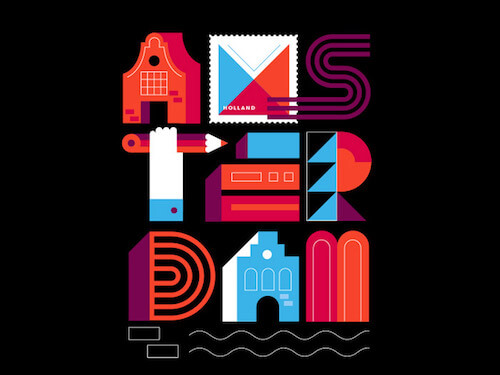
Postcards From Amsterdam | Typography
Great work. A typographic picture from the “Postcards from Amsterdam” series. The creativity in the letters is very inspiring. The beautiful color palette is also perfectly applied.
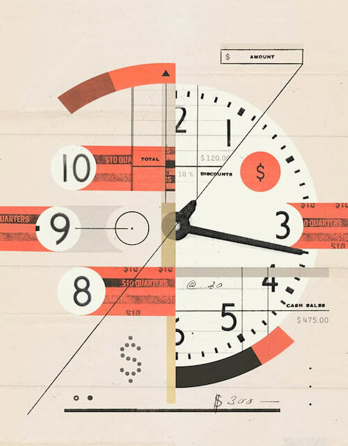
Stanford Social Innovation
Illustration for an article on how we should look at our time as currency. A few nice touches in this collage such as the handwritten dollar sign and also the stencil effect.
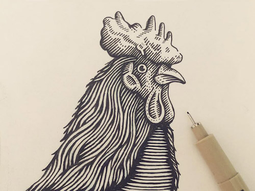
Rooster Etching
This is brilliant. Etching is difficult. The trick is understanding how the width of your lines corresponds to the contrast (light and dark areas) and how to draw them in such a way in order to accentuate that. Impressive!
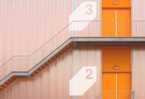
Alonso Balaguer | Ikonik Hotel
Photo of the Ikonik Hotel, a minimalist hotel made out of shipping containers and created by Alonso Balaguer. Inspiring geometry.
Hard Days Night
Fresh! Great job in making them recognizable. I’m pretty sure that any music lover will identify this group. Lovely color style, too.

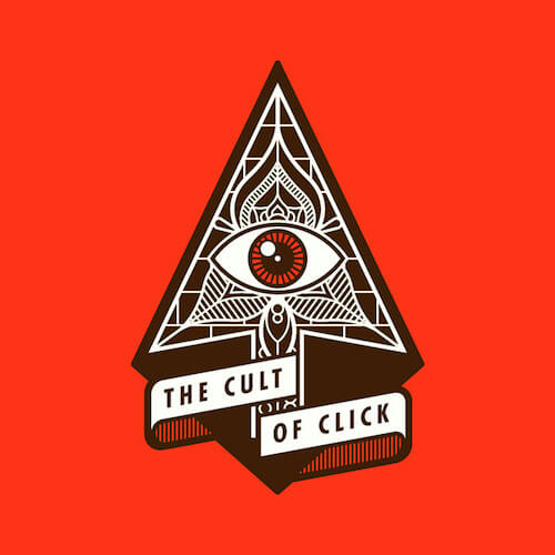
The Cult Of Click
Beautiful idea and execution. Love the shape of the ribbon.
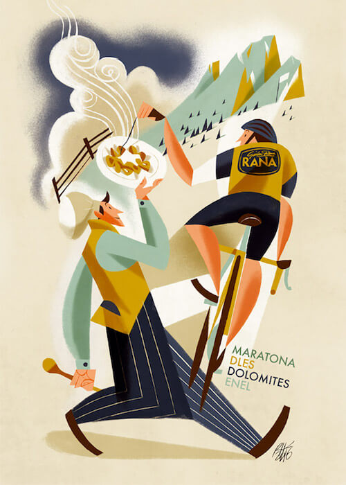
Maratona dles Dolomites
Riccardo Guasco’s first entry in the inspiration goes back to 2011 so you could say he’s a regular around here. Riccardo created 30 posters to commemorate the 30th anniversary of the famous Maratona dles Dolomites Gran Fondo. Simply a beautiful illustration style, a treasure for the eye.
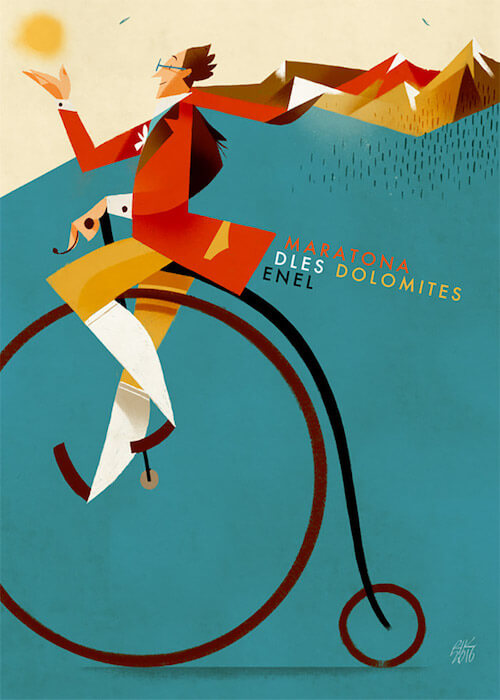
Maratona dles Dolomites II
Another one of the 30 posters series to to commemorate the 30th anniversary of Maratona dles Dolomites. The sharp angles are so well done and are always a kind of trademark in Riccardo’s work. Love the elegance, the color combo and the way they’re applied.
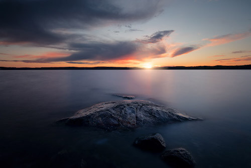
Värmdö, Sweden
Beautiful shot from Värmdö, an island in the innermost region of the Stockholm archipelago. I love the serenity.
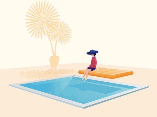
Lazy Day
I love a simple animation. This one ticks off all the boxes. Also, note the colored MacOS window management circles on the pool.
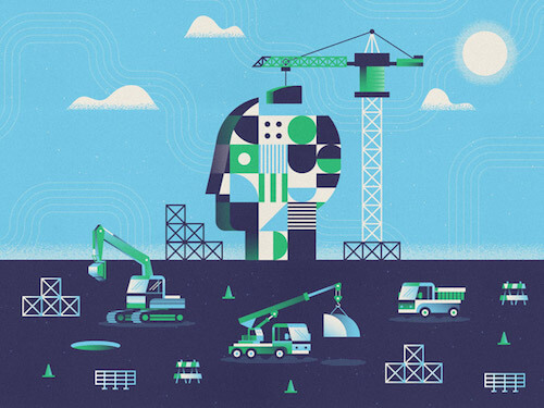
Construction Site
That head is super nice. The way it is represented by all those different building blocks is just clever. The subtle depth effect and gradients are very beautiful.
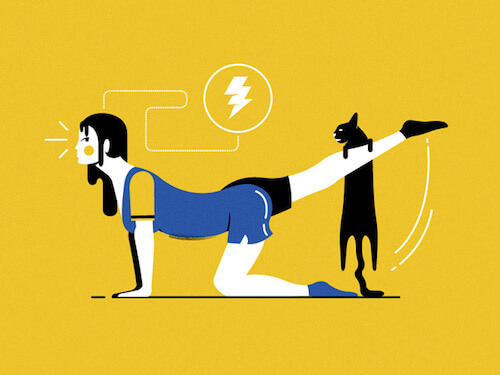
Women’s Illustration II
It’s always a pleasure to see a little bit of humor in an illustration. Not exactly a color combo I would personally use but it works really well. Sometimes you need to leave your comfort zone and try something differently to get surprisingly strong results.
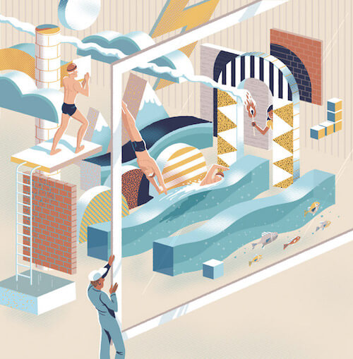
Adobe Website Illustration
The many different levels, and geometric effects are nicely done here. A subtle color palette is used which gives it a certain softness. I also love the little wave the swimmer creates and the flow of the smoke following the lines of the illustration.
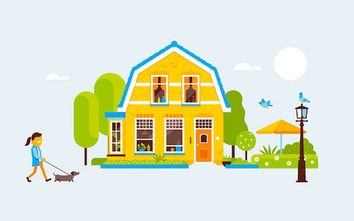
Funda Illustration
Adorable how this typical Dutch house is presented here. Such a friendly atmosphere as well.
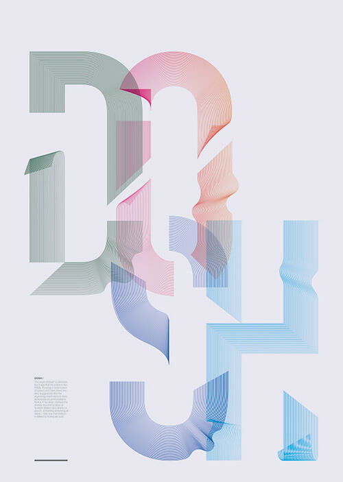
Dosh
The origin of the word ‘dosh’ is unknown but it was first recorded in the 1950s. Possiblly a combination of the words ‘dollars’ and ‘cash’. This poster is visually inspired by the beautiful patterns found on banknotes. Beautiful composition and effect.
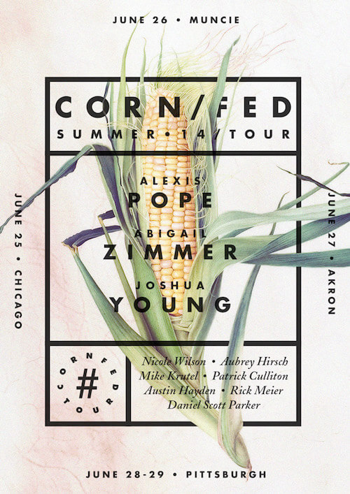
Corn/Fed Summer 14 Tour Poster
Nice typographic poster for a multiple city poetry reading event. Some cool details with corn leaves in front and back of the lines.
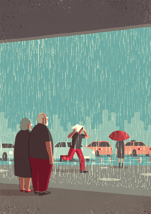
Day Trippers - Downpour
This made me laugh because it’s so recognizable. Looks like the kind of weather for a day trip like we have been having lately. The backdrop is nicely done. The highlights are so perfect, too!
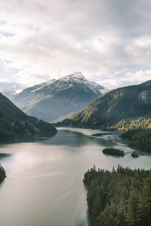
Diablo Lake
Enjoy the view! To me nature is always a good source of inspiration, and when captured so perfectly like this it makes you dream.
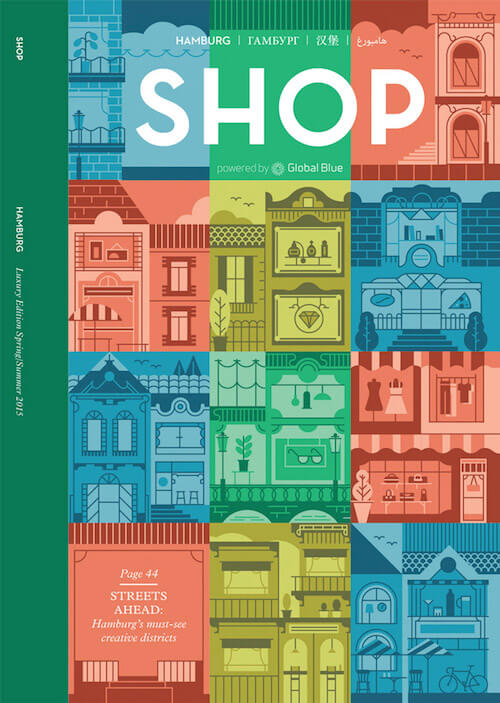
Shop - Global Blue
Cover for the SHOP magazine, an international luxury shopping, travel and lifestyle guide published by Global Blue. Love all those window shops constructed with only simple lines. It makes you keep on looking at it.
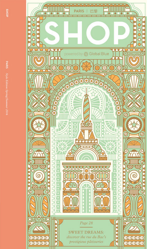
Shop - Global Blue II
Another cover for the SHOP magazine. This piece has much to discover with all those wonderful patterns in there. Tasty!
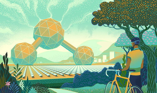
U of T Magazine
An illustration about how it could soon be possible to capture carbon dioxide from the air and convert it into fuel. Clever how it depicts a huge solar powered Carbon-molecule-shaped structure sucking carbon dioxide out of the air. Lots of beautiful details and a nice photographic composition with the trees as well as the cyclist in front on the right.
Pantheon
Always a pleasure to discover new work from Mads Berg. Structures are ace and the reflection of the sunshine is simply original.
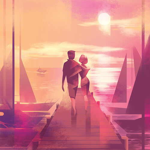
Les Echos Week-End
An illustration that shows how people find it hard to switch off from work, but really should whilst on holiday. Fun play with proportions.

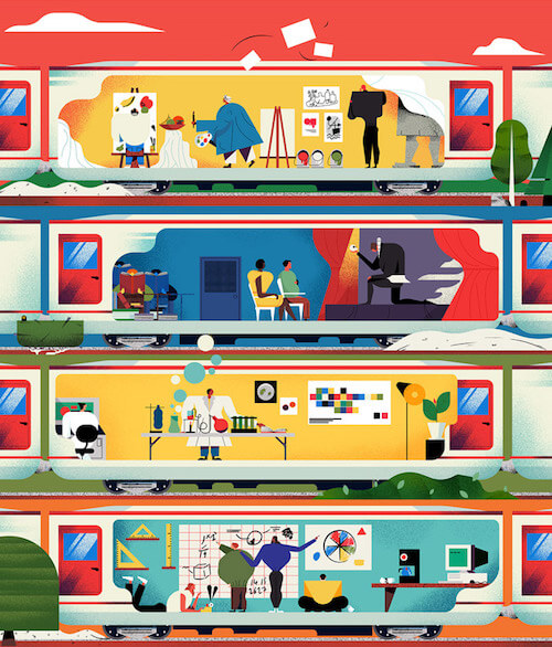
The Guardian University Guide
The Guardian University Guide conceptualized. My favorite illustrations are those that have many layers that you can discover. This see-through of a train has all aforementioned elements.
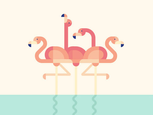
Flamingoes
Well-balanced formation of four flamingoes. It’s almost like they’re doing the famous dance.
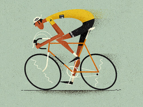
Maillot Jaune
Very sharp and I love the Merckx reference! Enjoying the subtleties. The pose on the bike is perfect. This illustration is so well done!
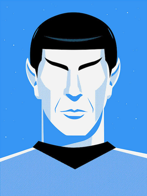
Star Trek Prints
This year, Star Trek celebrates its 50th anniversary. To commemorate the event, 50 artists from around the world were commissioned to create original artwork inspired by the iconic franchise. This is the poster done by Ty Mattson. These strong lines and few colors characterizes Spock just perfectly.
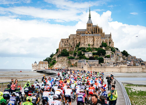
Mont-Saint-Michel
Mont-Saint-Michel is an island commune in Normandy, France. It’s where the first week of ‘Le Tour’ started. This beautiful shot is part of Ashley’s and Jered Gruber’s story of their first week.
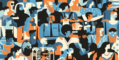
Facebook Awards Annual
Wisely chosen colors & great style by Owen Davey. Just admire those haircuts and beards. Lovely silhouettes.
Super Team Deluxe - Ultimate Edition
Some fine gradients going on in this one. Delightful color palette as well.

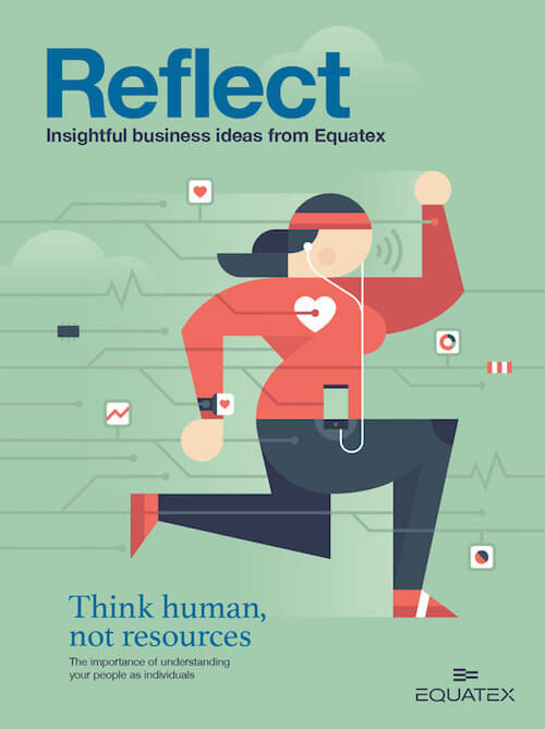
Reflect - Equatex
Lovely cover illustrating all the connected sport apps.
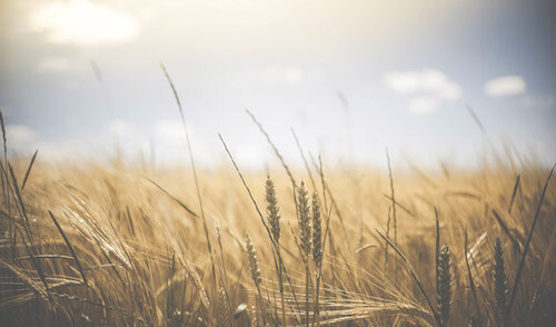
Wheat
Sometimes you don’t need much to have a beautiful picture. I love the soft tones and blurriness in this one. You can almost feel the breeze of that hot summer day.
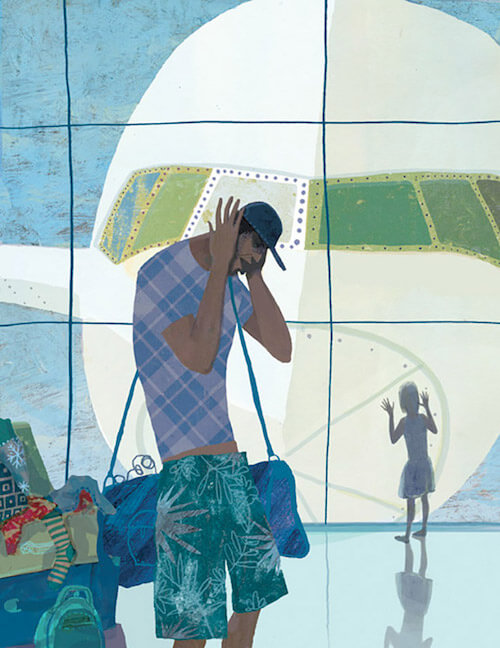
Big White Bird
Totally adoring those short pants and T-shirt prints.
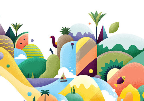
SOYO Frozen Yoghurt
Some inspiring brand illustrations for SOYO frozen yogurt. Be sure to check out to see them applied in real life. This one breathes the juiciness and sweet tastes of delicious fruit. Beautiful shapes, textures and colors.
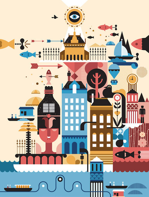
Audi Dreams
Many fun elements are incorporated into this collage illustration. Bonus points to the wonderful color palette.
Fast Company
Colorful work for Fast Company articles that live at the intersection of science and design. I admit, I do have a soft spot for overlaying colors and spirographs.
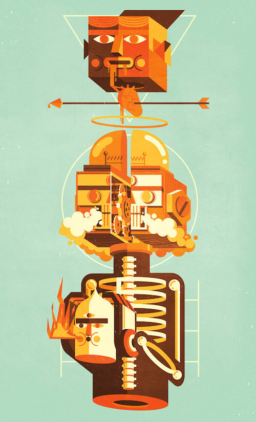
Element Three
The upper head is just wonderful. The fantasy in all the rest is quite something, too. I always love to study these; there’s so much to learn from such illustrations.
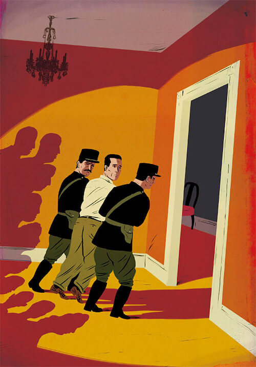
Folio Society - Epitaph For A Spy
The angles used in this comic illustration perfectly envision the sense of claustrophobia and paranoia. The shadows in this red color adds some extra drama in the mix, especially the heads of the people on the left. Carefully chosen colors, too.
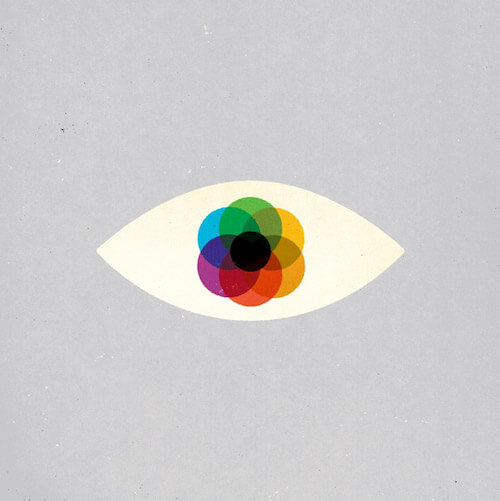
Mystery 80.1
Smart use of colors to add depth and richness. Simply beautiful.
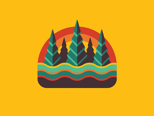
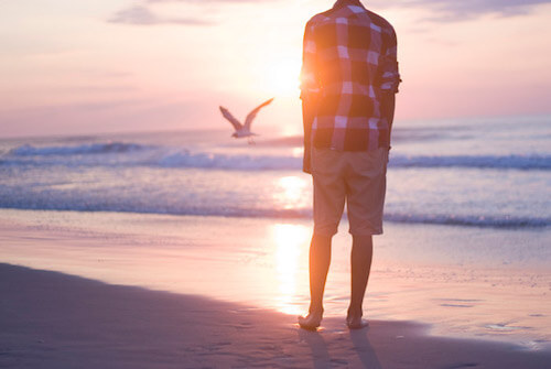
Beach Walk
Such an excellent photo! A perfect moment for a perfect composition. Can you also feel the inspiring mood and tones?
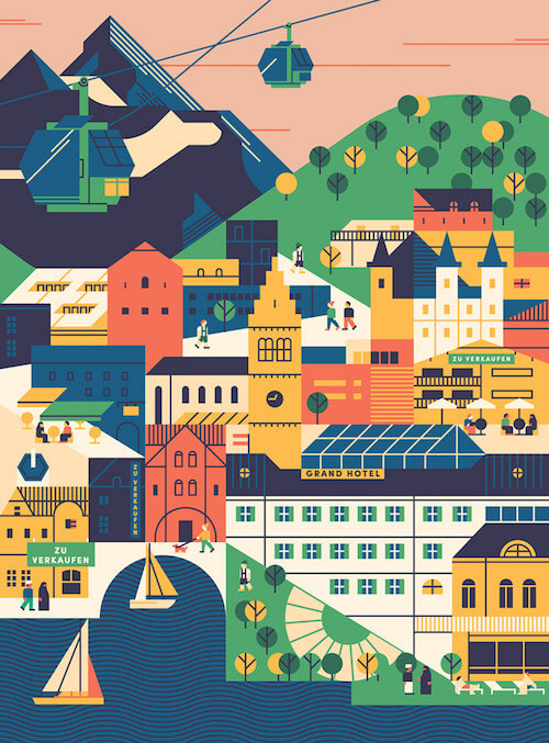
Rondo Open Haus – Zell Am See
Interesting composition going on with many different shapes. Not an easy task to make it all fit so well together. It’s like a true puzzle. So well done.
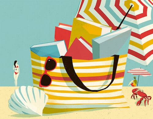
Beach Reading
Editorial illustration for an article about holiday reading. Compliments on the colors! Also, check out the crab’s cute reading glasses.
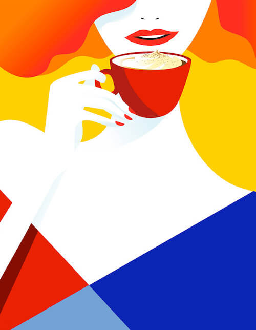
Candarel
A real eye-catcher with those super bright colors. It’s a series of illustrations for Canderel France to promote their line up of sweeteners. A clever idea to not show the lady’s eyes; that way the focus is on her mouth and the cup of coffee.
Golden Age Of Travelling
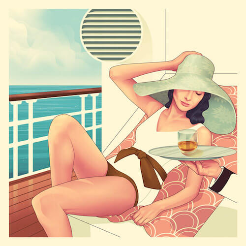
Excellent usage of gradient meshes. I’m seriously impressed with the balance between soft and hard. There is this perfect mix of a more realistically drawn technique, combined with a more flat specific drawn part. Very impressive and beautiful illustration style. Created for Scottish whiskey brand ‘The Macallan’.
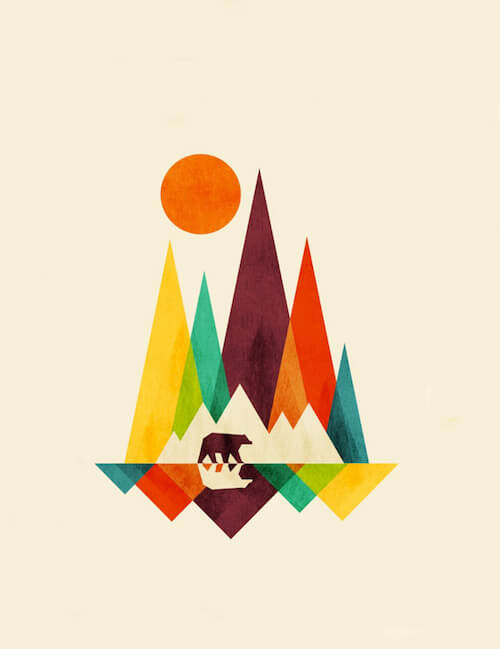
Bear In Whimsical Wild
A lovely color collection and clever usage of negative space to put the bear in. Nice overlaying color effects.
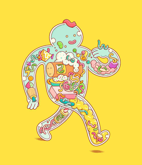
The Parasite Underground
As always, a colorful adventure discovering all those elements that are tucked away inside the Brosmind creatures.
An Interesting Day
A few interesting elements in this illustration. It also has an unusual color palette that you don’t see everyday.
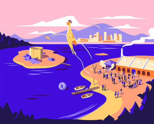
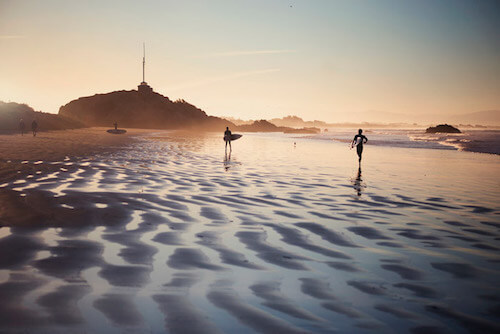
Of The Earth
A cool composition with just a few surfers in the frame. That golden light is also quite something!
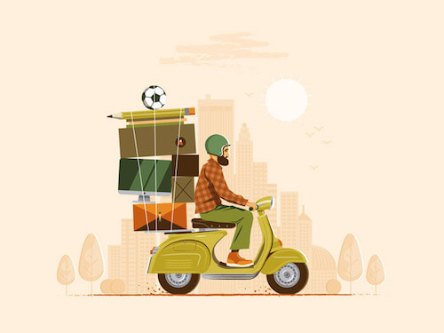
Full-Time Freelance
Very neat and clean. Just the right amount of detail. Love the idea of the stacking bagage, especially the big pencil with the soccer ball on top.
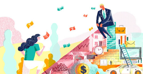
Sydney Opera House’s All About Women Festival
An editorial illustration for an article dedicated to gendered distribution of wealth. Love how some of the textures look, as if they were created with Wasco crayons.
Further Reading
- Modern Art Movements To Inspire Your Logo Design
- Beautiful Photoshop Illustrations By Artists Around The World
- Inspiring Illustrator Artworks By Artists Around The World
- Improving The Double Diamond Design Process


 How To Measure UX and Design Impact, 8h video + UX training
 JavaScript Form Builder — Create JSON-driven forms without coding.
 Register For Free
 Devs love Storyblok - Learn why!
 Get a Free Trial


