Photoshop Etiquette For Responsive Web Design
It’s been almost five years since Photoshop Etiquette launched, which officially makes it a relic on the web. A lot can happen on the web in a few years, and these past five have illustrated that better than most.
In 2011, everyone was just getting their feet wet with responsive web design. The traditional comp-to-HTML workflow was only beginning to be critiqued, and since then, we’ve seen a myriad of alternatives. Style Tiles, Style Prototypes, Visual Inventories, Element Collages, style guides, and even designing in the browser have all been suitable approaches to multi-device design. With a shift from page-based design to building a design system, it’s truly an exciting time.
There’s also been an explosion of tools attempting to make a responsive workflow more efficient. Applications like Webflow and Macaw have made breakpoint visualization digestible for the code-averse. Many designers have moved on from Photoshop as their workhorse to Sketch, Affinity Designer, or similar. Others have adopted apps like Keynote for prototyping.

Is ‘Etiquette’ Still Relevant?
With alternatives to the heavy Photoshopping we may be familiar with, it’s fair to question if we still need etiquette. For the sake of this article, we’ll define etiquette as transferring files in an organized, clear, and discernible way. Responsive design typically comes with a lot of moving pieces, from @2x images, concatenated CSS files, and more. With seemingly more to do in order to publish a website, being efficient is unquestionably high priority, if we want to be profitable.
Often masked as efficiency, poor organization and communication are products of rushing to ship a project. With Photoshop taking on different roles in our workflows, layers and exported files are easy targets for cutting corners. The fact remains: anything worth doing is worth doing well.
If we want to save time, we need to invest a bit upfront in staying organized and clear. Inefficiency is inheriting a file from a coworker and spending valuable time attempting to figure out where to start because it’s not clearly labeled. It’s having to fix images that have already been exported. At worst, it’s not being able to find the file you need in the first place.
What’s New In Photoshop Etiquette?
Photoshop Etiquette was given a fresh coat of paint by Adjacent, a design studio in Syracuse, NY. For those new to the concept, Photoshop Etiquette is a best practices guide that promotes efficiency through clarity in web design. Though engineered for Photoshop, many of these principles apply to Sketch and similar, layer-based design tools.
The guide is broken down into the following sections:
- File organization
- Layer structure
- Asset exporting
- Type execution
- Effect application
- Quality check
Those familiar with the site will see a lot of familiar guidelines, such as quintessential tips like ‘Name Your Layers’ and ‘Name Files Accurately’, each an attempt at ridding the earth of practices like ‘Layer copy copy 5’ and ‘client-final-v3.psd’, respectively. If you dig a little deeper, you’ll find a glut of responsive resources attached to various guidelines, and a few tips for designing for multiple devices.
1. Consolidate Your PSDs
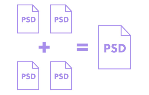
If you’re making multiple comps for multiple pages, Photoshop now has artboards that can help you stick to a single document. This helps eliminate confusion about which PSD is the right PSD.

2. Work Collaboratively
With the addition of Creative Cloud Libraries and Linked Smart Objects, designers can share assets quite easily. For example, if you’re creating a pattern or component guide in Photoshop, one designer can be working on a component while another designer simultaneously works on a different one. These components can be shared within a Library, or as Linked Smart Objects that are pulled into a master PSD.

3. Don’t Design To The Device
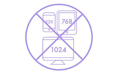
This can be argued, but if responsive design is about embracing all devices, perhaps we shouldn’t use popular Apple device presets as document sizes in Photoshop. Instead, allow your design to dictate breakpoints because of layout stress, wherever it falls. The exception is if you’re designing a device or platform-specific app, where targeting such presets is helpful.

4. Be Non-Destructive
With the rising implementation and support for SVG, it’s important for designers to sustain vector assets in Photoshop and not flatten them. Photoshop now allows you to save out SVGs, giving us one more reason to be nondestructive with our pixels.
5. Be Aware Of Screen Resolution
Speaking of SVG, it has really become a great approach to serving one asset that can adapt to any size and not lose fidelity. Having a Retina asset workflow, whether SVG or @2x/@3x images, has become part of a responsive practitioner’s workflow.
6. Compress
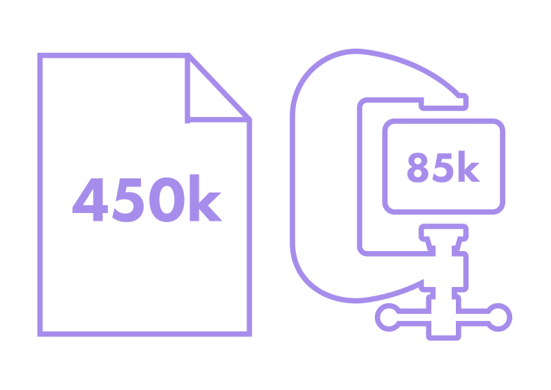
Performance is a worthy cause, not only for a developer but for a designer. I’ve often rationalized that if I want to include heavy web fonts and their Open Type features in my projects, I’ll need to make up the difference by aggressively compressing my images to stay within a performance budget. Third party tools like TinyPNG have made image compression a breeze.

As our web design workflows and use of Photoshop continues to change, so will the site. While it encompasses a Photoshop-centric workflow, there’s a few tips for ones where Photoshop is used sparingly, as well. The guide only advocates that if, and when, you use Photoshop, communicate your intent as clearly as possible.
Fueled By Community
One of the primary focuses for Photoshop Etiquette is growth, manifested in more guidelines, more resources, and more perspectives. A feature has been added to the site providing easier access to submit a new guideline for review, something hundreds of designers and developers did over the years by tracking me down on Twitter or hunting down an email address.
In the wake of Google Translate’s inaccuracies, there’s also an open call for translations by community volunteers.
It’s exciting to see how Photoshop Etiquette has resonated with so many organizations and individuals. How can it help you and your team?
Further Reading
- Designing For Retina in Photoshop
- Advanced Animations In Photoshop
- Photoshop Retina Asset Workflow
- Responsive Image Breakpoints Generator


 Devs love Storyblok - Learn why!
 Smart Interface Design Patterns, 45 lessons + UX training
 Register For Free
 JavaScript Form Builder — Create JSON-driven forms without coding.

