User Memory Design: How To Design For Experiences That Last
The two charts pictured below changed the way I think about thinking. Rebproduced from a classic 1996 psychology study, the story behind these charts is a vivid illustration that the way we humans feel in the moment as we experience the world can be very different from how we feel when we think back on those experiences later. Understanding the difference between experience and memory — and the ways they are related — can make us more sophisticated experience designers.
In this piece, I’m going to provide some tips for designing for experiences that leave a lasting positive impression. But first, I need to explain these two charts.
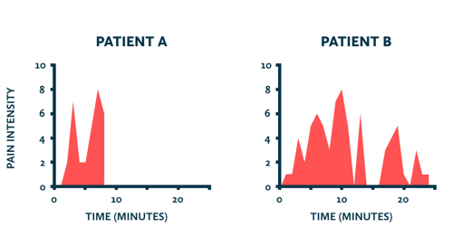
The charts depict the pain intensity that two patients experienced during a painful medical procedure, according to their own minute-by-minute ratings. A rating of zero means no pain and 10 means “extreme pain.”
One glance at these two charts shows that patient B had an objectively worse time, spending three times as long at some level of pain and hitting the same peak pain intensity as patient A. If you had to put yourself in the shoes of one of these two patients, you’d probably choose patient A. And that would be the rational choice.
But of course, the way humans think — including the way we remember — is not so rational.
When patient A, patient B and the 150 other study participants were asked after the procedure to rate the total amount of pain they had experienced, statistical analysis showed that those ratings had nothing to do with the length of the procedure or the cumulative amount of pain they experienced (the red area).
Instead, patients’ retrospective ratings of total pain could be reduced to a rough average of the pain intensity of just two single moments: the moment of greatest intensity and the final moment of the procedure.
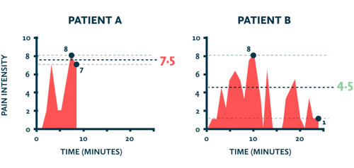
The lead researcher, Nobel Prize-winning psychologist Daniel Kahneman, saw confirmation of a psychological heuristic called the peak-end rule: people’s memories of an experience are based on a rough average of the most intense moment (the peak) and the final moment (the end). Likewise, the length of an experience has no impact on people’s memory of it, a concept called duration neglect.
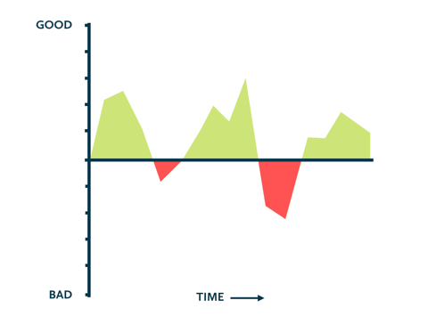
Twenty years of additional research in this area has shown that the peak-end rule holds true not just in painful experiences, but across a range of states, including pleasure. And, of course, experiences can be a mix of both good and bad moments, as shown below in the chart below, with positive and negative values on the y-axis. This type of chart is called an experience profile.
Streams And Snapshots
What we have learned from studies like Kahneman’s is that the way we remember experiences is not related to the sum of goodness or badness that we experienced. Instead, memory relies on a few key moments and mostly ignores the rest. Experience is a stream. Memory is a collection of snapshots.
Psychologists describe experience with phrases like a “constant stream of ‘self-talk’” or a “stream of transient states that vary from moment to moment”. But when we remember something, we don’t just “play back the tape” and re-experience that stream. Our brains make an imprint of the key moments, gradually discard the noise of moment-to-moment experience, and heavily weight the peak and end moments.
Two Selves
As Kahneman puts it, each of us has two selves: an experiencing self and a remembering self. Those selves take in the world in different and sometimes conflicting ways.
On one hand, our experiencing self asks the question, “How do I feel right now?” and experiences the world from moment to moment, feeling things like pleasure, boredom, frustration and fear. On the other hand, the remembering self asks the question, “How did I feel overall?” It interprets experiences after they occur, neglects their duration and focuses on key moments like the peak and end.
Ultimately, the remembering self is the boss, because it determines what we learn from our experiences. It constructs the story that we tell ourselves about our experiences that determines our future decisions. In other words, your customer’s remembering self decides whether they liked your thing, whether they’re going to use the thing again and what they’re going to tell people about it. The experiencing self was just a passive onlooker to those decisions.
User Memory Design
If the memory of an experience can differ so much from the experience itself, and the remembering self is the ultimate decider, should we throw out the whole focus on user experience design? Should we be thinking of ourselves as user experience designers or should we be user memory designers?
My answer is yes. We should be both.
Let’s be real. I work on the web, a fast medium where people can close the browser tab whenever they feel like it. There’s obviously no value to a great ending if people never make it there. As designers, we absolutely need to focus on removing moment-to-moment frustrations, and that’s why things like usability testing are always going to be important — because we should design for an experience that people can and will complete.
But we also need to consider how that experience translates into positive memories that will make people choose to use our thing again and to tell other people about it. What we need to do is design with both selves in mind: the experiencing self and the remembering self.
As promised, here are some ideas on how to design for both selves.
Don’t Screw Up The Ending
Think about where your design’s endings are and the ways they might be screwing things up for users. We can think about the ending as the most recent time that a user completed a session and then stepped away from the experience for some length of time. If you’re doing it right, people will have lots of endings, because they’ll keep coming back. As that happens, past endings become just another moment in the overall user experience, a concept that’s been called scalability of experience.
By the way, this is not to say that beginnings aren’t also crucially important in shaping users’ perceptions of your design. Plenty of studies have shown that first impressions of websites have a powerful anchoring effect on the subsequent experience. What Kahneman’s research should make clear to us is that beginnings aren’t the only thing that’s important. Endings matter, too. And, in my experience, endings are more likely to be overlooked in the design process.
Here are some examples of good endings in digital experiences:
- After finishing an article, the user sees a handful of relevant related stories.
- At the end of a shopping experience, the user is given the option to check out as a guest, rather than sign up for an account.
- Websites like GitHub and Gmail protect against accidental deletion, the ultimate unhappy ending, by making the user confirm the deletion or by allowing for undoing.
And here are some examples of endings that aren’t so good:
- After finishing an article, the user sees a handful of clickbait links to trashy sponsored content.
- As the user tries to leave a website, an exit modal appears and makes one last desperate attempt to capture the user’s email.
- After going through the onboarding process with a new app, the user receives a terse plain-text welcome email that looks like it was written as an afterthought.
Finally, if someone has decided to unsubscribe from your marketing emails, don’t be a monster and make it as difficult as possible to unsubscribe. There’s an entire Tumblr website called Spot the Unsubscribe, dedicated to emails that make it ridiculously difficult to even find an unsubscribe link.
Slow Down (When Appropriate)
When people recall experiences, they factor in key moments, but they tend to ignore the length of the experience. This means that in some situations, you may have more freedom to control the pace of the user experience than you think you do. When it’s appropriate, look for opportunities to purposefully slow things down to create a better experience.
Yes, the web is a fast medium and users’ attention is often hanging by a thread, but we shouldn’t take the don’t-make-me-think philosophy too far. Instead of focusing on moving users through an experience as fast and thoughtlessly as possible, we can add what Andrew Grimes calls meta moments, “tiny moments of reflection that prompt us to think consciously about what we’re experiencing.” For example, Slack uses pulsing tooltips during the onboarding flow, which add time and friction but ultimately help transform brand new users into more informed, more engaged users with a lot more potential energy to start using Slack.
Psychologist Dan Ariely tells a story on his blog about meeting a locksmith and talking to him about his job:
“Locks,” Dan Ariely (Watch on YouTube)
As the locksmith got better and faster at his job, he got fewer tips and more complaints. Not only were people’s perception of value not positively linked to the amount of time it took to open the lock, it was actually the opposite. Ariely tells us that the lesson here is that people assigned value to what they perceived as the amount of effort it took the locksmith to do the job.
A prime example of creating artificial delays to give the illusion of taking effort on your behalf is Intuit’s TurboTax. One of the really interesting ways that this thoroughness is manifested in the experience is in little dialogues like this one, which appear all the time in TurboTax:
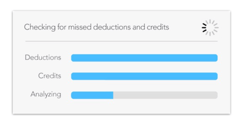
Surely, this software doesn’t need to double-check the data. But by seeing this screen, doesn’t it make you feel like TurboTax is going the extra mile to take care of you? In other words, this dialogue is just a placebo that doesn’t serve a functional purpose and actually slows down the experience. In this case, making the task take longer is a nice touch that actually improves the memory of the experience. And TurboTax isn’t the only company that uses this technique.
Create Peak Moments
Peak moments are awesome moments that are memorable. And it turns out that memorable moments have one major quality in common: They tend to carry emotional weight. Studies have shown for decades that human memory is biased towards emotional events.
People such as Don Norman and Aarron Walter have been writing about the elements of emotional design for years now. Emotional design is all about going beyond utility and usability to create moments that stand out and get remembered. When used well, elements of emotional design help make experiences stick.
One of the many emotional design techniques — and my personal favorite — is to create moments of surprise by letting users make their own discoveries in a UI. When my coworkers and I created JamBells, a cooperative mobile web game, we added a secret to the list of playable songs (check it out on mobile and see if you can find it). Another example is Snapchat’s lenses, a killer feature that’s almost impossible to find in the UI without help. I recently spent an entire dinner with four other UX designers trying to figure out how to do a face swap. While it certainly was not usable in any conventional sense, we felt pretty cool when we finally figured it out.
For a designer, creating peak moments also means not being a perfectionist with small problems and learning to see the big picture. A few years ago, Don Norman talked about how he asked people to tell him about the thing they hate most about a trip to Disney World or a new iPhone. Everybody is always ready with some horror story about the lines at Disney World or the new operating system, but when he asked if they would recommend that thing to a friend, they almost always emphatically said yes!
At the end of the piece, Norman concludes with this advice: “Perfection is seldom worth the effort. So what if people have some problems… What matters is the total experience.”
As experience designers, our goal shouldn’t only be to seek out and fix moments of frustration. That’s not only impossible, it’s also narrow-minded. If we think about the peak-end rule and the experience profile charts we’ve been looking at, we can illustrate the value that peak moments have in insulating our designs from negative moments.
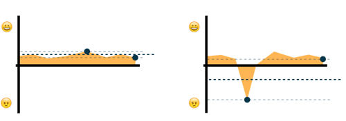
For example, the experience profiles below are the same except for one unexpected negative moment. You can imagine that the designer’s focus was on removing friction and not on creating peak moments, which resulted in a usable but bland experience that was vulnerable to a single unforeseen problem.
In contrast, an experience with an emotional high point, shown below, is more resilient to problems. In theory, one single great high point can override an otherwise disastrous experience.
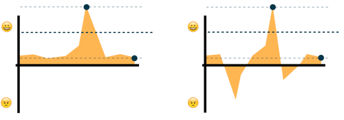
Focusing your resources on creating emotional high points might just mean the difference between a product that’s perceived as smooth but forgettable and one that’s flawed but awesome and leaves people with a lasting positive impression.
Be A Story Designer
Until recently, I was a story skeptic. You could say that I was a skeptic in the mold of Stefan Sagmeister. I thought the idea that storytelling has something to teach us about basically any and every discipline was, at best, a bit of stretch.
But then I saw the video below of Kurt Vonnegut. (Go ahead and watch it. I promise it’s worth five minutes.)
“Kurt Vonnegut on the Shapes of Stories” (Watch on YouTube)
The type of chart Vonnegut draws should look familiar to you at this point, because it’s exactly the type of experience profile used in Kahneman’s research.
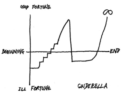
A student at Tufts University took this idea a step further, showing that it’s possible to map pretty much every single Disney movie to this story archetype. Disney has made a fortune with this formula for decades.
Do you notice anything in particular about this massively successful story archetype? It has a high peak and a high ending or, as they’re more commonly known in show business, a climax and a happy ending.
Human memory abstracts our stream of experience into individual moments, and what is a sequence of moments that occurs over time, that has an identifiable beginning and ending, that gets better and worse as the sequence progresses? It’s a story. Humans write stories every day. We’re constantly weaving moments of our remembered experience into a story that makes sense to us.
So, how do we use this to our advantage? One useful tool for applying storytelling thinking to experience design is experience mapping, or journey mapping. An experience map is a great way to bring together your qualitative and quantitative research and to visualize the story that users experience with your product or service. Adaptive Path provides a helpful guide.
Experience maps can be complex and granular, but the important thing is to visualize that experience profile. Where are people having peak moments? Where is there friction? How does the experience end?
Finally, applying storytelling thinking doesn’t have to be a vague, fluffy pursuit. Donna Lichaw points out that any sequence of steps that users take over a period of time can be described both with data and as a narrative structure that borrows the elements of storytelling, such as exposition, rising action and climax. Instead of being at odds, data and storytelling support and inform each other. Analytics provide the “what,” and story structure provides the “why” and inspires new design ideas and testable hypotheses.
Conclusion
Experience and the memory of experience are related but systematically different. Each of us has two selves, the experiencing self and the remembering self, but the remembering self does the learning, judging and deciding. Memory is a collection of snapshots that gives extra weight to the most intense moment and the final moment of an experience. Designing for experience is still important, but we should strive to also think like user memory designers.
To do this, we should first pay attention to endings and make sure we’re not letting our users down in the final moments of their experience. Secondly, we should slow down when we can, showing our users that we’re taking the time to take care of them. Thirdly, we should go beyond usability and use the elements of emotional design to create peak moments, focusing on the big picture and making our designs more resilient to unexpected problems. Finally, we should be sensitive to the features of the story that our design is telling, paying special attention to the moments that matter most, like the peak and the end.
And, just to make sure I end on a high note, here’s a puppy:

Further Reading
- Creating A Lasting Impression
- What Is User Experience Design? Overview, Tools And Resources
- Reducing Cognitive Overload For A Better User Experience
- Why User Experience Cannot Be Designed


 Register For Free
 Get a Free Trial
 Smart Interface Design Patterns, 45 lessons + UX training
 JavaScript Form Builder — Create JSON-driven forms without coding.
 Devs love Storyblok - Learn why!

