Breaking Out Of The Box: Design Inspiration (October 2016)
Whenever I work on an illustration, the objects don’t always have to look like they do in real life. They can look like how I perceive them in my mind. Breaking away from reality is the privilege you have as an illustrator. There are, in fact, no boundaries. Illustrating is creativity in its pure form. It is endless and that’s why I love it so much.
Pokedex
Drilled down to just the basics. Great work. I love the hard edged clean shadows and the high contrast of the bright colors palette.

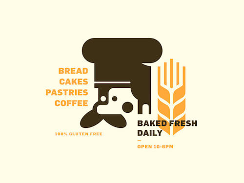
Bake Shop
It took me some time to see the face. You could see a dog at first, too. The mustache will help. :) Having to look and analyzing is what I also love about this one. I also see a fork in the wheat.
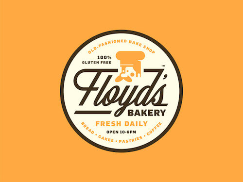
Floyd’s Bakery Part II
Great to see the previous branding evolving into a badge design. Love the connection between the ‘F’ and the ’D’.
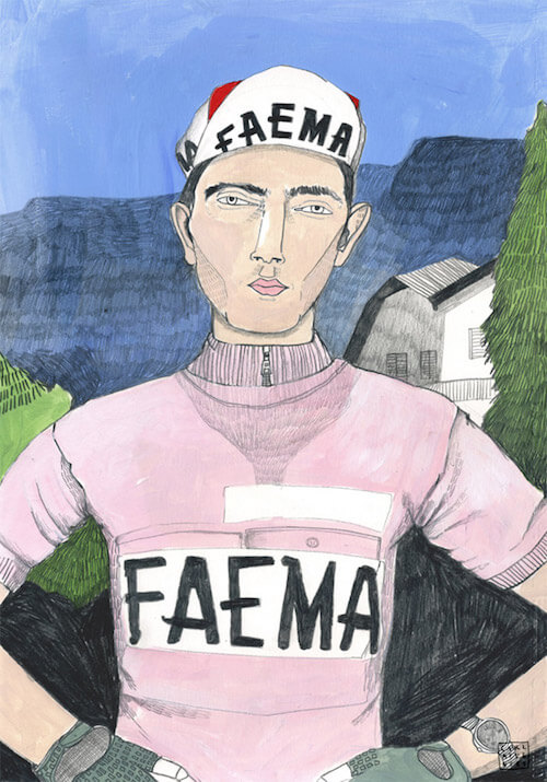
Le Tour By Carla Fuentes
Love the details that are present in this great texture work. There’s a certain uniqueness to this pencil drawn style.
Printing
Great to see some illustration work that tackles printing services. Some subtle gradients & textures. Love the ‘movement’ in the legs, and the shape of the hair.

3d Cake Car
I would buy an ice cream from this nicely designed 3D truck. The tires are especially well done.

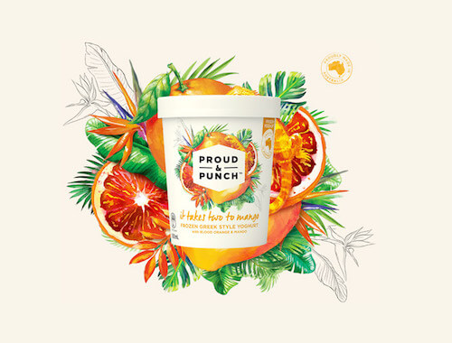
Proud & Punch
Brilliant summer vibe and colorful message. The aquarelle effect fits perfectly. Wouldn’t mind a taste with such lovely packaging. It expresses the fruity juiciness very well.
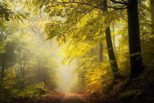
Secret Woods
With September being the new August here in Belgium, it’s too early for me to start thinking about Fall, but that’s not a valid reason to exclude a beautiful photo like this. The mystery wondering is strong in this one. Perfect path to cruise on. Very inviting indeed!
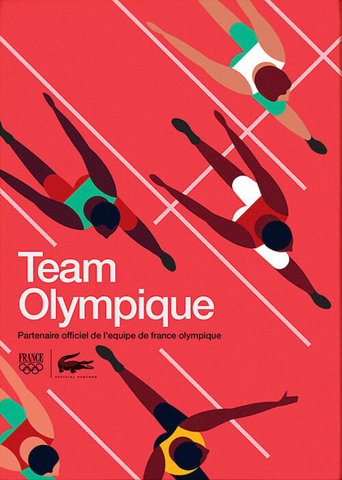
Team Olympique
Admiring how well balanced everything is in this poster for the Lacoste Team Olympia runners. Typography is also cleverly integrated, and the Comoros are just perfect.
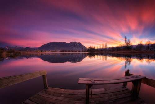
Alamar
Alamar, Ciudad De La Habana, Cuba. Sunset 8:11pm. Nature’s gradients at its best.
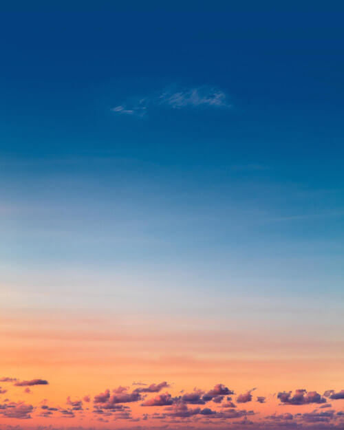
Fragment d’éternité
Speaking about nature and its talent for creating beautiful gradients. Wouldn’t mind enjoying this view for a while.
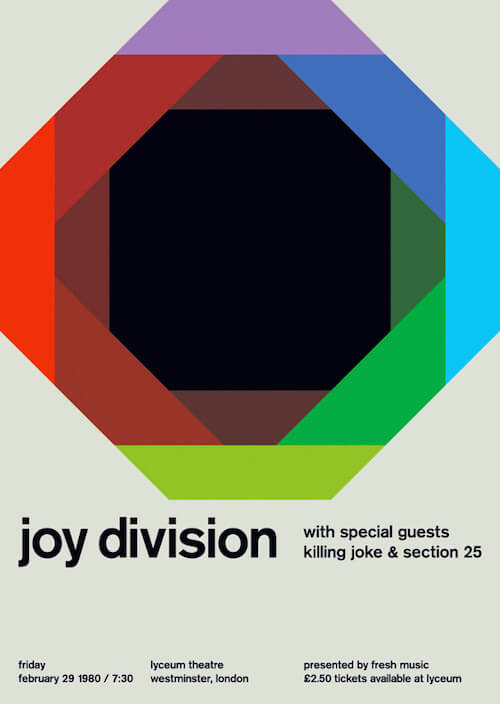
Joy Division
It has been a while since I last added something from Swissted. Joy Division at lyceum theatre, 1980. When you turn an indie rock show flyer into international typographic style poster this is the result.
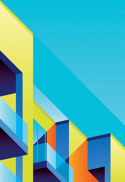
Colorful Geometric
Wonderful experiment with colorful geometric shapes. Almost looks like some modern apartment building with terraces. Love the highlight and shadow effect created by such perfect overlays and transparencies, in combination with only a bare minimum of gradients to keep the overal style extra clean.
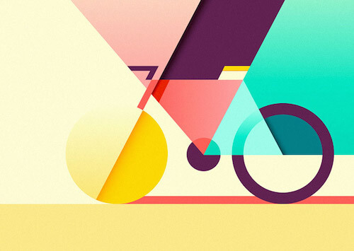
Geometric Bicycle
Another inspiring example of using geometric shapes to create a bicycle with a minimum of detail.
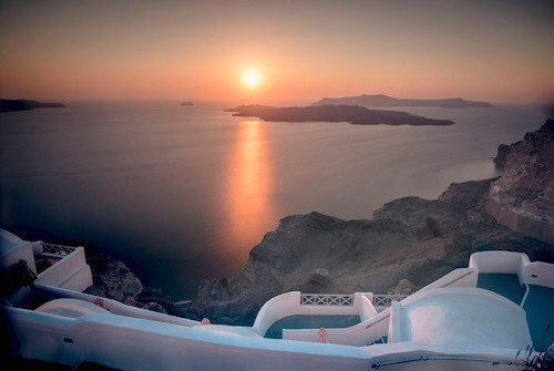
Volcano View
The right amount of light, colors and composition! Santorini sure has one of the most breathtaking sunsets. One of those places you’ll want to put on your to visit bucket list.
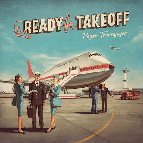
Ready For Takeoff
These kind of illustrations are just absolutely fantastic. They look straight out of a 60s magazine. A wonderful source to study all the texture overlays and shadows. Photographically realistic shown in every detail, wrinkle, glow or sparkle. It’s all there.
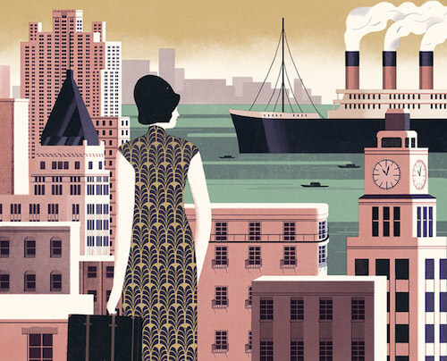
Her Living Room
Part of series of illustrations for an exhibition that portray the fashionable lives of the Shanghai women in the 30s. Love how the dress is constructed with a beautiful pattern. It immediately grabbed my attention.
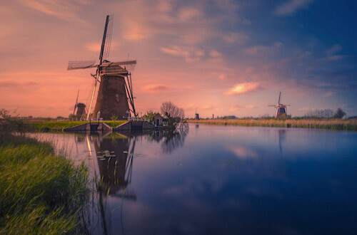
Kinderdijk, Holland
Beautiful shot of a Unesco World Heritage site in Holland called Kinderdijk. It has 19 windmills strung out on both sides of the canal.
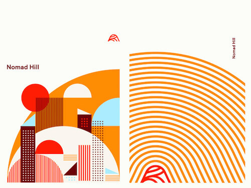
Nomad Hill
Inspiring patterns collage. Great color selection as well. It’s amazing what you can achieve as a result starting from simple shapes when you apply the right colors, and the right composition. It all looks so simple, but it is not.
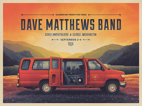
Dave Matthews Band Gorge Poster
Another piece of exceptional work by DKNG. Just study all the details and discover the depth in the landscape background, even when you look through the windows of the van.
Ticket App Illustration
Nice header illustration for a concert ticket application. For starters the colors are spot on and the texture is very much up to par as well.

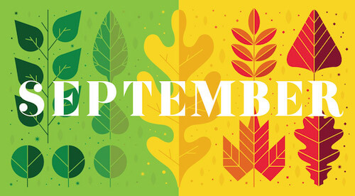
Dallas Child Magazine
Really a perfect example of great use of simple colors and shapes. Those leaves are pretty close to perfection.
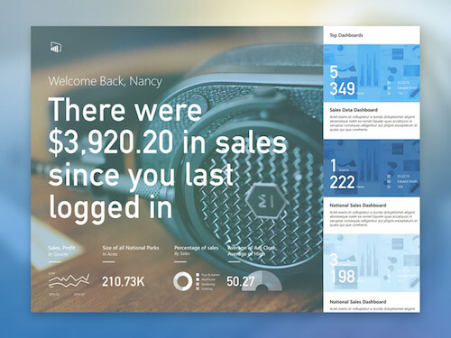
Sales Dashboard
A dashboard hub concept. Such great typography choices in here.
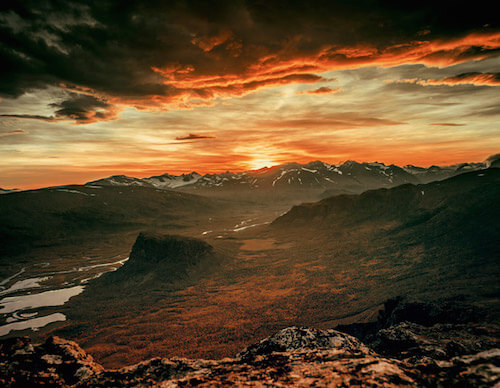
Fire In The Sky — Arto
Almost looks like a foreign planet. Some great clouds and an exploding sky.
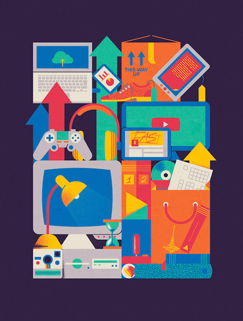
FM Magazine — Fast Changing
Illustration for FM Magazine about companies and the fast changing environment. Most notably in this one are the bright colors that are working well together. Love this early 90s looking pattern in the shoe and the book at the book at the bottom right. You can find this kind of pattern (named ‘Capsules’) in Adobe Illustrator’s ‘Basic Graphics Textures’ pattern library which you can load from the Swatches panel via ‘Open Swatch Library > Patterns’.
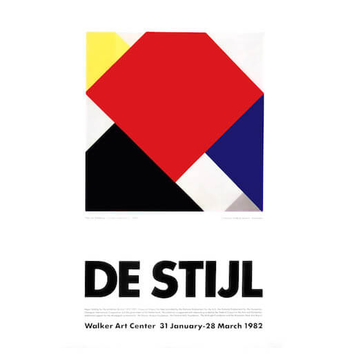
De Stijl
Poster for an exhibition based on oil on canvas painting called Counter-Composition V, 1924 — by Theo van Doesburg. Strong composition, very simple and eye-catchy.
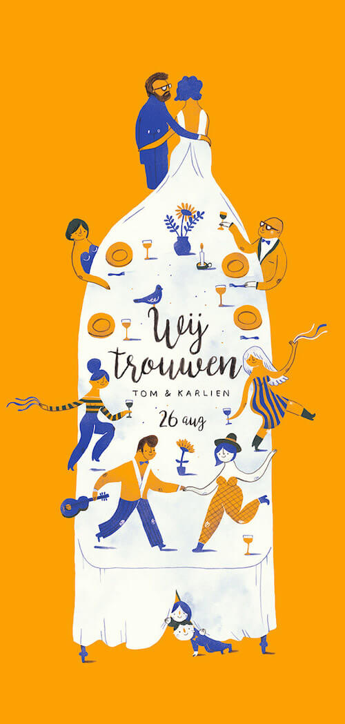
Wedding Invitation Tom & Karlien
Such a beautiful and original approach to a wedding invitation. Love how the dress is like the centre of everything and I especially like the two kids at the end of the table.
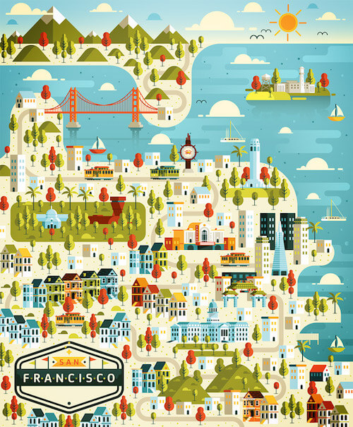
Cosmópolis Pt.4
One of the nice collection of illustrations that show a famous city. This one is about San Francisco. An inspiring color palette and many small details to discover. Beautiful flat 2D illustration style with a subtle depth created through colors.
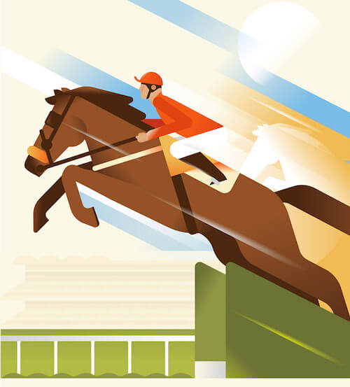
Jumping
The horse is nicely simplified and the diagonal items, and beautiful gradient effects perfectly show the notion of speed.
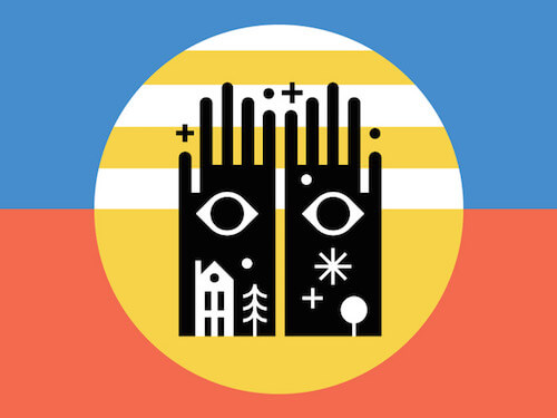
Club Kiddo Co. ✳ Flag 3
Part of a series of some inspiring flags. Quite delicious.
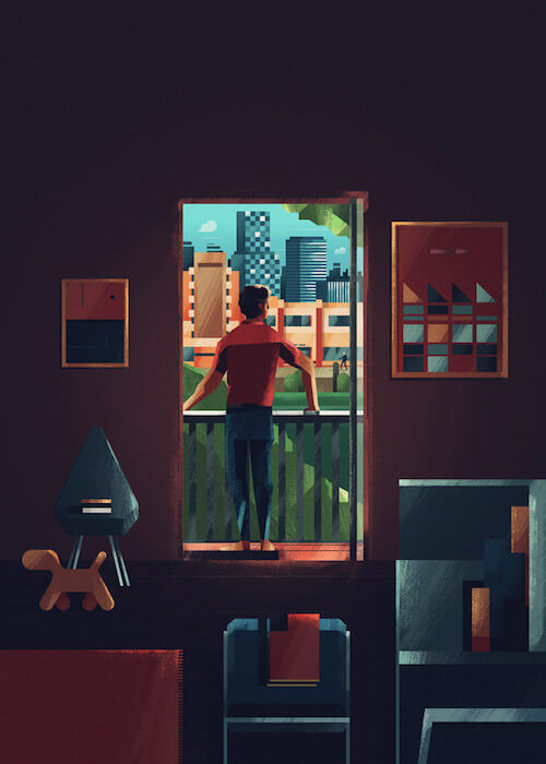
Cover For Settings Magazine
Cover for an interior magazine. Interesting use of textures and subtle 3D effect. The highlights and shadows are so well done here. You feel the daylight shining through the window.
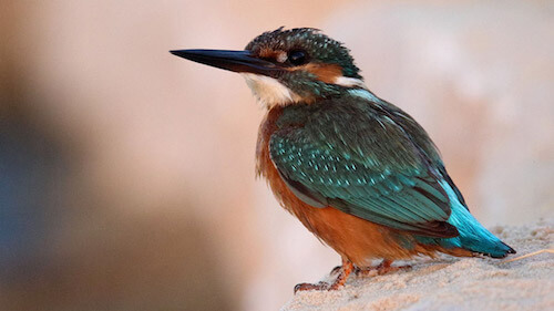
Kingfisher
Without a doubt the most beautiful little bird that you can spot in Belgium if you are lucky enough to be in the right spot at the right time. Those colors and little details in its feathers!
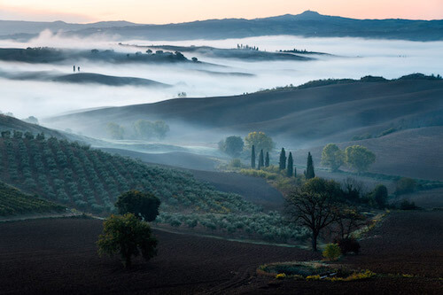
Daybreak At Val d’Orcia
This is absolutely gorgeous. Perfect lighting. This photo just looks like a painting.
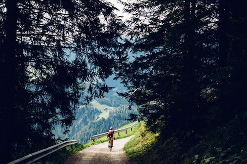
Yolomites5000
Out of the forest, back to the views. The nicest surprise you can get as a cyclist. After some rough section you come into this kind of view. Reward score! The Dolomites can do that for you.
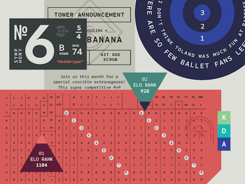
Native Specimen 2
Wonderful example of what can be achieved when you combine typography smartly. Featuring a lovely new typeface called Native.
Het Financieele Dagblad
Beautiful work from Amsterdam-based illustrator Jacob Stead. Great for studying the inspiring texture usage. Also a perfect example of going beyond reality and expressing the message directly.
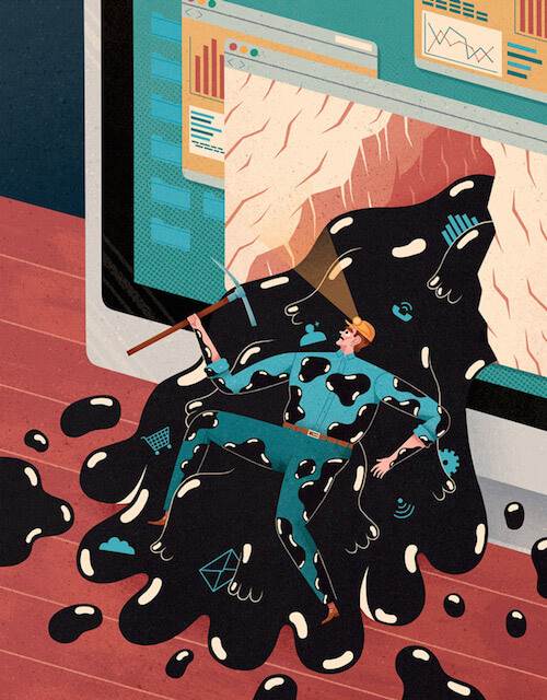
Het Financieele Dagblad II
The colors used here are so wonderful. The detail in the faces and the hair are quite amazing even on such a small size. The proportions are far from real which adds extra strength in this illustration. Just look at that huge body as he seems to grow out of the cubicle, compared to his tiny feet and hands. I think the message gets across just perfectly.

Electronic Pig
Again a perfect example of how illustrations are so perfect to translate to anything if your imagination is there.

Mountain View
The flow of this composition is just really beautiful. I feel it captures the Fall season as well with the color choices.
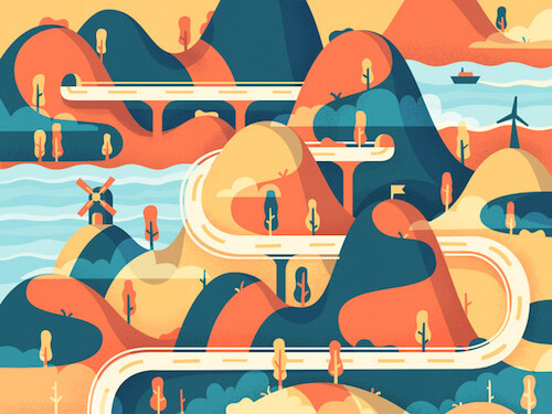
Geometric 3D
Excellent use of a well balanced color palette in combination with such well aligned geometric shapes and a bit of 3D achieved by these subtle gradient effects. So well done.
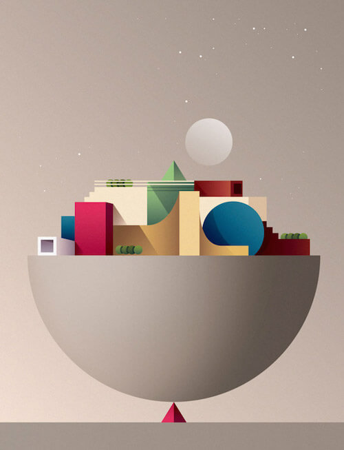
Tycho — Epoch
Boldly go into new musical territory. Tycho’s newest ‘Epoch’ is making me look forward to the upcoming album. As always the matching artwork is on par as well. Simple and beautiful.
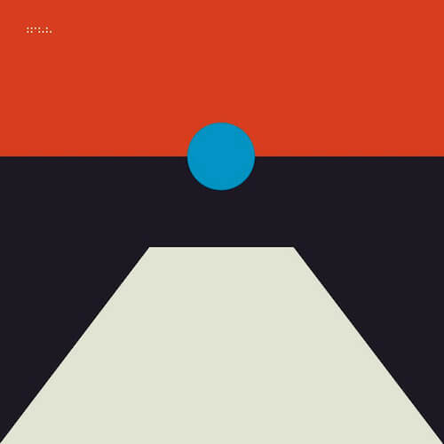
Apex Experience
Editorial illustration that matches an article focused on body language and behavior during a flight. Many nice subtleties to discover here. The expression on the faces is inspiring as those are so difficult to get right.

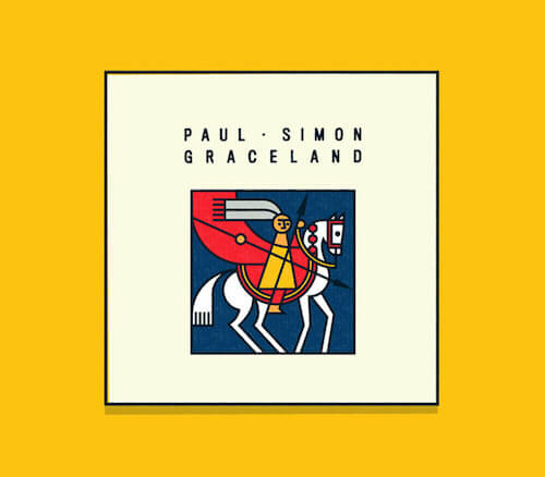
Paul Simon — Graceland
Minimalistic and great in composition. Perfect for a classy album. Ideas like these are treasures.
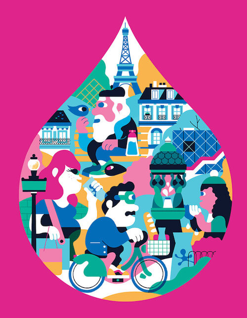
Eau de Paris
The special style of Rick Berkelmans aka Hedof. An illustration for the 2016 campaign for Parisian public water company Eau de Paris. The colors, and the overwhelming round shapes sets this one apart. There’s an animation as well created by Benjamin Moreau.
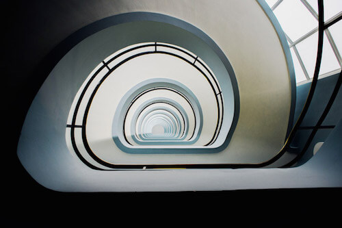
Staircase den Bell
Looking up or looking down, it’s all part of the thinking process of how you would get an awesome shot. This one of the staircase of “den Bell” Antwerp is just an example of that. Just fascinating to look at.
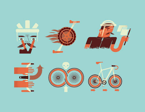
Bicycling Magazine
Great collection of spot illustrations created for bicycling magazine. Love the disproportion of the bicycle.
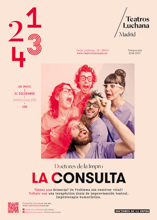
Teatros Luchana Madrid
Part of refreshed brand/corporate identity of Teatros Luchana Madrid. Interesting diagonal red overlay effect, and typographical choice. The rest can be seen here.
Water
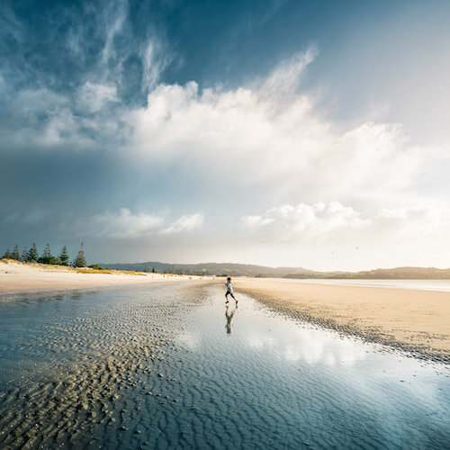
Beautiful image with moody sky. Wonderfully composed & perfect focus. Such perfect vanishing point!
Internet Tarot
A bit of humor. Not sure what this means but someone could pull the plug. :)

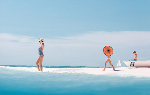
All I Need Is Blue
Part of a photographic series that focuses on the color blue. Such perfect scene. It’s wonderful, so be sure to check out the rest, too!
Further Reading
- Delightful Bits Of Vintage Graphic Design Inspiration
- Modern Art Movements To Inspire Your Logo Design
- Beautiful Photoshop Illustrations By Artists Around The World
- Inspiring Illustrator Artworks By Artists Around The World


 Register For Free
 JavaScript Form Builder — Create JSON-driven forms without coding.
 Devs love Storyblok - Learn why!
 How To Measure UX and Design Impact, 8h video + UX training
 Get a Free Trial

