Breaking Out Of The Box: Design Inspiration (November 2016)
With autumn starting to show its full glory, there is really no reason to stay inside and drink your hot cacao. No, it’s time to go outside and soak up all those warm colors nature has to offer, especially the vibrant golden-yellow leaves that can now be found almost everywhere you look. It’s the season of hazy mornings, and beautiful warm color palettes. In this month’s collection, I’ve gathered a couple of illustrations and photos that express this seasonal feeling.
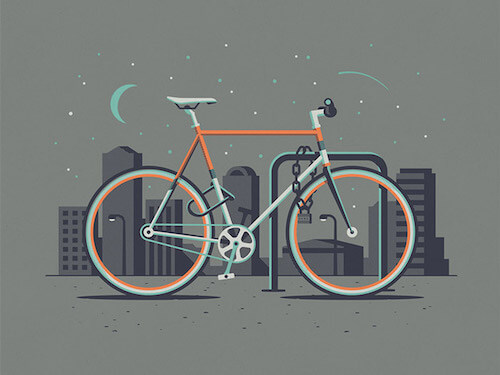
Downtown Fixie
Another one of the beautiful bicycles in the Cyclist Series by the DKNG Explorers Club. The shadow depth and color choices are simply ace.
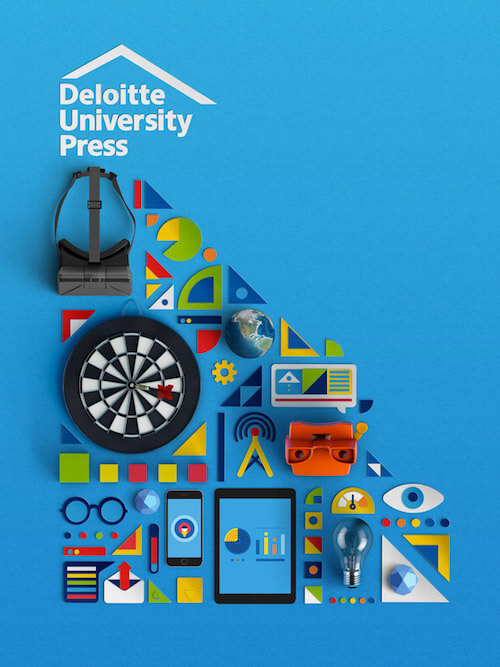
Deloitte Tech Trends
These collections of cutout items in combination with real ones is so beautiful if done right. Mostly something that is done when there’s animation involved as well.
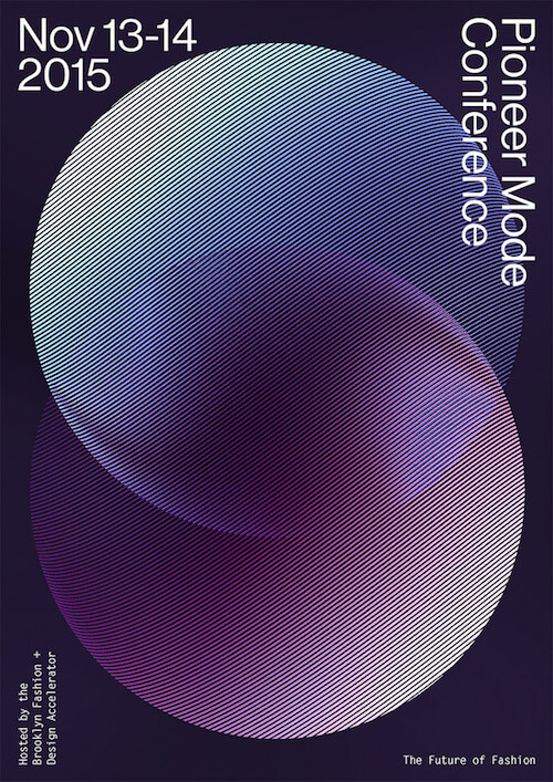
Pioneer Mode
Poster for a conference that discusses the social, environmental, and organizational issues plaguing the fashion industry. Some beautiful gradients in an inspiring organic shape.
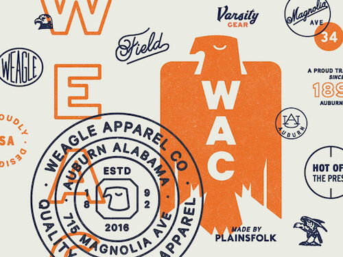
Weagle, Etc.
So many great pieces in here! Lovely retro color scheme and typographical inspiration.
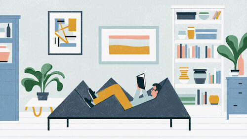
Mr. Porter
Smart how the sofa is adjusted towards the person lying down. Makes it a centrepiece in this illustration.
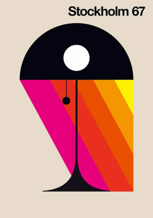
Stockholm 67
Bob Lundberg is an illustrator from Sweden that draws inspiration from objects he comes across in everyday life. The result is a harmonious testimony to design objects.
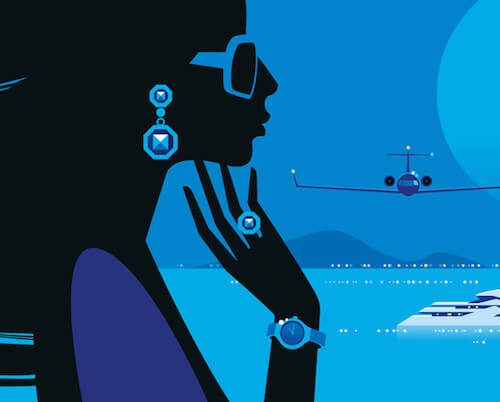
Cannes Collection
Illustrating the richness of Cannes. Drilled down to just the basics so the eye-catchers get all the attention.
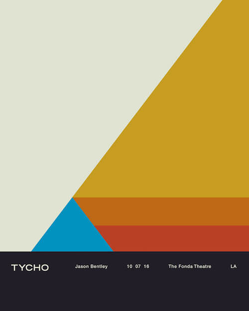
Tycho Fonda LA Concert Poster
Concert poster that is part of the design/color system that Scott Hansen has going since the release of his latest album ‘Epoch’. Be sure to read the story about the meaning and origin of the artwork of Tycho.
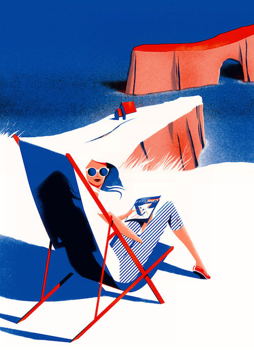
The Walrus /// Cover
Just wonderful how white space is presented here, and how your mind fills in the blanks. The shadows are equally well done.
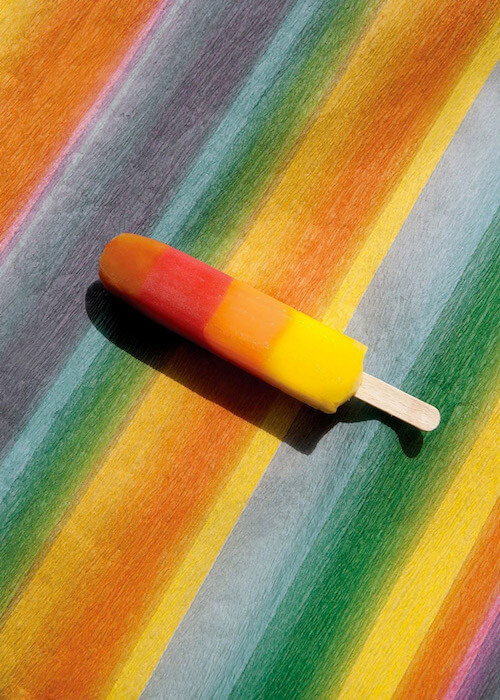
Taste The Colors
Conceptually just perfect. Wonderful idea by Ester Grass Vergara, a photographer based in Amsterdam.
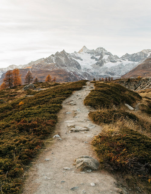
Five Lakes Trail
Another example of the pure beauty that Switzerland has to offer. The Five Trail, Zermatt. Onto the bucket list.
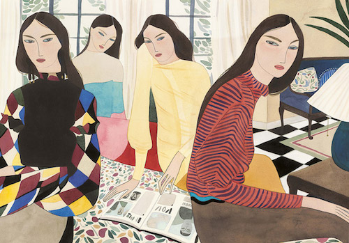
In The Bedroom
This one is created for a fashion editorial in Marie Claire Italia. It’s part of a series that explores the lives of four sisters, their relationships with each other, and their individuality. The eyes are the attention grabbers, maybe even a little creepy. Wonderful water-color work. Be sure to check out the rest.
Deep Run Roots
Lovely illustrations for a cookbook. The textures are very well done, and so are the highlights and shadows.
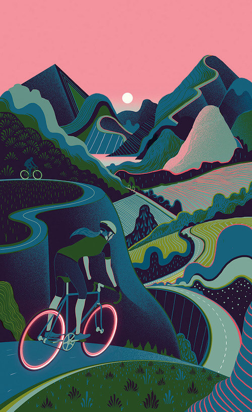
Wired - Sam Chivers
Great to see how the mountain roads have been translated here with all the different structures. The fluo wheels are a nice touch, and also the way the pink is applied everywhere to add this sunset feeling.
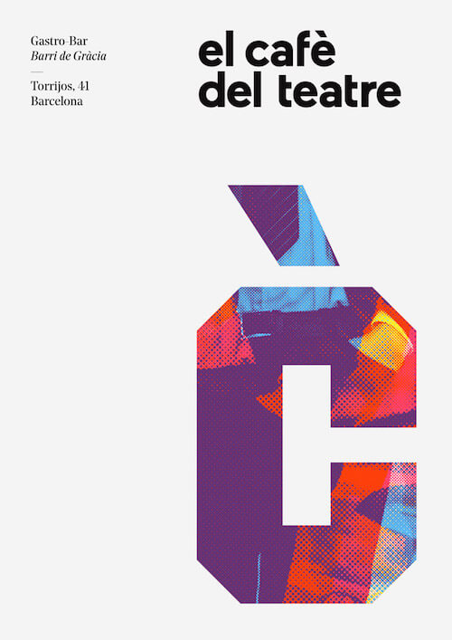
Gastro-Bar Barri de Gràcia
An inspiring and colorful visual ID. Love the typography and the moiré print textures.
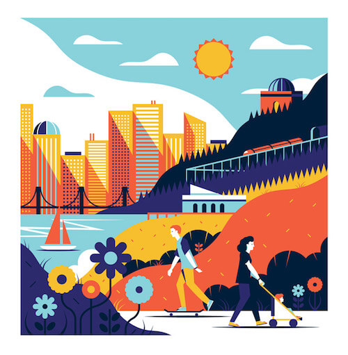
Cityscape Style Frame
Great atmosphere and the color combinations are top.
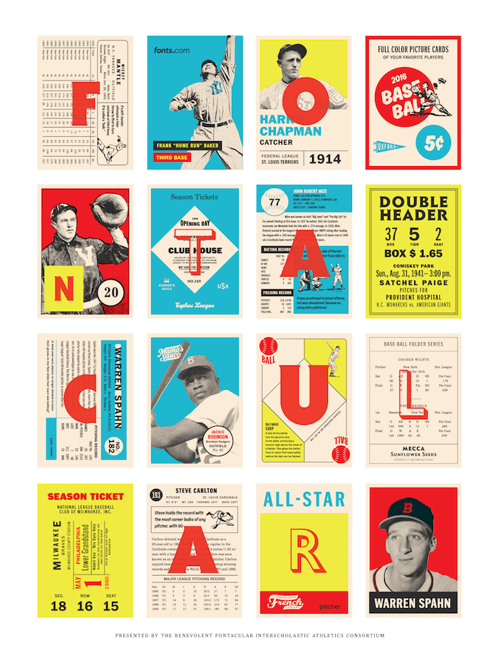
Fontacular!
You don’t have to be a baseball fan to appreciate everything in here. The typography is so on point. These are also hard colors to pull off just right. Be sure to admire them all.
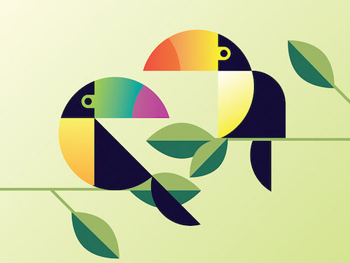
Two Cans
A nice composition with simple shapes in combination with some smart color usage.
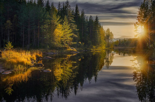
Autumn Rays
Sad that summer is over but one comfort is that light is usually very pretty this time of the year. This photo proves it. Just look at this. Quite spectacular imho. It’s just like a painting.
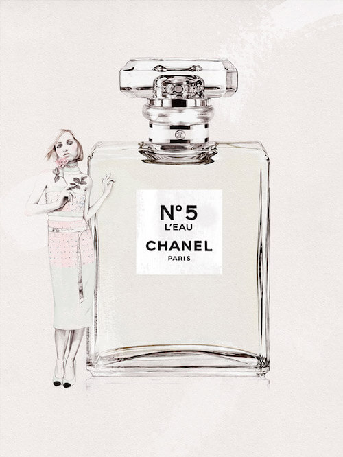
Chanel N°5 L’Eau
The illustrations of Elodie are super beautiful, almost like real photos sometimes. Great textures and subtle use of pastels.
Sunday - Nutsa
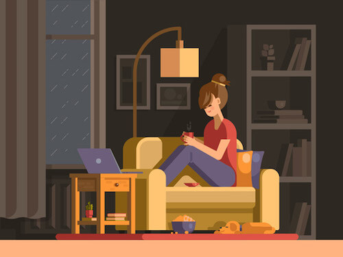
So how does a cozy Sunday look like when it is raining outside. Exactly as illustrated here. Some nice shading going on. The light creating this warm feeling is so perfectly done.
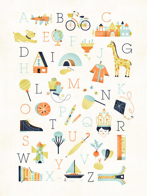
ABC Poster
A lovely poster created for Pottery Barn Kids. The colors are just perfect, so soothing. Lovely cute illustration style.
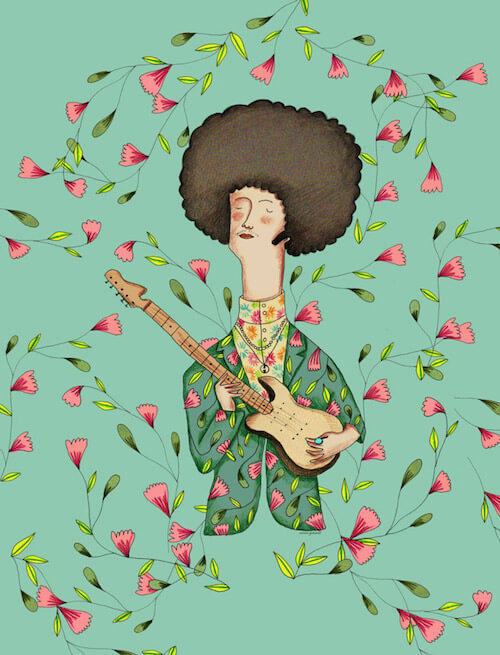
Jimmy Hendrix
The little details such as his shirt, jacket and textures are what’s making this one work for me, plus the expression on his face.
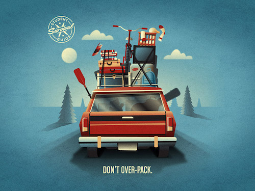
Bank Of America Student Survival Guide
Beautiful new work from DKNG. This one is part of 15 illustrated tips for students as they embark on their college career. That luggage!
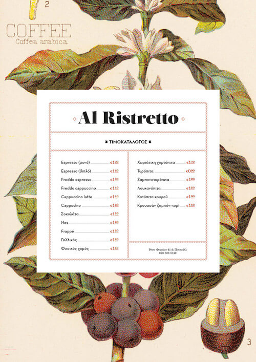
All Ristretto
Now that’s a good looking menu! A great background combined with some lovely typography, especially the menu items one.
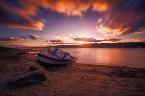
Charisma
Smooth surfaces and good looking color tones. The boat in the foreground is the icing on the cake.
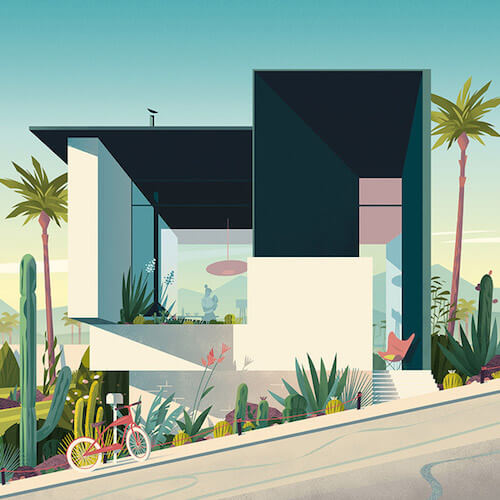
California Modernism
Created as a tribute to mid-century modernism in California for Focus Magazine. Superb style and color usage. Beautiful shadow and highlight at play. You feel the light of the sun.
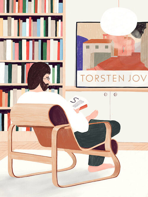
Torsten
Admiring the soft colors pencil style in this illustration. Oscar’s illustrations are a reaction to designer and founder of type foundry Letters from Sweden. Göran Söderström’s typeface called Funkis, which is influenced by the aesthetics from the early years of Scandinavian functionalism.
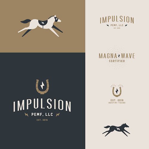
Impulsion
Nice identity for an electromagnetic therapy company specializing in show/racing horses.
PrescribeWellness - Delivery
Loving it! Going from flat to 3D is so well done here. Be sure to view the full animation. Such a cool illustration style!

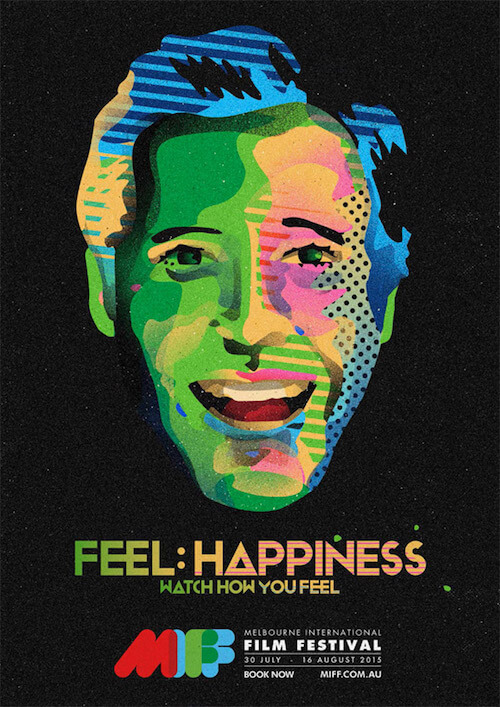
Melbourne International Film Festival 2016
Illustration for the 2016 Melbourne International Film Festival. It’s a beautiful mix of colors to get that Andy Warhol effect.
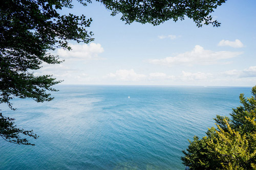
Sailing, Møns Klint
There are still some lingering thoughts that won’t accept fall. Queue a beautiful summer day with a magical view like you see here. Such a perfect scene with that tiny sail boat in the centre.
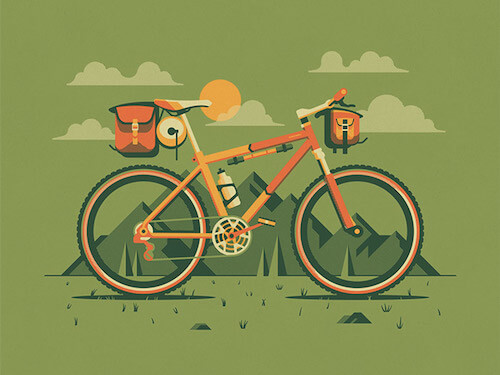
Explorers Club: Durango
Wouldn’t mind going on an adventure with this mountain bike called “Durango”.
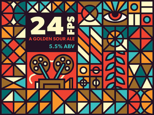
OMF Beer Labels
Some great patterns that could have been inspired by stained church windows but translated in a modern way. Neat work!
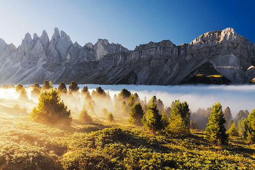
Alp Impressions
The mountains and their magical attraction lure. Love how you can see the clouds, and how the sunlight shines into the haze and over the tress.
Uber Visual Identity Redesign
An example how a billboard could look in the Uber visual identity redesign. All the other elements of this redesign are worth a look as well.

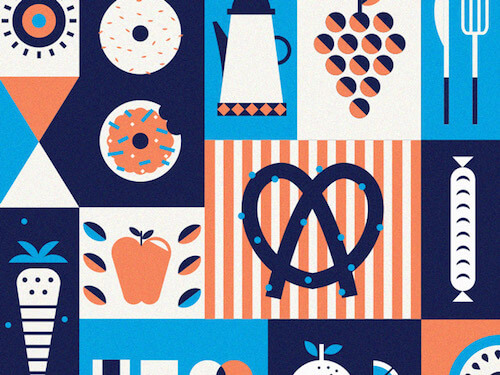
Breakfast - Bailey
A collage of how breakfast could be. The pretzel is the eye-catcher here together with the texture usage and color choices.
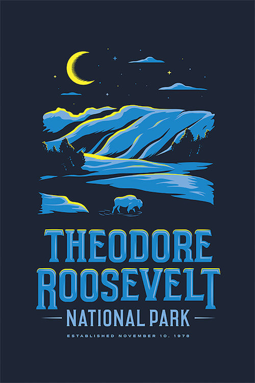
Theodore Roosevelt National Park
This illustration was submitted to Type Hike, a collaborative design project that includes 60 designers and typographers, all celebrating the National Parks Service centennial in the USA. Love how the yellow touches are applied to create this moonlight effect.
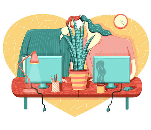
Falling In Love With Your Colleague
What an inspiring color palette! The texture of the wood is also refreshing. All textures are in fact very well done. Love the disproportion of their bodies too.
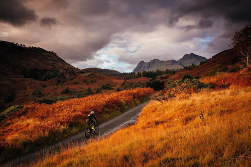
The Lake District
Added another one to “the places I want to ride my bicycle” list. My friends are not lying when they say, “It’s not LIKE riding through a painting — it IS riding through a painting — up a very, very steep and twisting painting”.
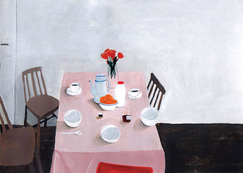
Dit Is (G)een Verhaal
This illustration almost looks like a painting. It’s refined in its simplicity. Love the light brushstrokes and the melancholic feel to it.
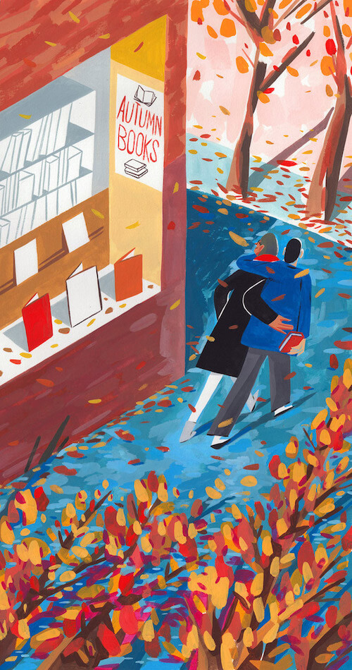
Autumn Books
Speaking of brush strokes, this lovely cover for the Autumn Books section of the Wall Street Journal is also very well executed. Perfect autumn feeling.
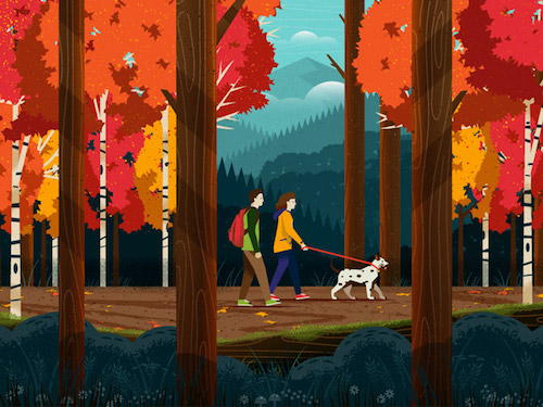
Fall Hike
The trees have just started to turn on their color show around here so this is a very appropriate illustration. Colorful!
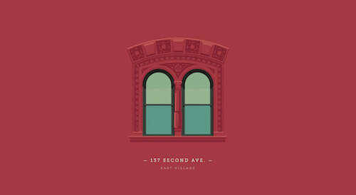
137 Second Avenue
It has been a while since I last had a look at the ‘Windows of New York’ project. Time to rectify this with this beauty from 137 Second Avenue in East Village.
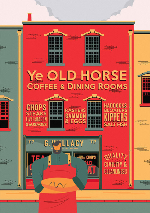
Fuller Street, London
Lovely illustration of an old Victorian shop front with proud proprietor outside. Great color palette and typography.
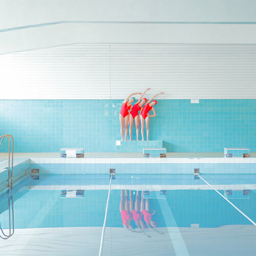
SWIMMING Trinity
New work in the swimming pool series from Maria Svarbova. It’s such an inspiring thing to watch. Brilliant in its simplicity. That red accent is just brilliant.
Just Be Yourself
More wonderful brushstrokes to admire. Studying all those facial expressions, and poses done with just minimal elements.
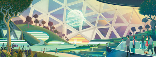
Airport Of The Future
I love illustrations that tackle the future. It’s such a great way to see imagination at work. Here you have a concept of how an airport terminal of the future could look like. Love the color palette and subtle gradient shades.
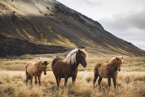
Icelandic Horses
These horses of Iceland are so recognizable. I absolutely adore the color tones in this photograph.
Freeze! Sky Police!
Love the line and pattern work that is going on in this illustration. Just look at his chin, fingers and elbows.

Further Reading
- Modern Art Movements To Inspire Your Logo Design
- Beautiful Photoshop Illustrations By Artists Around The World
- Inspiring Illustrator Artworks By Artists Around The World
- Rediscovering The Joy Of Design


 JavaScript Form Builder — Create JSON-driven forms without coding.
 Devs love Storyblok - Learn why!
 Smart Interface Design Patterns, 45 lessons + UX training
 Get a Free Trial


