Conversational Design Essentials: Tips For Building A Chatbot
Human interactions are incredibly fascinating if you take a close look at them — the social awkwardness, the communication styles, the way knowledge is transferred, the way stories are told and trust is built.
But what happens when a machine evokes the same response?
Conversational interfaces have become the new hotness in UX design. Google is about to release a new virtual assistant chatbot; Facebook has already launched the updated Messenger platform with chatbots; and Microsoft went as far as to claim that the operating system of the future isn’t Windows, but “conversation as a platform.”
What all of the big industry players have already figured out is that advances in artificial intelligence (AI) can solve a very important UX problem: making faceless branded websites and apps feel really personal.

Chatbots can create a more genuine, custom-tailored experience, one that could be compared to the experience in a store — you get a smile from the salesperson, some chit chat and a friendly wink, which makes the whole buying experience more personal and pleasant. For brands, this represents an opportunity to extend and manage relationships with their customers and to go beyond being “just a product.”
However, building a genuinely helpful and attractive chatbot is still a challenge from a UX standpoint. Though we now have brilliant machine learning, which advances AI and natural-language processing (NLP) technologies, we are still somewhat limited in the type of helper we can create, and we need to force the most out of what we have. Matt Schlicht, founder of the Chatbots Magazine has created a very comprehensive guide summarizing the current state of the chatbot ecosystem and opportunities for designers.
Recently, I worked on the chatbot project for Alty — a Facebook messenger bot to chit chat with potential customers, introduce them to the company and services offered, and send out email inquiries.
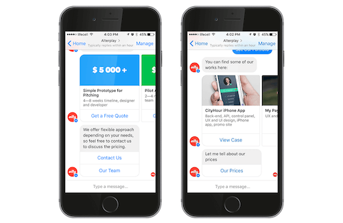
The experience was relatively new and challenging. Unlike the standard graphical user interface (GUI), the app needed to work seamlessly with little user input, provide new value by leveraging stored information, and anticipate users needs. Standard patterns and flows don’t really work in conversational design, or else they need significant readjustment. Check Bot UI Kit for Messenger platform, courtesy of Mockuuups and Botframe - a simple prototyping tool for emulating conversations developed by Alsadir Monk to get a better idea of the common flows on this platform.
1. Pick A Toolkit
As already stated the first challenge you are likely to encounter is that you have little control over the application’s appearance. You don’t need to fuss over typography, layouts or styling too much. If you are building a voice-control chatbot, it won’t even have a visual side! Hence, ditch most of the standard tools and power up your toolkit with new useful ones.
For our project, we opted for the simplest tool — Chatfuel, a free, intuitive bot builder for Facebook Manager with a drag-and-drop interface and hardly any coding required.
However, if you plan to build a more advanced bot, it’s worth looking into the following tools:
- Twine This non-linear text editor creates text scripts and message sequences for your dialogs.
- Wit This indispensable tool will help you convert voice and text commands into actions. Dozens of handy commands have been created by the community, and you can add custom ones.
- Botkit Howdy’s Botkit offers a handy set of commands and ready-made code for you to build your first Slack chatbot.
- Api.ai Recently acquired by Google, this robust and comprehensive platform will help you build any type of conversational UX interface.
- Botwiki This wiki answers all of the common chatbot questions.
Few of the standard controls or styles we use in standard apps apply to conversational design.
2. Hint To The User On How To Get Started
Conversational design completely changes the way users interact with an app. Typically, when a user opens a new iOS app, they will see some familiar elements, such as a menu, a panel to log in or create an account, buttons and so on — the elements they already know how to interact with based on common schemas.
However, the first encounter with a chatbot is less conventional. The user will be staring at a blank screen, lost in assumptions about what to do next or how to interact with the app. They face two simple problems:
- “I have no idea what I’m supposed to do.”
- “What exactly can this thing do for me?”
Chatbots don’t seem intuitive for most users yet. Hence, your first task is to prompt the user on what’s about to happen next. Start with a quick introduction and a straightforward call to action, something like:
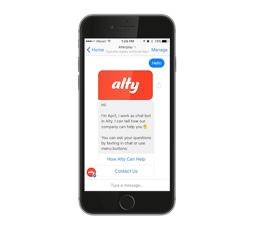
Keep it short and simple. Invite users to experience one quick benefit of your app and to enjoy the result immediately.
In the case of Alty’s bot, we opted to include buttons within the conversation for a few key reasons:
- Typing on the go could be cumbersome for some users, and chatbots are not always smart enough to detect typos (although we’ll talk about dealing with that later on).
- Buttons can hint to users about what kind of questions the bot can answer and what actions it can perform.
3. Craft The Right Conversation Flow
You want your robot to seem like a wizard, rather than an obstacle, right?
One of the most challenging parts about designing a chatbot is to make the conversation flow as naturally and efficiently as possible. However, human interaction is typically messy and non-linear. Here are some tips for optimizing the app’s performance.
Teach Your Bot To Distinguish Between Different Types Of Questions
Create the initial scope of questions that your bot will be capable of processing and answering efficiently. You can use a great library named qTypes, which has over 40 sub-classifications for how questions should be answered. qType indicates the type of reply the user expects, and qSubType indicates the question’s format:
- CH. With alternative choice question, the bot is asked to pick between two alternatives (for example, “Is this shirt red or green?”).
- WH. These are questions starting with who, what, when, where or why.
- YN. These are yes or no questions (for example, “Do you have a dog?”).
- TG. A tag question is not an actual question, but rather an option to keep the conversation flowing (for example, “This beach is lovely, isn’t it?”).
When your bot receives one of the standard questions, it can produce more accurate replies based on the data from the library:
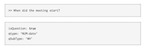
Avoid asking rhetorical questions, because most users tend to respond to them anyway, even if the chatbot is just being polite.
Now that your bot is capable of understanding questions, the next challenge is to teach the app to render appropriate commands in return.
Validate Input Data More Effectively
A standard GUI allows you to refine inputted data easily when processing it. Is this email address valid? Is this username available? Is this phone number valid? You can easily restrict and refine inputted data before processing it.
Yet, in conversational design, things get a bit more complicated. The user is free to say or type whatever they’d like; hence, you need to be smart when constructing your questions and processing the answers.
Offer hints. Avoid open-ended questions whenever possible because they usually result into more confusion. Instead, prompt for the kind of answer you expect. For example:
"What kind of case study would you like to see? We have ones for travel, social networking, design and personal finance apps."
Or you could present the information according to the format of the platform you are building on — for example, lists in the case of Facebook Messenger:
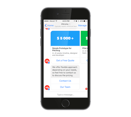
Also, confirm. If the answer is valid, repeat it to ensure that everything is correct, and then move on to the next question:
"Got it. Travel apps. And what budget do you have in mind?"
Or suggest what went wrong. If the inputted data isn’t valid, explain again what kind of answer you need. Ideally, distinguish between answers that you don’t understand and answers that are fine but that you can’t accept:
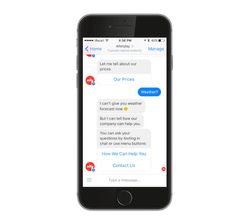
Don’t forget that users are talking to your app. They may use different words to describe the same thing — for example, “Thu,” “Thursday,” “tomorrow” or a word with a typo. You could either ask them to confirm their entry or focus on creating more advanced message sequences for your chatbot.
You can refine the inputted data by running it through Normalizer, a library that converts UK and Canadian spelling to US English, explains common abbreviations and fixes over 4,000 misspelled words.
Wait for critical inputs. In some cases, you’ll need the user to input some essential information that you cannot proceed without. In standard GUIs, the problem is usually solved with a popup modal window that blocks access to everything until the user completes the task: “Did you validate your email address?,” with the window prompting “Yes” or “No.”
However, in conversational design, you should tackle this issue in a slightly different manner. This kind of a loop can get rather annoying with a robot, so make sure to explain the exact action you require and why you need it so critically. Prepare a few conversational snippets for this purpose to keep the chatbot from getting repetitive:
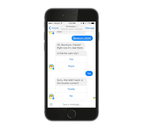
In general, think twice about whether certain information is critical in order to proceed. Whenever possible, make an educated guess, or ask for the same information again during a subsequent step.
Another option is to use buttons and pre-suggested texts that users can choose from both when asking questions and providing the replies. Buttons should improve the overall quality of user inputs, however, they may slightly reduce the engagement factor. So it’s best to use them only when you need to receive the essential data for proceeding.
As AI technology advances, it may become easier to train bots to make certain responses and to teach them to second-guess the user’s intention based on previous interactions stored in the database. Yet the majority of chatbots today don’t have fancy AI brains to respond to users; hence, for a better UX, you’ll need to tackle this job yourself.
4. Focus On The Microcopy
The designer should think like a copywriter when developing a chatbot. The content and the dialog will define your product’s style. The best apps are usually those that feature a fun conversational manner of speech. Hence, focus on the following:
- Follow the same user flow as you would if you were actually speaking to a person.
- The bot shouldn’t sound too clever, using complicated grammar or language structures. Keep it simple and be concise.
- Don’t use gender-specific pronouns, because you never know who’s on the other side of the conversation.
- Prepare a set of slightly different canned replies to make the conversation more human-like.
- Add help messages and suggestions for when the user feels lost.
- Write witty replies for unsupported topics, so that the bot doesn’t look dumb.
5. Reveal Features Gradually
Standard GUIs usually show all of the features available on the screen at once. The user can hover over icons, click buttons and access the menu to see what the app is capable of doing.
Interacting with a chatbot, however, can seem like the user is speaking into the void. Hence, hint at each next step, and gradually highlight unfamiliar features. Let’s explore what this means.
After receiving the initial command from the user, explain what’s about to happen next and what the robot will do to complete the task. Suggest the next possible steps and/or link to the FAQ page or user manual.
Unlock additional features after the first successful interaction. Disable “training mode,” and start suggesting additional features and more advanced tips. Base those features and tips on the user’s history and previously inputted data.
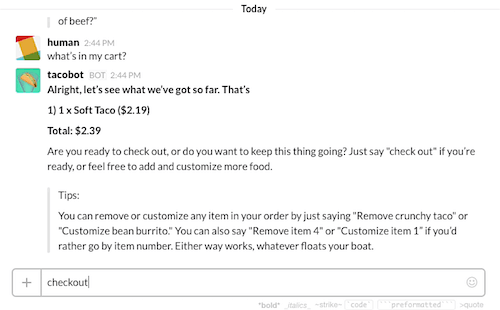
Prompt the user about new things to do. For instance, proactively suggest some other cool features of your robot:
"Hey, you have a party coming up! Do you want me to order 5 large pizzas?"
Conversational agility is one of the key strengths of Taco bot, for instance. The company used Wit.ai to power different conversation scenarios and even crack some jokes. The platform’s natural language processing technology, which is also now used to power Facebook’s M Virtual Assistant, allows the bot to render different ordering styles. For instance, “Can I have a burrito?”, “Buritto, please”, and even hilariously respond to “I’m drunk” request, which triggers the “Ok. A cup of water added to your order” reply. Additionally, users can type a one-line comment like “sans cheese” and the bot will understand that the information refers to the previously ordered burrito.
However, if the chatbot initiates the conversation, make sure it gives relevant suggestions because you don’t want to appear like an obnoxious spammer, right?
Chatbots And Speech Recognition
Speech commands are becoming a thing with Siri and Google Now, yet developing such bots obviously takes human and material resources. Even the most powerful neural networks that are responsible for speech recognition are rather hard to train at the moment. The most common challenge is that, while small errors are simple enough to eliminate, the larger recurring ones can become even larger due to multiplication, as Andrew Gibiansky points out.
For instance, if a user with an accent pronounces Apple as Eupple, the network might remember the command this way. Homophones are another major challenge for speech recognition; words like “flower” and “flour” sound identical, and understanding the right context might be hard.
Hence, if your aim is to build a simple chatbot, opting for speech commands might not be your best bet at the moment, unless you are ready to invest heavily in the architecture and advanced machine-learning technology stack.
Final Notes
While chatbots can be a great tool for creating more personalized customer experience, conversational design still have certain limitations. As Mariya Yao pointed out, there are clear cases when a conversation can help or hurt the UX.
Before building a chatbot for your business, you should clearly define its purpose and the exact value it could bring to the user. Teach the bot to do one thing extremely good, such as delivering weather forecasts or introducing the company’s scope of service before experimenting further with more advanced features. That’s the key lesson we learned when developing the April bot based on user feedback.
Further Reading
- Conversational Interfaces: Where Are We Today? Where Are We Heading?
- Does Conversation Hurt Or Help The Chatbot UX?
- How To Develop A Chat Bot With Node.js
- How To Develop A Chat Bot With Node.js


 Devs love Storyblok - Learn why!
 Smart Interface Design Patterns, 45 lessons + UX training
 Register For Free
 JavaScript Form Builder — Create JSON-driven forms without coding.
 Get a Free Trial

