More Than Just Pretty: How Imagery Drives User Experience
As the saying goes, “A picture is worth a thousand words.” Human beings are highly visual creatures who are able to process visual information almost instantly; 90 percent of all information that we perceive and that gets transmitted to our brains is visual. Images can be a powerful way to capture users’ attention and differentiate your product. A single image can convey more to the observer than an elaborate block of text. Furthermore, images can cross language barriers in a way text simply can’t.
Images are more than just decoration; they have the power to make or break a user’s experience. In this article, we’ll cover a good number of useful principles and best practices that will help you successfully integrate imagery into your designs. If you’d like to bring your app or website to life with little effort, you can download and test Adobe XD for free.
Only Use Relevant Images
Every image has a story to tell. Just like it is with writing, it’s better if you know what you want to say before you begin. Compelling images have a unique ability to inspire and engage your audience, but not all images improve the experience. Some of them just take up space or, in the worst case, confuse the user. One of the most dangerous elements in any design is imagery that conveys the wrong message.

Users react to visuals faster than text, so make sure your content matches the supporting visuals. You should select images that have a strong relationship with your product goals and ensure that they are context-relevant.
Images Shouldn’t Create A Visual Noise
The principle “more is better” doesn’t apply to images. Don’t put a lot of effort in creating purely decorative images because people usually ignore such images. Instead, choose images that showcase the purpose of your product. Use limited number of striking visuals in your designs — the ones that really capture users’ attention.
Use High-Quality Assets Without Distortion
Make sure your images are appropriately sized for displays across all platforms. Images shouldn’t appear pixelated, so be sure to test appropriate resolution sizes for specific ratios and devices. Display photos and graphics in their original aspect ratio, and don’t scale them greater than 100%. You don’t want the artwork or graphics in your product to look skewed, too small or too large.

Responsive websites and mobile apps often struggle with selecting image resolutions that best match the various user devices. It’s quite clear that one image for all screen resolutions and different devices is not enough. However, an image per pixel is too much; cropping images one at a time can be overwhelming especially if you have a ton of images.
So, how can someone automatically choose the optimal responsive image sizes? Hopefully, there are online tools that allow you to manage multiple sizes for an entire folder of images. One of them is Cloudinary which enables you to interactively generate responsive image breakpoints. This tool uses advanced algorithms to easily generate best matching breakpoints for each uploaded image; images are analyzed to find the best breakpoints on an image by image basis, rather than creating all possible image resolutions.
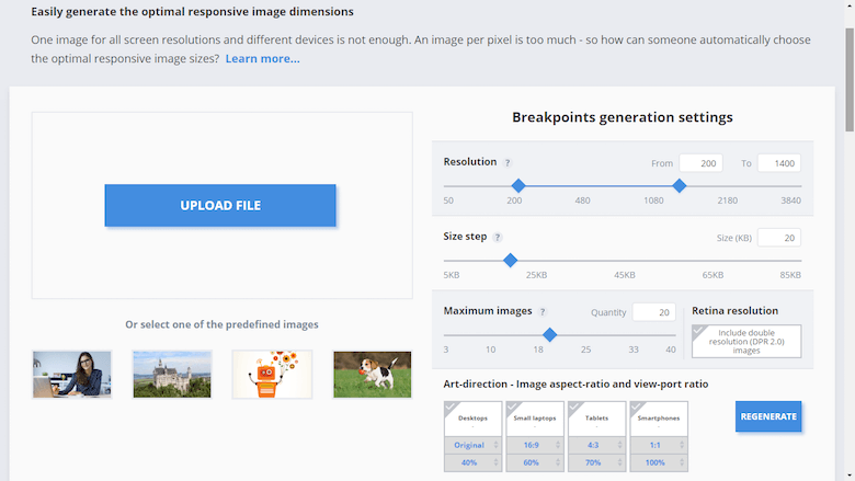
Image-Focussed Design Isn’t For Every Page
Getting people’s attention with aesthetically pleasing images certainly has value, but it comes at the price of making other elements harder to see and use.
Putting too much focus on images in your designs may create a visual overkill that can seriously distract users from meaningful engagement with your content. You can see this effect in SoundCloud’s app in which the image takes all the attention and you barely notice the two buttons.

Although image-focused design is appropriate in some cases (e.g. Apple’s homepage), the vast majority of apps and sites should follow a *balanced approach* — images that are used in user interfaces should support the product, but not obscure other important content or overshadow functionality.
Use Multiple Mediums
Both illustration and photography can be used within the same product.
- Photography is ideal to showcase specific entities and stories. For example, if we need to show not just any flower, but in particular a rose:
- Illustration is effective for representing concepts and metaphors, where photography might be alienating.


Have A Point Of Focus
Imagery is a visual communication tool that conveys your message. A clear focus communicates the concept at a glance, whereas a lack of focus makes the image meaningless.
When the point of focus is obscured, the iconic quality of the image is lost:

Avoid making the user hunt for the meaning in the image and ensure that a clear concept is conveyed to the user in a memorable way.

Try to minimize distraction and focus on meaningful elements in your images.
Show Real People
Human images are a very effective way to get your users engaged. When we see faces of other humans, it makes us feel like we are actually connecting with them, and not just using a product. However, many corporate sites are notorious for the overuse of insincere photography which is employed to “build trust.”

Usability tests show that purely decorative photos rarely add value to the design and more often harm than improve the user experience. Users usually overlook such images and might even get frustrated by them.
A very simple rule of thumb is to use high-quality photographs of people who match your app’s or website’s character. Imagery you use should be an authentic representation of your product, company or culture.

Tips:
- Try to avoid crowd shots; use photos that have a single main subject instead.
- Strive for images that represent genuine stories. Take photos of your people doing interesting things. If you have a product, consider ways they can interact with that product.
Blend Images With Designs
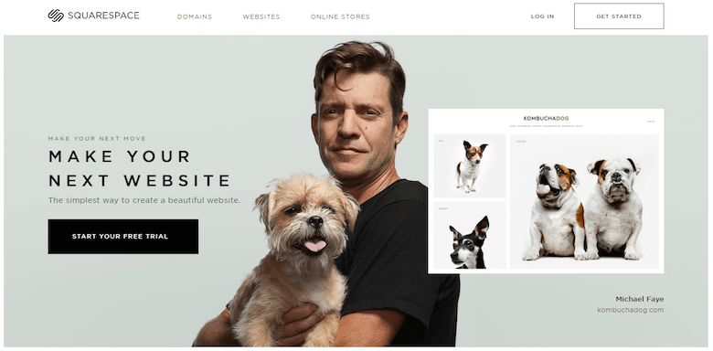
When using images in your design, ask yourself if the images you’re taking will match the aesthetic of your app or website. The homepage for Squarespace is a good example of focus on imagery. It’s elegant, clean and uses a huge amount of white space and large, full-screen images to create a bold design that grabs your attention.
Improve Your E-Commerce Design
The product image sells the item. Users often rely on the product image to assess product and it’s features. Regardless of your product, whether it be headphones or toys, product photography is the most important element of any e-commerce website. Ultimately, the more attractive your products look to visitors, the more confident they’ll feel about purchasing from you, and the better your conversion rate will be.
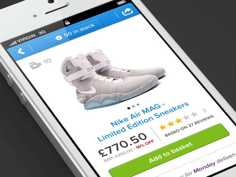
Make product images beautiful. A good image does all the hard work for you: It captures users’ attention and differentiates your product. However, good product photography requires work. Consider reading the article “Improve Your E-Commerce Design With Brilliant Product Photos” on how to take quality photographs of your products.
Let products sell themselves. Consider the Gorilla Pod example shown below. The photo demonstrates brilliantly the benefits of the product.

Display the primary image above the fold. Don’t make users scroll in order to see the main image for a product. The main product image should be anchored in a prominent position in order to merchandise your priority offerings.
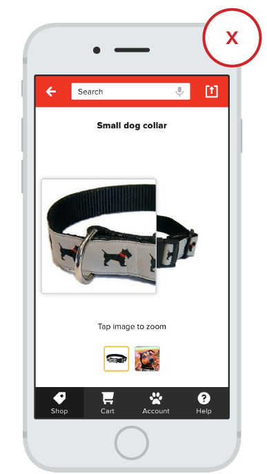
For the image to be effective it needs to be big — as big as you can make it. Then, when you’ve maxed out the size of your image, you need to integrate the ability to zoom in on specific details of the product. This is especially important for products like apparel where users are more concerned with detail. The zoomed-in images also need to maintain high quality.

Express Personality And Trigger User Emotions
Imagery can convey the essence of a product or service, but it can surprise and delight, too. Images have the capacity to entertain as much as to inform. If you already have a satisfying customer experience, adding delight to your product helps create an emotional connection with your users. Emotionally powerful imagery is a factor in ensuring that users continue to delve into your experience.
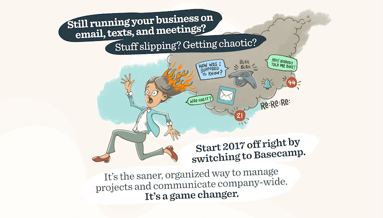
The emotional brain is affected by photos and illustrations, especially of people, and by stories. Speaking about illustrations, even sites or apps that don’t incorporate the drawn style throughout still can use cartoons for these purposes. For example, illustrations can be used for instructions, tutorials and empty states.

Real-Life Scenario: How To Pick Images For Landing Page That Serves A Purpose Well
Landing pages are essentially your shop window and in most cases you have only one chance to impress the user. When it comes to landing pages, you want your visitors to have just one task on your page: to convert. Great landing pages are built around solid user experiences and imagery plays important role in building this experience. When users come to your page, they’ll have some kind of reaction. Whether it’s positive or negative, in large part, is determined by what they see.
Following the advice “show, don’t tell” and:
- Choose imagery that fits your message.
It’s important to choose images that can simply explain the concept of the product or service. That doesn’t mean that the image needs to say everything — the image seen alone might not even seem to be clear, but it should logically fit when it’s connected to everything else on the page. It should visually reinforce the message you try to deliver to visitors. - Show images in the right place.
If the image supports a high priority goal, it should have more visual emphasis; conversely, images related to secondary goals should have less emphasis. The most important images should be anchored in a prominent position (i.e. above the fold), and should be a primary point of focus. - Choose striking visuals that capture attention.
Focus on selecting the most compelling images you can find. As Steven Snell mentioned, “A vivid, striking image will last in the minds of visitors. Text may be read and forgotten, but a strong image will be remembered.” - Use emotionally powerful imagery.
Your images should be emotionally persuasive — have an emotional impact and reinforce the feelings you are trying to create. After all, emotion often overrides logic when it comes to decision making.
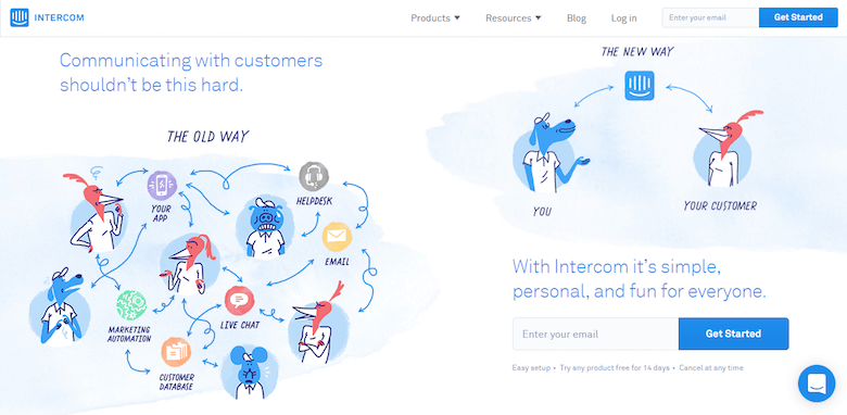
Below is an example of landing page by Intercom, a service that allows you to communicate with your customers more efficiently. The landing page takes a reasonably complex idea and makes it easy to understand how the product works, and why it might be beneficial.
Conclusion
Thinking about images in terms of their usability is important. All visual communication in your design leaves a cumulative impression on the user.
Compelling images have a unique ability to inspire and engage your audience to provide useful information. Take the time to make every image in your app or site reinforce user experience.
Recommended Reading
- Deciding When Graphics Will Help (And When They Won’t), Jared M. Spool
- How To Use Photos To Sell More Online, James Chudley
- Image-Focused Design: Is Bigger Better?, Kathryn Whitenton
"This article is part of the UX design series sponsored by Adobe. The newly introduced Experience Design app is made for a fast and fluid UX design process, creating interactive navigation prototypes, as well as testing and sharing them — all in one place.
You can check out more inspiring projects created with Adobe XD on Behance, and also visit the Adobe XD blog to stay updated and informed. Adobe XD is being updated with new features frequently, and since it's in public Beta, you can download and test it for free."
Further Reading
- In-App Gestures And Mobile App User Experience
- Best Practices For Animated Progress Indicators
- Designing Card-Based User Interfaces
- Powerful Image Analysis With Google Cloud Vision And Python


 Get a Free Trial
 Devs love Storyblok - Learn why!

 JavaScript Form Builder — Create JSON-driven forms without coding.
 Register For Free
 Smart Interface Design Patterns, 45 lessons + UX training

