How To Make Use Of Weekly Design Meetings
How do you keep a team engaged? How do you make sure the team gets up to date with everything that’s being released? How often do the team members talk to each other face to face? Do they have enough support to finish their tasks or to pursue their growth?
These are questions that popped in my head once a design team started to grow quickly in front of my eyes. As a team leader, I was faced with a new challenge: making sure there’s enough recurrence in my team’s communication to facilitate the team’s development. Enter the weekly design meetings.
The Problem
While taking IDEO.org’s Design Kit as part of our education plan, the course encouraged us (the design team) to meet week after week to discuss and solve real-world design problems. After finishing the course, we got back to our plain old habits, consisting of daily stand-ups and Monday morning meetings with the rest of the teams. But here’s the funny thing: The design team continued to feel the need to meet and engage with certain topics — especially since the team was split between two office locations. With this in mind, we thought, why not pursue the idea of an internal weekly design meeting?
The Format
We gathered around and sought to find a structure that fits our needs. We were looking for a way to keep the team connected, share the progress of our current tasks, prevent possible obstacles, solve issues, discuss topics of common interest and improve our skills. After a few brainstorming sessions, we came up with a one-hour format that felt right for our small team of four designers. We even gave the meeting a nickname: The Design Kiosk.
The Structure
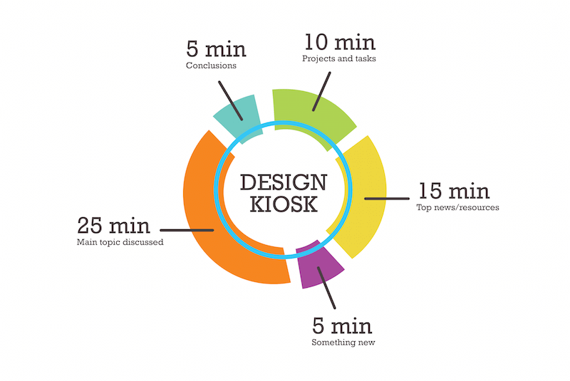
In a nutshell, The Design Kiosk consists of:
- 10 minutes for going through our current tasks and our top priorities for the company’s objectives and key results (OKR);
- 15 minutes for sharing the latest articles we’ve read, links we’ve found and other useful resources we’ve discovered (up to three for each member);
- 5 minutes for sharing a quick design tip that we learned in the past week (Photoshop, Sketch or other); for example, pressing “Alt” in a Photoshop panel displays the “Reset” button — Yipee!;
- 25 minutes for the main topic to be discussed (this could consist of how to adopt the latest design trends, or how to improve our presentation skills, or how to organize the style guide for our agency’s website);
- 5 minutes for wrapping things up, writing clear actions to be taken and deciding on the main topic for next week.
A Spreadsheet Template
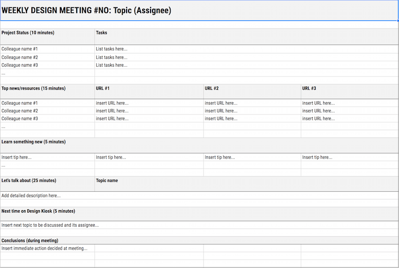
To store and keep track of all that’s been discussed and shared, we created a spreadsheet template on top of the structure. It’s practically our own meeting journal that we come back to every time we want to check a resource or go through what’s been decided. It’s a great tool to avoid losing focus and to keep things floating in the right direction. The template is organized in sheets for each week, and it follows the Design Kiosk’s structure. You can check the template yourself and see an example of meeting notes.
How It Works
Having a structure and a template to work with is not enough. We’ve settled on a few ground rules in order for the meetings to unfold properly. Here’s how a meeting actually goes:
- All members must participate.
- The meeting is on a Friday — this allows us to be on the lookout for what’s coming the following week.
- Each meeting has a different coordinator responsible for preparing the template and making the agenda for the main topic. That person makes sure everyone fills in the template for that week with their tasks’ statuses and their recommended resources.
- The assignee coordinates the whole meeting and goes through each item in the list.
- The coordinator makes sure we stay on track and don’t deviate from the main topic. They are responsible for stimulating their colleagues to engage and express their opinion.
- Throughout the meeting, the coordinator takes notes and makes a list of immediate actions to be taken.
- At the end of the meeting, a new topic and coordinator are decided for next week.
- The process repeats itself.
This process of switching coordinators among teammates provides diversity and adds a unique flavor to each meeting, while keeping every member involved.
After 10 Meetings
Results
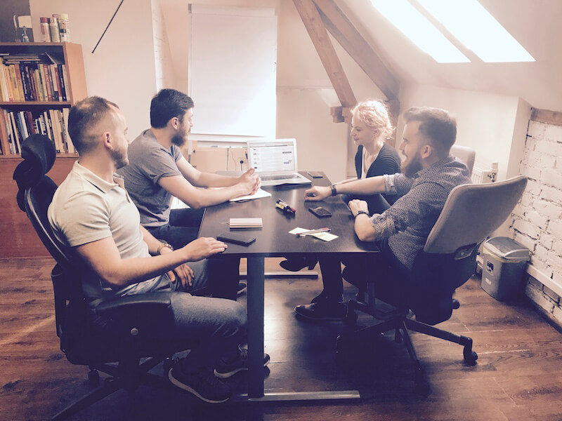
Looking back at the first 10 meetings, we went through over 100 resources and tackled 2 main design challenges.
The first challenge was recognizing that each of us has our own comfort zone when it comes to UI design — using the same safe patterns and behaviors from the very beginning. To deal with this, we decided to have assignments in which each of us had to create UIs for certain smart devices (IoT) using the current trends. The second challenge was improving our presentation skills as a team and individually. We participate in a lot of conferences, meetups and sales pitches, so everyone must practice their speeches, cases and gestures. To do that, those main 25 minutes were reserved for practicing our pitching skills. Focusing on these two challenges was an inspired move — the improvements were clearly visible with each round of slides or concepts we presented at the events and sales pitches that followed. It proved to benefit not only the team, but also the company.
Moreover, our content team adopted the meeting model (adjusting it to their needs), while the development team created their own format inspired by our model.
A Smart Example
Let’s rewind a bit and go into detail on how we started to exit our comfort zone in UI design through these kinds of meetings.
First, we set up a meeting in which we discussed the main visual trends in UI and web design (from bright colors and smooth gradients, bold typography, subtle shadows and blurs, UI cards and custom grids, to conversational interfaces, video, and VR and AR experiences — to name just a few).
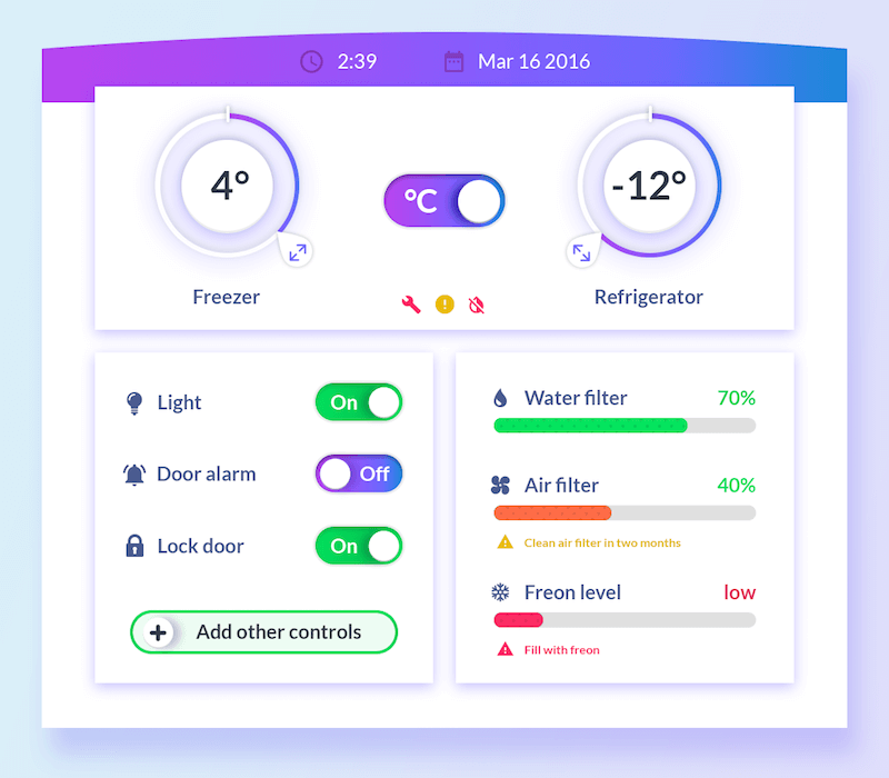
For the next meeting, we set up a few assignments. Each of us had to pick a “smart device” and create a screen of an imaginary app interface. We went with a smart trash can, a smart fridge and a smart mop. Each of us chose to work individually with one of the concepts. These proposals allowed us to go nuts and freely explore new patterns and trends. The following week, we presented our concepts and gave feedback to each other in just 25 minutes (because it was the main topic of the week).
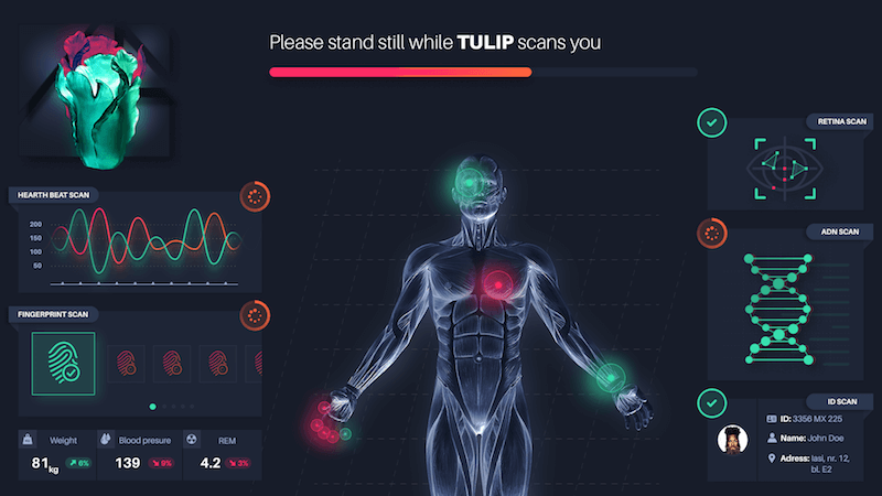
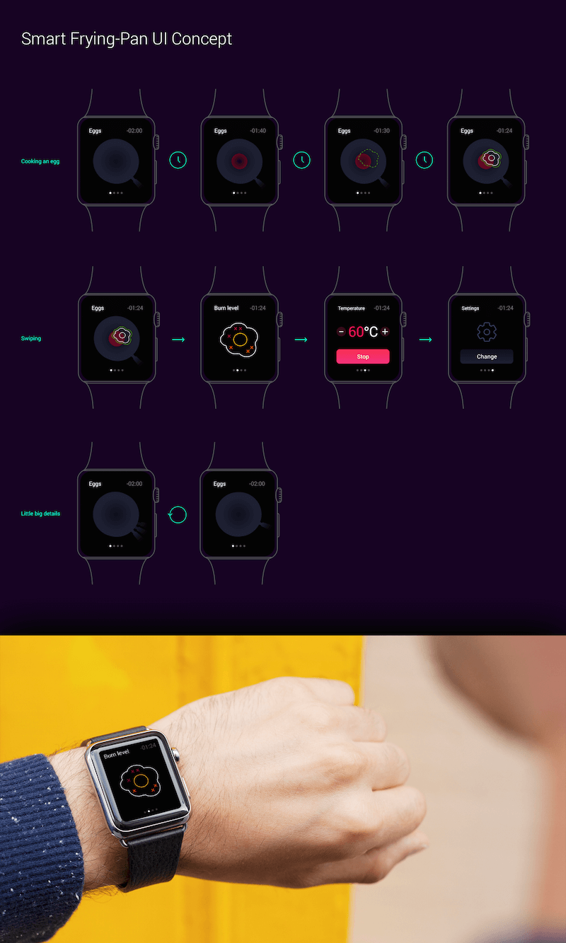
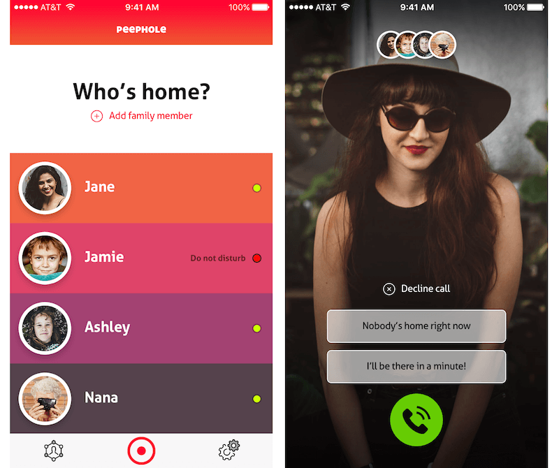
One set of assignments wasn’t enough. The following month, we made another batch of UIs for smart products, this time for a frying pan, a doorbell, a visor and a biometrics scanner.
Realizing that these practices are useful for the team, we decided that we must have one monthly meeting for UI concepts and another for presentation rehearsals.
Challenges
During these 10+ meetings, we faced a few challenges and changes.
For starters, when homework is involved, we do not meet again until everyone finishes their assignment. It’s comfortable to skip a meeting just because “we didn’t have time.” Also, it’s very important that everyone attends the meetings (except when people are on vacation — we’re only human, after all). And let’s not forget the unpredictable agency life that forces us to reschedule.
We removed the “Design tip” section because it seemed a bit forced, and the tips were starting to be added just to be added. So, we decided that if we have something to share, we would do so when listing the links and resources, thus leaving more time for the main topic.
At first, only three colleagues were attending. Now, with more members participating (including a colleague learning UX design so that she can switch careers), we are thinking of adding extra time to the meetings.
Final Thoughts
Looking back at how much we've explored and discovered during these meetings, we have no plans to give up on them. The team is excited, and if we were to go back and change anything, it would be to have organized ourselves sooner. The meetings help the team to communicate, collaborate and grow. If you're part of a team, I recommend you give it a try and adapt the template formula to your group's needs.
Further Reading
- Becoming A Better Facilitator
- How To Streamline Creative Dialogue
- How To Communicate Effectively In IT Projects
- Up On The Wall: How Working Walls Unlock Creative Insight


 Agent Ready is the new Headless
 SurveyJS: White-Label Survey Solution for Your JS App


