Challenge Yourself More Often By Creating Artwork Every Day
Whether you’re into good ol’ drawing and painting, or quick editing in Photoshop or Illustrator, one thing’s for sure: they’re all creativity’s best friends. Some draw pictures all day, while others find their inspiration in uncommon sources in order to break out of the box. Whatever it is that you decide to do, it’s good to challenge yourself more often and get out of your comfort zone. If you don’t, you may never discover something that you love doing, or perhaps even worse, never learn a whole lot about yourself.
If your excuse are pesky blackouts or simply having no clue what to create nor where to get started, don’t fret! Even the most talented artists out there practice so much more than you’d ever imagine, and hone their skills by trying out copywork. The most important thing is to be confident and simply give it a try. For more encouragement, I’ve collected a good number of inspirational artwork that is bound to give you that spark you need to get started already!
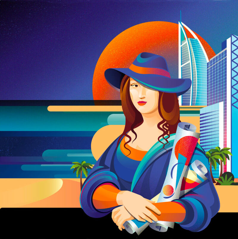
ING Creatives 2017
It’s quite obvious where they got the inspiration from. Very well executed.
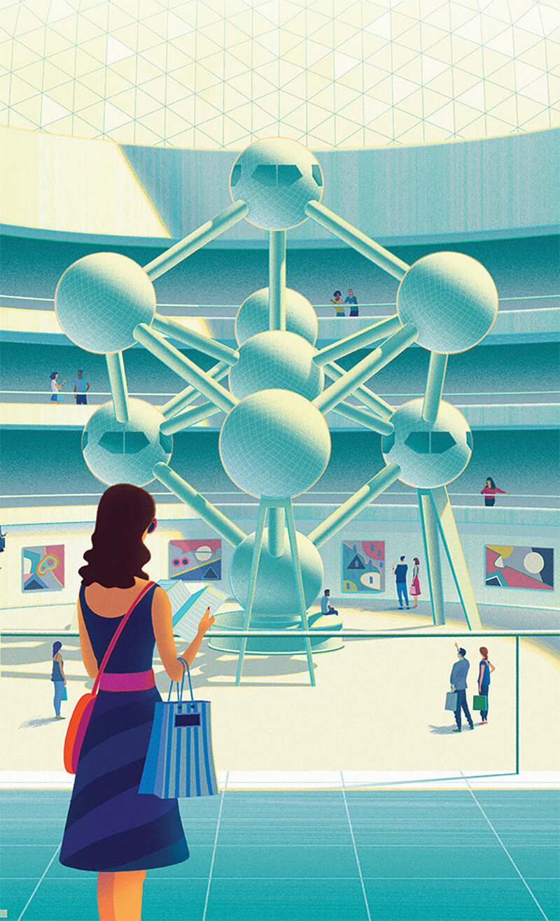
Shop — Belgium
Hard not to love this. Just look at the shadow and light effect on the Atomium, and the subtle texture pattern in the spheres. So well done.
Kinkaider Brewing Co. — Moscow Mule
Interesting choice of colors. It gets the adventure spirit going. Those line textures are also very well applied.

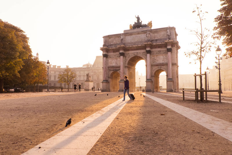
Golden Light At Paris
Beautiful timing to get that amazing golden hour work for you. Combine that with Paris and you get this result.
Balanced Life ?
Love the hairline, handlebar and wheels. Super cool!

Hacking — Crayonfire
An editorial illustration for DB Magazine in the US on the subject of the dangers of hackers within the hospital system. Beautiful style, colors and patterns.

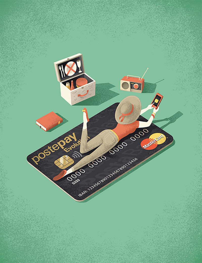
Poste Italiane
Nice perspective, and beautiful style. I love the radio.
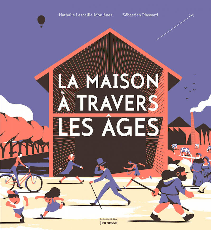
La Maison À Travers Les Âges
The surreal world of Sébastien Plassard.
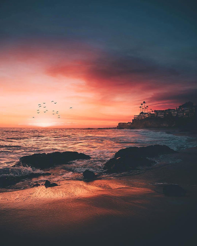
California Sunsets ?
Such a beautiful shot with a perfect fly-by by those birds. Amazing colors.
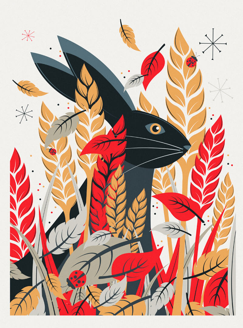
Nature Prints
A selection of recent prints created with a wildlife theme. Go see the others, too.
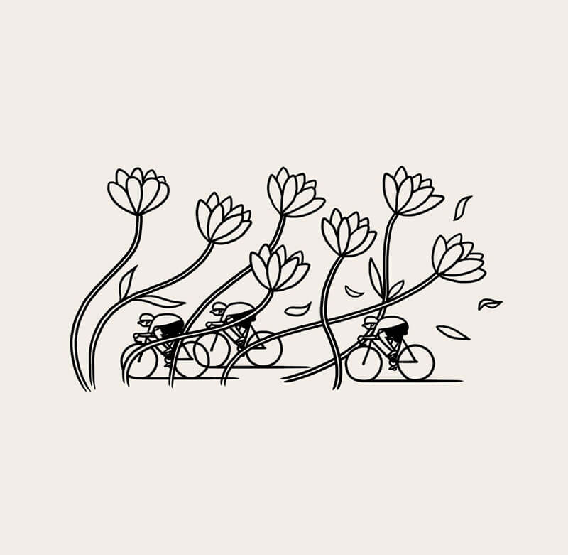
Belgian Headwinds
Beautiful! However, when your legs don’t want to cooperate it can be something else.
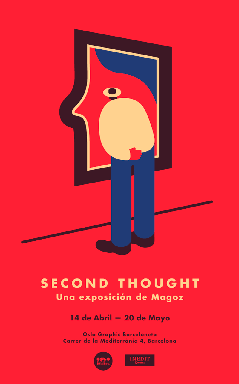
Second Thought Poster
One of winners of Communication Arts 2017. I love the duplicity in here. Very clever!
Escada
Wonderful usage of vivid colors used in this fragrance brand illustration.
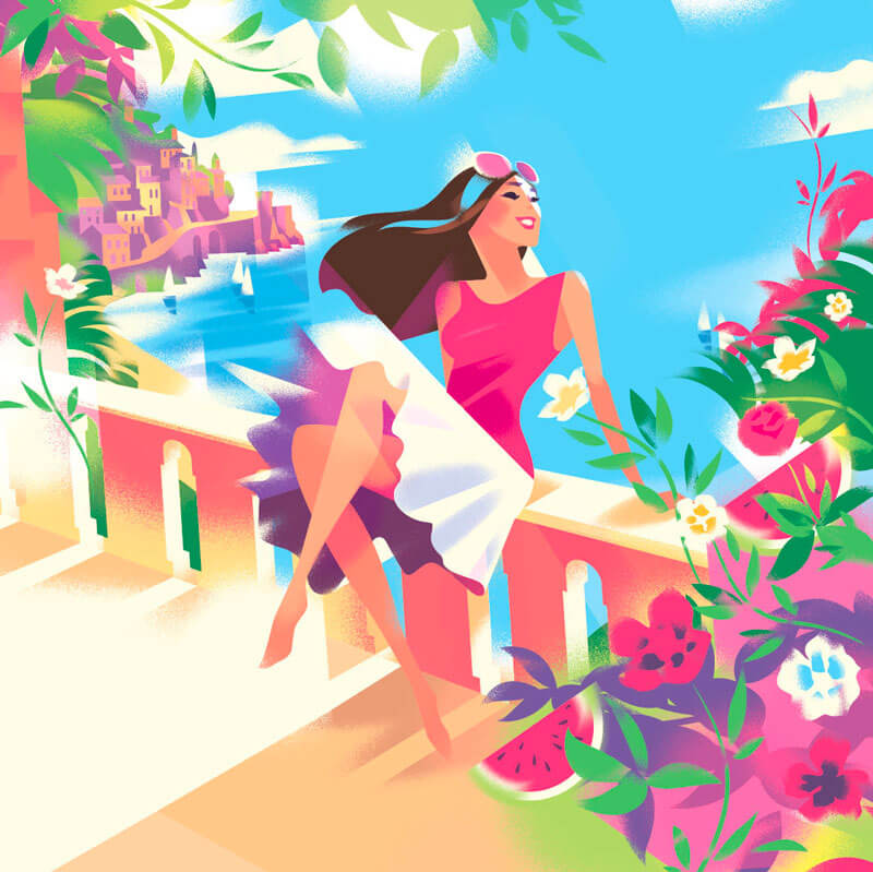
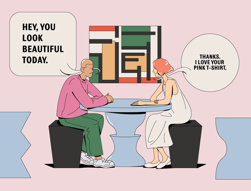
Illustration For GQ Magazine, Thailand
The muted colors work very well together. I’m also inspired by the simplicity of the shadows.
ING Creatives Festival
The reflection in the helmet, and reflection of the light on the suit are nicely executed.

ING Creatives Festival II
Much to love in here such as the custom typography, the special dog and the color palette.

Mortirolo-Gavia
Simply gorgeous!
Design In Alert
Still from an illustrated animation. The finished video of Festival Bienal is quite nice.

100 Years Of La Rinascente
Love the elegance in this design style.
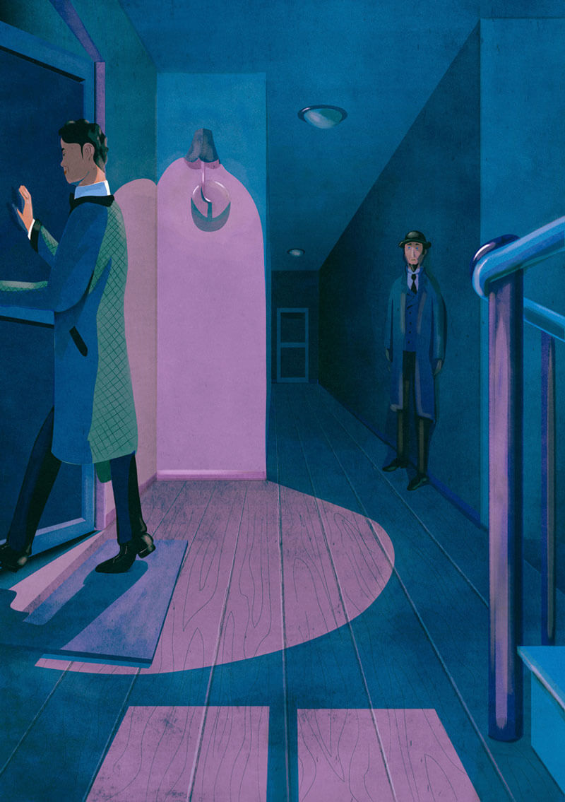
The Thirty-Nine Steps
The suspense is all over this illustration for the novel The Thirty-Nine Steps. Makes me want to read it.
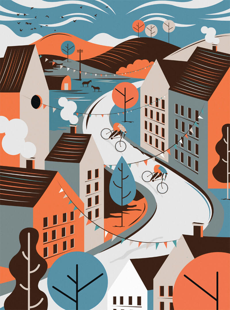
Countryside Cycling Prints
Inspired by those long countryside curved roads. Love how the colors are applied.
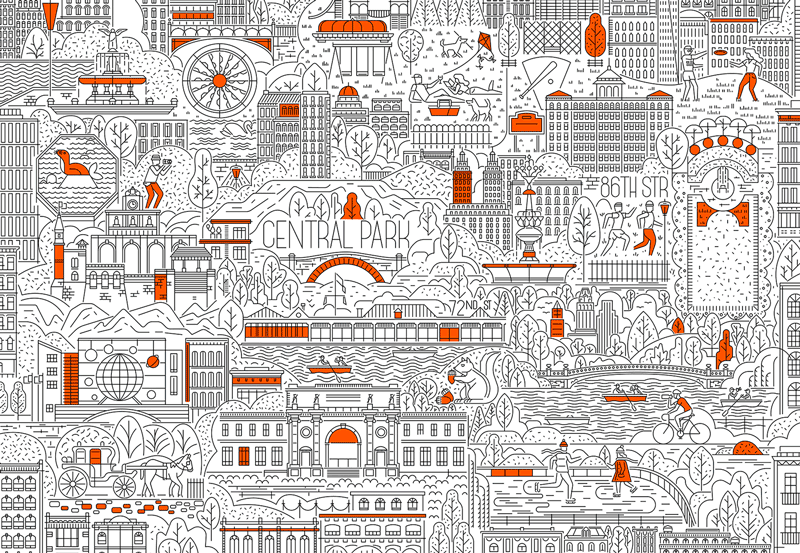
Manhattan — Muti
Love the amount of detail and simplicity with the 1 line weight and the minimal use of color.
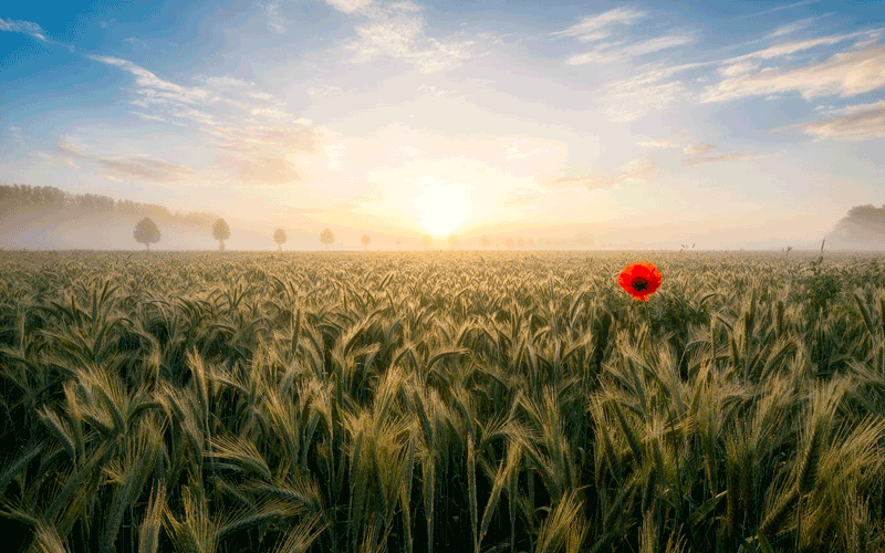
Foggy Sunrise
Wonderful landscape and atmosphere with fog, foreground and one red poppy!
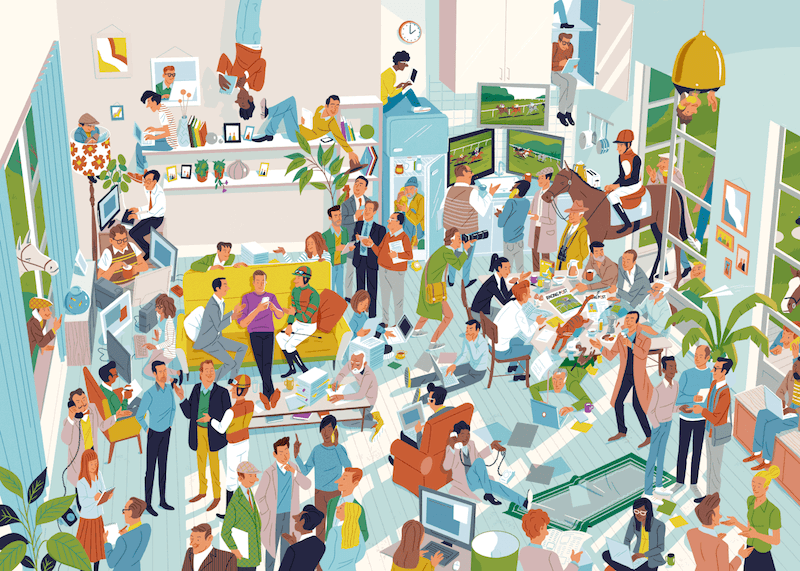
Racing Post
So many things to discover in this beautiful piece. Made me smile. I really love the busyness here. So well executed.
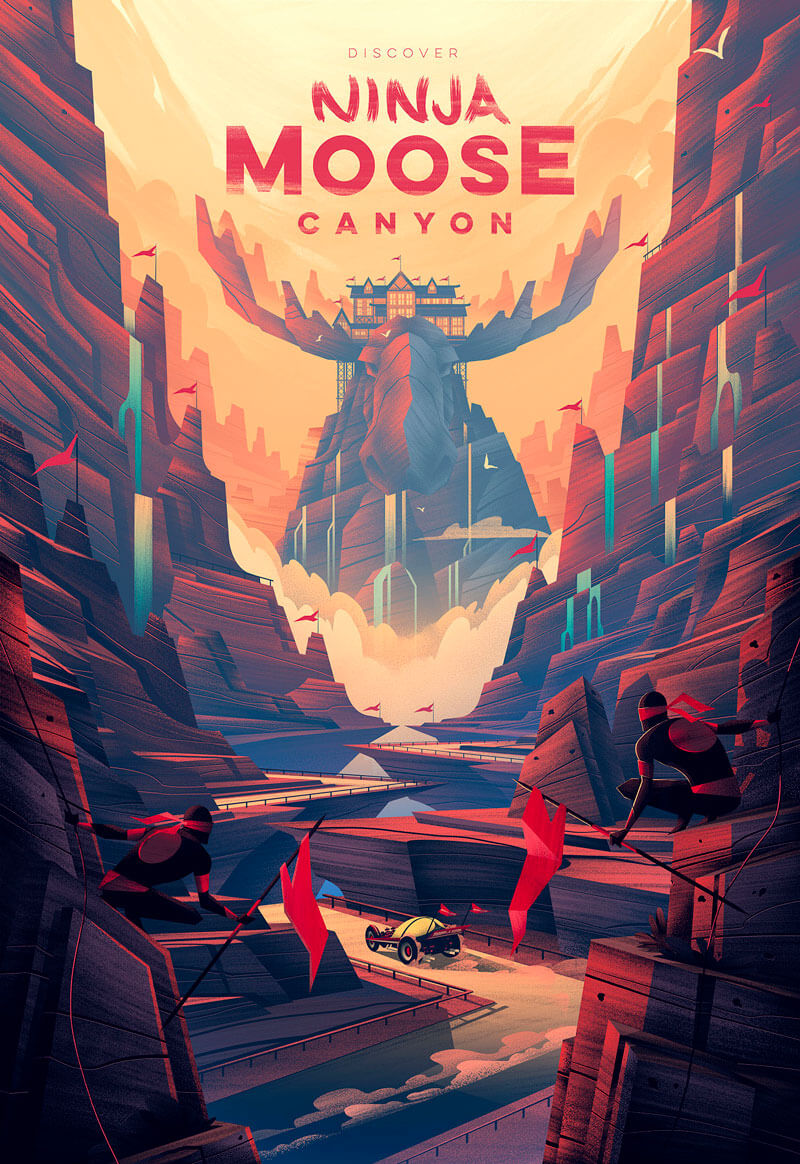
Radio Flyer 100th Anniversary Poster
Great poster. Love the impressive impact. Read about the design process.
Geometry In Architecture
Great geometry and wonderful reflection of the sky.

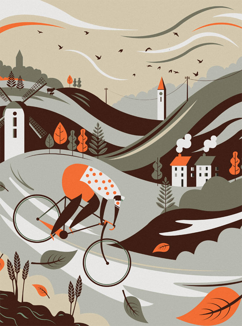
Countryside Cycling Prints II
Inspired by those long countryside curves. You feel the speed in this one. Available as a poster.
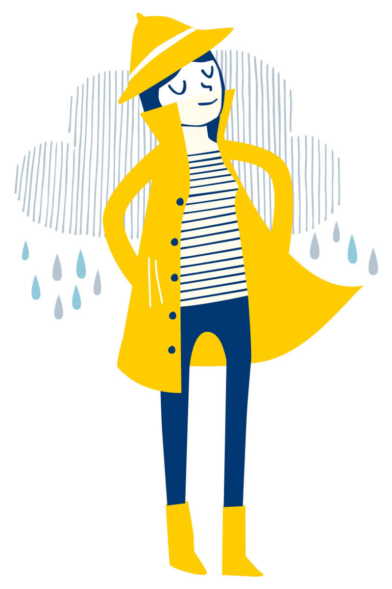
Seasalt Rain Branding
Part of a selection of characters which personified the incredibly functional yet stylish Rain collection. See the other characters, too.
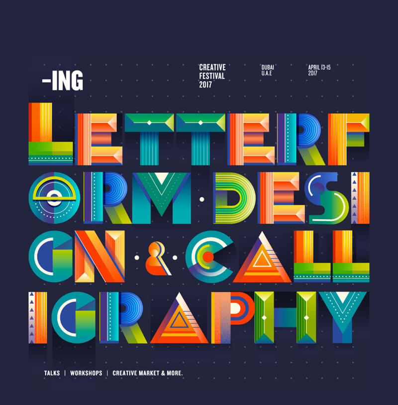
Letterforms And Calligraphy
Lovely mix of colors and beautiful custom typography.
Colorful Boxes
Playing with color, shapes and shadow. That’s what you’ll see in this series called Colorful Boxes. Absolutely love the very bright colors in this one.

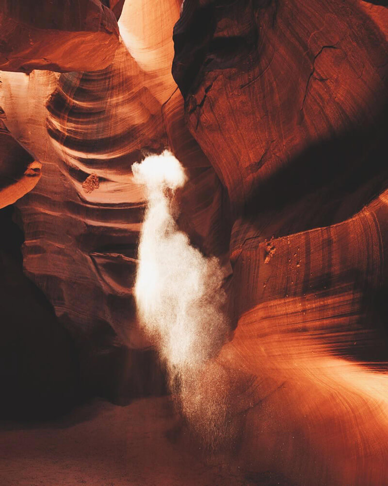
Antelope Canyon
Amazing capture! It’s Antelope Canyon in Arizona. It looks so surreal, just like paint strokes.
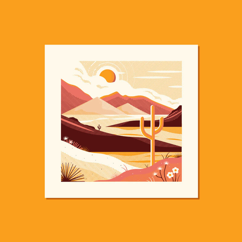
Desert Landscape Study
The 45 degrees lines made the final work looks really unique. Look at the shadow and light effect on the cactus. So well done.
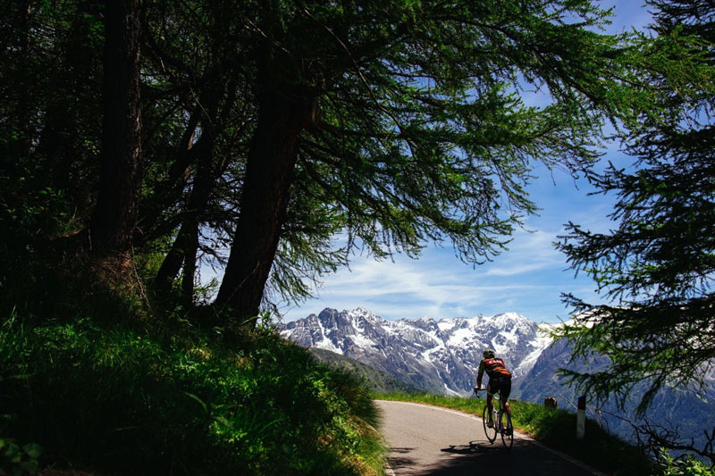
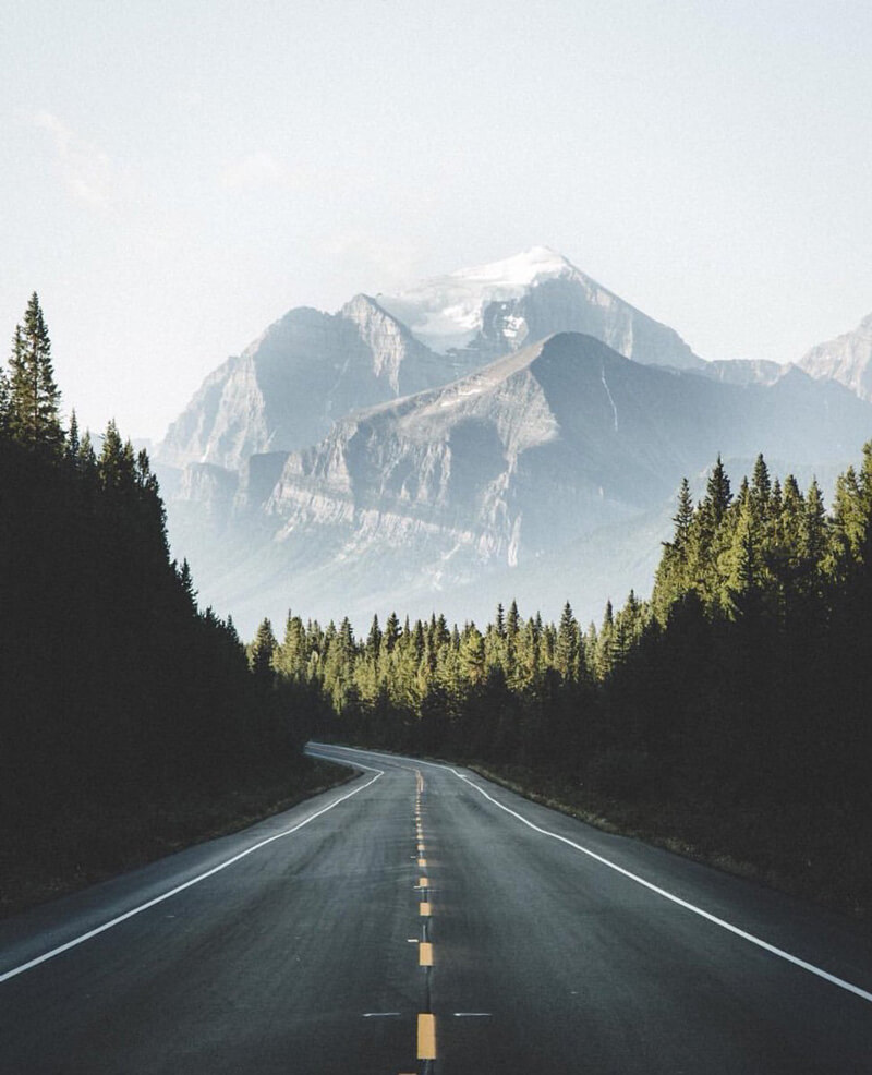
Mountain Roads
Views like this are the reward for all the suffering to get there.
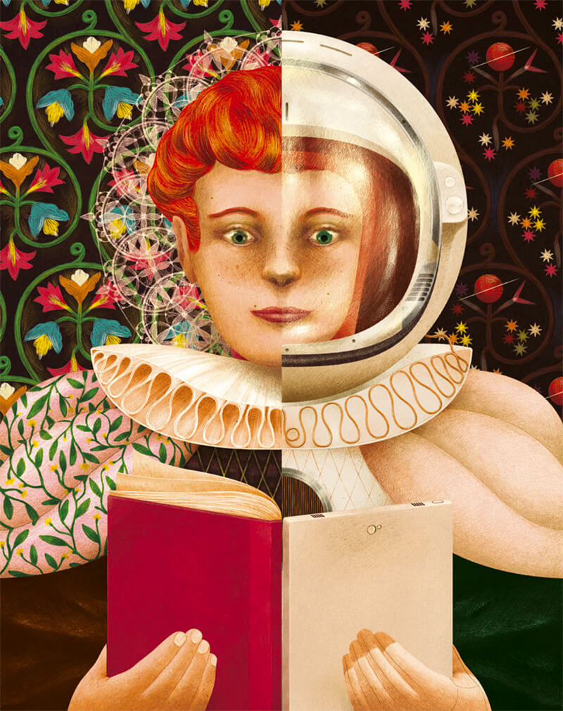
The History Of The Book
Opening illustration for an article about the history of the book. Beautiful style and details! The hair is nicely done.
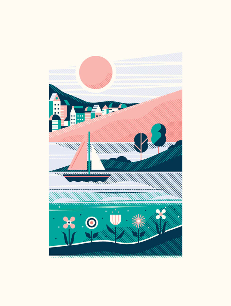
Seaside
Inspiring color combinations.
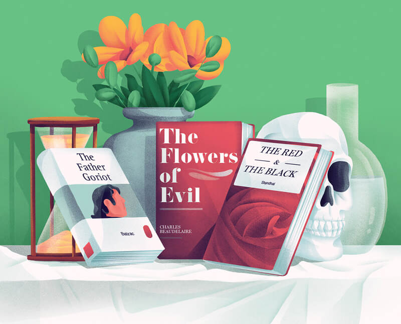
Usbek & Rica 22
Great shadows and gradients, and lovely soft style.
Pavillon Gazon
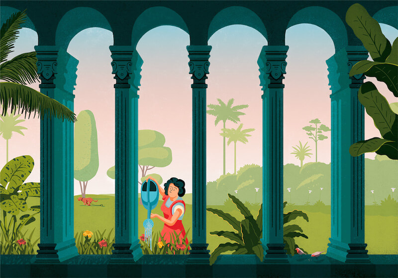
Great unity. Love the cute detail of the dog running away.
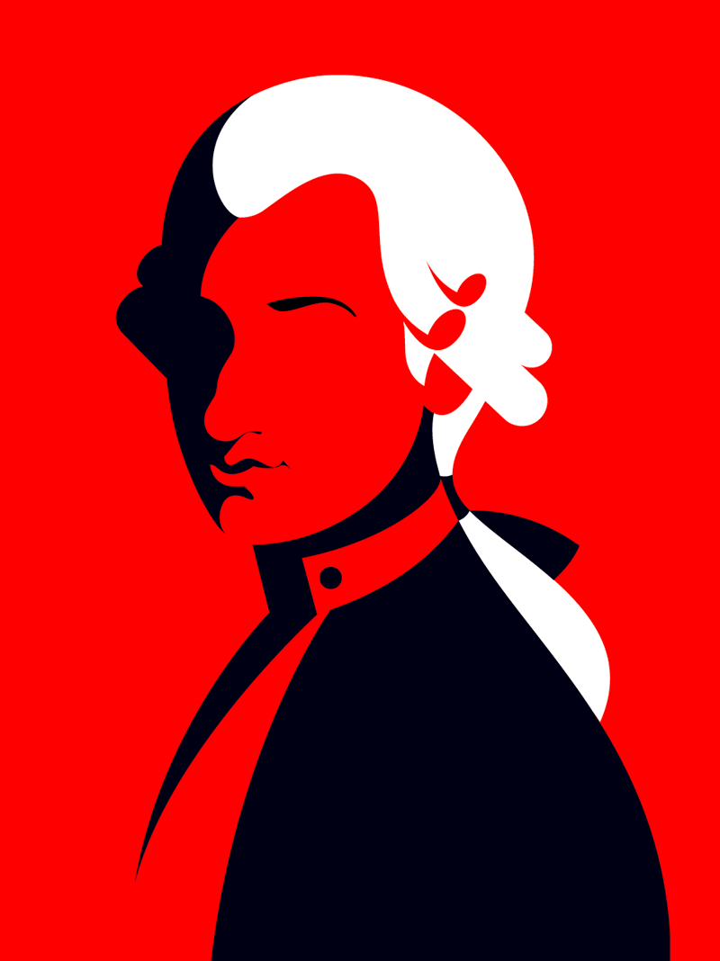
Mostly Mozart
Perfect example on what you can achieve when using negative space.
Mexican Dude
Gotta love the cacti as well as the colors here — obviously.

Designing For Growth
An illustration for Etsy for their medium blog about designing for growth.

Information Overload
Dealing well with flood of information. Very well translated.

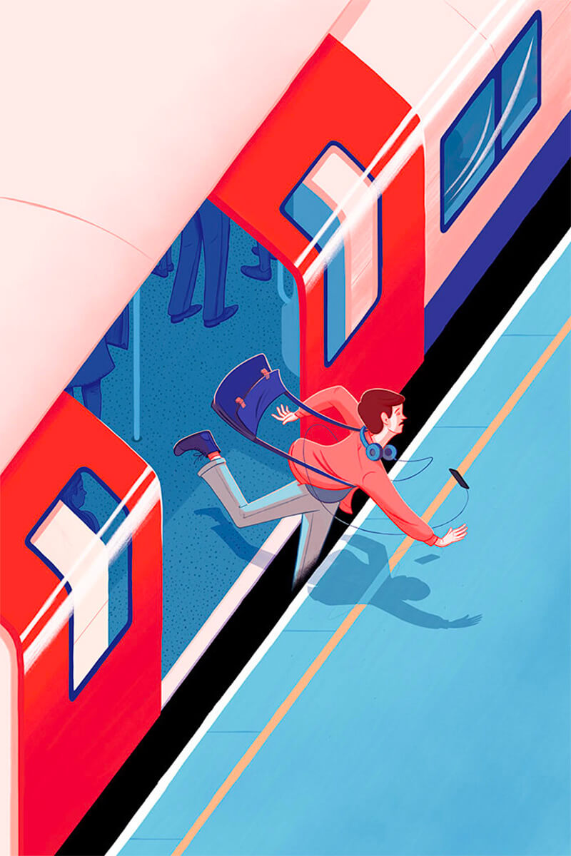
Train Safety, Mind The Gap
Nicely done Mind The Gap train safety poster.
Under Construction
Beautiful color palette in this one. The reflections on the windows are nicely done.

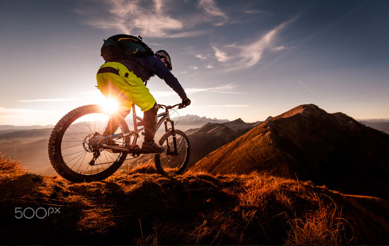
Trail Bliss
Never stop exploring! Fantastic action shot with superb light.
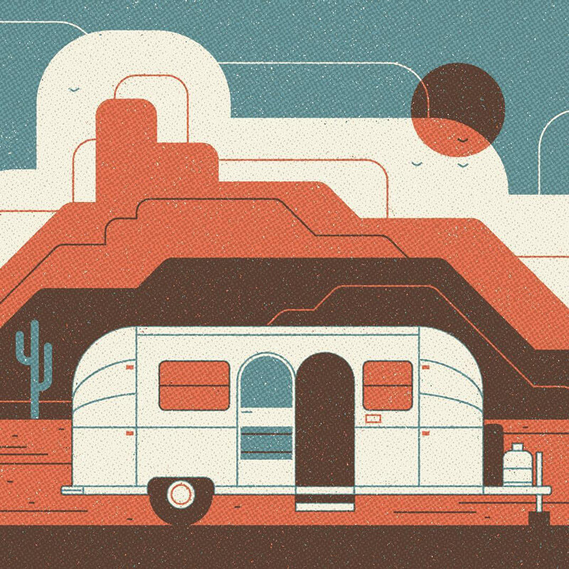
Airstream
Pretty sweet texture work and great color choices.
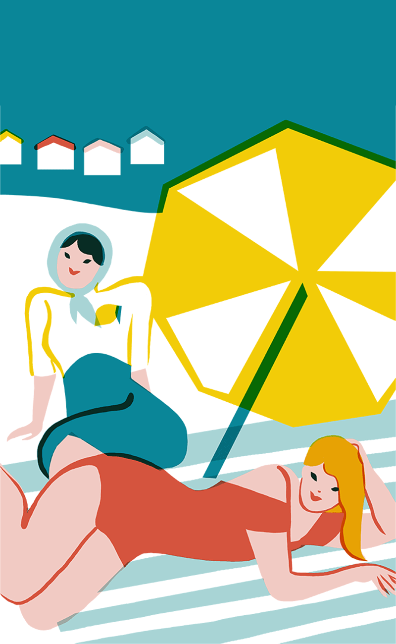
Bons Baisers De Lemon Bay
Admiring the simplicity of this style.
Segment
Not your everyday color palette. I really like the idea of leaving color out. Beautiful design style.

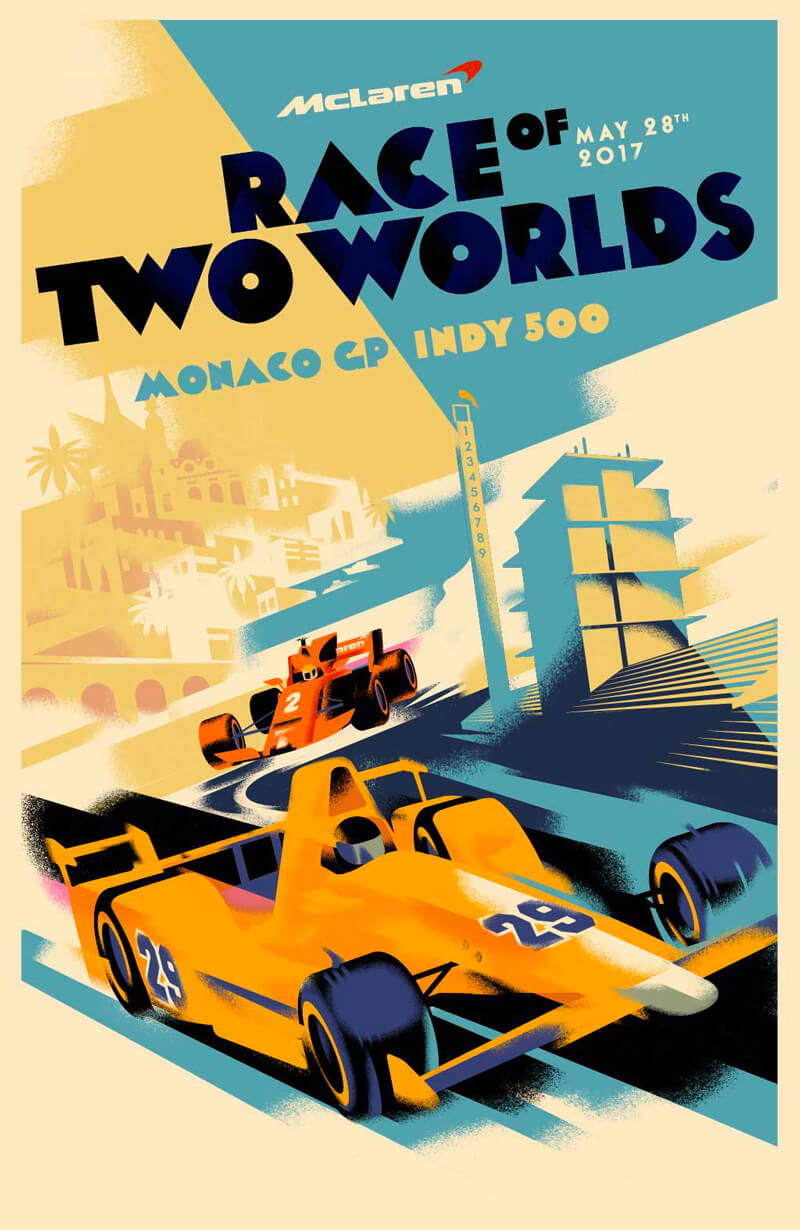
McLaren Poster Illustration
Always a pleasure to introduce some new work from Mads. Love how he played with perspective in this one.
Jazz
That clarinet player is just perfect. I love how his finger draws your eye up to the piano player with that matched fine line.

Further Reading
- Finding Inspiration In The Little Things Around Us
- As Far As The Eye Can See: Colorful Sceneries, Posters And Covers
- Spotify Playlists To Fuel Your Coding And Design Sessions
- Upcoming Web Design Conferences (June–October 2017)


 Devs love Storyblok - Learn why!


 Enterprise UX Masterclass, with Marko Dugonjic
 Get a Free Trial
 JavaScript Form Builder — Create JSON-driven forms without coding.

