Learn From What You See: It All Starts With Inspiration
The world around us is full of little things and experiences that shape us, our way of thinking, but also how we tackle our work. Influenced by these encounters, every designer develops their unique style and workflow, and studying their artwork — the compositions, geometry of lines and shapes, light and shadows, the colors and patterns — can all inspire us to look beyond our own horizon and try something new. It really doesn’t take much to let your mind wander. Always remember to take a closer look at things around you; you’ll be sure to find inspiration in the little things. But for now, let’s dig into another collection of brilliant illustrations and photographs.
Staying Out Of The Gray Zone
Do you often find yourself having mental blocks? Why not get out a bit and attend an event? We've prepared a list of upcoming events that will help you make a shift in your mindset. Read a related article →
Get Ready: It’s Friday
What a great friendly vintage atmosphere! Well done.

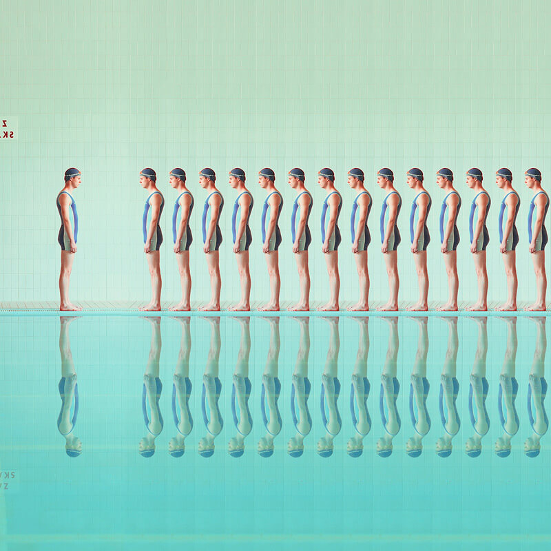
O r i g i n s
Latest project from Maria Svarbova. Again, cleverly playing with symmetry and color.
Inventing The Future Of Space
Diging the retro-futuristic-exciting style in this one.

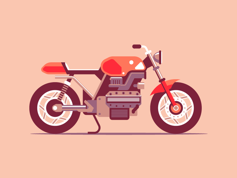
Cafe Racer
Perfect lines and shapes, but also such great use of color.
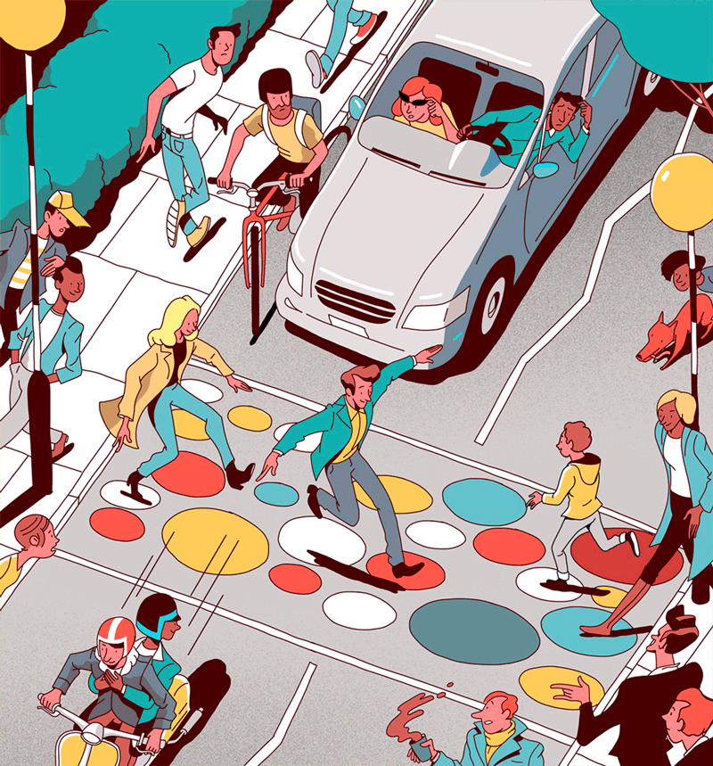
Cycling Plus Magazine
Loving the special color choices in this illustration, and all of the movement that’s been going on.
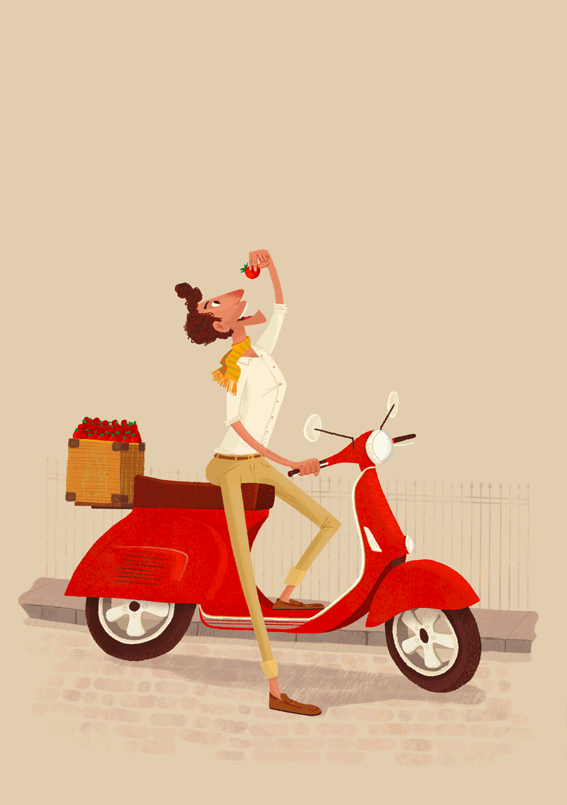
Stop! Tomato Time.
You should always stop to taste a delicious tomato. I like the atmosphere created in this one.
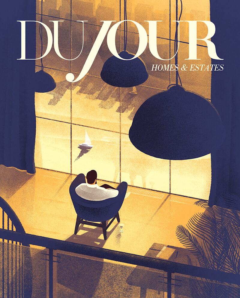
DuJour
Clever concept and execution mixed with subtle use of color and texture.
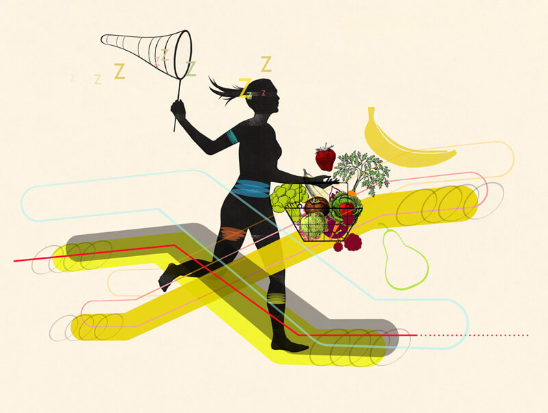
Food & Nutrition Magazine
Great black silhouette to use as a centerpiece in this illustration so that everything else can be in color.
Time Travel
A brilliant choice of style and textures in this one!

Exploration
Wow. Now these are some exceptional colors. Loving the vibrant contrast!

Essensys
This one has quite a special style and excellent usage of textures.

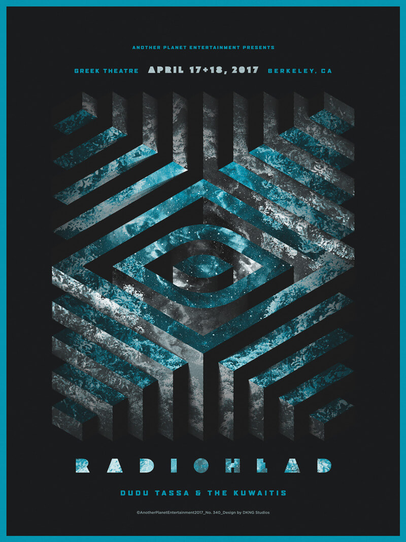
Radiohead Berkeley
DKNG got to create a poster for their favorite band Radiohead playing at the iconic Greek Theater in Berkeley, CA. Beautiful geometrical design with superb dark shadows and light effects.
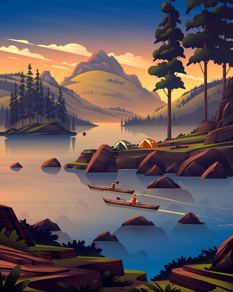
REI 4th Of July
It’s a wonderful thing to get to see the imagination of an illustrator who thinks “imagining what it would be like to paddle a kayak on those serene sunset waters”… The colors and gradients used here to reflect the sunset are just so well done.
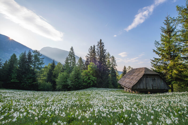
Mountain Barn
Just look at that view!
Google People
Nicely designed character poses. I love the subtle background elements and overall cute style.

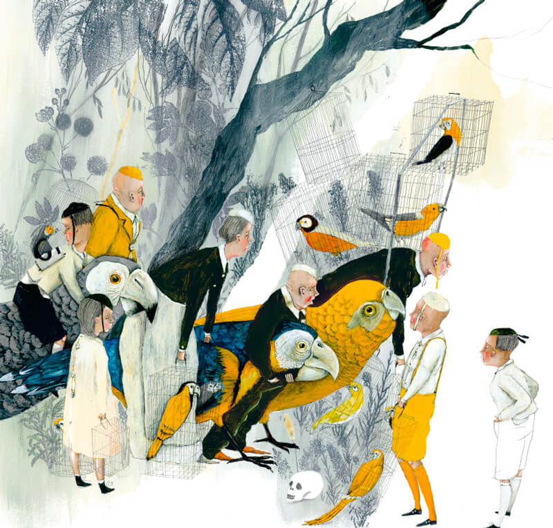
The Golden Cage
Gorgeous style by Carll Cneut from Belgium.
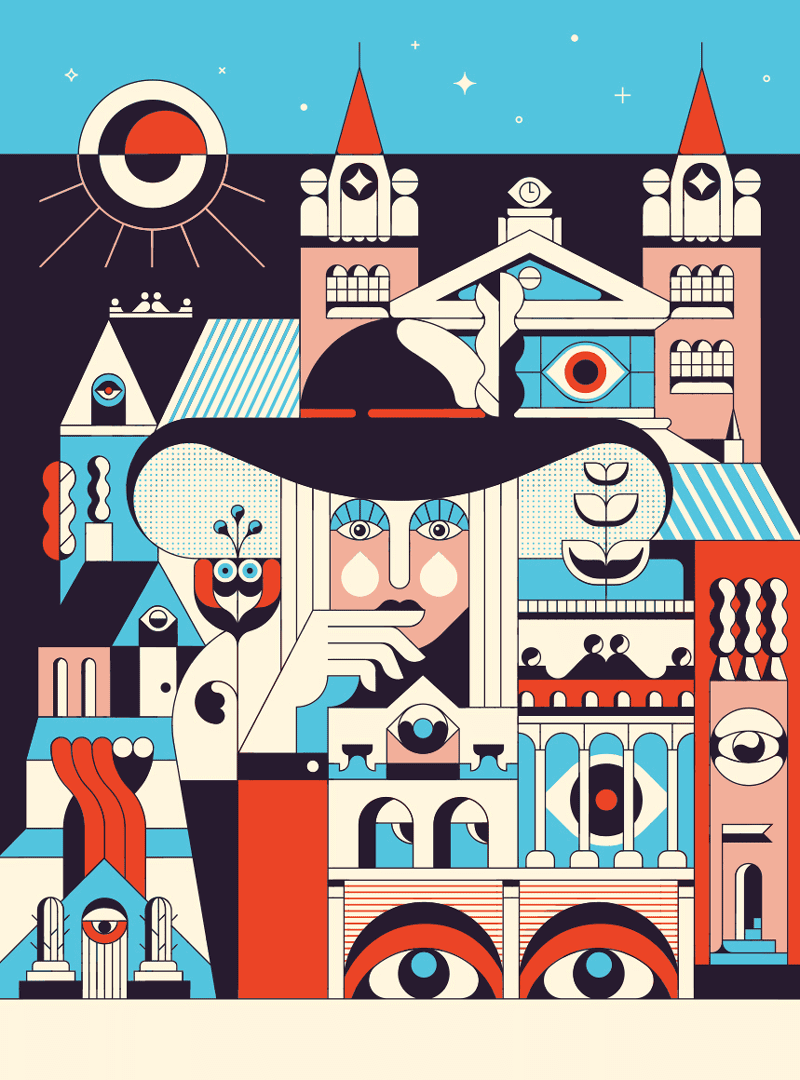
Heavy Eyes
All those lovely eyes!
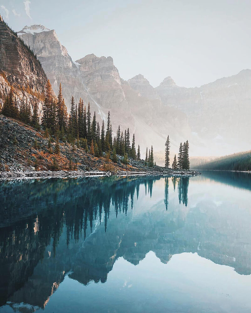
Moraine Lake, Banff
I love these reflections and the beautifully soft light. Such an incredible and tranquil image.
Men’s Health - Realty Check
On point! Part of the head makes me think about Magnum P.I. played by Tom Selleck.
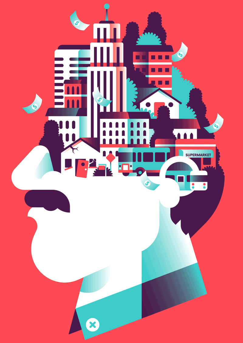
Comfortable Giant
Nice work, especially the color choices and the toned down background scene.
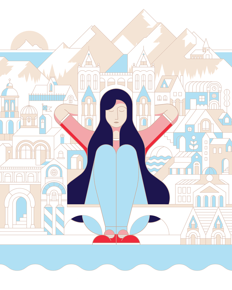
Siesta Beach
Pretty spectacular sunset at Siesta Key Beach.
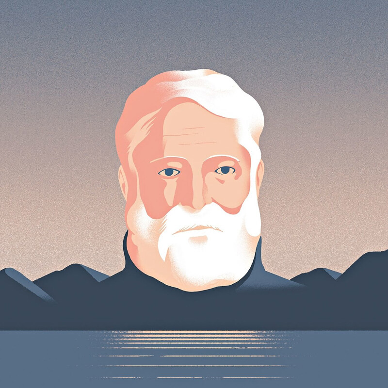
Hemingway
Great illustration by Sébastien Plassard. The beard and the hair are simply beautiful.
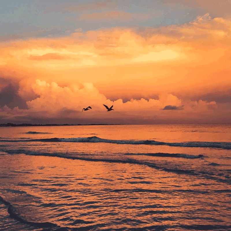
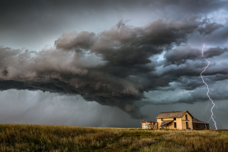
Oklahoma Storm
Incredible shot captured in Keyes, Oklahoma by storm chaser Vanessa Neufeld.
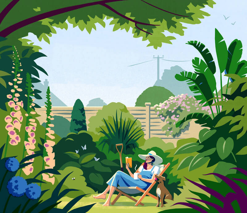
Guardian - What I’ll Be Reading
Really nice illustration and some inspiring color choices.
The Hound And The Hare
The patterns throughout this piece are mesmerizing. Loving that gold accent color as well.

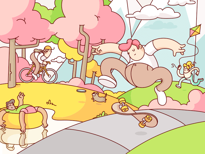
Johns Hopkins Magazine
Loving those candy colors. Also look at that skateboard! I love this ‘gummy’ bendable look.
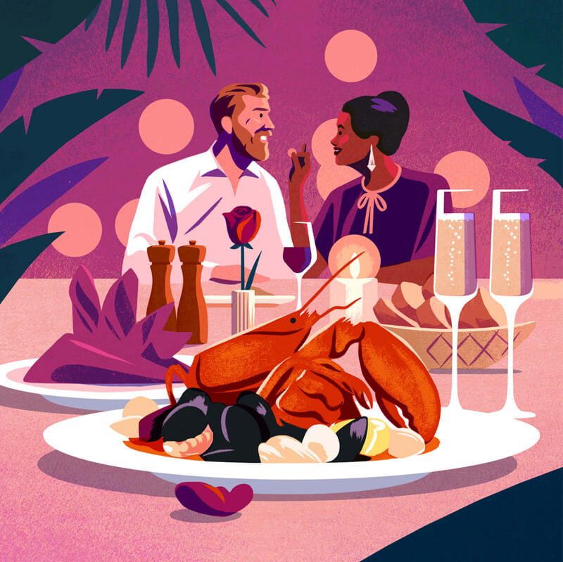
Opentable
Such beautiful contrasts! The subtle textures like on the lobster gives this one an edge.
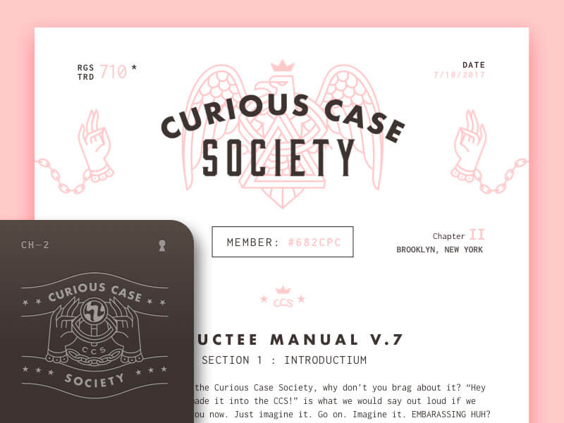
Curious Case Society Inductee Manual V.7
That eagle and those hand combos combined with the typography are making this a great shot.
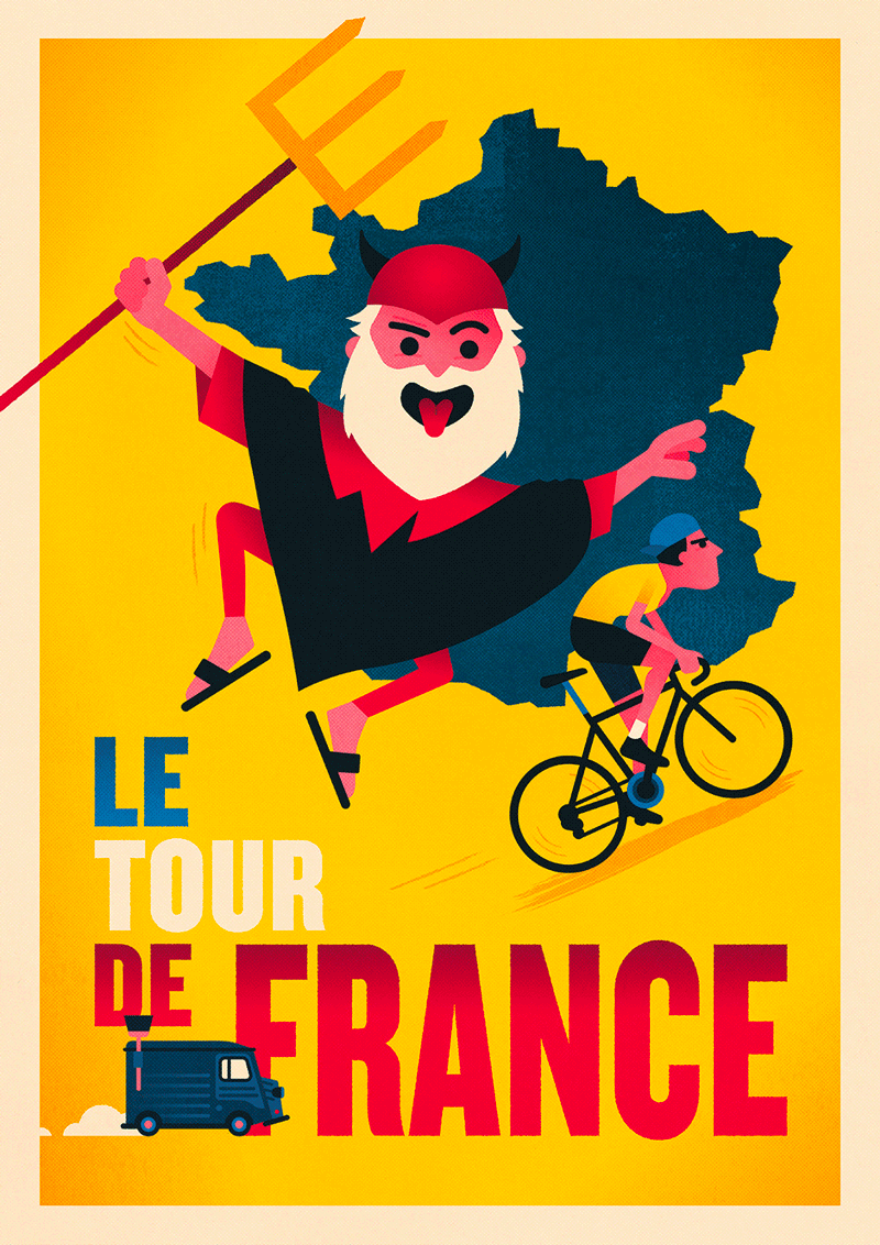
Le Tour de France
The yearly circus every July.
Esquire’s Big Black Book
Nice example of using just two colors.
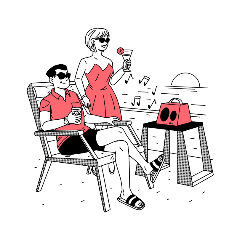
Wired World 2017
Great composition of a scene in which shapes are being used as either desks or surfaces to stand on.

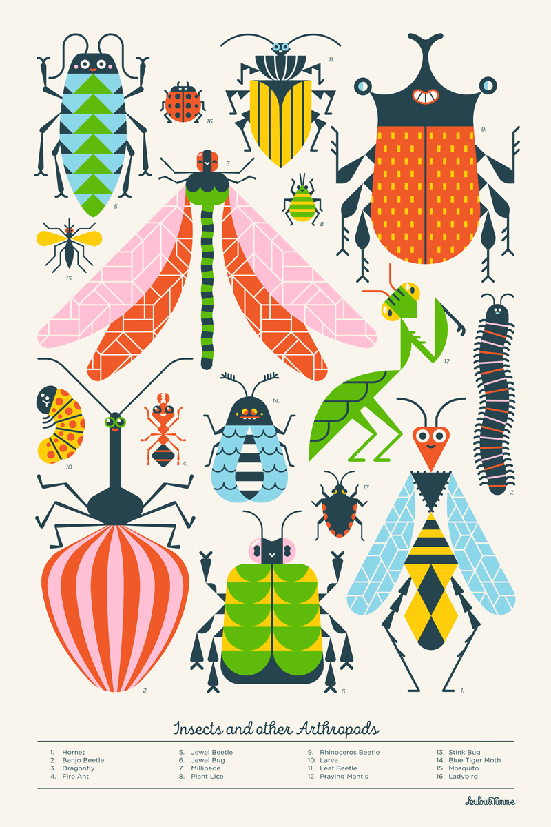
Insects And Other Arthropods
Wonderful school posters!
Diversity
Super dope! I love the pattern on the sweater. The faces and different beard styles are also ace.

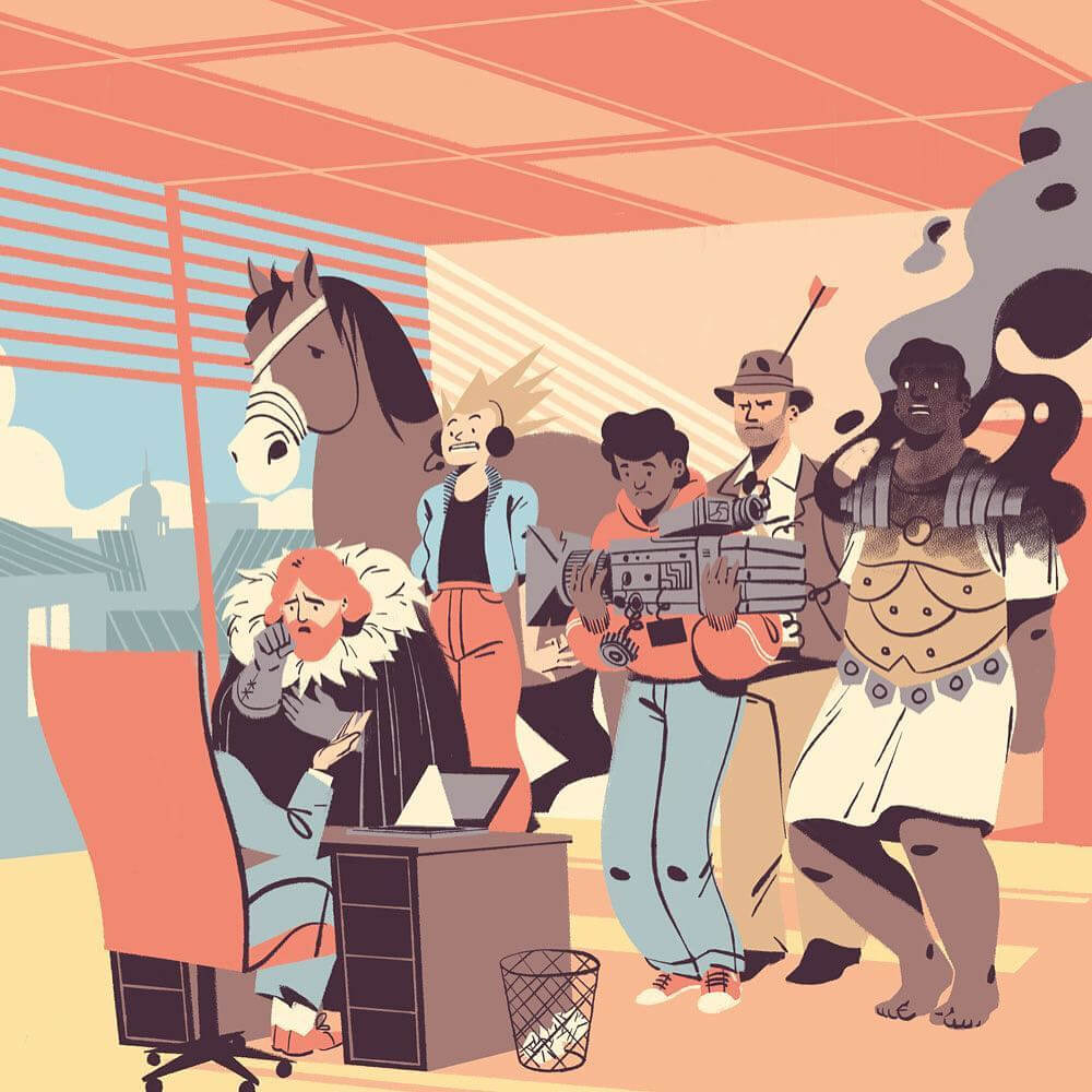
Les Echos
Great diverse bunch of characters.
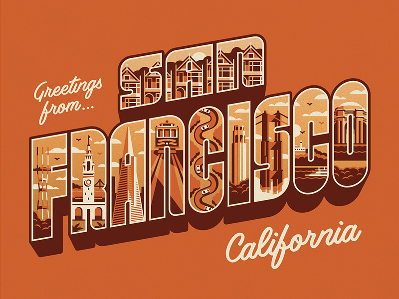
Greetings From San Francisco
Very nice to see all hallmark sights nicely integrated into the letters.
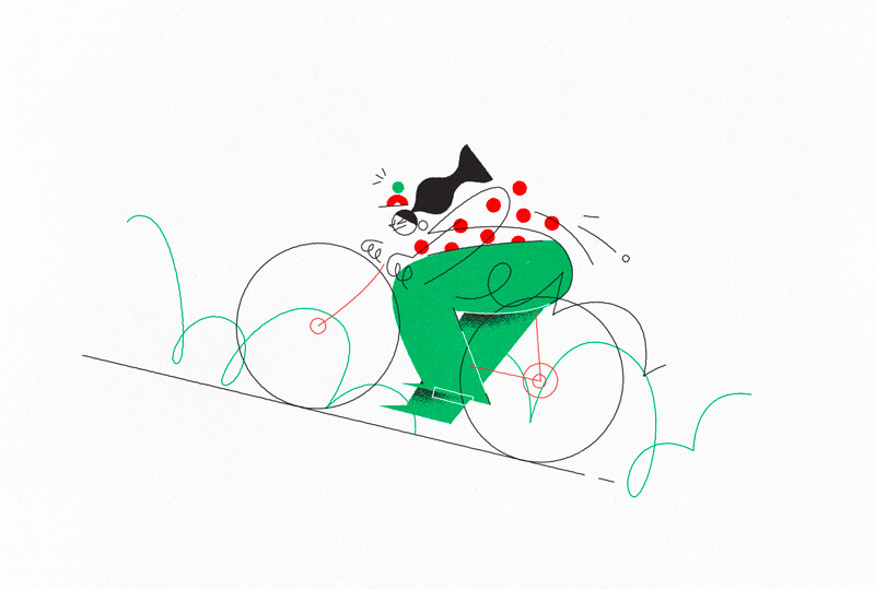
Tour de France Impressions
Enjoying the style, especially the lines that just guide you to see the rest.
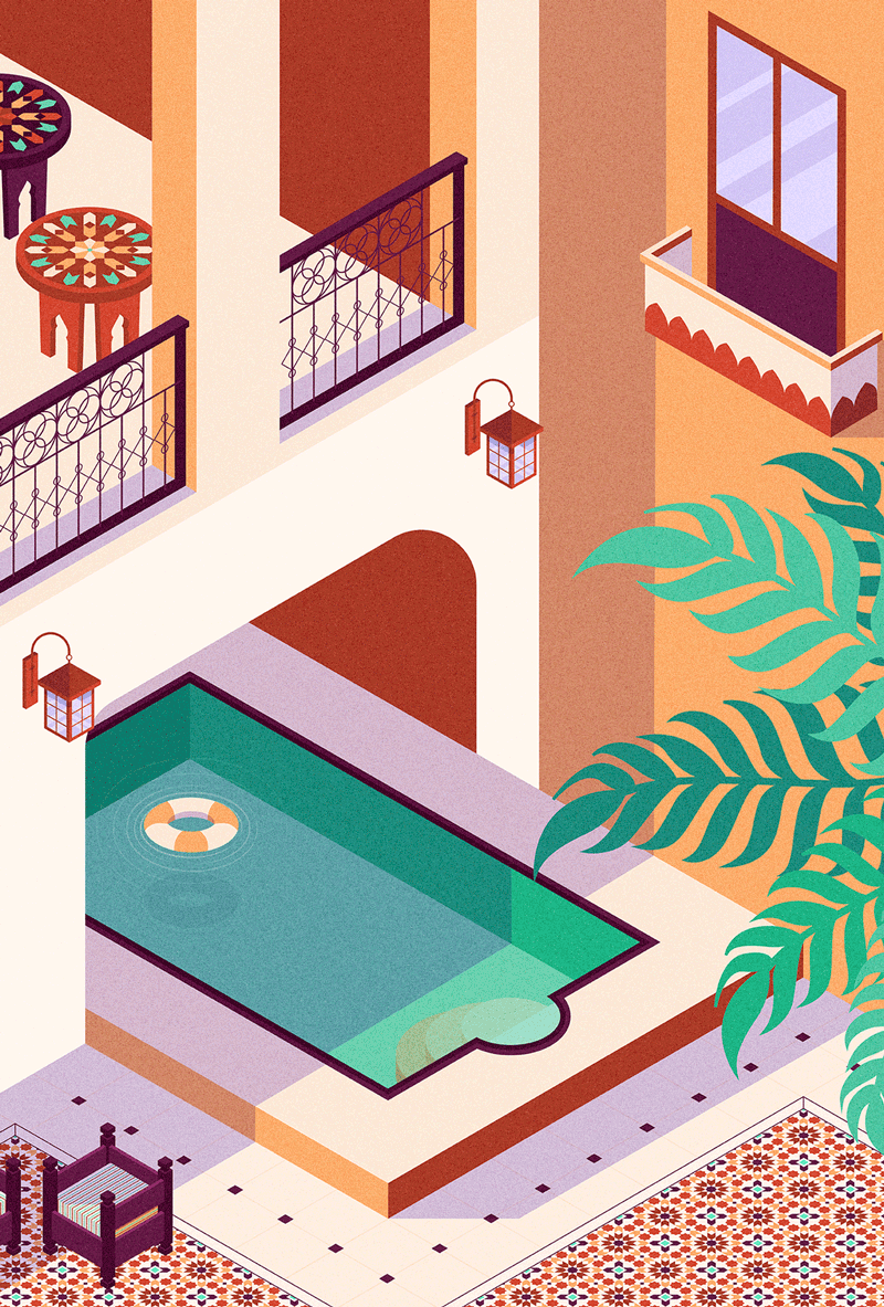
A Different View
The iron work on the fences and patterns on the tiles in this Morrocan riad is so beautiful. The colors are also perfect.
TRUE Webhosting
A beautiful style with some isometric influences.
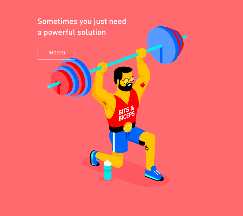
Picture Me Rollin’
Interesting approach to the tire shapes. Those are some lovely soft tones as well.

Growth
Beautiful! Love the movement.

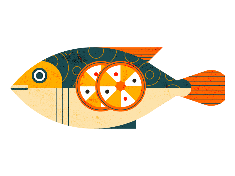
Fish
Great graphical elements on the fish.
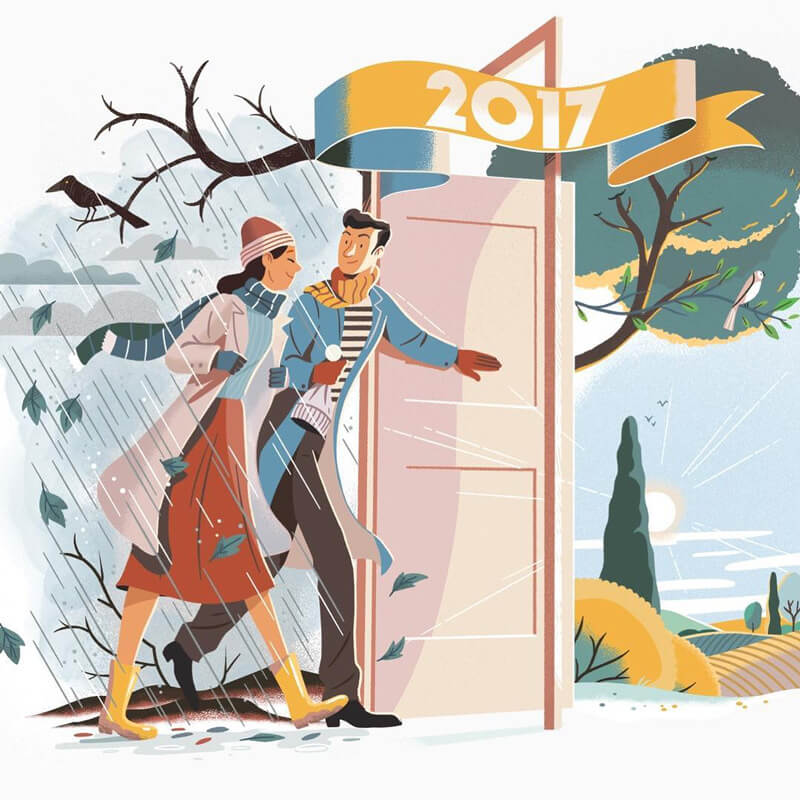
Open The Door…
Classic and elegant. Love the metaphor to open the door for better weather or a new season.
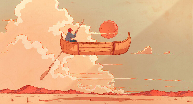
Adventure
Illustrations that explore imagination are always among my favorites. Thumbs up for the muted color palette as well.
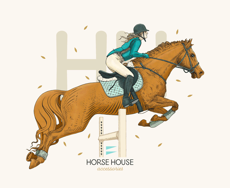
Horse House
It’s great to see how all those ‘etch’ lines are capable of accentuating the details in this illustration.
Stairhaus Inc.
Colors and composition are on point.

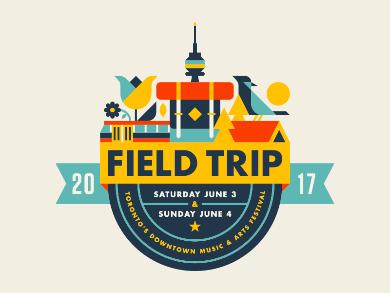
Field Trip 2017
Wonderful badge art for Field Trip Music Festival’s 2017 branding.
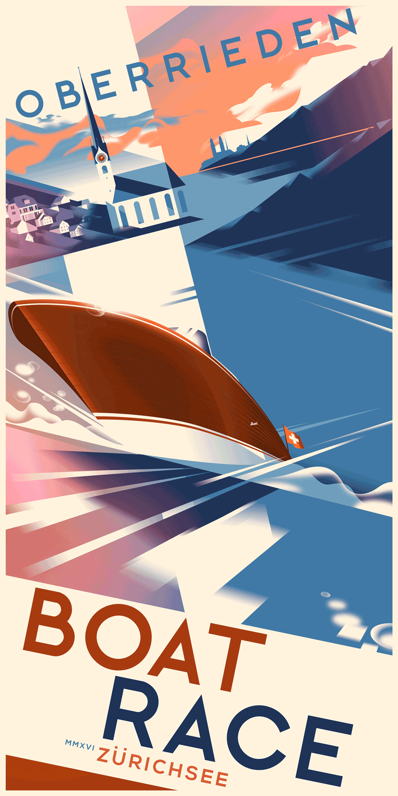
Cyrus Shey
Not an ordinary everyday color palette. Love the sense of speed in it.
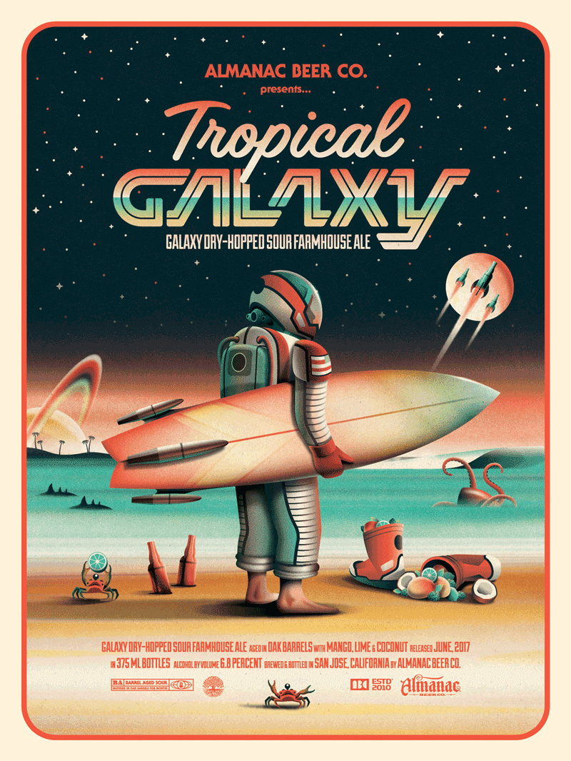
Tropical Galaxy
Top notch work as always with an inspiring color selection.
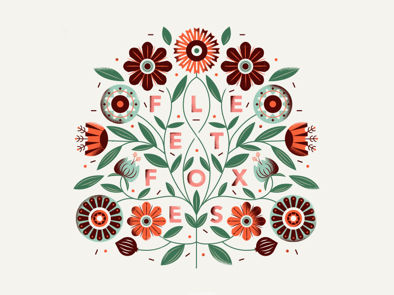
Fleet Foxes
The right mix of floral elements to achieve a perfect balance.
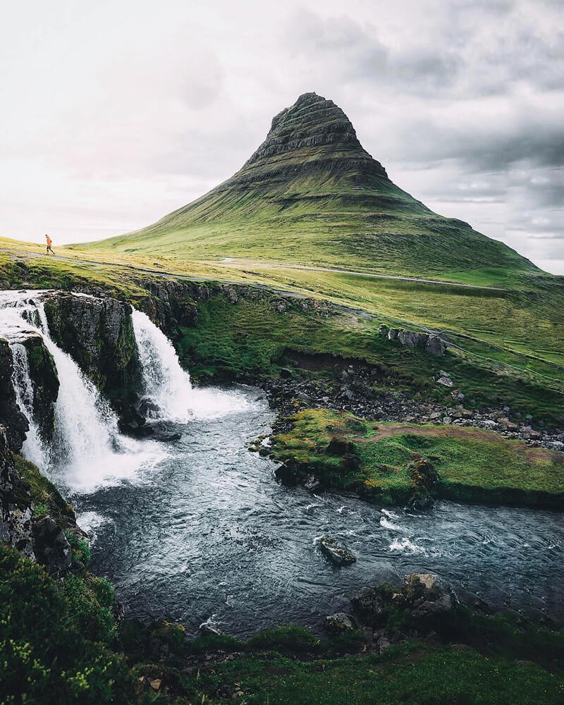
Kirkjufell, Iceland
Those soft subdued tones and light really compliment the wild and remote feeling of this scene. Composed perfectly as well with just one inclusion of the person.
Further Reading
- Design Under Constraints: Challenges, Opportunities, And Practical Strategies
- Rediscovering The Joy Of Design
- How To Create A Flat Vector Illustration In Affinity Designer
- Switching From Adobe Fireworks To Sketch: Ten Tips And Tricks


 Devs love Storyblok - Learn why!
 How To Measure UX and Design Impact, 8h video + UX training
 JavaScript Form Builder — Create JSON-driven forms without coding.
 Get a Free Trial


