The Evolution Of User Experience Design
(This series of articles is kindly supported by Adobe.) We’re fortunate enough to be working at an incredibly exciting time in our industry. Yes, the challenges are considerable, but the opportunities are – equally – transformational. It’s never been a more exciting time to work as a User Experience (UX) designer.
Great designers deliver wonderful, considered and memorable experiences. Doing that isn’t easy and – through this series of articles – I’ll provide a wealth of pointers to ensure you’re on the right track. In short: I’ll ensure we have all the bases covered.
When I first started working on the web right at the start (yes, I’m that old!), user experience wasn’t even something that was on the radar. Our primary focus was: “Just make it work.” The digital landscape has evolved rapidly since then, and ‘making it work’ is now commonplace. As a consequence, our role as designers has evolved to encompass delight: “Make it work – I’d expect nothing less! And make it delightful.” Delight is a skill, and we’ll explore its importance throughout this series.
Design in our field has evolved rapidly over the last number of years and, as the field has matured, we have begun to see the emergence of ‘experience design’ as a focus. This series of ten articles, which covers the breadth of the UX field, will build to encompass user experience in the broadest sense. I’ll explore how UX has evolved and how it is changing as we accelerate into the 21st century.
In short: I’ll kick everything off and tell the story of where we’ve been, where we are and where we’re going.

A Human-Centred Approach
UX is an ever-changing field, and the discipline has evolved considerably over the last few decades. It can be a struggle at times to keep up as our deliverables have changed and evolved over time: desktop and mobile, mouse and touch, web and native, and the list goes on.
One aspect of UX remains consistent, however: users.
Personally, I prefer the term ‘humans’ to ‘users.’ The former, ‘humans,’ are complicated: living busy lives, eager for delight, yet, at times suffering from frustration. The latter, ‘users,’ runs the risk of being a little too abstract and, as such, a little too easy to dismiss. Let’s design for humans!
Humans are people, and people have feelings. To design for them effectively we need to factor in those feelings: designing for delight and alleviating frustration where humanly possible.
Of course, we need to design with functionality in mind. Nevertheless, in our role as designers of experiences, we should also include a focus on delight.
To build truly human-centered experiences, we need to understand how humans work and that requires a degree of focus on psychology. Our remit as designers has broadened over the last few years, and we now need to understand not only the mechanics of how to build products and services but also why we build these products and services.
Consider two contrasting examples, and I think we can understand a little more about how our role as designers has changed. I’m sure most of us have used online banking in our time and many of us will (no doubt) have experienced differing experiences using these services.
“
I recently moved from my old bank (who shall remain nameless) to Monzo, a relatively new digital-first ‘challenger bank.’ The experience was transformational. My old bank — a traditional bricks and mortar business — considered its mobile and web-based apps as ‘add-ons,’ and it showed. The interfaces were complex, unintuitive and downright frustrating. Monzo, on the other hand, had built a digital-first application. It was delightful; so much so, that I moved to it.
When we consider the amounts of money — not to mention profit — that banks can make it becomes critical to shift towards a human-centered approach towards design. It’s not just banks, either. All businesses can benefit from a human-centered mindset.
In an always-on, connected world the temptation to shift to competing products and services is always at our fingertips. If we don’t design for delight, putting experience design at the heart of our process, we run the risk of losing customers in what is an often cut-throat world.
Equally, if we position delight at the heart of what we create, we can ensure that our customers — humans — remain with us for the long haul. The bottom line? Invest in delight and the rewards will be indisputable.

Building A UX Primer
This series of articles will explore UX in the broadest context. I’ll be writing ten articles that collectively will act as a ‘UX Primer.’ My goal is to help you as much as possible, collecting what I believe are timeless principles that will stand the test of time.
I’ll explore the entire process of designing great user experiences:
- Starting by stressing the importance of a considered user research process that informs our design decisions,
- Exploring the wealth of tools that we can use to design great experiences (stressing the importance of a prototyping process that is fit for purpose), and
- Stressing the qualities one needs to develop when pursuing a role as a UX leader, and that need to be considered when building a UX team.
Put simply, the UX process can be distilled down as follows:
Observation → Idea Generation → Prototyping → Testing
This is a cyclical process. The best work is often iterative, running through this loop multiple times to ensure that we test our assumptions and revisit our designs often.
Research is fundamental. To address our users’ needs we need to put ourselves in their shoes, we need to understand their goals and motivations, then design experiences that deliver these high-level goals. It’s important not only to ask those we design for about their needs, but it’s also important to observe (the most telling findings are often the result of observation).
Prototyping is a process, which we need to consider at every step of the customer journey. I’ll explore the importance of using research findings to deliver both paper prototypes, visual designs, and – ultimately – high-fidelity prototypes, which we can build to communicate and test our ideas, before building finished products or services.
Finally, I believe it’s important to focus on the qualities one needs to develop to grow in this rapidly changing industry. It’s an exciting time to be a designer, and I believe if we open our eyes to other industries’ approaches we can improve what we do.

The Ever-Shifting Context
We’re bombarded daily with messages – whether that’s in a desktop or mobile context – in this environment, it’s understandable that the people we design for can feel a sense of fatigue in the face of endless calls to action.
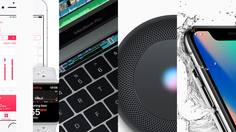
When our industry first came into existence, we designed websites, which were – more often than not – standalone experiences. Life was a great deal simpler. The launch of the iPhone a decade ago changed everything. Suddenly we were designing for both desktop and mobile situations.
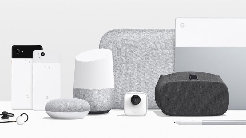
Technology has shifted once again as we witness an explosion of ‘connected products’ that are starting to deliver on the promise on the ‘internet of things.’ As designers, we now have a new set of challenges: to tie everything together and deliver seamless experiences.
The good news is that we can learn a great deal by widening our frame of reference, learning from other disciplines that are a little more mature than our relatively new industry.
We can learn from the worlds of Industrial Design and Service Design, applying the lessons learned there to our own industry. If you’re scaling up your knowledge (which I believe you should always be doing!), there’s never been a better time for you to open your eyes to disciplines beyond our own.
“
I firmly believe that the present (and the future!) is multidisciplinary. To truly stand out as a designer it’s important to have a deep understanding of your own discipline, but also — equally and importantly — to be able to communicate with others from related disciplines. The future will be dominated by what Tim Brown, CEO and President of IDEO, calls ‘T-Shaped’ people. I’ll explore the importance of developing these qualities throughout this series.
In Closing…
The opportunities ahead are fantastic for designers working in this industry. It’s challenging, of course, to keep up with an ever-shifting digital landscape, but equally, it’s incredibly exciting.
Yes, the landscape is evolving (fast!), but it’s important to remember that fundamental design principles remain constant. I’m an optimist. Yes, the challenges ahead are daunting, but equally, I can think of no better time to be working as a designer.
Tools like Adobe XD should be pride of place in any self-respecting designer’s toolkit. They enable us as designers to build rich and immersive experiences, regardless of the medium we’re designing for. Thanks to tools like this we’re able to design, prototype and build experiences in one, centralized place.
Even better, XD and a vast array of other tools are being updated constantly; keeping pace with the rapid and ever-changing shifts that face our industry.
I’m looking forward to sharing some lessons I’ve learned over the last few years as our industry has evolved to encompass ever more exciting new opportunities. Next up, I’ll explore ‘Universal Principles of UX.’ Stay tuned!
This article is part of the UX design series sponsored by Adobe. Adobe XD tool is made for a fast and fluid UX design process, as it lets you go from idea to prototype faster. Design, prototype and share — all in one app. You can check out more inspiring projects created with Adobe XD on Behance, and also sign up for the Adobe experience design newsletter to stay updated and informed on the latest trends and insights for UX/UI design.
Further Reading
- Everything I Know About UX Research I First Learned From Lt. Columbo
- When Words Cannot Describe: Designing For AI Beyond Conversational Interfaces
- Modern Technology And The Future Of Language Translation
- Testing Sites And Apps With Blind Users: A Cheat Sheet


 How To Measure UX and Design Impact, 8h video + UX training
 Get a Free Trial
 Devs love Storyblok - Learn why!
 Register For Free
 JavaScript Form Builder — Create JSON-driven forms without coding.

