A Comprehensive Guide To User Experience Design
(This is a sponsored article.) Having undertaken initial user research and analyzed your research findings, the next phase of the design process is to apply what you’ve learned by developing a series of designs to test your assumptions. In the fourth article in my series for Adobe XD, I’ll be focusing on the initial phase of the design process.
Within this overall series of ten articles, this is the first of three that tie together the design process. This article deals with UX design at a higher level, from a birds’ eye point of view. My next article will explore UI design, exploring interface inventories, building pattern libraries and designing interactions and animations. The third article in this series within a series will explore wireframing and prototyping.
As I explored in my preceding article on UX research, it’s important to stress that we’re building on the user research undertaken. Having analyzed our research findings, our goal at this phase of the design process is to:
- establish some clear user pathways that satisfy different users’ needs by embracing user stories, scenarios and storyboarding;
- apply some lessons from the world of Human Computer Interaction (HCI) so that we design with first principles in mind; and
- establish a ‘look and feel’ for our designs in a manner that’s device-agnostic that can be applied in both a desktop and mobile context.
In short, this article is intended to act as a bridge between the research phase and the design phase. As I stressed in my last article, the design process — research, design, prototype, build, test — is an iterative one; at this phase in the process, we’re focused on developing a series of designs that we can prototype, build and test.
UX Design is a vast topic so consider this article a short primer, but — as in my previous articles — I’ll provide some suggested reading to ensure you’re well covered.
Getting A Skeleton In Place
Before we get down to the details of user interface (UI) design and building interactive prototypes, it’s important to get the high-level flow of the design in place, establishing a skeleton around which we can build our design.
At this point in the process, it’s important to use our research findings to inform the development of user stories, identifying different users’ goals. We can use these user stories to create different scenarios. This helps us to identify clear goals — and an underlying intent — that guides the design process. It also enables us to develop flows through what we’re building.
When developing initial flows — using paper prototypes and storyboards — we’re focused on getting a feel for the design in its totality, before drilling down into detail. It’s important to get a skeleton in place and not get lost in the details, which will follow down the line.
In my previous article, I focused on the importance of undertaking user research before you embark upon the design phase of a project. As I put it:
"Spend some time with your users, getting to know their needs, and what it is they are trying to achieve, these are their ‘jobs to be done.’"
By teasing out our users’ ‘jobs to be done,’ we can ensure that what we design is truly user-centered. Having undertaken some focused user research, it’s important to take your findings and use them to inform your design process. Your research should have helped you establish some patterns, needs that the users you’re designing for having in common.
One size rarely fits all, however, and it’s likely that whatever you’re designing will have multiple user types with different needs. Developing ‘user stories’ — that represent the needs of different users — can help you distill down the goals that you’re trying to solve, helping to shape the rest of the process. But what exactly are user stories?
User Stories
User stories are a useful way of establishing a high-level view of different users’ ‘jobs to be done.’ Written from the perspective of typical users, they help you to establish the different goals your different users have so that you can design for their different needs accordingly.
The term ‘User Story’ was originated by Alistair Cockburn, one of the initiators of the agile movement in software development, who coined the phrase, “a user story is a promise for a conversation,” during a project for Chrysler in 1998.
User stories shift the emphasis from writing about requirements to talking about them. Whilst subtle, this shift — from writing to talking — can have a significant impact upon the design process.
All too often requirements are delivered in an abstract manner, as a list to be checked off that — if you’re not careful — bears little resemblance to what users need and more resemblance to what a ‘design by committee’ needs. User stories help position users at the heart of the conversation.
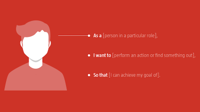
This idea, of a tool to encourage and facilitate conversation, captures user stories’ strength. They are an ideal tool to start mapping out scenarios, ensuring users always remain at the heart of the design and development process.
Short descriptions of goals and features told from the perspective of different users, user stories help you to get an understanding of the underlying goals your users have so that you can see the problem from their perspective. These follow a pattern as follows:
- As a (person in a particular role),
- I want to (perform an action or find something out),
- So that (I can achieve my goal of).
Using the above template, we can put ourselves in the shoes of different users and develop different stories to shape our design. Imagine, for example, that we’re building a web-based learning resource where lecturers and students can share learning materials. We’re likely to have a number of different users with different needs. A lecturer’s user story might be:
"As a lecturer, I want to share my lecture slides so that I can provide my students with access to resources beyond the classroom."
By developing a short story around this user’s specific needs, we can begin to envisage design patterns that satisfy this type of user. Seen from the perspective of a student — a different user with different needs — we might develop the following user story:
"As a student, I want to access lecture slides so that I can refer to them when I’m revising."
These stories — relayed from different perspectives — provide us with useful provocations we can use at the start of the design process to start mapping out our design at a high level. Importantly, the stories are focused on satisfying our users’ needs. In short, user stories help us to get a feel for what users’ goals are at a high level. We can then use these stories to develop different scenarios which we can begin to design.
Using Scenarios To Inform Your Design
At the start of a project, it’s easy to get carried away adding features aplenty and getting lost in ‘featuritis.’ The danger of this approach is that it’s easy to begin adding features and functionality that detract from your users’ core goals.
By using user stories to develop typical scenarios, you remain focused on your users’ core goals. This approach also enables you to establish expectations and develop benchmarks for typical user needs, which can be used to set clear deliverables and scope at the start of the project.
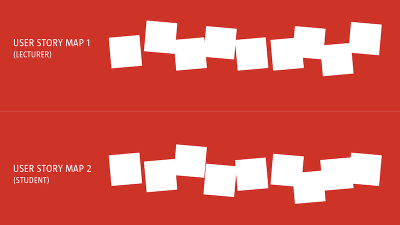
Returning to the previous example, we can establish some high-level goals from the perspective of our different users: for the lecturer, we’re going to need to design an upload feature; for the student, we’re going to need to design an access feature. These are high-level goals, but we can — as we develop our scenarios — start to add some granularity and complexity to our user stories informing the design further.
For example, returning to the earlier example, from the students’ perspective we might consider the following scenarios:
- At a base level, the students want to access the slides.
- At a slightly more enhanced level, the students might want to be able to annotate the slides, capturing their notes.
- Finally, if resources allow it, the students might want to share their notes with their peers, enabling collaborative learning.
Scenarios, like the example explored above, enable us to get a clear picture of differing levels of complexity and design for these accordingly. They also allow us to get a feel for the flow of users through our design, enabling us to map them out on paper so that we can begin to build a birds’ eye view of the project.
Mapping Your Design Flow
Using your user stories and scenarios as a driver for discussion it’s possible to begin to map pathways through your design at a high level. This process of user story mapping, illustrated earlier, helps us to define different user flows.
At this point in the process, paper is a powerful tool for rapid prototyping, before moving on to develop more refined storyboards. A low-cost, low-fidelity and fast approach, paper prototyping has many benefits:
- It’s low cost, allowing you to explore multiple ideas with very little barrier to entry;
- It’s low fidelity, which encourages you to focus on the big picture and not get lost in the details;
- It’s fast, enabling you to quickly iterate through multiple variations of a flow.
Paper also enables collaboration, allowing multiple participants to get around a table and develop a design quickly, taking on board everyone’s opinions and insights.

Lastly, paper ‘saves itself.’ When we design on screens, we often lose design artifacts due to the nature of software saving ‘states,’ different points in the design process. Paper prototyping allows us to see the entirety of the design process including rejected ideas en route to our finished concept.
In my experience, a typical project will often require multiple rounds of paper prototypes as you iteratively work your way through your thinking. At this point in the process working on screen is too slow and too refined, which can quickly lead to getting lost in needless detail. Paper frees you up to focus on the big picture, which is what matters at this stage.
Of course, even experienced designers can recoil when confronted with the idea of sketching interfaces, finding the process intimidating. It’s not uncommon to hear, “But, I can’t draw!” This is patently untrue, all of us were able to draw just fine when we were children (as all those pictures on our parents’ fridges attested!) we just need to re-learn this valuable skill.
To paraphrase Jason Santa Maria:
"Sketching isn’t about being a good artist, it’s about being a good thinker."
With high-level sketches established it’s time to start adding some fidelity by creating some storyboards and wireframes. Hold that thought. However, I’ll return to it in my sixth article on Wireframing and Prototyping.
A Spot Of Science: UX Laws
UX might be a relatively new discipline, but it’s informed by decades of research within the field of Human Computer Interaction (HCI).
As I noted in the first article in this series, on The Evolution Of User Experience Design, we are above all designing for humans, and humans broadly share similar characteristics that we should factor in when we make our design decisions. HCI offers us numerous principles that we can apply to the field of user experience design.
Many of these principles have been distilled down in the form of ‘laws’ that we can draw from, for example:
- Hick’s Law, which stresses the need to minimize choices to ease cognitive burden and help drive decision-making;
- Fitt’s Law, which provides valuable advice on how we can ease interactions through the careful sizing and positioning of interface elements; and
- Miller’s Law, which emphasizes the benefits of ‘chunking’ to ease complex tasks.
These are principles that can be applied at both the macro- and micro- level and to improve as a designer they are well worth exploring in depth. I’ll explore three — Hick’s Law, Fitt’s Law, and Miller’s Law — but there are many more.
Jon Yablonski’s excellent site, Laws of UX, is a helpful collection of principles, which is well worth bookmarking. Not only is a lovely piece of design in and of itself, but it also provides a good overview of each principle accompanied by links to further reading.
Hick’s Law
Hick’s Law (or, in full, the Hick-Hyman Law) states:
"The time it takes to make a decision increases with the number and complexity of choices."
Named after William Edmund Hick and Ray Hyman, a pair of psychologists, the law stresses the importance of reducing the number of choices you present a user with.
You might think you’re helping your user by offering an endless series of choices, but in reality, you’re adding to their cognitive burden. The more choices a user is confronted with, the more likely they are to walk away, crippled by ‘decision paralysis.’ This can be particularly problematic in an e-commerce context, where users walking away leads to a direct impact on the bottom line.
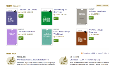
We can apply Hick’s Law to UX design in a variety of ways:
- When creating navigation instead of providing an endless list of choices, focus on just a few. Your users will thank you.
- In an e-commerce context, instead of listing every single product, reduce the number of choices and focus. Do this, and you’ll offset decision paralysis leading to higher conversion rate.
- Distinguish essential content from secondary content. By enabling users to find a path through fewer choices, you’ll reduce their cognitive burden.
We’re often guilty of equating ‘more’ with ‘better,’ but Hick’s Law tells us to think otherwise. The greater the number of options, the longer it takes our users to reach a decision (and sometimes leads them to making no decision). Focus is what matters, not least in a world increasingly overwhelmed with choice.
Fitt’s Law
Fitt’s Law states: The time it takes to acquire a target is a function of the distance to and size of the target. Translated that means: The farther away a target is — a button on a screen, for example — the larger it needs to be for a user to be able to reach it easily.
Fitt’s Law is particularly important when it comes to designing buttons and other clickable onscreen elements. Different contexts require different approaches and will inform your design approach.
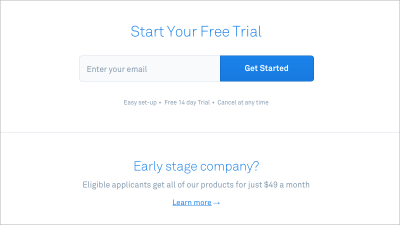
In a desktop context a user will be using a mouse and — on a large screen — traversing potentially large distances. In this context, it’s important to ensure your call-to-action buttons (CTA) are reasonably sized, easy to see and to click on.
In a mobile context, it’s critical to consider tap targets when designing interfaces. When designing for touchscreens, our fingers are lower fidelity than mouse pointers, so we need to increase our tap target sizes. (Of course, larger tap targets in desktop environments can help, too!)
We can apply Fitt’s Law to UX design in a variety of ways:
- When designing for mobile, consider your tap targets. With less screen real estate reduce the number of clickable elements and increase their size.
- It might sound obvious, but if you have a large button on screen, ensure it’s the primary call to action otherwise you run the risk of users clicking it inadvertently.
- When designing drop-down menus or other forms of nested navigation, ensure your target sizes are large enough for users to acquire.
Generally speaking, the further away something is the larger it needs to be in order for a user to hit it. When planning out your design at a high level consider important calls to action and ensure you’ve taken on board Fitt’s Law when designing these. Tiny buttons might look neat and tidy, but if they frustrate your user, your design needs work.
Miller’s Law
Miller’s Law states: The average person can only keep seven (plus or minus two) items in their working memory. In short: there’s only so much we can hold in our heads in a short space of time.
Miller’s law is particularly important when we consider how we organize and group information, and is where chunking can come in useful. Consider the formatting of the following two phone numbers (both the same, fictional number):
- 07700984964
- 07700 984 964
As a string of digits without spacing, an eleven digit number is difficult for a user to hold in working memory. Add some spacing, however, and your users’ task is considerably eased. By chunking the information, your user can retain the three groups of numbers in working memory, enabling them to complete their task.
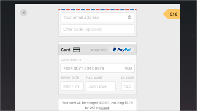
Miller’s Law goes further than easing micro-interactions like this; it can also be used at a more macro scale. For example, when designing forms, focus on chunking information into logically organized groups: name, address and contact details; account details, like usernames and passwords; bank details; and other groupings.
We can apply Miller’s Law to UX design in a variety of ways:
- When listing telephone numbers chunk the information so that it can be held easily in working memory.
- When designing payment forms that feature credit card information, a credit card number will be easier to parse by users if it’s broken into four chunks of four.
- Reduce cognitive load by limiting the number of choices on offer.
As designers, we often have to present complex information. Miller’s Law is useful to keep in mind in this context. Where possible look for groups of information that can be broken down and chunked, enabling them to be held more easily in users’ working memory.
Look And Feel: Communicating Visual Design
With a bird’s eye view of your project’s flow established, it’s important to start to think about its look and feel, as well as its visual design. This is what I call ‘visual grammar,’ and it’s the visual approach you’ll be adopting in your design.
With an ever-increasing proliferation of devices to design for — watches, phones (from small to large), tablets, desktops and other media — the idea of developing a single pixel perfect visual has become dated.
In response to this changing landscape, we’ve seen a move towards design artifacts that move away from pixel perfection in favor of capturing the ‘flavour’ of a design. These artifacts include, for example:
- Mood Boards
- Style Tiles
- Element Collages
Everyone’s process is different, but at this stage in the process, I use a combination of mood boards and element collages to help to establish direction: mood boards help you to get into the right ballpark, element collages act as a bridge between your visual design and your user interface design.
Moodboarding
Moodboarding, as its name implies, establishes the mood, helping you to zone in on a particular look and feel that fits your overall goal. Mood boards are useful as conversation starters, acting as a focus around which you can build. As a rule of thumb, I usually put together between three and five different mood boards, each signposting different directions.
You might have a particular look and feel in mind, but — as we all know, all too well, I’m sure — your preferred option might not match your client’s point of view. I find it helps to have alternatives and often find the end result drawing together different elements from different mood boards.
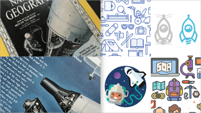
The bottom line: At this stage you’re presenting a high-level visual design, not getting lost creating pixel-perfect designs, which are futile in an age of widely differing screen sizes. Detailed mockups will follow at the wireframing and prototyping stage.
This point in the process is about developing design artifacts that can be used to spark conversations. To drive that creative discussion it helps to have a variety of different mood boards — each with a different look and feel.
When putting together mood boards, it’s important to consider analog approaches as well as digital approaches. If your visual inspiration is 100% digital, you run the risk of what I call everythinglooksthesameness where one design looks exactly like another. Consider looking beyond the screen for inspiration, using old unwanted magazines for inspiration, do so, and your designs will stand out.
Element Collages
With feedback gathered on your mood boards, it’s time to start developing some design components, applying your visual direction to some typical user interface elements so that you can settle on a ‘visual grammar.’
There are a number of tools you can use to do this including Style Tiles and Element Collages. Both have their strengths, primarily acting as catalysts for edging towards a finished look and feel.
As Samantha Warren, who developed the Style Tiles methodology, puts it:
"Style Tiles are a catalyst for discussions around the preferences and goals of the client."
This emphasis — on having a discussion about look and feel — is the strength of these two methods. They save a considerable amount of time, removing the need at this stage to create pixel-perfect renderings at multiple sizes.
In my experience, Style Tiles can be misread by clients who mistakenly think they’re visual mockups. I prefer a more freeform, less template-based approach, and when I discovered Dan Mall’s Element Collage approach, I was hooked.
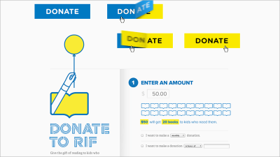
In an excellent post detailing his design process on a project for Reading Is Fundamental, Mall stresses the need to replace presentations with conversations, getting the client involved in the process. Element Collages are an excellent way of driving this conversational approach. As Mall puts it:
"When talking about design with my clients, I like to have as much visual fodder as I can, in order to ensure we’re talking about the same thing. My version of Style Tiles integrates my love of collaging for a different type of execution I call an ‘Element Collage.’ That particular phrase creates an expectation that what we’re looking at isn’t a final design but rather an assembly of disparate pieces without specific logic or order."
The beauty of Element Collages is that they act as a bridge between your mood boards and your (soon to be developed) UI components. They’re flexible enough to show clients to establish a feel for what we’ll be building. Above all, they’re a useful tool for helping you to gain consensus around your visual grammar before you start to develop more time-intensive prototypes.
In Closing
Before we get down to the details of user interface (UI) design and building interactive prototypes, it’s important to get the high-level flow of the design in place, establishing a skeleton around which we can build our design.
By establishing a high-level process to kick off the design phase of your projects you can work more efficiently to get a clear framework in place. At this stage in the process, it’s important not to get lost in the details, but rather to focus on getting the broad brushstrokes in place.
It’s important to get the broad brushstrokes right before diving deeper into designing UI and developing wireframes and prototypes. Focus on establishing a clear design direction, and some clear user goals, before getting into the details. Resisting the urge to focus on details without clear design goals established saves wasted work.
In short, don’t get lost in the detail until you have everything mapped out.
Suggested Reading
There are many great publications — offline and online — that will help you on your adventure. I’ve included a few below to start you on your journey.
- “How to Write Smarter User Stories,” Joe Natoli
If you’re already familiar with user stories, I’d recommend reading Natoli’s suggested enhancements to user stories — by adding a focus on measurable benefits — are an interesting take. - “User Stories,” Mountain Goat Software
This guide provides helpful advice on splitting user stories into a series of smaller, connected stories and adding ‘conditions of satisfaction,’ which are worth considering. - “Laws of UX,” Jon Yablonski
An excellent site with helpful collection of principles that is well worth bookmarking. Not only is a lovely piece of design in and of itself, it also provides a good overview of each principle accompanied by links to further reading. - “Psychology and UX,” Nielsen Norman Group
With a firm grounding in the different laws that can be applied within the field of user experience, I’d recommend exploring psychology, too. - “Element Collages,” Dan Mall
This is well worth reading if you want to gain an understanding of how these tools can be used in the service of typical client projects.
This article is part of the UX design series sponsored by Adobe. Adobe XD is made for a fast and fluid UX design process, as it lets you go from idea to prototype faster. Design, prototype, and share — all in one app. You can check out more inspiring projects created with Adobe XD on Behance and also sign up for the Adobe experience design newsletter to stay updated and informed on the latest trends and insights for UX/UI design.
Further Reading
- How Accessibility Standards Can Empower Better Chart Visual Design
- Improving The Double Diamond Design Process
- Everything I Know About UX Research I First Learned From Lt. Columbo
- Writing CSS In 2023: Is It Any Different Than A Few Years Ago?

