Free Adobe XD Icon Sets Made By Legendary Designers
(This is a sponsored article.) Our friends at Adobe unveiled a very special goodie at the Awwwards Conference in Berlin today. A goodie which is too good to miss: They asked three renowned designers to create exclusive free icon sets to use in Adobe XD. And, well, we are very happy to feature them here on Smashing Magazine, too.
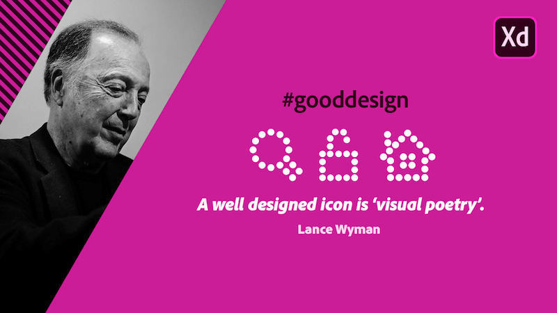
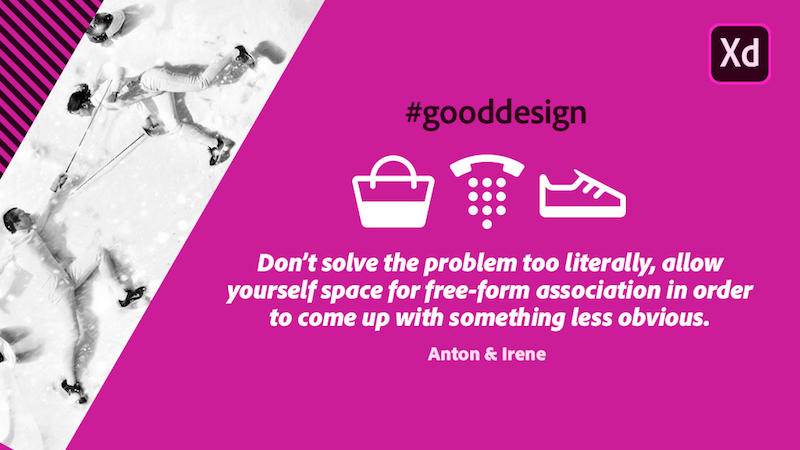
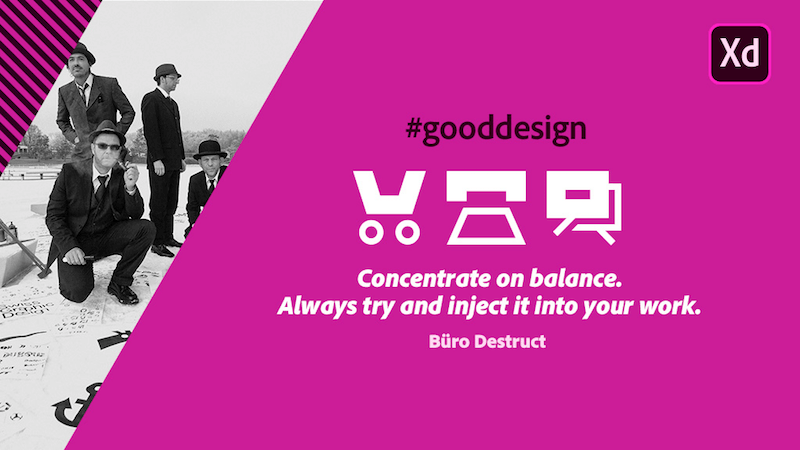
The icon kits were created by design legend Lance Wyman, award-winning design studio Anton & Irene, and the Swiss design group Büro Destruct. While each kit carries the characteristic style of their creator, they all have one thing in common: They celebrate well-made user experiences and emphasize how important icon design is to telling stories.
You can download the icon kits for free in .XD format right from Adobe. Just save them to your Creative Cloud account, and, once you've done so, you can access them from your CC folders and use them in Adobe XD. If you need any further assistance, there's a quick start guide that helps you get things up and running.
Let's take a closer look at the kits and their designers.
Feeling Inspired?
If you'd like to design your own icons with Adobe XD, no problem, Manuela Langella shares a step by step tutorial on how to do it. Get creative! →
Lance Wyman

You've probably seen his iconic 1968 Mexico Olympic Games logo before, and if you ever tried to find your way around the Washington underground, chances are high that it was his metro map that guided you: Lance Wyman. A true master of design art, Lance Wyman used paths of circles for his icon set — an element which is deeply rooted in his work.
Anton & Irene

Anton & Irene's client list is impressive (Google, Apple, Sony, USA Today, CNN, BBC, for example), and so are the more than a dozen prizes they received for their outstanding work: Webby, Emmy, Red Dot, .Net, Awwwards, and Cannes Lions just to name a few. For their icon set, they mixed easily identifiable metaphors with a simple, minimalistic style. The result is free of any clutter and noise, and shines with thoughtful little twists that give each icon a unique character.
Büro Destruct

Founded in 1994, the Swiss design studio Büro Destruct has kept open the boundary between art and commercial graphic design ever since. Their icon set is based on a simple setup which is hard to master — but they've done it exemplary, of course: One bold and one thick line contrast and complement each other to form a balanced unity. Minimalistic yet radical.
Further Reading
- Everything I Know About UX Research I First Learned From Lt. Columbo
- When Words Cannot Describe: Designing For AI Beyond Conversational Interfaces
- How Accessibility Standards Can Empower Better Chart Visual Design
- Open-Source 3dicons Library: Case Study And Free Downloads


 Devs love Storyblok - Learn why!
 Register For Free
 Get a Free Trial
 JavaScript Form Builder — Create JSON-driven forms without coding.
 Enterprise UX Masterclass, with Marko Dugonjic

