Building Websites With Tilda (Full Review)
(This is a sponsored article.) The modern web is very unified. Designers use the same patterns, and, as a result, websites created by different people look like clones. The only way to stand out from the crowd is via content. Content is what brings people to your website in the first place.
Tilda is a website builder that can be used to create websites, landing pages, online stores and special projects. Tilda’s creators practice a “content-first” philosophy: Content precedes design. Being big fans of storytelling, they came up with block mechanics for creating websites, so that users not just create web pages, but also tell stories about their products or services. And it helps to turn visitors to customers more effectively.
This article is a story of how Tilda differs from other website builders and how it helps you focus on what you know and love, without having to think about technical stuff — because you often don’t have time to learn technical things. Below are a few key benefits of using Tilda to create websites.
Blocks Mechanics
When designers make websites, they often have to implement the same objects over and over again. This not only makes the design process tedious, but also takes up valuable time.
To solve this problem, the Tilda team created blocks, which are commonly used modules. This modular editing mechanism is at the core of the platform. When you create a website, you don’t need to use a hardcoded template; all you need to do is choose predesigned blocks that satisfy your requirements.
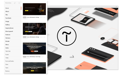
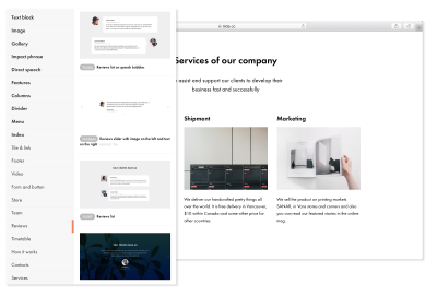
You have access to a library of 450 blocks. This library is updated constantly. To facilitate navigation between blocks, Tilda organizes them into categories. Each block in a collection is categorized either by function (for example, cover) or by meaning (for example, product reviews, “our team”, etc.).

All blocks have been created by professional designers, so you don’t need to worry about the core design properties. Also, all blocks work harmoniously together, so you don’t need to worry about how to adjust one block to another.
You might be thinking, “Does this mean that all websites created using blocks will look like clones?” No. Think of a block as a skeleton: It gives you something to modify according to your own needs. Tilda gives you a lot of control over the details. Almost everything in a block is adjustable.
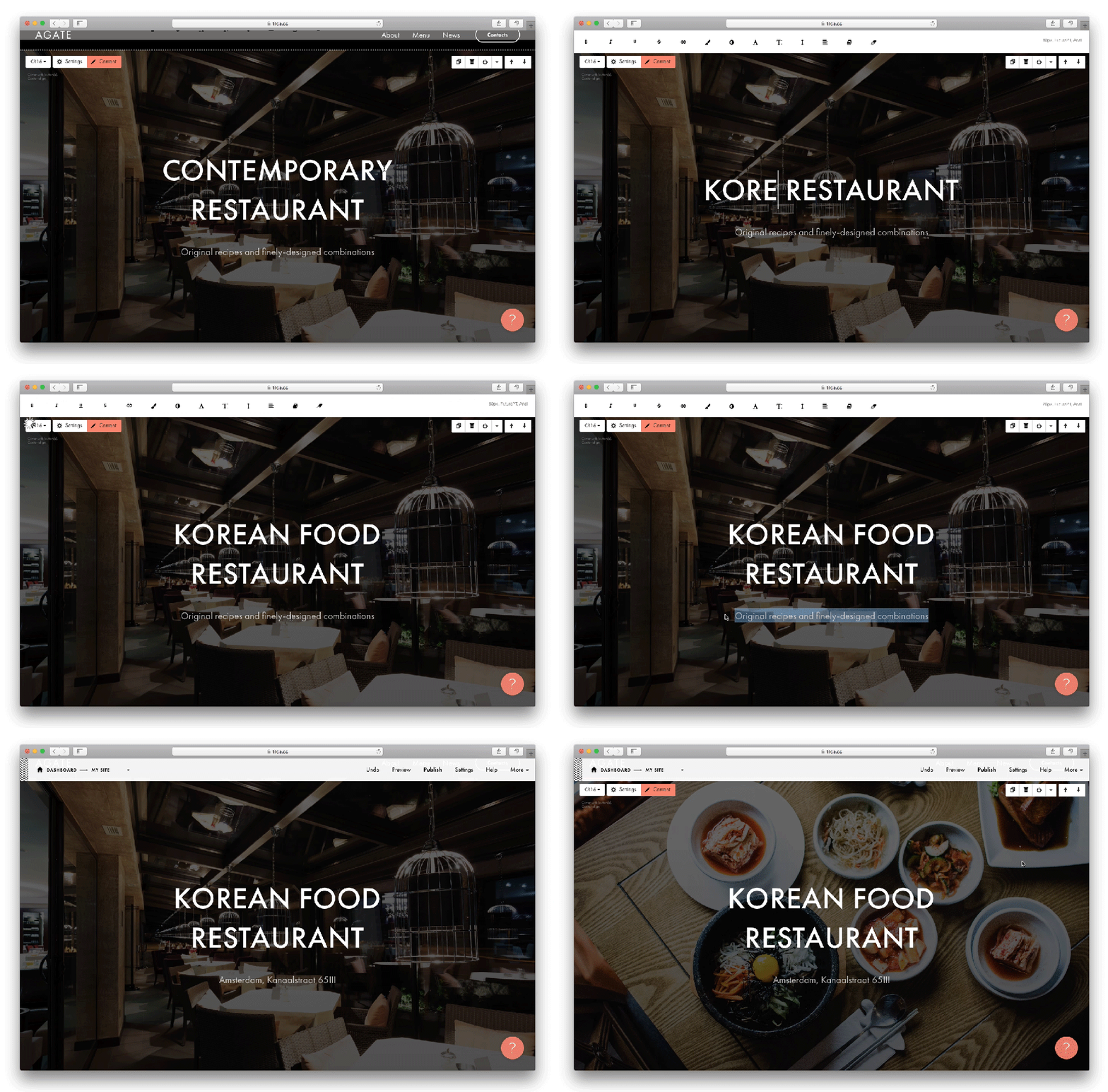
Tilda allows you to customize blocks using the content and settings areas. Click on the “Content” button to edit all of the information that a block contains. The “Settings” button allows you to adjust different parameters, such as the visual appearance of a block. If you want to change the text, click on it and change it directly on the screen. To replace a picture, simply drag it from the folder on your computer.
The following are the biggest advantages of using blocks:
- Readability
Tilda puts a strong focus on typography. Tilda’s team take care of all typographic elements such as line length, spacing and font sizes to harmonious proportions. Every block is perfectly balanced to make the reading an enjoyable experience. - Responsiveness
There’s no need to spend any time optimizing pages for tablets and smartphones. - Visual appearance
The appearance of the blocks can be changed dramatically: the sizes of text and images, buttons — you can do everything on your own on the tab ‘Settings.’ - Solving complex problems
Using blocks, you can solve pretty complex tasks such as collecting applications or selling goods and services.
Zero Block
No matter how rich a default collection of blocks is, some users will always want to create something truly unique. Precisely for this case, Tilda provides a Zero Block editor: a built-in editor for creating your own blocks. Think of it as a graphic editor for your website that lets you explore your creativity: add text, shape, button, image, video, tooltip, form, even insert HTML code; move, transform and hide every element on the canvas. You can start from scratch and create new unique blocks!
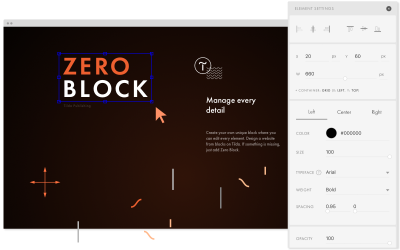
All you need to do to start using the editor is to click the “Zero” button on a newly created page. Zero Block allows you to manage every detail of your design. You can change the style options for objects, change their position, change their size and more.
Here is how this process looks:
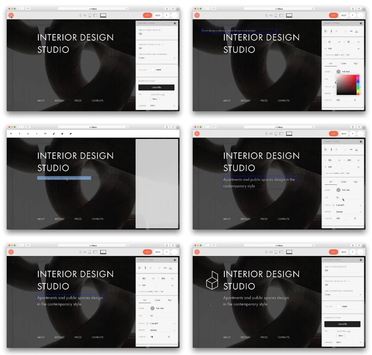
Just like regular Blocks, Zero Blocks are adaptive. Tilda provides five modes for adapting content to different screen sizes. You can preview a design in the following screen modes:
- mobile (portrait mode),
- mobile (landscape mode),
- tablet (portrait),
- tablet (landscape mode),
- desktop.
Zero Block can be used together with existing blocks. It’s possible to convert an existing block into a Zero Block and modify it however you like.
Animated Effects
Animation brings a sense of interactivity to the user experience. Properly incorporated, animation make a website’s elements come alive. There a lot of different ways in which adding motion can benefit users. For example, you can use animation to focus the user’s attention on a particular object (such as by assigning a specific animated effect to a call-to-action button to direct the user’s attention to that element) or for purely aesthetic purposes (such as to create a sense of craftsmanship).
Tilda allows you to create stunning interactive pages without any code. Tilda provides three types of animation, which we’ll go over now.
1. Basic Animation
In all standard blocks, you can adjust the appearance of any element to make the website more alive and interesting. For example, you can add an animated effect for a cover title.
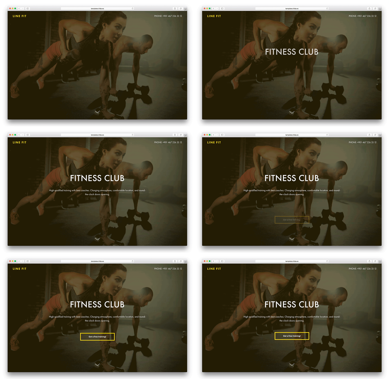
Animations work in all blocks, except for the slider. All you need to do to add an animated effect is simply select the desired effect in the block settings.
2. Extended Animation In Zero Block
With Tilda, you can also create a step-by-step animation where any element of the page can be a part of motion sequence. Tilda allows you to set the trajectory of elements. You can implement complex behaviors for elements on the page and add maximum interactivity.
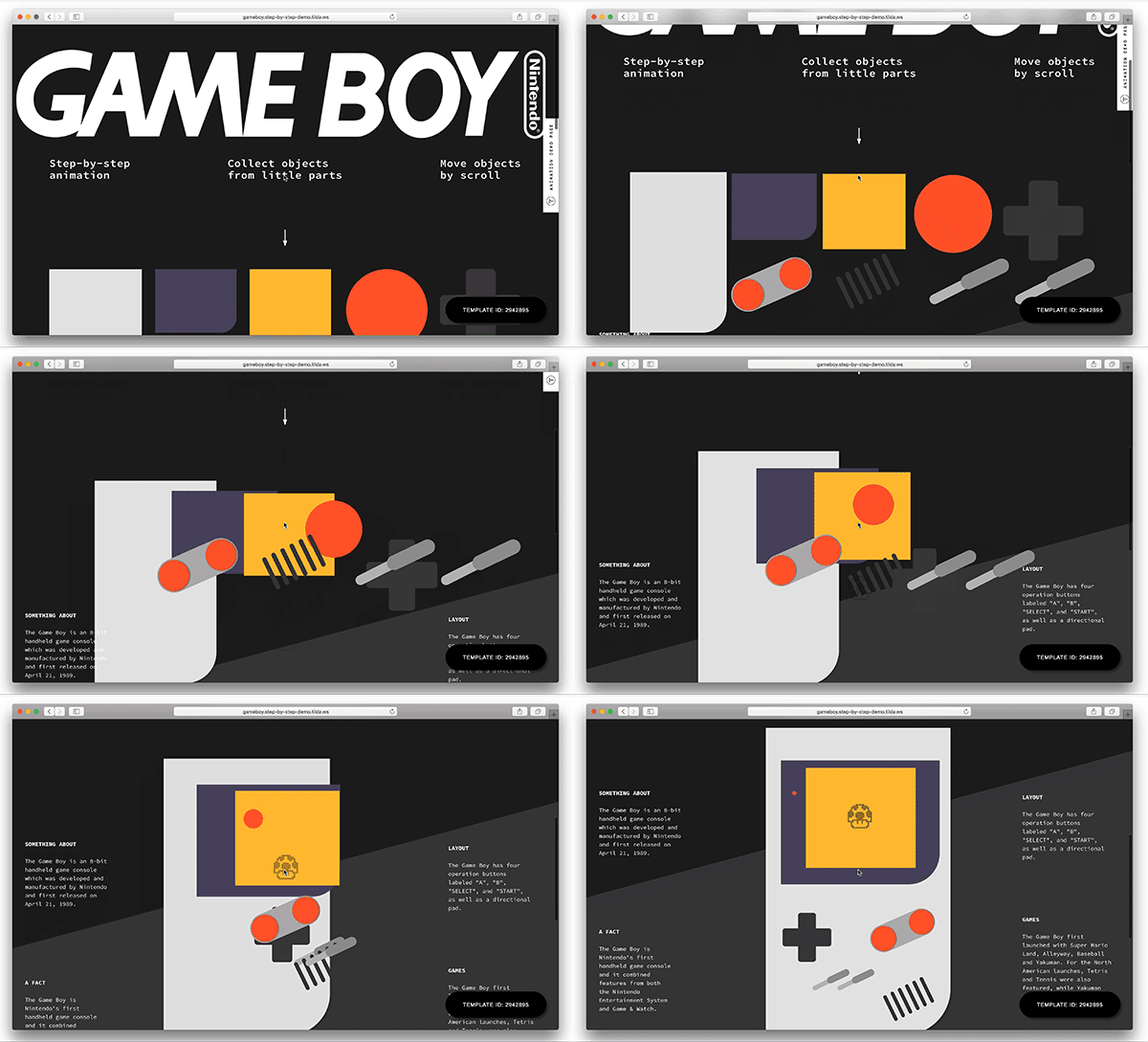
In addition to the appearance effects, you can adjust parallax and fixing. Parallax enables objects to move at different speeds when users scroll a page. Fixing allows you to fix an object on the screen during the scroll. You can play with following parameters: speed, duration, delay, event triggers for starting the animation.
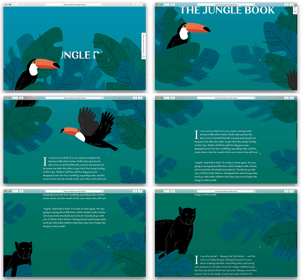
Here is a quick video that demonstrates how to create a complex animated effect.
3. Specially Designed Blocks
Those blocks are designed to add animation effects. You can also create animation using special blocks, such as:
- a typewriter effect,
- a galaxy effect for covers,
- an animated slideshow for covers
Templates
While templates and blocks sound pretty similar to each other, they are different. Templates are for common use cases (such as landing pages for businesses, event pages, blogs, etc.); they can be used as a base and later changed according to your own style. Choose a template that’s most relevant to your project, and customize it according to your preferences. Unlike many other website builders, Tilda doesn’t force users to select a template from a list. It’s entirely up to you whether to use a template or start with a blank slate.
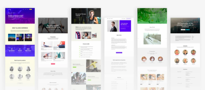
It’s also possible to design your own template. All you need to do is design your own page and save it as a template. You can share the template with others.
SEO Optimization
The web has over 1 billion websites and is continually growing. All of those websites are competing for visitors. In today’s competitive market, search engine optimization (SEO) &mdash improving a website's rankings in search results — is more important than ever, and it’s become a critical task of web designers.
The great news about Tilda is that it’s a search-engine-friendly platform; websites created with Tilda are automatically indexed by search engines. A robots.txt file (which contains special instructions for search engine robots) and a sitemap.xml file (which lists the URLs of the website) are generated automatically.
Users can improve search results using special settings:
- You can manage title and description settings and set meta tags for HTML objects (for example,
alttags for images). - Add
h1,h2andh3tags. Theh1heading carries the most weight for search engines. - Set https or http, www or non-www, and 301 redirects (a 301 redirect improves SEO when you change a URL).
Users have access to Tilda’s “Webmaster Dashboard”. This tool tests a website against basic recommendations from search engines and identifies errors that would affect indexing. The tool is available in “Site Settings” → “Analytics and SEO” → “Tilda Webmaster Dashboard”. Users can click “Check Pages” in “Critical Errors and Recommendations” to see which pages need work.
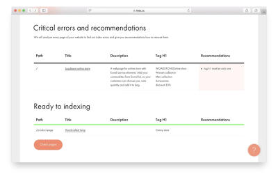
If you want specific recommendations on SEO optimization, consider reading the guide to SEO by Tilda.
Fonts
95% of the information on the web is written language. As Oliver Reichenstein states in his article “Web Design Is 95% Typography”: Optimizing typography is optimizing readability, accessibility, usability(!), overall graphic balance.
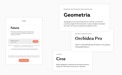
I’ve already mentioned that Tilda has a strong focus on typography, but it is worth saying a few words about the font collection. Fonts have a direct impact on a website’s aesthetics. Tilda users have access to a rich font collection. Tilda integrates with Google Fonts and Typekit. Users can use distinctive fonts such as Futura, Formular, Geometria, Circe, Kazimir and others provided by Rentafont.
Data Collection Forms
The primary goal of the business is creating and keeping customers. And one of the main tools that allow business to work with it customers is forms. Forms allow customers to send applications and feedback, or subscribe to mailing list. Using Tilda, you can create vertical, horizontal, pop-up, and step-by-step forms. The library has a separate category with ready-made design options.
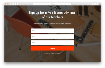
In vertical forms, you can add an unlimited number of fields. For each field you can choose its type: drop-down list, checkbox, phone number, file attachment, etc. Tida provides a few special form fields such as ‘Split’ and ‘Calculator.’ The ‘Split’ field allows you to divide the form into a few steps. The ‘Calculator’ field allows you to calculate the cost using a specific formula and shows the cost to the visitor before sending. This can be extremely useful for e-commerce websites (during product purchase).
Tilda integrates with various data-receiving services. It helps you solve common problems with data collection, such as:
- Connecting emails, Telegram or Slack messengers, Trello or Google Table to quickly proceed new applications.
- Running email campaigns and collecting email subscribers
Set up a form on Tilda and connect it to mailing lists in MailChimp, UniSender, SendGrid or GetResponse. - Collecting data about online orders into a CRM system
Trello, Pipedrive and AmoCRM are CRM systems that all have native integration with Tilda. All you need to do to start receiving the data is to link up your account.
Email Campaign Builder
Tilda has a built-in constructor for emails which allows you to create a nice looking email from blocks in no time. You can connect MailChimp, UniSender, SendGrid services and send mail directly from the Tilda interface. If you use other email services, email builder still can be useful for you — you can download HTML code of a template created in Tilda and use it in your service.
Built-In Analytics
Tilda has built-in analytics that show basic measurements of a website’s effectiveness: page views, page conversions, visitor engagement, etc. These key performance indicators satisfy the basic needs of users. It’s possible to view high-level details (general performance) and page-specific data.
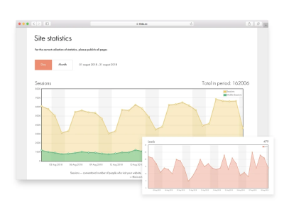
Tilda users can view source, medium and campaign tags in the UTM table. If you click the tag itself, you will be taken to a page where you can see statistics linked to this parameter, such as visitors, sessions, leads and a detailed view by day.
While Tilda analytics will cover you in 90% of cases, sometimes you need more data. At such times, you might need to switch to Google Analytics. Tilda allows you to connect Google Analytics and Google Tag Manager to monitor your website’s traffic. You don’t need to code in order to add Google counters to your pages; simply add your account to the page settings when setting up Analytics tracking.
Online Store Functions
Building online stores is one of the most common tasks of web designers. Unlike with other types of websites, web designers need to not only create a great design but also integrate with payment gateways. The great news is that Tilda has built-in e-commerce tools that enable you to build a small online stores in minutes, not hours or days.
Shopping Cart
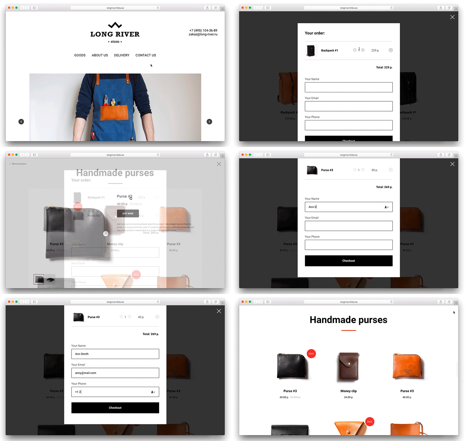
Tilda’s users can add a shopping cart to their website. The cart widget is universal, and you can use it to sell both goods and services. The cart is integrated with the order form, which you can customize as you want. Simply add the fields you need, and you’ll get the information you need.
The order form is very user-friendly. Visitors will be able to add a number of products and change the quantity of a product. You can modify checkout form wherever you like — for example, you can add a few different delivery options and/or a special field for promo codes. The final sum is calculated automatically. After successful payment, the customer will receive an email with order details (this feature is configured in the payment systems settings).
Accept Payments On Your Website
Receiving payment online might seem like a problem. But with Tilda, you don’t need to worry. Setting up payment gateways is very easy. All you need to do is choose your preferred way of taking payments: credit card, PayPal or Stripe. The order details will come to your email, Google Drive or CRM — you can connect any data reception service.

Features For Web Developers
Tilda provides a few excellent features for web developers:
- Tilda API for website integration
- Bespoke code
You can always add advanced functionality to your website with code. It’s easy to add bespoke HTML code, JavaScript or CSS to your Tilda website. You can add HTML code using the “Insert HTML” block or embed any type of code, includingscriptandstyletags. - Data exporting
What if you don’t want to depend on Tilda and want to host your website on your servers? No problem. Everything you make on Tilda can be easily exported in an archive. To export your code, go to “Project Settings” → “Export”. The archive will include static HTML code and all files, such as images, CSS and JavaScript. The exported code is ready to use; all you need to do to run the website is unpack the archive and copy the files to your server.
Publication Platform
Tilda isn’t just a website builder. It’s also a powerful cloud-based platform for publication. Websites created using Tilda can be published on Tilda’s servers or exported to yours. Below are a few benefits of using Tilda’s publication platform.
Hosting Not Needed
With Tilda, you don’t need to pay for hosting. Tilda guarantees a high loading speed and DDoS protection.
Optimized Page Speed Out Of The Box
The high loading speed is provided by the content delivery network (CDN), which is used to store images. All websites created on Tilda have lazy-loading enabled by default. This allows content to be downloaded very quickly, even on mobile devices.
Connect Your Domain Name
Assigning a unique address to your website is easy. Just go to “Project Settings” → “Domain”, and put your domain name in the “Custom Domain” field.
Configure HTTPS
Tilda provides free HTTPS for its users. Installing an SSL certificate is relatively easy. Go to “Settings” → “Analytics and SEO” → “Tilda Webmaster Panel” → “HTTPS Settings”, and generate your free certificate.
Who Tilda Is For
Now that you know what Tilda is and what features it has, it’s time to discuss how web designers can use this tool. According to Tilda’s team, the tool is used for a few purposes:
- Creating websites for business
It could be a company website or a small online store. - Creating landing pages
A landing page that gathers people to a conference, presents a new product or describes a special project. - Create a corporate blog or online magazine
It’s possible to create an outstanding visual presentation for an article or a case study using Tilda. - Validating a hypothesis
Create a website that serves as a proof of concept. For example, create a landing page and verify whether people are interested in the product or service. - Learning web skills
Tilda educates designers by providing examples of how to create things right.
Examples Of Websites Created Using Tilda
Tilda’s team also collects the best examples of websites built using the tool on its inspiration page. Below are a few inspiring websites that were designed with Tilda.
You can also read what people say about Tilda on the Capterra and Product Hunt (Tilda became Product of the day in 2016)
Trend Reports
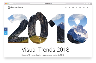
Tilda helps you to display high-quality images, videos and text in a fully customizable gallery. “Visual Trends 2018” by Deposit Photos is an excellent example of how to present visual information interestingly and engagingly.
Events
When it comes to creating web pages for events, it’s essential to present a lot of information in a logical and easy-to-scan way. Check out UX Sofia 2018, a website for a UX conference. It combines different information, such as the main talks and workshops, information about speakers, and the location, in easy-to-scan chunks.

Landing Pages
The purpose of a landing page is to convert visitors into customers. A lot of factors can affect conversions, but it’s clear that better-designed landing pages outperform competitors. Check Metric.ai’s landing page, which has a tool that estimates a project’s profitability.

Company Website
In the modern world, the first interaction between a customer and business happens online. People visit a website and decide whether they want to do business with that company. Design plays a vital role in the decision. When a website looks fresh and modern, there’s a better chance that people will work with the company. Quantum Attorneys uses a lot of popular visual effects (vibrant colors, duotones, attention-grabbing typography) to create a truly unique feel for visitors.

Artwork
People often come to a website for inspiration. Inspiration can come in many forms. But sometimes, a relatively simple design can arouse a lot of emotions. White space is one of the most significant aspects of design. Check out Buro247’s project called Silent Rebellion Fashion. The black and white aesthetic paired with the white space create a unique feel.

How Much Does Tilda Cost?
Tilda has both free and paid plans:
Tilda has both free and paid plans:
- The free plan allows you to create one website using a collection of 50 fundamental blocks. This plan has a few limitations: You can’t connect your own domain, and a UI element saying “Made on Tilda” will be placed on all pages by default.
- The personal plan is $10 per month. This plan allows you to create one website and provides access to the full blocks collection. It also allows you to configure a custom domain. There are no extra charges when you create an e-commerce website.
- The business plan is $20 per month. It includes everything in the personal plan but also allows you create up to five websites and to export source code.
Conclusion
Whatever website you want to create, whether it be a landing page, an online store or a personal blog, your goal is to make the content and design work together harmoniously and play off each other. With Tilda, it’s become much easier to achieve that harmonious balance.
Register in the platform today and try all the features yourself.
Further Reading
- CSS Scroll Snapping Aligned With Global Page Layout: A Full-Width Slider Case Study
- New CSS Viewport Units Do Not Solve The Classic Scrollbar Problem
- How Accessibility Standards Can Empower Better Chart Visual Design
- The Future Of User Research: Expert Insights And Key Trends

