Mixing Tangible And Intangible: Designing Multimodal Interfaces Using Adobe XD
(This article is kindly sponsored by Adobe.) User interfaces are evolving. Voice-enabled interfaces are challenging the long dominance of graphical user interfaces and are quickly becoming a common part of our daily lives. Significant progress in automatic speech recognition (APS) and natural language processing (NLP), together with an impressive consumer base (millions of mobile devices with built-in voice assistants), have influenced the rapid development and adoption of voice-based interface.
Products that use voice as the primary interface are becoming more and more popular. In the US alone, 47.3 million adults have access to a smart speaker (that’s one fifth of the US adult population), and the number is growing. But voice interfaces have a bright future not only in personal and home use. As people become accustomed to voice interfaces, they will come to expect them in a business context as well. Just imagine that soon you’ll be able to trigger a conference-room projector by saying something like, “Show my presentation”.
It’s evident that human-machine communication is rapidly expanding to encompass both written and spoken interaction. But does it mean that future interfaces will be voice-only? Despite some science-fiction portrayals, voice won’t completely replace graphical user interfaces. Instead, we’ll have a synergy of voice, visual and gesture in a new format of interface: a voice-enabled, multimodal interface.
In this article, we’ll:
- explore the concept of a voice-enabled interface and review different types of voice-enabled interfaces;
- find out why voice-enabled, multimodal user interfaces will be the preferred user experience;
- see how you can build a multimodal UI using Adobe XD.
The State Of Voice User Interfaces (VUI)
Before diving into the details of voice user interfaces, we must define what voice input is. Voice input is a human-computer interaction in which a user speaks commands instead of writing them. The beauty of voice input is that it’s a more natural interaction for people — users are not restricted to a specific syntax when interacting with a system; they can structure their input in many different ways, just as they would do in human conversation.
Voice user interfaces bring the following benefits to their users:
- Less interaction cost
Although using a voice-enabled interface does involve an interaction cost, this cost is smaller (in theory) than that of learning a new GUI. - Hands-free control
VUIs are great for when the users hands are busy — for example, while driving, cooking or exercising. - Speed
Voice is excellent when asking a question is faster than typing it and reading through the results. For example, when using voice in a car, it is faster to say the place to a navigation system, rather than type the location on a touchscreen. - Emotion and personality
Even when we hear a voice but don’t see an image of a speaker, we can picture the speaker in our head. This has an opportunity to improve user engagement. - Accessibility
Visually impaired users and users with a mobility impairment can use voice to interact with a system.
Three Types Of Voice-Enabled Interfaces
Depending on how voice is used, it could be one of the following types of interfaces.
Voice Agents In Screen-First Devices
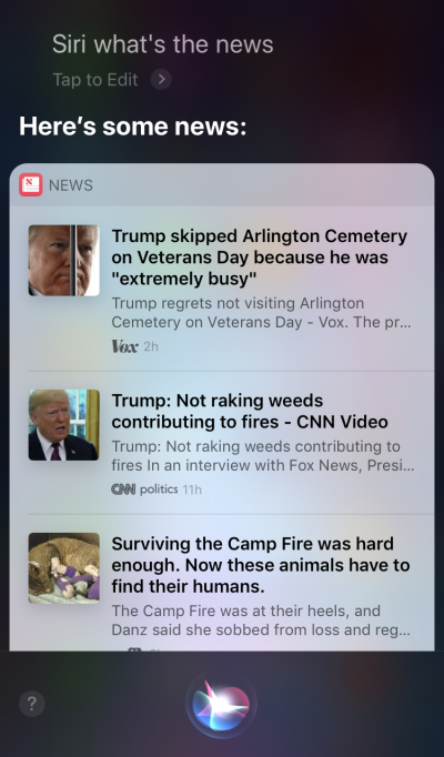
Apple Siri and Google Assistant are prime examples of voice agents. For such systems, the voice acts more like an enhancement for the existing GUI. In many cases, the agent acts as the first step in the user’s journey: The user triggers the voice agent and provides a command via voice, while all other interactions are done using the touchscreen. For example, when you ask Siri a question, it will provide answers in the format of a list, and you need to interact with that list. As a result, the user experience becomes fragmented — we use voice to initiate the interaction and then shift to touch to continue it.
Voice-Only Devices
These devices don’t have visual displays; users rely on audio for both input and output. Amazon Echo and Google Home smart speakers are prime examples of products in this category. The lack of a visual display is a significant constraint on the device’s ability to communicate information and options to the user. As a result, most people use these devices to complete simple tasks, such as playing music and getting answers to simple questions.

Voice-First Devices
With voice-first systems, the device accepts user input primarily via voice commands, but also has an integrated screen display. It means that voice is the primary user interface, but not the only one. The old saying, “A picture is worth a thousand words” still applies to modern voice-enabled systems. The human brain has incredible image-processing abilities — we can understand complex information faster when we see it visually. Compared to voice-only devices, voice-first devices allow users to access a larger amount of information and make many tasks much easier.
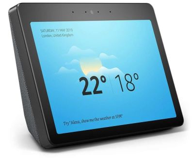
The Amazon Echo Show is a prime example of a device that employs a voice-first system. Visual information is gradually incorporated as part of a holistic system — the screen is not loaded with app icons; rather, the system encourages users to try different voice commands (suggesting verbal commands such as, “Try ‘Alexa, show me the weather at 5:00 pm’”). The screen even makes common tasks such as checking a recipe while cooking much easier — users don’t need to listen carefully and keep all of the information in their heads; when they need the information, they simply look at the screen.
Introducing Multimodal Interfaces
When it comes to using voice in UI design, don’t think of voice as something you can use alone. Devices such as Amazon Echo Show include a screen but employ voice as the primary input method, making for a more holistic user experience. This is the first step towards a new generation of user interfaces: multimodal interfaces.
A multimodal interface is an interface that blends voice, touch, audio and different types of visuals in a single, seamless UI. Amazon Echo Show is an excellent example of a device that takes full advantage of a voice-enabled multimodal interface. When users interact with Show, they make requests just as they would with a voice-only device; however, the response they receive will likely be multimodal, containing both voice and visual responses.
Multimodal products are more complex than products that rely only on visuals or only on voice. Why should anyone create a multimodal interface in the first place? To answer that question, we need to step back and see how people perceive the environment around them. People have five senses, and the combination of our senses working together is how we perceive things. For example, our senses work together when we are listening to music at a live concert. Remove one sense (for example, hearing), and the experience takes on an entirely different context.

For too long, we’ve thought about the user experience as exclusively either visual or gestural design. It’s time to change this thinking. Multimodal design is a way to think about and design for experiences that connect our sensory abilities together.
Multimodal interfaces feel like a more human way for user and machine to communicate. They open up new opportunities for deeper interactions. And today, it’s much easier to design multimodal interfaces because the technical limitations that in the past constrained interactions with products are being erased.
The Difference Between A GUI And Multimodal Interface
The key difference here is that multimodal interfaces like Amazon Echo Show sync voice and visual interfaces. As a result, when we’re designing the experience, the voice and visuals are no longer independent parts; they are integral parts of the experience that the system provides.
Visual And Voice Channel: When To Use Each
It’s important to think about voice and visuals as channels for input and output. Each channel has its own strengths and weaknesses.
Let’s start with the visuals. It’s clear that some information is just easier to understand when we see it, rather than when we hear it. Visuals work better when you need to provide:
- a long lists of options (reading a long list will take a lot of time and be difficult to follow);
- data-heavy information (such as diagrams and graphs);
- product information (for example, products in online shops; most likely, you would want to see a product before buying) and product comparison (as with the long list of options, it would be hard to provide all of the information using only voice).
For some information, however, we can easily rely on verbal communication. Voice might be the right fit for the following cases:
- user commands (voice is an efficient input modality, allowing users to give commands to the system quickly and bypassing complex navigation menus);
- simple user instructions (for example, a routine check on a prescription);
- warnings and notifications (for example, an audio warning paired with voice notifications during driving).
While these are a few typical cases of visual and voice combined, it’s important to know that we can’t separate the two from each other. We can create a better user experience only when both voice and visuals work together. For example, suppose we want to purchase a new pair of shoes. We could use voice to request from the system, “Show me New Balance shoes.” The system would process your request and visually provide product information (an easier way for us to compare shoes).
What You Need To Know To Design Voice-Enabled, Multimodal Interfaces
Voice is one of the most exciting challenges for UX designers. Despite its novelty, the fundamental rules for designing voice-enabled, multimodal interface are the same as those we use to create visual designs. Designers should care about their users. They should aim to reduce friction for the user by solving their problems in efficient ways and prioritize clarity to make the user’s choices clear.
But there are some unique design principles for multimodal interfaces as well.
Make Sure You Solve The Right Problem
Design should solve problems. But it’s vital to solve the right problems; otherwise, you could spend a lot of time creating an experience that doesn’t bring much value to users. Thus, make sure you’re focused on solving the right problem. Voice interactions should make sense to the user; users should have a compelling reason to use voice over other methods of interaction (such as clicking or tapping). That’s why, when you create a new product — even before starting the design — it’s essential to conduct user research and determine whether voice would improve the UX.
Start with creating a user journey map. Analyze the journey map and find places where including voice as a channel would benefit the UX.
- Find places in the journey where users might encounter friction and frustration. Would using voice reduce the friction?
- Think about the context of the user. Would voice work for a particular context?
- Think about what is uniquely enabled by voice. Remember the unique benefits of using voice, such as hands-free and eyes-free interaction. Could voice add value to the experience?
Create Conversational Flows
Ideally, the interfaces you design should require zero interaction cost: Users should be able to fulfill their needs without spending extra time on learning how to interact with the system. This happens only when voice interaction resemble a real conversation, not a system dialog wrapped in the format of voice commands. The fundamental rule of a good UI is simple: Computers should adapt to humans, not the other way around.
People rarely have flat, linear conversations (conversations that only last one turn). That’s why, to make interaction with a system feel like a live conversation, designers should focus on creating conversational flows. Each conversational flow consists of dialogs — the pathways that occur between the system and the user. Each dialog would include the system’s prompts and the user’s possible responses.
A conversational flow can be presented in the form of a flow diagram. Each flow should focus on one particular use case (for example, setting an alarm clock using a system). For most dialogs in a flow, it’s vital to consider error paths, when things go off the rails.
Each voice command of the user consists of three key elements: intent, utterance and slot.
- Intent is the objective of the user’s interaction with a voice-enabled system.
An intent is just a fancy way of defining the purpose behind a set of words. Each interaction with a system brings the user some utility. Whether it’s information or an action, the utility is in intent. Understanding the user’s intent is a crucial part of voice-enabled interfaces. When we design VUI, we don’t always know for sure what a user’s intent is, but we can guess it with high accuracy. - Utterance is how the user phrases their request.
Usually, users have more than one way to formulate a voice command. For example, we can set an alarm clock by saying “Set alarm clock to 8 am”, or “Alarm clock 8 am tomorrow” or even “I need to wake up at 8 am.” Designers need to consider every possible variation of utterance. - Slots are variables that users use in a command. Sometimes users need to provide additional information in the request. In our example of the alarm clock, “8 am” is a slot.
Don’t Put Words In The User’s Mouth
People know how to talk. Don't try to teach them commands. Avoid phrases like, “To send a meeting appointment, you need to say ‘Calendar, meetings, create a new meeting’.” If you have to explain commands, you need to reconsider the way you’re designing the system. Always aim for natural language conversation, and try to accommodate diverse speaking styles).
Strive For Consistency
You need to achieve consistency in language and voice across contexts. Consistency will help to build familiarity in interactions.
Always Provide Feedback
Visibility of system status is one of the fundamental principles of good GUI design. The system should always keep users informed of what is going on through appropriate feedback within a reasonable time. The same rule applies to VUI design.
- Make the user aware that the system is listening.
Show visual indicators when the device is listening or processing the user’s request. Without feedback, the user can only guess whether the system is doing something. That’s why even voice-only devices such as Amazon Echo and Google Home give us nice visual feedback (flashing lights) when they are listening or searching for an answer. - Provide conversational markers.
Conversational markers tell the user where they’re at in the conversation. - Confirm when a task is completed.
For example, when users ask the voice-enabled smart home system “Turn off the lights in the garage”, the system should let the user know that the command has been successfully executed. Without confirmation, users will need to walk into the garage and check the lights. It defeats the purpose of the smart home system, which is to make the user’s life easier.
Avoid Long Sentences
When designing a voice-enabled system, consider the way you provide information to users. It’s relatively easy to overwhelm users with too much information when you use long sentences. First, users can’t retain a lot of information in their short-term memory, so they can easily forget some important information. Also, audio is a slow medium — most people can read much faster than they can listen.
Be respectful of your user’s time; don’t read out long audio monologues. When you’re designing a response, the fewer words you use, the better. But remember that you still need to provide enough information for the user to complete their task. Thus, if you cannot summarize an answer in a few words, display it on the screen instead.
Provide Next Steps Sequentially
Users can be overwhelmed not only by long sentences, but also their number of options at one time. It’s vital to break down the process of interaction with a voice-enabled system into bite-sized chunks. Limit the number of choices the user has at any one time, and make sure they know what to do at every moment.
When designing a complex voice-enabled system with a lot of features, you can use the technique of progressive disclosure: Present only the options or information necessary to complete the task.
Have A Strong Error-Handling Strategy
Of course, the system should prevent errors from occurring in the first place. But no matter how good your voice-enabled system is, you should always design for the scenario in which the system doesn’t understand the user. Your responsibility is to design for such cases.
Here are a few practical tips for creating a strategy:
- Don’t blame the user.
In conversation, there are no errors. Try to avoid reponses like, “Your answer is incorrect.” - Provide error-recovery flows.
Provide an option for back-and-forths in a conversation, or even to exit the system, without losing important information. Save the user’s state in the journey, so that they can re-engage with the system right from where they left off. - Let users replay information.
Provide an option to make the system repeat the question or answer. This might be helpful for complex questions or answers where it would be hard for the user to commit all of the information to their working memory. - Provide stop wording.
In some cases, the user will not be interested in listening to an option and will want the system to stop talking about it. Stop wording should help them do just that. - Handle unexpected utterances gracefully.
No matter how much you invest in the design of a system, there will be situations when the system doesn’t understand the user. It’s vital to handle such cases gracefully. Don’t be afraid to let the system admit a lack of understanding. The system should communicate what it has understood and provide helpful reprompts. - Use analytics to improve your error strategy.
Analytics can help you identify wrong turns and misinterpretations.
Keep Track Of Context
Make sure the system understands the context of the user’s input. For example, when someone says that they want to book a flight to San Francisco next week, they might refer to “it” or “the city” during the conversational flow. The system should remember what was said and be able to match it to the newly received information.
Learn About Your Users To Create More Powerful Interactions
A voice-enabled system becomes more sophisticated when it uses additional information (such as user context or past behavior) to understand what the user wants. This technique is called intelligent interpretation, and it requires that the system actively learn about the user and be able to adjust their behavior accordingly. This knowledge will help the system to provide answers even to complex questions, such as "What gift should I buy for my wife’s birthday?"
Give Your VUI A Personality
Every voice-enabled system has an emotional impact on the user, whether you plan for it or not. People associate voice with humans rather than machines. According to Speak Easy Global Edition research, 74% of regular users of voice technology expect brands to have unique voices and personalities for their voice-enabled products. It’s possible to build empathy through personality and achieve a higher level of user engagement.
Try to reflect your unique brand and identity in the voice and tone you present. Construct a persona of your voice-enabled agent, and rely on this persona when creating dialogs.
Build Trust
When users don’t trust a system, they don’t have the motivation to use it. That’s why building trust is a requirement of product design. Two factors have a significant impact on the level of trust built: system capabilities and valid outcome.
Building trust starts with setting user expectations. Traditional GUIs have a lot of visual details to help the user understand what the system is capable of. With a voice-enabled system, designers have fewer tools to rely on. Still, it’s vital to make the system naturally discoverable; the user should understand what is and isn’t possible with the system. That’s why a voice-enabled system might require user onboarding, where it talks about what the system can do or what it knows. When designing onboarding, try to offer meaningful examples to let people know what it can do (examples work better than instructions).
When it comes to valid outcomes, people know that voice-enabled systems are imperfect. When a system provides an answer, some users might doubt that the answer is correct. this happens because users don’t have any information about whether their request was correctly understood or what algorithm was used to find the answer. To prevent trust issues, use the screen for supporting evidence — display the original query on the screen — and provide some key information about the algorithm. For example, when a user asks, “Show me the top five movies of 2018”, the system can say, “Here are top five movies of 2018 according to the box office in the US”.
Don’t Ignore Security And Data Privacy
Unlike mobile devices, which belong to the individual, voice devices tend to belong to a location, like a kitchen. And usually, there are more than one person in the same location. Just imagine that someone else can interact with a system that has access to all of your personal data. Some VUI systems such as Amazon Alexa, Google Assistant and Apple Siri can recognize individual voices, which adds a layer of security to the system. Still, it doesn’t guarantee that the system will be able to recognize users based on their unique voice signature in 100% of cases.
Voice recognition is continually improving, and it will be hard or nearly impossible to imitate a voice in the near future. However, in the current reality, it’s vital to provide an additional authentication layer to reassure the user that their data is safe. If you design an app that works with sensitive data, such as health information or banking details, you might want to include an extra authentication step, such as a password or fingerprint or face recognition.
Conduct Usability Testing
Usability testing is a mandatory requirement for any system. Test early, test often should be a fundamental rule of your design process. Gather user research data early on, and iterate your designs. But testing multimodal interfaces has its own specifics. Here are two phases that should be taken into account:
- Ideation phase
Test drive your sample dialogs. Practice reading sample dialogs out loud. Once you have some conversational flows, record both sides of the conversation (the user’s utterances and the system’s responses), and listen to the recording to understand whether they sound natural. - Early stages of product development (testing with lo-fi prototypes)
Wizard of Oz testing is well-suited to testing conversational interfaces. Wizard of Oz testing is a type of testing in which a participant interacts with a system that they believe is operated by a computer but is in fact operated by a human. The test participant formulates a query, and a real person responds on the other end. This method gets its name from the book The Wonderful Wizard of Oz by Frank Baum. In the book, an ordinary man hides behind a curtain, pretending to be a powerful wizard. This test allows you to map out every possible scenario of interaction and, as a result, create more natural interactions. Say Wizard is a great tool to help you run a Wizard of Oz voice-interface test on macOS. - Later stages of product development (testing with hi-fi prototypes)
In usability testing of graphical user interfaces, we often ask users to speak out loud when they interact with a system. For a voice-enabled system, that’s not always possible because the system would be listening to that narration. So, it might be better to observe the user’s interactions with the system, rather than ask them to speak out loud.
How To Create A Multimodal Interface Using Adobe XD
Now that you have a solid understanding of what a multimodal interface is and what rules to remember when designing them, we can discuss how to make a prototype of a multimodal interface.
Prototyping is a fundamental part of the design process. Being able to bring an idea to life and share it with others is extremely important. Until now, designers who wanted to incorporate voice in prototyping had few tools to rely on, the most powerful of which was a flowchart. Picturing how a user would interact with a system required a lot of imagination from someone looking at the flowchart. With Adobe XD, designers now have access to the medium of voice and can use it in their prototypes. XD seamlessly connects screen and voice prototyping in one app.
New Experiences, Same Process
Even though voice is a totally different medium than visual, the process of prototyping for voice in Adobe XD is pretty much the same as prototyping for a GUI. The Adobe XD team integrates voice in a way that will feel natural and intuitive for any designer. Designers can use voice triggers and speech playback to interact with prototypes:
- Voice triggers start an interaction when a user says a particular word or phrase (utterance).
- Speech playback gives designers access to a text-to-speech engine. XD will speak words and sentences defined by a designer. Speech playback can be used for many different purposes. For example, it can act as an acknowledgment (to reassure users) or as guidance (so users know what to do next).
The great thing about XD is that it doesn’t force you to learn the complexities of each voice platform.
Enough words — let’s see how it works in action. For all of the examples you’ll see below, I’ve used artboards created using Adobe XD UI kit for Amazon Alexa (this is a link to download the kit). The kit contains all of the styles and components needed to create experiences for Amazon Alexa.
Suppose we have the following artboards:

Let’s go into prototyping mode to add in some voice interactions. We’ll start with voice triggers. Along with triggers such as tap and drag, we are now able to use voice as a trigger. We can use any layers for voice triggers as long as they have a handle leading to another artboard. Let’s connect the artboards together.
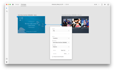
Once we do that, we’ll find a new “Voice” option under the “Trigger”. When we select this option, we’ll see a “Command” field that we can use to enter an utterance — this is what XD will actually be listening for. Users will need to speak this command to activate the trigger.
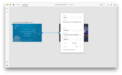
That’s all! We’ve defined our first voice interaction. Now, users can say something, and a prototype will respond to it. But we can make this interaction much more powerful by adding speech playback. As I mentioned previously, speech playback allows a system to speak some words.
Select an entire second artboard, and click on the blue handle. Choose a “Time” trigger with a delay and set it to 0.2s. Under the action, you’ll find “Speech Playback”. We’ll write down what the virtual assistant speaks back to us.
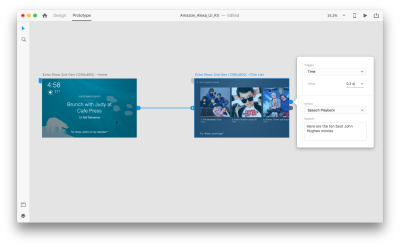
We’re ready to test our prototype. Select the first artboard, and clicking the play button in the top right will launch a preview window. When interacting with voice prototyping, make sure your mic is on. Then, hold down the spacebar to speak the voice command. This input triggers the next action in the prototype.
Use Auto-Animate To Make The Experience More Dynamic
Animation brings a lot of benefits to UI design. It serves clear functional purposes, such as:
- communicating the spatial relationships between objects (Where does the object come from? Are those objects related?);
- communicating affordance (What can I do next?)
But functional purposes aren’t the only benefits of animation; animation also makes the experience more alive and dynamic. That’s why UI animations should be a natural part of multimodal interfaces.
With “Auto-Animate” available in Adobe XD, it becomes much easier to create prototypes with immersive animated transitions. Adobe XD does all the hard work for you, so you don’t need to worry about it. All you need to do to create an animated transition between two artboards is simply duplicate an artboard, modify the object properties in the clone (properties such as size, position and rotation), and apply an Auto-Animate action. XD will automatically animate the differences in properties between each artboard.
Let’s see how it works in our design. Suppose we have an existing shopping list in Amazon Echo Show and want to add a new object to the list using voice. Duplicate the following artboard:

Let’s introduce some changes in the layout: Add a new object. We aren’t limited here, so we can easily modify any properties such as text attributes, color, opacity, position of the object — basically, any changes we make, XD will animate between them.
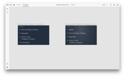
When you wire two artboards together in prototype mode using Auto-Animate in “Action”, XD will automatically animate the differences in properties between each artboard.

And here’s how the interaction will look to users:

One crucial thing that requires mentioning: Keep the names of all of the layers the same; otherwise, Adobe XD won’t be able to apply the auto-animation.
Conclusion
We’re at the dawn of a user interface revolution. A new generation of interfaces — multimodal interfaces — not only will give users more power, but will also change the way users interact with systems. We will probably still have displays, but we won’t need keyboards to interact with the systems.
At the same time, the fundamental requirements for designing multimodal interfaces won’t be much different from those of designing modern interfaces. Designers will need to keep the interaction simple; focus on the user and their needs; design, prototype, test and iterate.
And the great thing is that you don’t need to wait to start designing for this new generation of interfaces. You can start today.
This article is part of the UX design series sponsored by Adobe. Adobe XD tool is made for a fast and fluid UX design process, as it lets you go from idea to prototype faster. Design, prototype and share — all in one app. You can check out more inspiring projects created with Adobe XD on Behance, and also sign up for the Adobe experience design newsletter to stay updated and informed on the latest trends and insights for UX/UI design.
Further Reading
- Iconography In Design Systems: Easy Troubleshooting And Maintenance
- Connecting With Users: Applying Principles Of Communication To UX Research
- Better Context Menus With Safe Triangles
- Modern CSS Tooltips And Speech Bubbles (Part 1)

