How To Design Search For Your Mobile App
Why is Google the search behemoth it is today? Part of the reason is because of how it’s transformed our ability to search for answers.
Think about something as simple as looking up the definition of a word. 20 years ago, you would’ve had to pull your dictionary off the shelf to find an answer to your query. Now, you open your phone or turn on your computer, type or speak the word, and get an answer in no time at all and with little effort on your part.
This form of digital shortcutting doesn’t just exist on search engines like Google. Mobile apps now have self-contained search functions as well.
Is a search bar even necessary in a mobile app interface or is it overkill? Let’s take a look at why the search bar element is important for the mobile app experience. Then, we’ll look at a number of ways to design search based on the context of the query and the function of the app.
Using The Web With A Screen Reader
Did you know that VoiceOver makes up 11.7% of desktop screen reader users and rises to 69% of screen reader users on mobile? It’s important to know what sort of first-hand difficulties visually impaired users face and what web developers can do to help. Read a related article →
Mobile App Search Is Non-Negotiable
The search bar has been a standard part of websites for years, but statistics show that it isn’t always viewed as a necessity by users. This data from Neil Patel and Kissmetrics focuses on the perception and usage of the search bar on e-commerce websites:
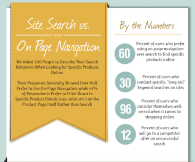
As you can see, 60% of surveyed users prefer using navigation instead of search while 47% opt for filterable “search” over regular search functionality.
On a desktop website, this makes sense. When a menu is well-designed and well-labeled — no matter how extensive it may be — it’s quite easy to use. Add to that advanced filtering options, and I can see why website visitors would prefer that to search.
But mobile app users are a different breed. They go to mobile apps for different reasons than they do websites. In sum, they want a faster, concentrated, and more convenient experience. However, since smartphone screens have limited space, it’s not really feasible to include an expansive menu or set of filters to aid in the navigation of an app.
This is why mobile apps need a search bar.
You’re going to find a lot of use for search in mobile apps:
- Content-driven apps like newspapers, publishing platforms, and blogs;
- e-Commerce shops with large inventories and categorization of those inventories;
- Productivity apps that contain documents, calendars, and other searchable records;
- Listing sites that connect users to the right hotel, restaurant, itinerary, item for sale, apartment for rent, and so on;
- Dating and networking apps that connect users with vast quantities of “matches”.
There are plenty more reasons why you’d need to use a search bar on your mobile app, but I’m going to let the examples below speak for themselves.
Ways To Design Search For Your Mobile App
I’m going to break down this next section into two categories:
- How to design the physical search element in your mobile app,
- How to design the search bar and its results within the context of the app.
1. Designing The Physical Search Element
There are a number of points to consider when it comes to the physical presence of your app search element:
Top Or Bottom?
Shashank Sahay explains why there are two places where the search element appears on a mobile app:
- 1. Full-width bar at the top of the app.
This is for apps that are driven by search. Most of the time, users open the app with the express purpose of conducting a search.
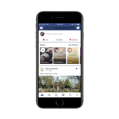
Facebook is a good example. Although Facebook users most likely do engage with the news feed in the app, I have a sneaking suspicion that Facebook’s data indicates that the search function is more commonly engaged with — at least in terms of first steps. Hence, why it’s placed at the top of the app.
- 2. A tab in the bottom-aligned navigation bar.
This is for apps that utilize search as an enhancement to the primary experience of using the app’s main features.
Let’s contrast Facebook against one of its sister properties: Instagram. Unlike Facebook, Instagram is a very simple social media app. Users follow other accounts and get glimpses into the content they share through full-screen story updates as well as from inside their endless-scroll news feed.

With that said, the search function does exist in the navigation bar so that users can look up other accounts to peruse through or follow.
As far as this basic breakdown goes, Sahay is right about how placement of search correlates with intention. But the designing of the search element goes beyond just where it’s placed on the app.
Shallow Or Deep?
There will be times when a mobile app would benefit from a search function deep within the app experience.
You’ll see this sort of thing quite often in e-commerce apps like Bed Bath & Beyond:
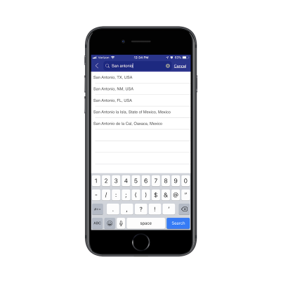
In this example, this search function exists outside of the standard product search on the main landing page. Results for this kind of search are also displayed in a unique way which is reflective of the purpose of the search:

There are other ways you use might need to use “deep” search functions on e-commerce apps.
Think about stores that have loads of comments attached to each product. If your users want to zero in on what other consumers had to say about a product (for example, if a camping tent is waterproof), the search function would help them quickly get to reviews containing specific keywords.
You’ll also see deep searches planted within travel and entertainment apps like Hotels.com:
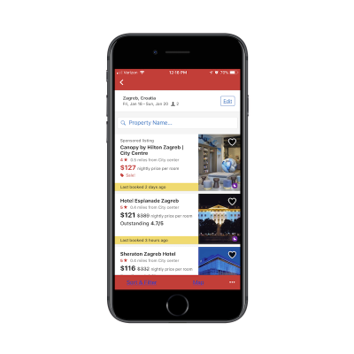
You’re all probably familiar with the basic search function that goes with any travel-related app. You enter the details of your trip and it pulls up the most relevant results in a list or map format. That’s what this screenshot is of.
However, see where it says “Property Name” next to the magnifying glass? This is a search function within a search function. And the only things users can search for here are actual hotel property names.
Bar, Tab, Or Magnifying Glass?
This brings me to my next design point: how to know which design element to represent the search function with.
You’ve already seen clear reasons to use a full search bar over placing a tab in the navigation bar. But how about a miniaturized magnifying glass?
Here’s an example of how this is used in the YouTube mobile app:
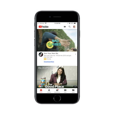
The way I see it, the magnifying glass is the search design element you’d use when:
- One of the primary reasons users come to the app is to do a search,
- And it competes against another primary use case.
In this case, YouTube needs the mini-magnifying glass because it serves two types of users:
- Users that come to the app to search for videos.
- Users that come to the app to upload their own videos.
To conserve space, links to both exist within the header of the YouTube app. If you have competing priorities within your app, consider doing the same.
“Search” Or Give A Hint?
One other thing to think about when designing search for mobile apps is the text inside the search box. To decide this, you have to ask yourself:
“Will my users know what sort of stuff they can look up with this search function?”
In most cases they will, but it might be best to include hint text inside the search bar just to make sure you’re not adding unnecessary friction. Here’s what I mean by that:
This is the app for Airbnb:
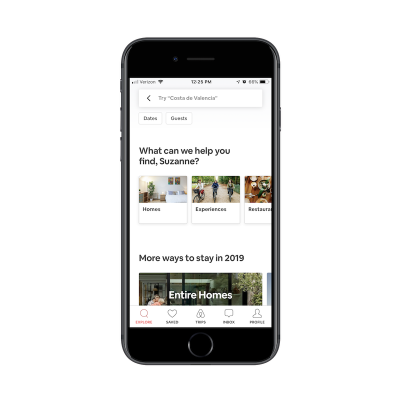
The search bar tells me to “Try ‘Costa de Valencia’”. It’s not necessarily an explicit suggestion. It’s more helping me figure out how I can use this search bar to research places to stay on an upcoming trip.
For users that are new to Airbnb, this would be a helpful tip. They might come to the site thinking it’s like Hotels.com that enables users to look up things like flights and car rentals. Airbnb, instead, is all about providing lodging and experiences, so this search text is a good way to guide users in the right direction and keep them from receiving a “Sorry, there are no results that match your query” response.
2. Designing The Search Bar And Results In Context
Figuring out where to place the search element is one point to consider. Now, you have to think about how to present the results to your mobile app users:
Simple Search
This is the most basic of the search functions you can offer. Users type their query into the search bar. Relevant results appear below. In other words, you leave it up to your users to know what they’re searching for and to enter it correctly.
When a relevant query is entered, you can provide results in a number of ways.
For an app like Flipboard, results are displayed as trending hashtags:
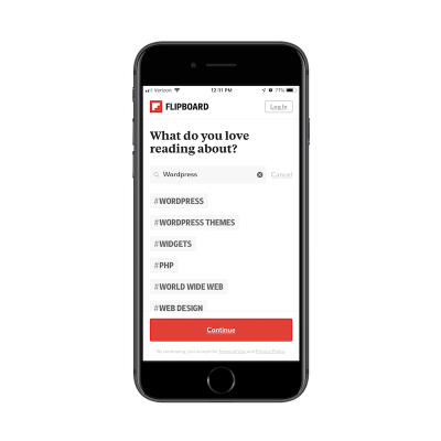
It’s not the most common way you’d see search results displayed, but it makes sense in this particular context. What users are searching for are categories of content they want to see in their feed. These hashtagged categories allow users to choose high-level topics that are the most relevant to them.
ESPN has a more traditional basic search function:
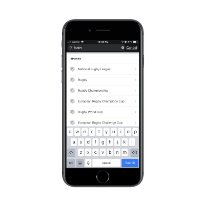
As you can see, ESPN provides a list of results that contain the keyword. There’s nothing more to it than that though. As you’ll see in the following examples, you can program your app search to more closely guide users to the results they want to see.
Filtered Search
According to the aforementioned Kissmetrics survey, advanced filtering is a popular search method among website users. If your mobile app has a lot of content or a vast inventory of products, consider adding filters to the end of your search function to improve the experience further. Your users are already familiar with the search technique. Plus, it’ll save you the trouble of having to add advancements to the search functionality itself.
Yelp has a nice example of this:

In the search above, I originally looked for restaurants in my “Current Location”. Among the various filters displayed, I decided to add “Order Delivery” to my query. My search query then became:
Restaurants > Current Location > Delivery
This is really no different than using breadcrumbs on a website. In this case, you let users do the initial work by entering a search query. Then, you give them filters that allow them to narrow down their search further.
Again, this is another way to reduce the chances that users will encounter the “No results” response to their query. Because filters correlate to actual categories and segmentations that exist within the app, you can ensure they end up with valid search results every time.
e-Commerce websites are another good use case for filters. Here is how Wayfair does this:
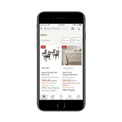
Wayfair’s list of search results is fairly standard for an e-commerce marketplace. The number of items are displayed, followed by a grid of matching product images and summary details.
Here’s the thing though: Wayfair has a massive inventory. It’s the same with other online marketplaces like Amazon and Zappos. So, when you tell users that their search query produced 2,975 items, you need a way to mitigate some of the overwhelm that may come with that.
By placing the Sort and Filter buttons directly beside the search result total, you’re encouraging users to do a little more work on their search query to ensure they get the best and most relevant results.
Predictive Search
Autocomplete is something your users are already familiar with. For apps that contain lots of content, utilizing this type of search functionality could be majorly helpful to your users.
For one, they already know how it works and so they won’t be surprised when related query suggestions appear before them. In addition, autocomplete offers a sort of personalization. As you gather more data on a user as well as the kinds of searches they conduct, autocomplete anticipates their needs and provides a shortcut to the desired content.
Pinterest is a social media app that people use to aggregate content they’re interested in and to seek out inspiration for pretty much anything they’re doing in life:
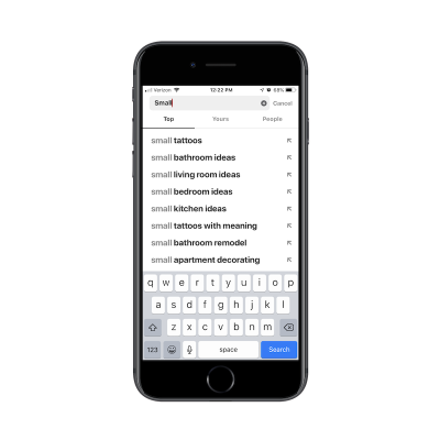
Take a look at the search results above. Can you tell what I’ve been thinking about lately? The first is how I’m going to decorate my new apartment. The second is my next tattoo. And despite only typing out the word “Small”, Pinterest immediately knew what’s been top-of-mind with me as of recent. That doesn’t necessarily mean I as a user came to the app with that specific intention today… but it’s nice to see that personalized touch as I engage with the search bar.
Another app I engage with a lot is the Apple Photos app:
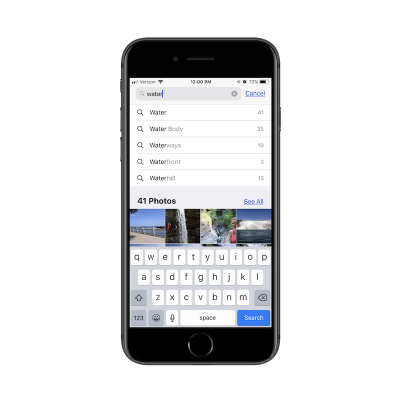
In addition to using it to store all of my personal photos, I use this on a regular basis to take screenshots for work (as I did in this article). As you can imagine, I have a lot of content saved to this app and it can be difficult finding what I need just by scrolling through my folders.
In the example above, I was trying to find a photo I had taken at Niagara Falls, but I couldn’t remember if I had labeled it as such. So, I typed in “water” and received some helpful autocomplete suggestions on “water”-related words as well as photos that fit the description.
I would also put “Recent Search” results into this bucket. Here’s an example from Uber:

Before I even had a chance to type my search query in the Uber app, it displays my most recent search queries for me.
I think this would be especially useful for people who use ride-sharing services on a regular basis. Think about professionals who work in a city. Rather than own a car, they use Uber to transport to and from their office as well as client appointments. By providing a shortcut to recent trips in search results, the Uber app cuts down the time they spend booking a trip.
If you have enough data on your users and you have a way to anticipate their needs, autocomplete is a fantastic way to personalize search and improve the overall experience.
Limited Search
I think this time savings point is an important one to remember when designing search for mobile apps.
Unlike websites where longer times-on-page matter, that’s not always the case with mobile apps. Unless you’ve built a gaming or news app where users should spend lots of time engaging with the app on a daily basis, it’s not usually the amount of time spent inside the app that matters.
Your goal in building a mobile app is to retain users over longer periods, which means providing a meaningful experience while they’re inside it. A well-thought-out search function will greatly contribute to this as it gets users immediately to what they want to see, even if it means they leave the app just a few seconds later.
If you have an app that needs to get users in and out of it quickly, think about limiting search results as Ibotta has done:
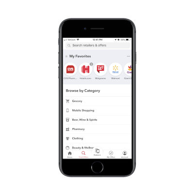
While users certainly can enter any query they’d like, Ibotta makes it clear that the categories below are the only ones available to search from. This serves as both a reminder of what the app is capable of as well as a means for circumventing the search results that don’t matter to users.
Hotels.com also places limits on its search function:
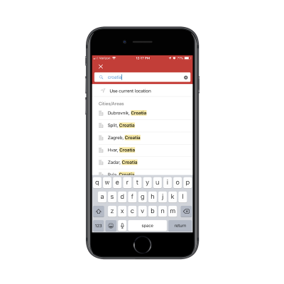
As you can see here, users can’t just look for hotels throughout the country of Croatia. It’s just too broad of a search and one that Hotels.com shouldn’t have to provide. For one, it’s probably too taxing on the Hotels.com server to execute a query of that nature. Plus, it would provide a terrible experience for users. Imagine how many hotels would show up in that list of results.
By reining in what your users can search for and the results they can see, you can improve the overall experience while shortening the time it takes them to convert.
Wrapping Up
As you can see here, a search bar isn’t some throwaway design element. When your app promises a speedy and convenient experience to its users, a search bar can cut down on the time they have to spend inside it. It can also make the app a more valuable resource as it doesn’t require much work or effort to get to the desired content.
Further Reading
- Iconography In Design Systems: Easy Troubleshooting And Maintenance
- Sliding 3D Image Frames In CSS
- The Things Users Would Appreciate In Mobile Apps
- Penpot’s CSS Grid Layout: Designing With Superpowers


 Register For Free
 Devs love Storyblok - Learn why!
 Get a Free Trial
 JavaScript Form Builder — Create JSON-driven forms without coding.


