Smashing Monthly Roundup: What’s New?
With the year slowly coming to an end, now is probably a great time to slow down and be mindful. Look back, reflect, breathe. It’s been a long year for all of us, so why not make yourself a good cuppa coffee or tea (whatever your preference is, there are other options, of course), and think about what your personal highlights were and set out some hopes and goals for the upcoming year to come.
 We enjoyed counting down the days of 2019 with a good number of creative advent calendars that were brought to life by some quite talented folks. Some are publishing traditional articles while others have thought of a challenge for each day of the month of December. You can follow the lovely projects via their RSS feeds (if available) and Twitter accounts to make it easy for you to keep track of your favorites.
With the holidays coming up, why not get yourself cozy and catch up with a few talks? We have a whole lot of videos that you may like watching and listening to:
 Sara Soueidan presented a talk on Applied Accessibility in SmashingConf NYC, and Marcy Sutton spoke about Garbage Components. In case you’d like to follow along more closely, you’ll find the talk slides and some helpful links on the SmashingConf website, as well as some lovely snapshots of the event.
If you’re already planning which events to attend next year, we have an oveview of upcoming conferences around the globe that you may want to check out, and if you’re eager not to miss out on one of our SmashingConfs, then super early-bird SmashingConf tickets are already available! Just sayin’! 😉
What’s New At Smashing?
In case you missed it, we launched the Smashing Podcast just a few weeks ago — a bi-weekly podcast that is moderated by our dear friend and colleague, Drew McLellan. There are already 5 podcasts to listen to, so join him as he chats to Jina Anne about design tokens, Heydon Pickering on inclusive components, and Jason Pamental on all things variable fonts. You can subscribe and tune into any podcast player of your choice!
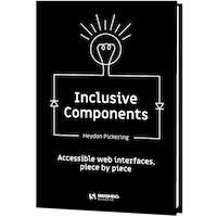
Also, we officially released the “Inclusive Components” book, and the response has been overwhelmingly positive! Ari Stiles collected some of the book reviews we’ve received so far, with more coming in each day! Grab your own copy of Heydon’s book, and let us know what you think — we’d love to hear from you!
Trending Articles On Smashing Magazine
We publish a new article every day, and so if you’re not subscribed to our RSS feed or follow us on social media, you may miss out on some brilliant articles! Here are some that our readers seemed to enjoy and recommend further:
- “Should Your Portfolio Site Be A PWA?” by Suzanne Scacca
This question concerns many, so here’s why spending your time turning it into a PWA would be worth your while. - “Tips To Speed Up Your UI Design Workflow” by Tomáš Čakloš
This article offers guidance on how to make your designs more consistent and user-friendly. - “Is There A Future Beyond Writing Great Code?” by Ronald Mendez
Exploring some of the different directions developers can take and the complementary skills that can help them throughout their journey. - “Creating Online Environments That Work Well For Older Users” by Barry Rueger
Here’s why it’s not enough to just say, “I can read it, so what’s the problem?” A significant part of the Internet-using population is aged 50 or older—including the people who invented it.
Best Picks From Our Newsletter
We’ll be honest: Every second week, we struggle with keeping the Smashing Newsletter issues at a moderate length — there are just so many talented folks out there working on brilliant projects! So, without wanting to make this monthly update too long either, we’re shining the spotlight on the following projects:
Note: A thank you to Cosima Mielke for writing and preparing these posts!
Web Almanac 2019
Take data processed from nearly 6 million websites and 85 people volunteering countless hours planning, researching, and writing — that’s what it took to create the 2019 edition of the Web Almanac, HTTP Archive’s annual state of the web report.

The report consists of 20 chapters spanning aspects of page content, user experience, publishing, and distribution to shine a light on the current state of the ever-evolving network of technology that the open web is. A great resource to become more aware of current best practices.
How To Read A WebPage Test Waterfall Chart
Do you have difficulties reading WebPageTest waterfall charts? You’re not alone, it can be quite a challenge to remember the details and what they all mean. To freshen up your knowledge, Matt Hobbs collected all the many bits of information in a single blog post that we all can refer to.
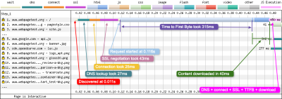
The post explains the basic layout of the waterfall chart, what each of the colored vertical lines means, and what metrics the horizontal blocks refer to. It also lists common patterns that you might stumble upon in a waterfall chart. One for the bookmarks.
Open-Source Illustrations Kit
100-day challenges are a wonderful opportunity to dive deep into a topic or craft and evolve and improve with each day. Back in 2016, Vijay Verma spent almost two hours a day for 100 days designing, illustrating, and experimenting to get himself to the next level of illustration.

After living on a harddrive untouched since then, Vijay now decided to release the illustrations as a free open-source illustrations kit so you can use them for your landing pages, mobile apps, presentations, or whatever else comes to your mind. Available in AI, SVG, PNG, and EPS formats. Thank you, Vijay, for sharing!
30 Days Of Code Tidbits
Who doesn’t love a bite-sized tip? One that doesn’t take long to swallow but teaches you something new to instantly ease your life as a developer? Using the hashtag #codetidbits30 on Twitter, Samantha Ming posts a new coding tidbit every day in December.
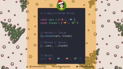
Three ways to remove array duplicates, a little trick to style elements that have no children or text at all, and a solution for displaying your data in your browser dev tools, these are only some of the tips in the series. Covering JavaScript, HTML, and CSS snippets, #codetidbits30 is a true treasure chest of front-end goodies. Be sure to follow along.
Scaling SVGs Made Simple
Scaling elements can be a daunting task, since they act very differently than normal images. Amelia Wattenberger came up with aningenious comparisonto help us make sense of SVGs and their special features: “Theelement is atelescope into another world.”
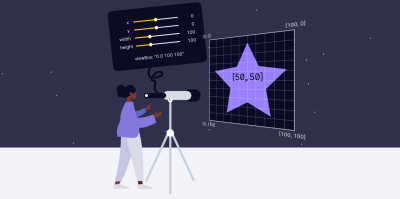
Based on the idea of the telescope, Amelia explains how to use theviewBoxproperty to zoom in or out with your “telescope”, and, thus, change the size of your. A small tip that works wonders.
Recreating Print Layouts With CSS
When it comes to creative layouts, magazines are an endless source of inspiration. And thanks to CSS Grid, there’s nothing to hold you back from bringing more sophisticated layouts to the web, too.

Inspired by magazine layouts, their use of typography and their structures, Dan Davies took on the challenge to recreate some of the print work he liked on the web. The result is an awe-inspiringcollection of nine layoutsthat use the potential of CSS Grid to its fullest. Beautifully art-directed and responsive, they are great examples of pushing the limits of what’s possible on the web layout-wise.
Web Performance Vs. User Engagement
It’s no secret that performance can have a positive impact on user engagement and, in effect, improve conversion. To find out how performance correlates to conversion for their product, the team at Vrbo implemented an automated process that shows the connection between business events and performance data.
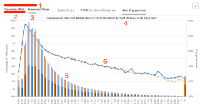
Carlos Moro from Vrbo now shares acase studyin which he gives more insights into the approach, as well as handy tips for measuring site performance, user engagement, and putting the two into relation to one another. Interesting.
Time-Travel-Debugging For The Web
An early Firefox DevTools experiment that is worth keeping an eye on isWeb Replay. Web Replay records your actions so you can track bugs down faster and understand your code better — a collaborative time-travel debugging instrument, so to say.
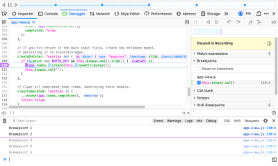
The replaying process preserves all the same JS behavior, DOM structures, graphical updates, and most other behavior that occurred while recording. Want to give it a try? Replay is already available in Firefox Nightly for macOS (still disabled by default until it is more stable, but you canturn it on manually). Handy!
Commit-Message-Driven Development
Have you ever considered to write the commit message before you start writing the code? Sven Hofmann does it this way, and now he explainswhy you could give it a try, too.
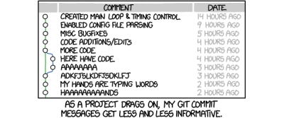
We all know those vague and messy commit messages like “bugfixes and minor improvements” that aren’t helpful in the long term — especially if you’re working with a team or on an open-source project. The commit-message-driven workflow that Sven suggests could help change that: first, you write the commit message, then the code, then you commit. Having the scope of the task nailed down in advance, gives each commit a precise goal that you can focus on and that makes it easier to review your commits later on. Clever!
Dealing With Ads In 2020
Ads are a two-sided sword: nobody really likes them but a lot of sites depend on them to generate revenue. Working for a news company that is dependent on ads, Christian Schaefer wanted to find ways to minimize their impact and make them less annoying. Now hesummarized his approachin a comprehensive blog post.

The post shares valuable insights into how Christian and his team developed a generic solution to transform and combine mobile and desktop ad code into one responsive ad loading code, how they improved performance by lazy loading the ads, what they did to prevent the ads from breaking the site’s layout, and some other things that add up to bringing the front end into a much better position when dealing with ads. Great tips for everyone who finds themselves wrangling ads.
If you don’t get our newsletter yet, thensign up hereto receive useful techniques and goodies (including a free eBook on accessibility)!
From Smashing With Love
A month can be a long time to stay on top of things, so please do subscribe to our bi-weeklynewsletterand ourpodcastif you still haven’t. Each and every issue is written and edited with love and care. No third-party mailings or hidden advertising — promise!
You can also tune into our very ownSmashing TV, and follow us onTwitter,Facebookas well asLinkedIn. Please do always feel free to reach out and share your projects with us! We love hearing from you!
On behalf of the entire team, we wish you all the best for 2020! Stay smashing!😉
Further Reading
- How To Become A Better Speaker At Conferences
- The Modern Guide For Making CSS Shapes
- How To Hack Your Google Lighthouse Scores In 2024
- New CSS Viewport Units Do Not Solve The Classic Scrollbar Problem

