
October 20, 2016 Smashing Newsletter: Issue #168
Editorial This newsletter issue was sent out to 195,477 newsletter subscribers on Tuesday, October 20th 2016. If you are not subscribed yet, feel free to subscribe to our email newsletter anytime. We’re all trying to figure things out. Over the last years, I’m happy to have had a look behind the scenes of how mid-size and large-sized companies deal with their front-end and UX problems. It’s surprising that since problems are very similar, solutions are often very similar as well.

Editorial
This newsletter issue was sent out to 195,477 newsletter subscribers on Tuesday, October 20th 2016. If you are not subscribed yet, feel free to subscribe to our email newsletter anytime.
We’re all trying to figure things out. Over the last years, I’m happy to have had a look behind the scenes of how mid-size and large-sized companies deal with their front-end and UX problems. It’s surprising that since problems are very similar, solutions are often very similar as well.
While design agencies often work in an agile environment, larger companies experience difficulties on building smaller tactical agile teams that work in a corporate environment. Frankly, most of the time you’ll find a lot of “wateragile”, with just too many cooks and too many stakeholders working on the moving parts of the system.
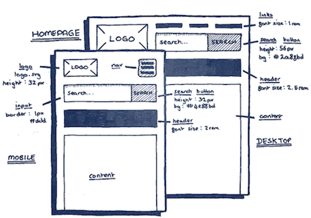
“Vertical” architecture with multi-disciplinary teams, assigned by features, rather than skills or technology, seems to work better than “horizontal” architecture with separated teams of screen designers, developers and UX professionals. Frankly, collaboration is a cheesy word these days, but bringing teams closer together to work on the components of the UI does work well indeed.
Everybody is trying to solve design inconsistencies with a pattern library or a style guide or a design system, yet too often I see resources being plummeted into building a consistent design language just to push it aside for “real” projects a few months later. Pattern libraries can work, too, but they alone don’t solve the problem; we need to apply a design process related to the way our teams are organized, too.
Too often, user experience still has to be sold, and both performance and accessibility are seen as the edge case, unless you argue with hard data and actual recordings of user interviews proving otherwise.
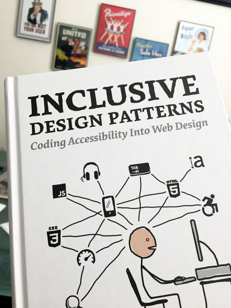
To help us get there, we’ve published a new book, in which Heydon Pickering explains how we can craft accessible interfaces without extra effort — and what front-end design patterns we can use to create inclusive experiences. Everything you need to know about accessibility gathered in one practical, smashing book, fully dedicated to building and designing accessible interfaces.
We all share these problems, but the good thing is that we all work hard on solving them. If you have a story to share of how your company changes, please drop me an email at editor[@]smashingmagazine.com — we’d love to work with you on an article or two. Let’s figure it out together!
— Vitaly (@smashingmag)
1. The Community’s View On JavaScript
When you ask fellow developers about their preference on JavaScript tools and frameworks, you’re likely to get diverse answers. Some might consider popular frameworks modern and reliable, others might use words like “bloated” and “overly complex” in that context instead. So how can you make sense of it all?
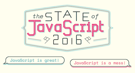
Sacha Greif knows from his own experience how hard it can be to come to a conclusion. He spent a lot of time building with JavaScript, but, in the end, he still wasn’t sure. That’s why he created a survey to find out what the community thinks. And, well, the idea hit a nerve: In just over two weeks, he got 9,000 replies. To help you come to your own conclusions about the JavaScript ecosystem, Sacha analyzed the answers and made the results publicly available. The questions cover front-end frameworks and state management, build tools and testing libraries, and which libraries have the highest satisfaction rankings. Insightful! (cm)
2. One World, One Typeface
Five years ago, Google and Monotype embarked on a one-of-a-kind project that involved the cooperation of hundreds of researchers, designers, linguists, cultural experts, and project managers. Now it’s finally ready: The open-source typeface family Noto. What’s so special about it? Well, it supports every written language in the world — living and dead. That makes 800 languages and 100 written scripts in total, from Latin, Cyrillic, and Hebrew to Egyptian Hieroglyphs and Cherokee. It’s one of the largest typographic projects ever undertaken.

The aim of Noto is to enable communication across borders and to digitally preserve little-spoken languages that have been said to disappear from human memory sooner or later. But it also means to put an end to those little, annoying boxes that are usually displayed on a computer when a font isn’t supported. Hence, also the name: “Noto” stands for “No Tofu”, as the boxes are often referred to as “tofu” because of their shape. The sans-serif family of Noto is already available, a serif counterpart is still in the making. A harmonious, timeless typeface with a deeper meaning. (cm)
3. JavaScript Or No JavaScript?
Some UI components traditionally call for JavaScript, but more often than you’d think, you might get by without any additional dependencies. Especially if you’re only targeting more modern browsers. A valuable overview of non-JavaScript solutions now comes from Una Kravets. Her side project “You Might Not Need JavaScript”, is a collection of functional components that are based only on native HTML and CSS, along with a sprinkle of Sass.
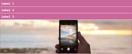
The components in the showcase range from image sliders, view switchers and modals, to tabs and accordions, but also form validation and a scroll indicator are part of it. All of the methods can be made accessible, although the demos themselves might not be. So take a moment to test before you use them in production.
Beware: JavaScript, or no JavaScript: when solving a problem, let’s pick a solution that is most accessible and reliable. CSS hacks are as bad as JavaScript bloat. Sometimes we might need JavaScript after all. (cm)
4. Sensor-Enabled Experiences Made Easy
Motion is a powerful interaction tool, especially in combination with the motion sensors on mobile devices. A user could shake their device to navigate through an image gallery, for example, while on a more advanced level motion can be used to power augmented and virtual reality environments. But catering for effects like these also means having to access and work with sensor data. That’s where MotionStack comes in.
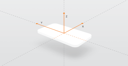
The JS-based motion processing library lets you integrate motion and spatial computing into your web and native applications without having to get your hands on any of the low-level processing or mathematical transformations that are needed to leverage the sensors in a mobile device. What MotionStack essentially does is quantify the motions: You send callback functions to the MotionStack APIs, and the motions from the user will act as inputs to these functions. A clever way to simplify the act of creating motion-interactive experiences. (cm)
5. Freebie: Printable Wireframing Templates
Digital tools are good, but sometimes you don’t want the tech to stand between you and your ideas. Sometimes all you want is to quickly jot down thoughts or scribble mockups. What could be better for this purpose than a piece of paper and a good ol’ pen, right? A great little addition to your analog toolkit are the printable sketching templates from Sneakpeekit. Just download the PDF of your favorite template, and, well, print it.
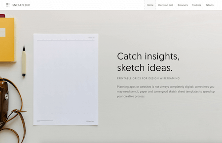
The printables include tablet, smartphone as well as browser templates and come in versions with a dotted grid and without. There’s also a multipurpose precision grid template available with column marks that are ideal for icon, font, and logo design. Perfect to speed up your creative process. (cm)
6. A Guide To Progressively Enhancing A Comment Form
How do you usually build a form? After having created a lot of forms before, Michael Scharnagl recently decided to tackle the task differently. He started his next comment form with a very simple base and enhanced it step by step — progressive enhancement par excellence.
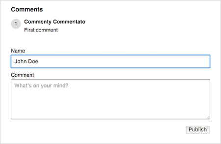
The basic version is an HTML form that will work in every browser. On top of that, Michael adds required and placeholder attributes, defines custom error messages, ajaxifies the form, and adds a nifty auto-expand feature for the text area that makes sure the height of the comment field adapts to the length of its content. To enhance the experience further, an indicator is added that shows if the comment was posted successfully or not. Finally, for browsers that support ServiceWorker, Michael uses BackgroundSync to improve the experience for poor and unusable connections and, in case a user is offline, show a message that the comment will automatically be published as soon as the connection is back on again. A clever solution that doesn’t leave any browser behind. Some users might get a better experience, but in essence, all of them will be able to use the form and post a comment. And that’s what it should be all about. (cm)
7. SVG And Media Queries
Have you ever used media queries within SVG? If yes, you might have encountered some weird issues. Imagine, you declare a media query for an SVG with min-width: 100px. Which viewport will be the reference point for these 100px? The CSS size of the host document? The width, height, and viewBox attributes on the <svg>? The width and height of the <image>? Or the CSS layout size of the <img>? To get to the bottom of this, Jake Archibald examined how different browsers behave.

Surprising is especially Firefox’s behavior: If the SVG lives inside an <img> tag, the viewport is the rendered size in device pixels and will change depending on display density. In other browsers, the viewport of the SVG is the CSS dimensions of the <img>. This can already be quite confusing, but things get more complicated when you draw your SVG to a <canvas>. The spec is unclear how this should be handled, and the actual behavior of browsers goes into entirely different directions, with Chrome showing the wonkiest and Edge an ideal behavior — it allows you to activate media queries for widths independent of the drawn width. To dive deeper into the issue, check out Jake Archibald’s findings. (cm)
8. Goodies! CitySets And Free Brush Script Font
Why would you release icons and typefaces for free if you could bring them into a marketplace and sell, or just set up a landing page with Stripe integration on your own? Well, if you want your project to grow, or collaborate with other designers, or just establish your profile in the community, open sourcing your work is the best way to achieve just that.

Bryn Taylor has released Citysets, a growing collection of free city-based icon sets, including London, New York, Paris and Sydney, with all icons designed in a similar way. Also, Raul Taciu and Vlad Cristea have released Hensa Free Font, a free brush script typeface with quite a personality. On top of the regular set, the fonts contain ligatures and swashes, and could be used for logos, quotes, packaging designs, posters, greeting cards or anything else! The font can be used in private and commercial projects. An attribution isn’t required but always welcome, and well deserved!
Not a big fan of colorful icons? Worry not! CSS Icon Space features simple icons, designed with CSS alone. (vf)
Inspiration, Freebies, Misc.
- Best Of Halloween: All Things Spooky
- Breaking Out Of The Box: Design Inspiration (October 2016)
- Web Development Reading List #153: Slow JavaScript, A Universal Typeface, And Healthy Work Environments
- Web Development Reading List #154: Yarn, Deep-Fried Data, And A Guide To Stateful Components
That’s All, Folks!
Thank you so much for reading and for your support in helping us keep the web dev and design community strong with our newsletter. See you next time!
Smashing Newsletter
Useful front-end & UX bits, delivered once a week. Subscribe and get the Smart Interface Design Checklists PDF — in your inbox. 🎁
You can always unsubscribe with just one click.
Previous Issues
- New Front-End Techniques
- Neat Little Time-Savers
- Useful Guides For Designers and PMs
- Charts and Data Visualization
- Usability & UX
- Color Palettes and Generators
- Psychology and UX
- Accessibility and Inclusive UX
- UX and Product Design
- Design Systems
Looking for older issues? Drop us an email and we’ll happily share them with you. Would be quite a hassle searching and clicking through them here anyway.

