
August 15, 2017 Smashing Newsletter: Issue #187
This newsletter issue was sent out to 227,579 newsletter subscribers on Tuesday, August 1st 2017.

Editorial
One of the very first things to do when travelling abroad is buying a SIM card to stay connected. But what if you didn’t? Or even better — what if you don’t take a phone with you in the first place? As an experiment, after crashing a phone’s glass, I decided to spend 14 days of my travelling abroad without a mobile phone altogether. No access to emails on the go, no tweets, no Facebook, no nothing. That’s all reserved for laptop-only experiences in early mornings or evenings.
The results so far are quite surprising. Without a phone, you have to be more deliberate in your planning and your choices, and you have to plan ahead of time not to get lost. You also have to find a map, and an alarm clock, and you have to train your writing skills to take notes quickly on the go. Rather than picking recommendations from tourists online, I’ve been asking for recommendations from locals offline. As a result, I spent more time interacting directly with locals whom I wouldn’t have met otherwise.
Without a permanent connection or VPN access, it turned out to be difficult to work on the go, but I must admit that working sessions have become much more focused and considerate. Also, interestingly enough, with a connection being flaky most of the time, it’s surprising how slow most websites actually are. Having a 500 MB limit for 3 days is barely enough to purchase tickets or even look up destinations — even in data-saving browser mode. On slow connections, Facebook is remarkably slow, but Twitter is surprisingly fast.
Most importantly, staying without a phone has been a liberating experience. As Craig Mod put it, you might get bored without the phone, but boredom is critical to noticing and whitespace is critical for thinking. Almost automatically you start paying more attention to little random things happening around you, living in the moment and actually experiencing it fully.
My experiment is only halfway through, and I’ll share more of my findings mid-August. I think crashing the screen of that phone was one of the best things I’ve done for myself in years.
Stay disconnected,
Vitaly (@smashingmag)
Table of Contents
- Complex Grids Without Complex Calculations
- Only 11 Weeks Left For SmashingConf Barcelona!
- Version Control For Sketch
- Best Practices For Designing A Chatbot
- How To Become A Pro Remote
- Make Your Workday More Productive
- Taking Your Color Schemes To The Next Level
- FOUT Without Any JavaScript
- A University In Your Pocket
1. Complex Grids Without Complex Calculations
Did you note that CSS Grid has been shipped with a new CSS unit called the fr (fraction) unit? The unit makes it possible to quickly slice the grid up into proportional columns or rows. Robin Rendle explains how it works.
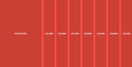
The fr unit can be used with %, px or em when defining grids to set columns to one fraction without causing any overflow on the x-axis, and thus preventing horizontal scrolling. Note that you can’t use calc() in combination with the fr unit, e.g. calc(1fr - 2em) is not allowed. (cm)
2. Only 11 Weeks Left For SmashingConf Barcelona!
The web is constantly changing, and it’s easy to fall behind. So, how do you stay on track? Where can you go to optimize your websites’ performance? How about SmashingConf Barcelona! On October 17th and 18th, we’ll be returning to the Palau de la Música Catalana with two packed days of hands-on sessions by some of the most respected members of our industry.

This conference will focus on Design Systems, SVG techniques, performance, accessibility, and user experience, and as always with SmashingConf, will contain loads of useful takeaways. Tickets are available now. We can’t wait to meet you! (cm)
3. Version Control For Sketch
Devs have Git for version control, and designers? Well, Git. At least if you’re working with a Sketch version not older than 43 and pair it with the version control tool Abstract, as Marie L. describes on uxdesign.cc.
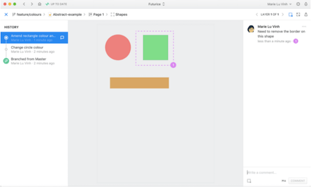
Sketch now allows us to read the underlying structure of a .sketch file by unzipping its content. In it, you’ll find JSON files with details about the position, appearance, contents, and names of each layer, group, and page. And that’s exactly where Abstract comes in.
Abstract uses this information to enrich your design workflow with the power of Git’s version control, so that you and your team members can work on your own local versions of a file, then merge them together without creating duplicates. Tracking changes in files, recording their history, opening up branches with different statuses, and a better review process — Abstract is a promising solution to (finally!) make the dream come true for designers. (cm)
4. Best Practices For Designing A Chatbot
Chatbots are changing the way we design experiences, and this means that we have to rethink how we make our design decisions. It’s not so much about what users see anymore, but what the conversation with the bot feels like. To get you fit for the challenges that conversational UIs bring along, Ish Jindal, founder of the chatbot building platform Tars, wrote up his lessons learned and best practices from designing chat experiences.

Which role do message delays play when designing a bot? What’s the optimal message length? And how does rich media content like GIFs and memes influence the conversation? These are the questions that this three-part article series attempts to answer. Good pointers when you want to start building your first chatbot. (cm)
5. How To Become A Pro Remote
No doubt, working remotely has its advantages, but there are also quite some hurdles you need to overcome in order to make collaboration between team members (who are miles or even time zones apart) fruitful and efficient. To give your remote team a boost, the folks at Hanno put together a Remote Starter Kit jam-packed with tools that have proved themselves invaluable when working together as a team of 10 designers who are spread all across the globe.
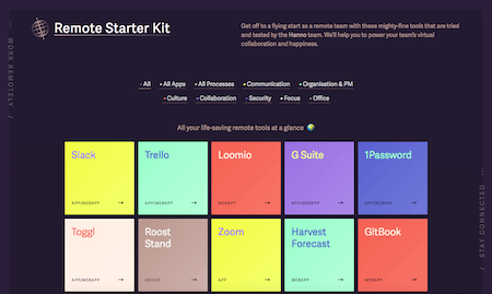
In the starter kit you’ll find useful apps, tried and tested processes (for weekly updates, for example), and tools to connect the team and facilitate discussions, help brainstorm ideas, or simply foster the team spirit. Handy little helpers to keep your remote team happy. (cm)
6. Make Your Workday More Productive
What tasks does your job include? And how do you prioritize them? There probably isn’t an easy answer to these questions, especially if your job requires you to switch contexts frequently. To help prioritize your work better and bring order to the task-switching chaos, Rian van der Merwe shares a useful little tip: create a mind map to gain a better understanding of what you’re doing.
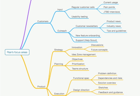
The idea is to create a detailed map of all the things you do during a particular week, so you can identify and prioritize your focus areas. By doing this, you’ll also notice where your work overlaps with that of your team members and where you might maybe need to scale back. An eye-opening experience that is bound to make your workday a lot more productive. (cm)
7. Taking Your Color Schemes To The Next Level
You’re looking for a quick way to create color palettes and get some fresh color inspiration as well? Then be sure to check out Coolors. The browser tool lets you create color palettes as easily as pressing the spacebar on your keyboard.

In fact, just press the spacebar, and Coolors will present you a random color palette. To gain more control over the result, you can also lock individual colors of your palette to pair them with matching colors. Or you pick up starting colors from your images and get the perfect combination automatically. A nice bonus: To prevent bad surprises when using your palette in an actual project, the tool offers a mode in which you can see what the palette will look like to color-blind users. Once you’re happy with the result, you can export the palette in a number of formats (PNG, PDF, SCSS, or SVG) or just copy the URL to share it.
Speaking of color schemes. Have you already heard of the new Sketch plugin Chain? It lets you create dynamic color relations in Sketch with just one click. All you need to do is select the layers to chain, the reference color and the transformations you want to apply, and — ta-daa — you get perfectly harmonious color relations. Nice! (cm)
8. FOUT Without Any JavaScript
With the recent Chrome 60 stable release, we got a small step closer to support for font-display. Why we might want to have it? Well, by adding font-display: swap to your @font-face block, you can opt-in to FOUT; font-display: fallback or font-display: optional can be used if you consider web fonts unnecessary to the design, as Zach Leatherman describes.
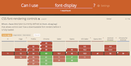
Only one single CSS descriptor to handle FOUT without any JavaScript polyfill and without the need to modify the font itself through subsetting or otherwise, font-display has the makings to make it happen — if browser support will become more widespread someday. Apart from Chrome 60+, Opera versions 47 and newer currently support the desriptor, and it’s in progress and behind a flag on Firefox Platform Status. As support is still very limited today, font-display by itself isn’t a sufficient solution yet. However, it’s still a good idea to plan ahead and add it to your font-face blocks already today. (cm)
9. A University In Your Pocket
To get better at what we do and improve ourselves further, there’s one credo we should always keep in mind: never stop learning. So why not take a bit of time aside each week to learn something new? A programming language you don’t master yet, some new business skills maybe, or even a foreign language? If you’re thirsty for knowledge, Class Central certainly has something to keep you busy.

The platform lets you search online courses from over 700 universities around the world on all kinds of subjects — from web development, art and design, marketing, computer and data science to engineering, science, humanities, and many more, as well as lectures from renowned companies such as Google and Microsoft. The courses are taught mainly through short video lectures that you can watch whenever and wherever you want. Discussion forums, assignments, online quizzes and exams help you strengthen your newly acquired skills. Taking the courses is free, costs for receiving graded assignments or a certificate at the end of the course vary depending on the provider. (cm)
Smashing Newsletter
Useful front-end & UX bits, delivered once a week. Subscribe and get the Smart Interface Design Checklists PDF — in your inbox. 🎁
You can always unsubscribe with just one click.
Previous Issues
- Neat Little Time-Savers
- Useful Guides For Designers and PMs
- Charts and Data Visualization
- Usability & UX
- Color Palettes and Generators
- Psychology and UX
- Accessibility and Inclusive UX
- UX and Product Design
- Design Systems
- New CSS Features For 2025
Looking for older issues? Drop us an email and we’ll happily share them with you. Would be quite a hassle searching and clicking through them here anyway.

