Fixed vs. Fluid vs. Elastic Layout: What’s The Right One For You?
This article discusses the pros and cons of each type of layout. Either one can be used to make a successful website layout, as long as you keep usability in mind.
Why all the debate? Web page design comes down to usability, and this can be difficult to balance because website users can account for many different variables among them.
When designing a website layout for a large audience, the designer must consider the following potential differences among visitors:
- Screen resolution,
- Browser choice,
- Whether or not the browser is maximized,
- Extra toolbars open in the browser (History, Bookmarks, etc.),
- Even the operating system and hardware.
Without the benefit of a standardized website size to work with, Web designers encounter numerous problems when it’s time to get to work.
1. Difference Between Fixed And Fluid Layouts
Although most designers and developers would consider defining fixed and fluid website layouts to be elementary, we’ll go over it just to be clear.
Fixed Website Layouts
A fixed website layout has a wrapper that is a fixed width, and the components inside it have either percentage widths or fixed widths. The important thing is that the container (wrapper) element is set to not move. No matter what screen resolution the visitor has, he or she will see the same width as other visitors.
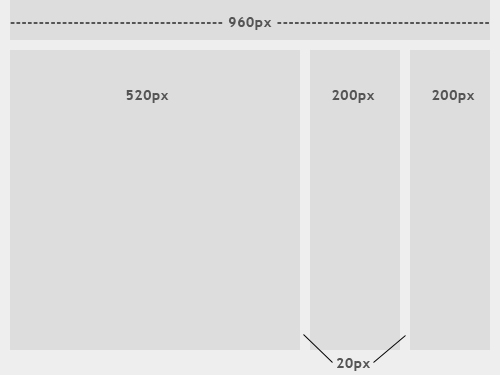
The image above shows the general outline of a fixed-width website layout. The components inside are fixed to 520, 200 and 200 pixels, respectively. A 960-pixel width has become the standard in modern Web design because most website users are assumed to browse in 1024x768 resolution or higher.
Fluid Website Layouts
In a fluid website layout, also referred to as a liquid layout, the majority of the components inside have percentage widths, and thus adjust to the user’s screen resolution.
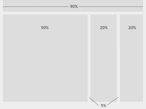
The image above shows a fluid (liquid) website layout. While some designers may give set widths to certain elements in fluid layouts, such as margins, the layout in general uses percentage widths so that the view is adjusted for each user.
2. Fixed Web Page Design
Many designers prefer fixed layouts to fluid ones because they’re easier to make and provide more assurance that what the designer sees, the user sees. However, the pros and cons come out even with fluid-layout design.
Pros
- Fixed-width layouts are much easier to use and easier to customize in terms of design.
- Widths are the same for every browser, so there is less hassle with images, forms, video and other content that are fixed-width.
- There is no need for min-width or max-width, which isn’t supported by every browser anyway.
- Even if a website is designed to be compatible with the smallest screen resolution, 800x600, the content will still be wide enough at a larger resolution to be easily legible.
Cons
- A fixed-width layout may create excessive white space for users with larger screen resolutions, thus upsetting “divine proportion,” the “Rule of Thirds,” overall balance and other design principles.
- Smaller screen resolutions may require a horizontal scroll bar, depending the fixed layout’s width.
- Seamless textures, patterns and image continuation are needed to accommodate those with larger resolutions.
- Fixed-width layouts generally have a lower overall score when it comes to usability.
Examples of Fixed-Page Design
Here are five examples from designers who get the most out of fixed-width layouts. These websites incorporate many design elements, a perfect scenario in which to use a fixed layout. The designers have more control over the placement of extra design elements around the content areas and can work with the content and navigation widths more precisely.
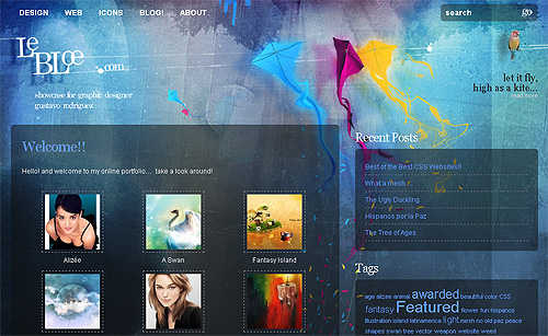
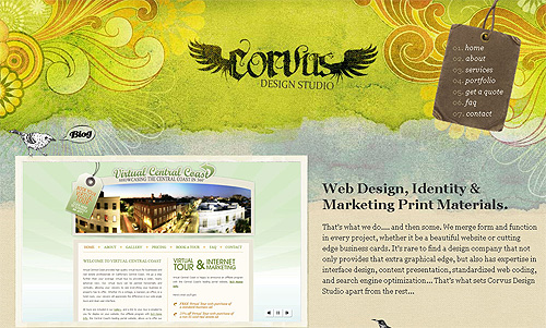
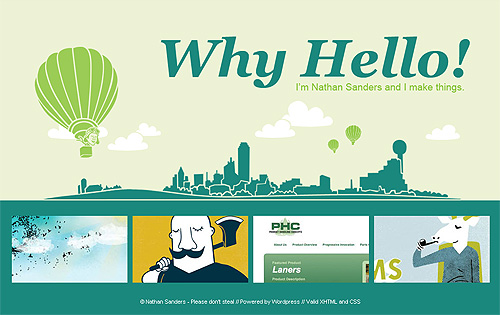
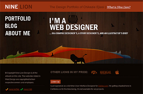
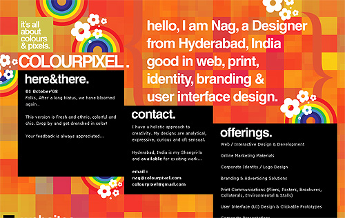
Notice how in all of these examples, the designers use continuous imagery to work with larger screen resolutions.
3. Getting Around The Cons Of Fixed Web Page Design
If you’ve decided on a fixed page design, you should know these few tricks to get around the cons of this layout and create a successful design.
Looking at the Statistics
Today, most designers assume that the majority of Internet users have a screen resolution of 1024x768 or higher. According to a poll published by W3Schools, this is not the case (please notice that one should take the W3Schools statistics with a grain of salt, more details about it follow below):
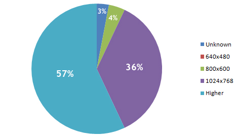
As you can see, 640x480 doesn’t even register on the chart. W3Schools’ analysis found a whopping 0% of users have this screen resolution. While, in fact, some users actually do have this screen resolution, the statistics show that they make up a small enough percentage that designers should be able to ignore the size and still offer wide usability.
Even for people who do use this resolution size, they probably use it mainly on smaller portable computers and wouldn’t use it as their primary screen resolution normally.
However, these statistics are probably not as accurate as one might hope. Because W3Schools’ visitors primarily belong to a certain demographic (designers and developers), the information is a little biased. Other research sources show different findings, but only slightly different. According to resolution statistics from individual companies in 2009, the 800x600 screen resolution showed up at somewhere under 10% of users.
This next interesting table comes from SohTanaka.com, whose blogger has done a bit of research comparing how some of the largest websites accommodated screen resolutions in February 2006 versus February 2008.
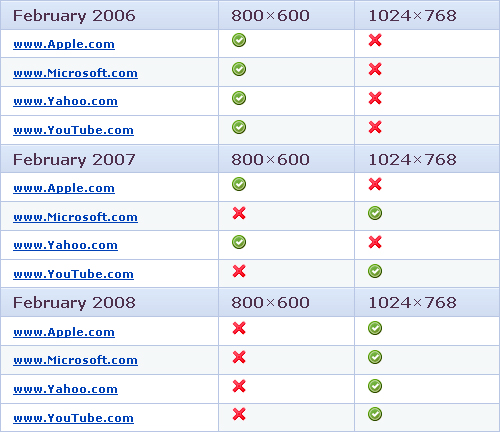
For all four major websites in the study, there was a complete turnaround. Even the biggest companies on the Web are now assuming that their audiences have larger screen resolutions.
For other research on screen resolution, have a look through the sources below:
960px or 760px?
All this being said, most designers choose a fixed width of either 960 or 760 pixels. A layout 960 pixels wide looks good for users with a 1024x768 resolution or above, with a bit of room for margins. For designers who want to accommodate the approximately 10% of users with a 800x600 screen resolution, the 760-pixel-wide layout works well, and is still suitable for larger screens.
Always Center the Layout
When working with a fixed width design, be sure to at least center the wrapper div to maintain a sense of balance (margin: 0 auto; usually does the trick). Otherwise, for users with large screen resolutions, the entire layout will be tucked away in the corner.
4. Fluid Web Page Design
Designers may not use fluid page designs for various reasons, but the layout’s benefits are often overlooked. Below are pros and cons to think about when considering fluid web page design.
Pros
- Fluid web page design can be more user-friendly, because it adjusts to the user’s set up.
- The amount of extra white space is similar between all browsers and screen resolutions, which can be more visually appealing.
- If designed well, a fluid layout can eliminate horizontal scroll bars in smaller screen resolutions.
Cons
- The designer has less control over what the user sees and may overlook problems because the layout looks fine on their specific screen resolution.
- Images, video and other types of content with set widths may need to be set at multiple widths to accommodate different screen resolutions.
- With incredibly large screen resolutions, a lack of content may create excess white space that can diminish aesthetic appeal.
Examples of Fluid Page Design
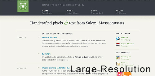
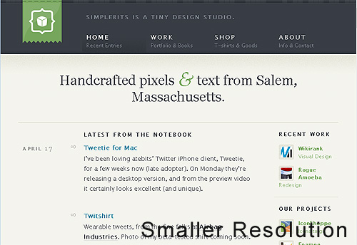
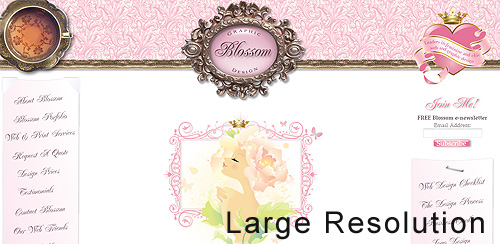
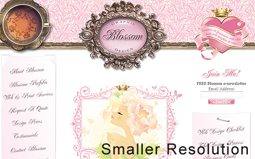
Below are two designs that use percentage widths to accommodate different screen resolutions. The first example in each set alters the width of the content according to screen width, while the second screenshot uses varying widths for the white space.
5. Getting Fluid Web Page Design To Work
Even though fluid layouts can present a few problems, some of those problems can be overcome with a few tricks.
Use Simple Design
The less a fluid Web design depends on graphics and difficult techniques, the easier it will be to create and maintain. It will also be more compatible with alternate screen resolutions. With cleaner code and design, compatibility problems are more easily prevented, found and dealt with.
Smashing Magazine, for example, uses a fluid Web page layout, and to make it simple only the top black-and-orange navigation bar expands, depending on the user’s situation. Otherwise, the content area expands and contracts as needed, and smart use of CSS covers situations in which the sidebar and internal content could clash.
Min-width and Max-width
Two CSS properties, min-width and max-width, can be used to create a fixed width if the user’s screen is too small or too big for the layout to be usable. In this case, the layout gets a scroll bar and functions essentially as a fixed-width layout. Look over W3Schools’ pages on the min-width and max-width CSS properties below for more details:
Unfortunately, most versions of Internet Explorer don’t support min-width and max-width. Getting around this is simple, though, with an IE-specific expression. Read more about that in the article Maximum and Minimum Height and Width in Internet Explorer.
6. Elastic Design
There is a third option when working with Web page layouts. An elastic design is sometimes preferred by designers because it mixes the two other main layout types. It works by sizing all elements with em’s. The quote below explains exactly what an em is and why it can be beneficial.
“A pixel is an unscalable dot on a computer screen, whereas an em is a square of its font size. Because font sizes vary, the em is a relative unit that responds to users’ text-size preferences.” - Patrick Griffiths, A List Apart
While elastic design is supposed to offer more benefits, it still has its pros and cons like the other two layout styles.
Pros
- If implemented correctly, this layout style can be very user-friendly. The goal is to have everything grow larger or smaller in proportion with the user’s preference.
- Elastic layouts are perfect for designers who love both fluid and fixed designs, because the pros of each are found in elastic layouts.
Cons
- Even given the first pro above, this type of layout can create a huge problem with usability. It takes a lot of savvy and testing to get the layout right for all users.
- This type of layout is much more difficult to create than the other two, and the extra bit of usability it brings may not always seem worth it.
- Depending on the specifics of the layout, some elastic designs may require supplementary style sheets and cheats for IE6.
Examples of Elastic Page Design
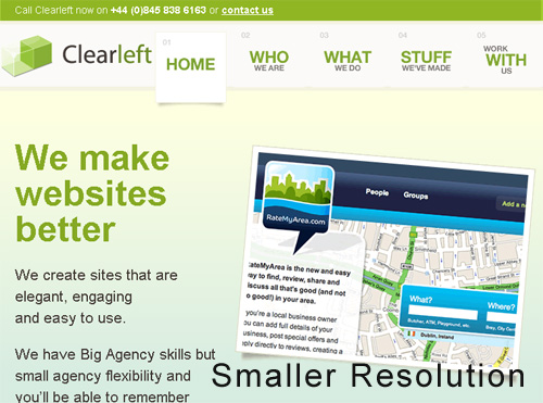
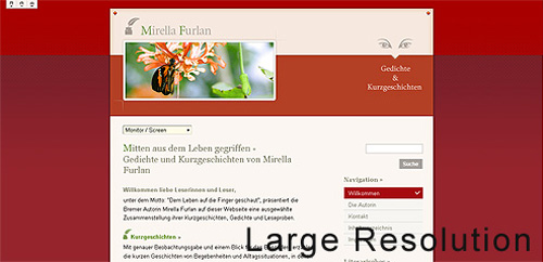
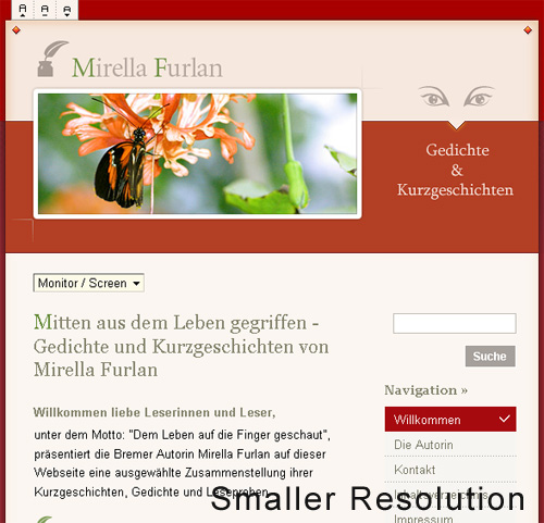
Elastic and fluid layouts are incredibly similar in appearance, so much so that they are usually confused with each other. However, elastic designs use em’s instead of percentages and depend primarily on font size. These designs adjust to the text size that users set for their browser.

7. Which Is Right For Your Website?
Choosing between a fixed and fluid website will depend a lot on the type of website itself. Weigh the pros and cons above to determine the right solution for your website.
A portfolio website, for example, would probably be best shown in a fixed-width layout, so that you have more control over the design. Not only will you be able to better control the layout of individual elements in the design, but the images in your portfolio showcase will be better handled with a fixed width. Many designers, not just those with portfolios, may prefer fixed-width layouts for the ease of use and assurance it gives them.
Any designer who seeks 100% compatibility should take the time to set up a fluid layout. In such a case, the main challenge isn’t the excess of white space in large screen resolutions, but rather the small percentage of users with a small screen resolution. For websites with large audiences, accommodating even the smallest percentage of users may be important. But even beyond that, websites with large audiences should have a simple and clean design anyway, which can be done effectively with a fluid layout.
Still can’t decide? An elastic or partially elastic design is still an option. When used correctly, elastic layouts can bring the biggest benefits of both other types<. Designers will often employ the elastic-layout principle in using em’s for fonts and containers, and then use a smart mix of percentages and pixel widths to set the rest of the layout elements.
What Other Designers Say
Comment by Heidi Cool on Fixed vs. Liquid vs. Elastic Layout This designer makes some great points about working with other people who will be using the layout and may not know as much about Web design:
“I go back and forth on this issue. We use a fixed width at case.edu because:As you can see the bulk of these issues relate to the fact that our sites are distributed and built and maintained by people of varying skill levels. If I were working on one site alone and I was doing the coding, then I’d base the decision on goals, content, etc.”
- Liquid is more complicated, and we distribute templated designs to users of varying skills who might easily break a liquid layout. (They’re actually regular HTML files rather than Dreamweaver templates.)
- We want to ensure our maintainers don’t build pages with line lengths that are too long and thus harder to read.
- We try to limit the space available because people have a tendency of filling up whatever space is available. If they have large monitors they could really overcrowd a page not realize how messy it gets on smaller displays.
Comment by madr on Where Have All the Flexible Designs Gone? Two more good points are made here about using fixed-width layouts:
“Banners and ads are usually made with images and Flash movies, making it harder to do an elastic or flexible design. I have worked in the newspaper world for a year and a half, and the ads really are a holy cow in these areas. So are article images, for which an elastic layout would make the viewing area too big for the top image.Every browser but Safari 3 and below (Safari 4 is coming), Firefox 2 and below and IE6 and below (which are to be viewed as obsolete/deprecated soon) have support for page zoom instead of text resizing, making the time to accomplish a flexible and elastic design hard to justify since the majority of the visitors won’t even notice it.”
Comment by jphilapy on Where Have All the Flexible Designs Gone? Two good points in support of fluid-width layouts:
“Flexible sites can be made to work at many resolutions. There is no need for heated debates or research about user screen sizes. Besides, screen resolution statistics are a myth; few people run their browser full-screen and many have toolbars, sidebars, or other widgets that use valuable screen estate.Mobile phones, such as the iPhone, and games consoles are becoming viable alternatives for web browsing. In general, these devices have smaller resolutions and can benefit from flexible web designs.”
Comment by Calrion on About Fluid- and Fixed-Width Layouts Clear case for using elastic designs:
“I think the ‘elastic’ layout is the best option. Fluid to a point, then fixed to ensure lines of text, etc., don’t become ridiculously long.I’m a Windows user, and I maximize.
Mostly, I maximize because I can get the best look at whatever app I’m using, and because I generally have large amounts of detritus on my desktop. Additionally, maximizing my browser (Firefox) allows the maximum space for interface elements, specifically the links toolbar and tabbed area.
In terms of usability, fluid is probably best for savvy users, as their browser width is in control. For less experienced users, elastic is probably best, as it will automatically stop itself from becoming too wide.”
Comment by Georg on About Fluid- and Fixed-Width Layouts An explanation of how one designer uses a mix of all three to get the best results:
“Fluid main part, fixed sidebars and (maybe) some elastic parts is my preferred layout method. I always keep text areas within 600px max-width though, and hack IE/win.Using min/max for the whole page, so it’ll stay within 600 - 1200px and centers above. The same hacks for IE/win.
Testing everything on 600 to 2400 wide screens, and leave the rest to each visitor. Text lines will not get too wide (600px max), and the page doesn’t break too early under stress.
Most comments I get are that visitors don’t notice anything that really disturbs them, and that it makes easy read. Guess that means that it’s a working compromise.
Your site works fine for me, so I’ll call it a good compromise. My old eyes say the text is a bit too small, so I zoom it to 200% in Opera on a 1280 screen. No problems whatsoever.”
Further Resources
You may also be interested in these extra references:
- Responsively Retrofitting An Existing Site With RWD Retrofit
- Responsive Web Design: What It Is And How To Use It
- Responsive Web Design Techniques, Tools and Strategies
- The State Of Responsive Web Design
- Design Process In The Responsive Age


 Smart Interface Design Patterns, 45 lessons + UX training


 Bring your design to life
 Register For Free
 JavaScript Form Builder — Create JSON-driven forms without coding.

