Think Your App Is Beautiful? Not Without User Experience Design
Lately, every app is “beautiful”. If you read tech news, you’ve seen this pageant: Beautiful charts and graphs. Beautiful stories. Beautiful texting. Beautiful notebooks. Beautiful battery information.
Aspiring to beauty in our designs is admirable. But it doesn’t guarantee usability, nor is it a product or marketing strategy. Like “simple” and “easy” before it, “beautiful” says very little about the product. How many people, fed up with PowerPoint, cry out in frustration, “If only it were more beautiful”?
At best, the problem is simple: No one has figured out how to describe their product effectively. For example, Write, a note-taking app, describes itself as “a beautiful home for all your notes,” which doesn’t say much about why one might want it. Macworld describes it as “Easy Markdown Writing for Dropbox Users.” That’s both concise and specific: If you like Markdown and use Dropbox, you’ll read more.

Changing adjectives reflect changing attitudes. In his recent article “The Seduction of the Superficial in Digital Product Design,” Adaptive Path’s Peter Merholtz writes:
"Digital product design discourse over the last few years has become literally superficial. Much (most?) of the attention has been on issues like 'flat' vs 'skeuomorphic', the color scheme of iOS 7, parallax scrolling, or underlining links. And not that these things aren’t important or worth discussing, but as someone who came up in design by way of usability and information architecture, I’ve been disappointed how the community has willfully neglected the deeper concerns of systems and structure in favor of the surface. I mean, how many pixels need to be spilled on iOS 7.1’s redesigned shift key?"
It wasn’t always this way. Indeed, when I became a designer, we had the opposite problem.
Design Before Aesthetics
When I started designing in the mid-’90s, we called it “user interface design,” or “human-computer interaction.” Software wasn’t a particularly hospitable place for graphic designers. The web was a limited medium, with 216 “web-safe” colors and a need to support 800 × 600 displays at 72 PPI. Desktop platforms were even more limited: A button looked like a button looked like a button, and few apps undertook the monumental effort of creating their own look and feel. Animation was limited to image-swap rollovers. The notion of a “front-end web developer” didn’t exist, because the platform was restrictive enough that designers with no coding experience could do it themselves.
Practitioners of human-computer interaction tended to disregard visual design. We dealt in usability, information architecture and data visualization. Making it pretty was, if anything, a great way to obscure substance with Flash.
And that bothered me. Aesthetics didn’t seem incompatible with usability; and given the choice between a usable ugly product and a usable attractive one, why not the latter? I also couldn’t help thinking about form and function together, each supporting and enhancing the other.
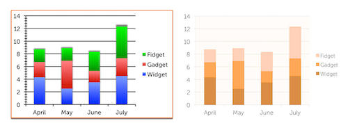
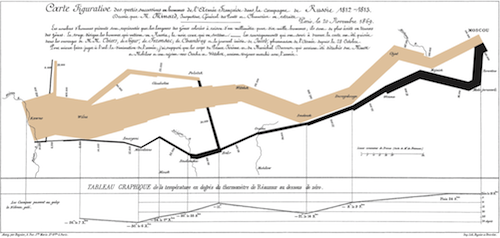
I found support in the work of Edward Tufte, whose books laid out principles and processes for information design. Many of these principles — like the “smallest effective difference” and the distinction between data ink and chartjunk — continue to guide my work today.

Tufte rarely talks of beauty, yet his work is infused with it. Over and over, he takes a poor design and turns it into an effective one — and in the process transforms it from garish to gorgeous. For Tufte, beauty is an integral part of presenting information well. In closing The Visual Display of Quantitative Information, he writes, “Graphical elegance is often found in simplicity of design and complexity of data.”

Putting The Visual In Design
By the mid-2000s, the industry had caught up with Tufte. Digital designers tended to fall into one of two buckets: “user experience design” (UX) and “visual design” (although titles varied). Visual design was, in a sense, applied graphic design, and it brought UX to life in pixels. It wasn’t uncommon to put two designers on a project, one of each type. The resulting work benefited not only from their breadth of skills but also from the interplay between the two.
Why this newfound acceptance of the visual? In his 2007 Emotional Design, Don Norman writes:
"In the 1980s, in writing "The Design of Everyday Things", I didn’t take emotions into account. I addressed utility and usability, function and form, all in a logical, dispassionate way — even though I am infuriated by poorly designed objects. But now I’ve changed. Why? In part because of new scientific advances in our understanding of the brain and of how emotion and cognition are thoroughly intertwined."
Perception and cognition are subjective, and our emotional state influences how we think. That malleability is pervasive: The world we see is not the world as it is. (For a fascinating and detailed exploration of this, I recommend David Eagleman’s Incognito: The Secret Lives of the Brain.) The consequences are profound: If, in crafting an app’s look and feel, one can put the user in an emotional state conducive to the task at hand, then the visual design will have been a foundational part of the UX.
This shift in perspective paralleled technological improvement. We had millions of colors, larger displays and the horsepower to build smooth animations. CSS and the DOM gave us the flexibility to build fully styled, animated, interactive apps in the browser. Displays were still low-resolution and typography rudimentary, but it was possible to build a product that represented a distinct, polished graphical vision from top to bottom — and to apply the principles of information design with far more subtlety.
And it kept getting better. The iPhone put dynamic, context-aware software in everyone’s pocket. Display resolution doubled, and then kept increasing. Animation got smoother, richer and much easier to build — complete with bouncing, colliding objects that mimicked real-world physics. Web fonts freed us from the shackles of Arial and Verdana, and those high-resolution displays gave legibility to font families and weights that weren’t previously practical. Today, we have unprecedented power to deliver cinematic delight.
Taking The UX Out Of Design
By 2011, I noticed attitudes changing again. We’d taken the “design” out of “user experience design,” and some companies had separate UX and “design” teams. Wireframes had fallen out of favor in some circles. Design debates were increasingly divorced from user needs, as Peter Merholz noted.
Last year saw the triumph of “flat” over “skeumorphic” design, rooted in the odd Modernist-esque argument that drop shadows, textures and gloss are somehow untrue to the medium of a digital display.
But the digital display is not, in fact, our medium. The display, the keyboard, the mouse and the touchscreen are themselves artifacts that we’ve designed in order to work with our true medium: the user. Our medium is a strange, quirky one, evolved over millennia to interact with an environment that rarely matches the one we find him in, stuck with a heuristic way of thinking that sometimes produces incredible flashes of insight and sometimes steers him in entirely the wrong direction.
So today, perhaps Don Norman’s insight in Emotional Design is needed in reverse. Beauty is wasted when our products don’t address real user needs in a usable manner. Again, perception is subjective: The product gets uglier if it fails to meet user needs or becomes confusing. It’s like falling in love at first sight, then falling back out after a brief conversation. Your crush looks less attractive now; you can’t even recall why you were so captivated in the first place.
Great design is a synthesis of art and science, of aesthetics, usability and a deep understanding of user needs and behaviors. To succeed, we need a balance. Beauty that isn’t part of holistic, effective product design will be wasted.
As digital designers, our tool is the pixel, but we have higher-level tools as well. We can induce an emotional state. We can use pictures and shapes to evoke familiar objects, endowing our grid of pixels with illusions of the physical world, prompting familiar interactions in an unfamiliar environment.
Furthermore, we can delight with animation, even as we use it to preserve context and mimic physicality. We can deliberately choose typography, color and thickness to create visual hierarchy — emphasize some elements and de-emphasize others to help the user’s eye flow across the page and understand what needs to happen next. We can condense a galaxy of data points into a chart that allows instant understanding. And we can infuse all of it with a beauty built not as a complement to our efforts, but as an integral part of it.
Further Reading
- Why User Experience Cannot Be Designed
- Effectively Planning UX Design Projects
- 25 User Experience Videos That Are Worth Your Time
- Better User Experience With Storytelling


 Register For Free
 Bring your design to life
 Enterprise UX Masterclass, with Marko Dugonjic

 JavaScript Form Builder — Create JSON-driven forms without coding.

