Product Design Unification Case Study: Mobile Web Framework
Big companies are always trying to simplify the support and development of their large product portfolios. Mail.Ru Group (one of the two largest Internet companies in Russia, with more than 100 million monthly users), has about 40 products — even more if you add mobile and tablet websites and apps, promo websites, etc. My team deals with almost half of them — that’s about 100 ongoing projects at different stages. Our goal is to update these products and unify them around several guidelines. Continue reading of Part Two.
This article will discuss the transformation of our design process from the classic Prototype → Design Mockup → HTML → Implement approach for every screen to a modern and more efficient framework-based approach.
In mid-2012 we relaunched the mobile website for News Mail.Ru. It was the first project based on the design and technical platform that we refer to internally as “Bootstrap on steroids.” Now we have nine products built on this framework and some more coming soon.
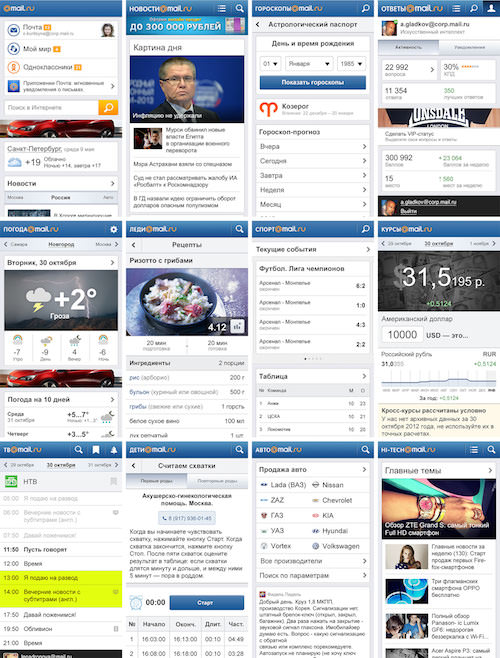
This approach has several benefits:
- The visual style, interaction design principles and information architecture are unified. Making a group of products visually familiar and work in a similar way benefits users. It’s also great for the brand because the product line becomes holistic.
- Launching new products and redesigning existing ones gets easier. The framework has all of the necessary UI controls, patterns and components for every need. It also helps us to build new designs really quickly.
- Controlling a large pool of projects is easy when they’re all built the same way. Instead of having to closely monitor a hundred separate projects, you just have to control a couple of core guidelines.
- The modern design process means that we are designing with code instead of the classic Prototype → Mockup → HTML → Implement approach for every screen, which would produce a lot of unnecessary artifacts.
- Any effective product decisions have a cumulative effect. For example, we can increase page-view metrics on the Sports website and then apply these enhancements to all other products.
- We’re moving from large redesigns every couple of years to constantly updated designs. A large redesign takes a lot of time and effort and typically loses a thousand little enhancements over its lifetime.
Overall, it has become a critical part of our UX strategy. The most important thing about our framework is that it has also become a way to achieve technical unification. We tried to unify our designs several times with specifications, UI kits, pattern libraries and so on, but they didn’t help us as long-term solutions. They were the internal deliverables of the design team and were rarely requested by developers. We all know how often designs can be implemented incorrectly when going from mockup to production. However, if you make the implementation accurate once and reusable after, then you’ll be much more confident in the design quality of the shipped product. That’s why I believe that the key stage in any effort to unify a set of products is the implementation level.
How Our Framework Works
The main idea behind the first version is to compile a huge UI kit in Photoshop, with all UI patterns, controls and common screens. This goes together with wireframe templates in Adobe InDesign that look visually similar to design mockups. The point is to make it look like a real product, not just gray blocks. Although these wireframes have small differences from mockups, they’re good enough to present and discuss with managers and developers. When we start a new project, we wireframe all screens in InDesign, which easily converts into a clickable PDF prototype to view on a smartphone. If there are any new UI patterns, we mock them up in Photoshop in detail and then add them back to the InDesign library.
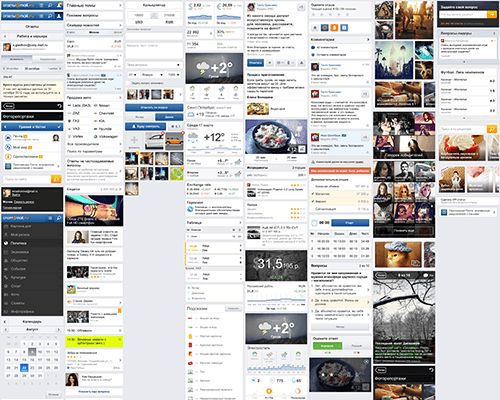
All new patterns are included in the unified code base. We compile complete pages in HTML out of ready-made components (such as comments or a photo gallery) to make a working prototype. Designers review this prototype and have a chance to make enhancements to the visual and interaction design of particular pages or blocks. In this way, we can identify many little problems and ideas that didn’t work in earlier stages.
Here is a structure of a repository:
touch.news/
   blocks/
   logotype/
      logotype.png
   /* Compiled from blocks and toolkit. Blocks includes pseudobundle common.css */
   bundles/
   article
   toolkit/
   blocks/
      logotype/
         logotype.xml
      section/
      header/
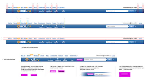
We use a templating engine to show a page in the user’s browser. It builds a final, valid and well-formed HTML page on the fly using the code, image assets, styles and scripts of a single UI pattern. Every page template has a set of rules to build the page: the types of blocks and their order. Notably, a template and the data to build a specific page are separated and loaded independently. It helps us to save on traffic and increase speed. For example, if a user sees a news list, then its template will be cached in the browser so that only the content is downloaded the next time.
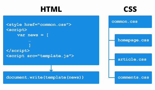
When we come up with a new design for a pattern or component (for example, a new way to display a photo gallery), then we change it in the mockups, prototypes and code base all at once. Then, every project is updated from the unified repository — almost like an app from the App Store. The best part is that a designer has to review only a single implementation in the unified code base, instead of having to check every product. And they can be sure of the quality of the final design.
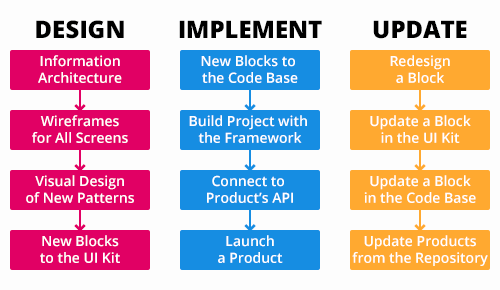
We’re going to be rethinking the UI kit soon. Designers will work in code instead of creating and updating static comps in Photoshop and InDesign. But to get there, we’ve had to go through the whole process of creating and implementing a framework:
- Create a reference design and the platform. You have to find a suitable and scalable information architecture, interaction principles, a visual style and a technical solution for the framework.
- Move all products to the platform. The UI kit and unified code base are expanded with new patterns, and the back end of every product is made consistent with the framework’s requirements.
- Refactor the design process. The technical solution has been fine-tuned and core product tasks have already been solved, so you can get rid of most design artifacts and create new screens out of ready-made blocks from the unified code base.
- Refactor the design. Releasing a dozen products takes a significant amount of time, so a lot of problems are discovered after launch. Design trends also change.
We’re now at the third and fourth step of our framework implementation. But we’ve gotten benefits from working with it from the very beginning. Evolving a design becomes easy, and the amount of unwanted work decreases significantly. Looking back, I believe we could have made the implementation process faster and shorter. I’ll discuss our good and bad decisions so that your job is easier should you decide to follow our path.
How It Was Created, Part 1: Design
It all started with Mail.Ru Group’s home page at the beginning of 2012. The home page is a portal that our audience visits to use our services. At the beginning of the project, we agreed on a basic design approach: a set of cards to present chunks of information from different products. This also includes a common style for headers and footers, controls, etc. We liked the initial concept, so we decided to apply it to the News product. It has much more information than the one-pager, as well as a complex structure and several page templates.

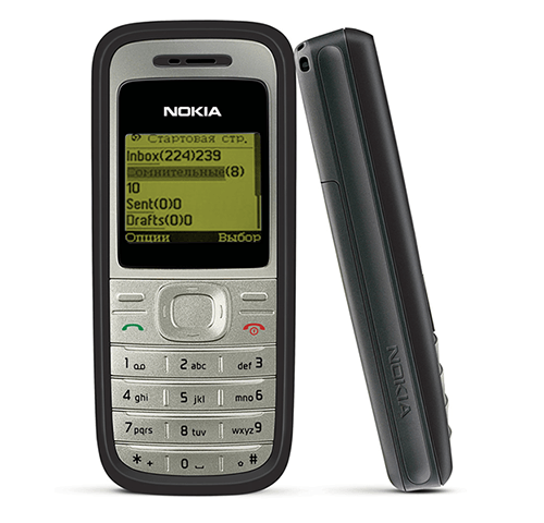
Now it was time to design the navigation principles, the structure of key pages and the presentation of content. We had to consider all of our other projects, too, because they would also follow these guidelines. Luckily, we had already worked on a mobile “event guide” website with a pretty complicated structure and a lot of services. The visual design of this event guide was quite different from what we needed for News, but most of the UI patterns were applicable.

We ran usability tests for the event guide. Testing showed that the concept was working! It also helped us find a bunch of improvements. For example, an additional search field at the bottom of the page was welcomed by users. Linking the last card in a slider to a list of all items helped a lot. It was also important to see that users had problems scanning long pages with a card-less design (i.e. when blocks have no margins between themselves and the screen’s edge), because the content is diverse and relies heavily on cross-linking between sections and objects. iOS 7 eliminated cards, and I believe the card-less approach is not as helpful for long pages with a bunch of aggregated content. Google’s Material Design approach is way better for such situations.

Wireframes made with InDesign was our next step. Here, we discovered the first problem with reusing patterns. Should we decrease the time to load and use as few images as possible, or should we be visual and show illustrations for every link? What do you do with the cards approach in borderline situations, such as an article with a lot of related items: use all cards or no cards at all? Keep in mind that many users visit our content projects via links to particular articles from Mail.Ru’s home page, while others come from a project’s home page. Where should the “back” button lead then?
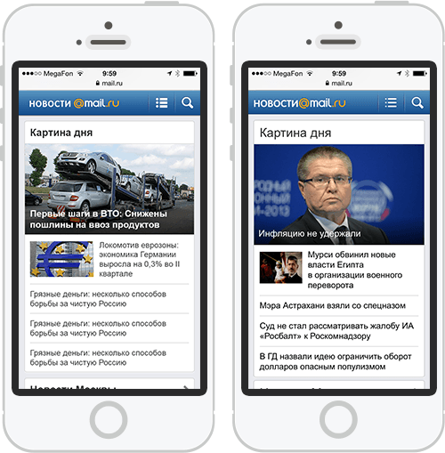
After the design mockups for key pages were ready, our designer put them into one document. We have a UI kit, which made the designer’s work easier. Putting mockups together is faster, and divergence between them has decreased. We also started to make guidelines, which enable other designers to participate in mobile web designs for the framework. Additionally, these guidelines are a great reference for developers when implementing UI patterns. The structure of our guidelines looks like this:
Overview
Visual style
   Grid
   Color and textures
   Typography
   Icons
Interaction
   Navigation
   Gestures
   Selection
   Scrolling
   Notifications
Basic patterns
   Screen structure
      Header
      Title
      Search
      …
      Footer
   Controls
      Inputs
         Input
         Textarea
         Select
         Date
         Checkbox
         Radio button
         …
      Buttons
      …
   Navigation
      Tabs
      Slider
      Links
      Alphabet
      …
   Dialogs and windows
      Popup
      Photo viewer
      Photo upload
      Calendar
      …
   Lists
      Article
      Event
      Match
      Search results
      …
   Widgets
      Weather
      Currency
      Horoscope
      …
   Media
      Photo
      Video
      …
Common screens
   Login
   Registration
   Settings
   Help
   …
Ads
   Banners
   Internal promo
   …
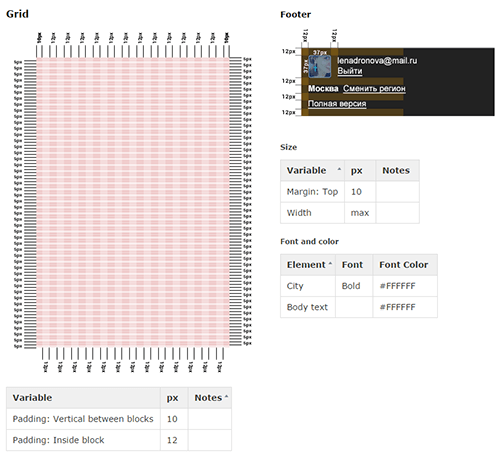
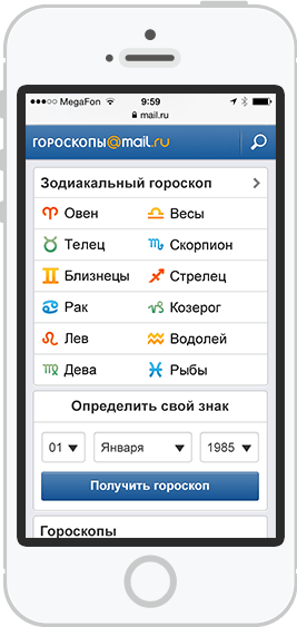
All of the pieces came together well. However, we wanted to double-check whether the design could scale to dozens of projects, so we designed a Horoscopes website. The approach worked — adaptation was fast and easy. A test-flight like this is critical before scaling the reference design to a bunch of products because it helps to find weaknesses in the concept before it is too late.
How It Was Created, Part 2: Technology
While discussing the idea of unifying the designs with the developers, we explored technical solutions already in use in our projects. Our projects all have a global navigation menu within the branded header. And many smaller solutions were made for our webmail product, such as authorization pop-ups and other parts of the UI. Although the technology had to be seriously rethought, we never launched a whole product based on it.
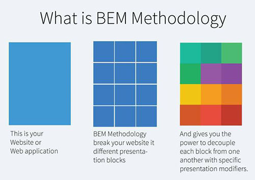
Our developers have conducted extensive research on how to technically unify the designs. Should we create our own solution or use an existing framework? The BEM (block-element-modifier) ideology from Yandex was the perfect framework to consider. To unify the design of several products, we’d need similar UI blocks to be reused as often as possible, without having to review each implementation. BEM guarantees that every single block would be independent of what’s happening around it. You can put it on any page and it will be the same.
Yandex has made a repository of open-source tools, called bem-tools, to work more easily within the framework. Incidentally, our developers have committed several patches to the repository. The idea behind BEM was referred to as “absolutely independent blocks,” and more and more frameworks like this are being launched (such as InuitCSS and Topcoat). Smashing Magazine published a great detailed article about BEM by a former Yandex employee.
However, BEM’s templating engine was not speed-efficient enough for us and didn’t fit our tasks. We had already been using JavaScript-based tools with Node.js to execute code on the server, so this was our choice. Thanks to this, we have the same template on the client and the server, and it’s rendered absolutely the same. The data is transferred separately. Therefore, when a template is cached in the browser (which happens after first load), the user is just downloading new content. This method makes the process speedier and decreases traffic.
Note: I’m describing the technical part briefly just to give you an idea of how it works. The focus of this article is on rethinking the design process. The technical details will be shared in the second part.
After a couple of weeks, the developers showed us a working prototype — and the approach worked! We tested and enhanced the framework to be sure it was ready for mass rollout. In two and a half months we designed 12 projects — a true speed record for our UX team. The guidelines have grown a lot and encompass visual style, interaction principles, information architecture and common patterns such as navigation, lists, different types of cards, content presentation, forms, popups, diagrams and a bunch of project-specific things. We also grew the UI kit in Photoshop and InDesign templates.
However, supporting three libraries (InDesign, Photoshop and the unified code base) was a burden, so we found a way to automate guideline support. This is a live style guide — an automatically generated page where real code is used instead of PNGs. You can annotate those patterns to have proper descriptions. Reviewing the implemented designs as soon as you see production code for every UI block is much easier than getting static pictures (which could be coded incorrectly) from mockups. For now, this live style guide is just a prototype, but after relaunching and refreshing all projects, we’ll get back to it. Moreover, with the guidelines done this way, we will be able to make prototypes out of real code, bypassing InDesign altogether — yet another way to stay closer to the production code.
It seems we’ve gone further than Bootstrap. The popular Bootstrap framework is just a set of ready-made styles and scripts that come with code examples. But when the Bootstrap framework itself is updated, rolling out the changes to your project is not so easy; sometimes you also need to update the HTML to the new version. In our case, a project gets a set of ready-to-use UI blocks that are constantly updated — even after changes are made to the framework. Additionally, Bootstrap doesn’t support the independent block model, so conflicts are possible when you connect to third-party libraries such as jQuery UI because they will override each other’s styles. Bootstrap is made for other tasks, like starting a project really quickly using ready-made elements. This is a problem for any custom solution like ours — you need a lot of time to get it off the ground.
Here are some facts and numbers that show improvements in our work process:
- The overall speed of the UX and visual design has improved. Previously, we had to mock up most screens in InDesign and Photoshop for every project. Now, a paper or whiteboard sketch is enough. That’s backed up by a couple of aggregated mockups that show how all of the project’s unique blocks will look. We might have spent a month or more on the design before, but now it all happens in a week or two.
- The speed of development has also increased, so we can launch new designs much more quickly. We don’t need to code design mockups or think over the data’s structure — we just take an existing pattern and it will automatically work in a new product. Even if we want to change or extend a UI block, it’s fast and cheap. We can ship a new product in a single month, rather than a couple of months as before.
- Getting approval from management is an easier job now. Any design guidelines will help with this, but management has more confidence because the guidelines are now secured by a unified code base. We have fewer meetings now and also receive fewer requests for changes.
- We also have fewer bugs in the design implementation. Before we had the framework, every design review might introduce 50 or so bugs. Now it’s something like a dozen. However, a new issue was introduced: Before rolling out an updated UI pattern, we have to check that it doesn’t break all of the products it’s used in.
- The focus of expertise has changed; more skilled front-enders are needed. Previously, all computations were made in the back end — front-enders just had to put them into templates. So, anything that involved minimizing performance issues, such as inefficient sorting algorithms, was the responsibility of back-end developers. Now developers just provide the data. And the template is a JavaScript code whose supplementary functions can affect overall page-rendering performance. Roughly speaking, the risk of performance leaks on the front end have jumped from 2% to 70%. Moreover, front-enders have to anticipate extending features for every pattern so that they don’t have to rewrite it globally every time. The barrier to entry has risen.
- Team members are interchangeable and can be reassigned more easily. A coder working on project A can easily be moved to project B. The working principles and standards of code and data are the same. This also allows us to put several front-enders on a single project to work in parallel.
- The team can be small and focused. The whole product line for the mobile web, with its 10 products, was updated with two UX designers, two visual designers, six front-enders and three developers. And that’s all without them being assigned full-time.
- Design experiments are much easier now. Improvements are implemented more quickly. This was our designers’ little dream: to be able to ship ideas more quickly than competitors.
- Keeping the design modern and up to date is much cheaper. Instead of redesigning once every couple of years, we update the style of a project as needed, and we need just a couple of days for each.
- In the year since the framework launched, mobile usage in our content projects has risen from between 1 and 2% to between 7 and 12%. A couple of products have experienced even bigger growth — up to 15 to 20%! Frankly, the reason is not our particular approach to mobile development — any approach would do the same in a market where smartphones are sold like hotcakes — but rather our framework, which enables us to launch mobile websites incredibly quickly.
- This framework will be used to relaunch the main versions of our content projects, so their development will be cheaper. I’ll talk about this in a future article in this series.
We have our share of problems for sure. But the overall result is amazing for the products and for the team.
The Future Of Our Framework
Initially, our framework was intended to support three categories of phones: modern smartphones (Android, iPhone, Windows Phone), older smartphones (Bada, Symbian — the installed base for these in Russia is still sizeable) and feature phones. Furthermore, for older Android browsers (including the standard one that shipped before Chrome), we used a slightly simplified version because they are unable to render some of the visual effects quickly enough. Initially, this version had more differences from the basic design, but we simplified it to ease future support; it was later deprecated.
Our idea was to make this degradation of the UI automatic; supporting three guidelines would be too expensive otherwise. But while we were launching a version for modern smartphones, the market share for the other two phone categories decreased even more. So, it seems we wouldn’t even need this simplified solution.

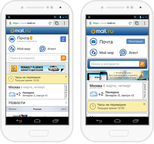
A unification like this has a shortcoming: If all products have a similar design, then they will lack a unique identity and differentiation. Our experience shows that users perceive a standalone product such as a weather forecaster as being more trustworthy and professional than one that is part of a big portal (even if both draw on the same data). So, visually differentiating a product can help to change this perception. It’s not yet important at the moment, despite the really fast growth of the mobile web. In the very first weeks of work on this framework, we tried several approaches to stylize products differently, and we will get back to it later.
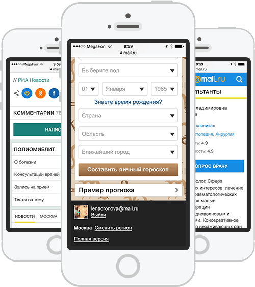
Some readers will wonder about responsive design; Smashing Magazine pushes it really hard, after all. Why did we launch a separate framework for the mobile web? It was a long and heated discussion, with each side listing the pros and cons. We have to ship modern mobile versions as soon as possible, and a proper responsive approach would require relaunching big web versions first. We’re working on it, and we’ve already launched several products based on a similar framework. But this task is much more complex, so it would be impossible to fit in a meaningful timeframe. Our approach can be called adaptive. Smashing Magazine recently published a great article on the topic.
In any case, we’re not making stripped-down mobile versions — the products have all of the content and most of services of their bigger counterparts. Although, for a growing number of users, there’s no such thing as a “main website.” The page they happen to be looking at on their mobile phone is the one and only version of the product. On Device Research has data on mobile growth for 2010 and 2011.
There are two approaches to design unification. You can make detailed guidelines first and then apply them to existing products, or you can redesign one of your products to become so good and successful that it can be used as a “reference product.” There are pros and cons to both approaches. We went with the latter. We’re scaling up a design that has already been proven in practice and been optimized with usability testing and analytics. There’s still the risk that we have to change some patterns later because we couldn’t see the whole picture in the beginning, but we think that product efficiency is much more important.
As a little bonus, we also found a way to unify our app icons — the ones shown when a mobile website is pinned to a smartphone’s home screen. It was a long road to accomplish this — only a few companies in the world with large product portfolios have been able to solve it (Yandex, Google on Android). Others just put a small company logo in the corner.
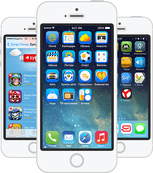
Now we’re going to update the visual design, and we’ll find out whether it’s as easy as planned. We’re going to change the visual appearance because it’s been more than two years since this design was originally implemented. When rolling out guidelines like these, there is the risk that new design trends will emerge. Even so, designers should strictly follow their own standards. Sure, as the framework rolls out, some products might not be so fresh visually. But after the platform has launched, you’ll have the luxury of updating the designs of a dozen products at once in a matter of days.

So, the trend that comes after flat design will be easy to catch. Of course, chasing trends is not a viable design strategy. But in our fast-changing industry, radical transformations sometimes happen overnight, as happened with iOS 7 last year. Companies should have a way to respond to these changes quickly.
Conclusion
Our initial goal was just to update the designs of our content-based projects on mobile and make them look similar. The idea of total unification, including the technical part, emerged during our talks with developers. Being good friends with developers pays off with the discovery of a possibility like this. Big thanks go out to the whole team of designers and developers who made it happen, especially Anton Eprev, who built the technological foundation.
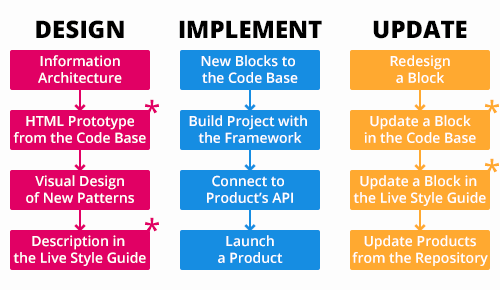
You have to be a bit authoritative when implementing guidelines — that’s the way to stay systematic in design. You should always use existing patterns when possible. And if you need to introduce something new, then you should understand whether you’ll use it in future. That’s the only way to keep a design framework and product portfolio consistent. That will also make it convenient to support, comfortable for users and positive for the brand.
Was this case study useful? For a follow-up article, we’re thinking about discussing the technical aspects of these projects. Drop us a line in the comments if you are interested in seeing this.
Further Reading
- Which Responsive Design Framework Is Best?
- Frameworks: Just Because You Can, Should You?
- Creating A Complete Web App In Foundation For Apps
- Responsive Web Design: What It Is And How To Use It


 Devs love Storyblok - Learn why!
 How To Measure UX and Design Impact, 8h video + UX training
 Register For Free
 JavaScript Form Builder — Create JSON-driven forms without coding.
 Get a Free Trial

