Strategic Design: 6 Steps For Building Successful Websites
Web design isn’t art. It involves a whole collection of different skills — from copywriting and typography to layout and art — all fused together to create an interface that not only features a pleasant aesthetic but that communicates function and facilitates easy access to its content.
But in order to combine all these elements of Web design together and achieve successful results you must have a clear direction, a direction that will guide each and every aspect of your design towards common goals. You must think strategically.

What is strategic design?
Strategic design is the fusion of your organizational goals with every aspect of your design process. You aren’t simply designing a user interface that looks good and is usable and accessible. You’re designing an interface that will help you accomplish your organization’s objectives.
There are many websites out there that look fantastic and sport the latest trends in design yet often fail miserably in their intended function. Design trends are, of course, important because they give you fresh inspiration and new techniques, but the implementation of those techniques and styles needs to be intelligent and focused. For example, a blog isn’t a marketing brochure; you should focus on usability and readability rather than style. Similarly, a promotional website for a computer game should feature graphics and styles that portray a specific feel and style; the aesthetic is very important here.
When the designer simply implements a look and feel that is fashionable at the moment (think Web 2.0 trends) without any thought of how they fit the function of the website or the business behind it, the end result is unlikely to be very effective.
Web design is all about crafting an interface that communicates function, is usable and accessible and exudes the right emotion and feeling. Effective Web design needs all of these elements to be in tune with the goals of your website and in sync with the organizational objectives behind the website. Strategic design is all about identifying those goals and using them to guide your design.
Implementing Strategic Design
Let’s take a look at how we can use six steps to think strategically about a Web design project:
1. Establish your goals
One of the first things you need to do before starting work on a Web design project is to be clear about your client or organization’s goals. What are you trying to achieve with the new website or redesign? What is the website’s main purpose? Ask your client, your manager or yourself what those are. If they or you don’t know yet, then they should be discussed and agreed upon. A clear direction is essential if you want your design to have a purpose.
Remember that a website isn’t a piece of art; it’s an interface that serves a function. That function may be to sell products, to deliver informational content, to entertain, to inform or to provide access to a service. Whatever that function is, your design must focus on fulfilling it. Goals are also important, especially if you’re doing a redesign. Ask why you are doing the redesign: are you looking to grow the number of sign-ups, decrease the bounce rate or maybe increase user participation?
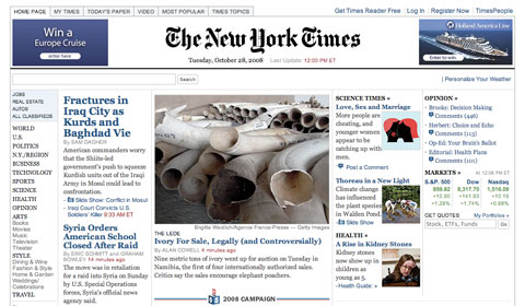
Take a look at the design of the New York Times website above. Its function is to deliver informational content. The minimalist interface serves this function beautifully by fading into the background.
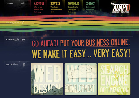
In contrast to the New York Times, AdaptD is a Web design studio, so the goal is not to deliver a lot of content but to impress visitors with its design, showcase a gallery and advertise the company’s services. The visuals are very important here, and AdaptD delivers a browsing experience with beautiful imagery and strong colors.
2. Identify your audience
Who your audience is will play a big role in how your website should look and function. There are many demographics here that can influence your design, ones like age, gender, profession and technical competency. A computer game website for a younger audience needs a different style than that of a serious business journal. Usability should play a bigger role for older and less technically savvy audiences.
Who your audience is will not only influence the general aesthetic of the website but will also determine a lot of smaller details, like font sizes, so make sure you’re clear about who will be using your website.
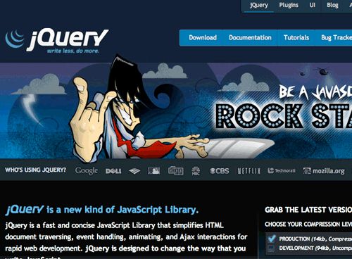
This is the unsuccessful jQuery rock-star redesign. The designer went too far in trying to create excitement and so failed to cater to the more serious, techy audience. Since then, the rock-star graphic has been replaced with a more conservative look.
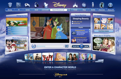
Disney’s target audience is kids. The intent is to entertain and involve this young audience, and the design does it by wrapping the content in a fun, colorful interface with a lot of visual and interactive elements.
3. Determine your brand image
A lot of designers tend to get a little too inspired by the latest trends and then implement them without thinking first about what sort of image they really should be conveying. Glossy buttons, gradients and reflective floors may work for some websites, but they may not be right for your brand.
Think about color. Think about the feel you want to achieve and emotions you wish to elicit. Your design should embody the personality and character of your brand. Everything has a brand; even if you don’t sell a product or service – for example, if you run a blog – your website still has a certain feel that makes an impression on your visitors. Decide what that impression should be.
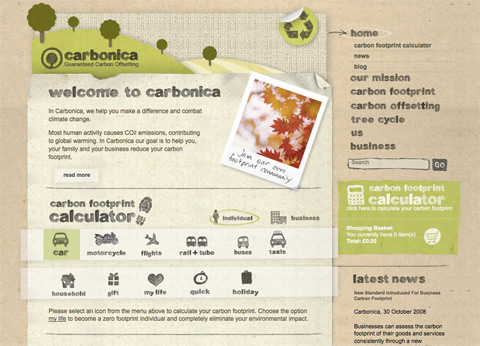
Carbonica is a website aimed at helping people reduce their carbon emissions. The environmentally friendly image of the website is crafted using a lot of recycled paper images and textures, as well as earthy green and brown tones.
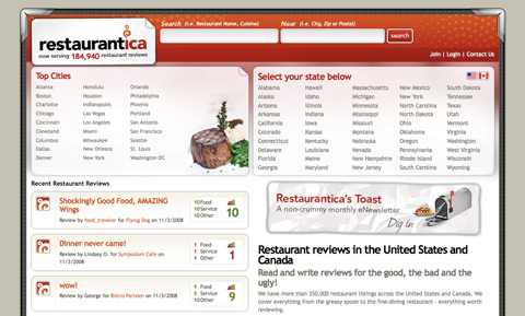
Restaurantica was a restaurant reviews website. Its design illustrates this by taking on the look and feel of an actual menu you would see in a restaurant.
4. Goal-driven design direction
You’ve established the purpose of your website, set some goals you want to achieve, identified your audience and determined your brand image. You can now proceed to implement it. So how do you make design decisions sync with your strategy? Let me illustrate this with a likely example.
Suppose your main objective is to increase the number of subscribers to your Web service. How can your design help accomplish this goal? I can see at least three things here that will make a difference:
- Make the “About” snippet on your landing page as clear and concise as possible. Your visitors must not have any confusion about the function of your website.
- Use color and contrast to make the registration button or link stand out. If people can’t find it, then you won’t get many sign-ups.
- Streamline the registration process by removing unnecessary and optional elements; people can fill those out later. If the form looks long, people may be put off of filling it in.
These are just three ways you can lead your design towards accomplishing the goal of increasing the number of sign-ups to your service. Your goals may vary, but the strategy is the same: shape and focus all the design elements towards meeting those goals.
The same strategy applies to your brand and audience: design the aesthetic that best suits it. If your website’s focus is entertainment, then create an “experience.” You are free to use a lot of color and imagery to shape that experience. On the other hand, if you’re designing a website that is focused on information consumption, for example, a blog or a magazine, then focus on usability and readability. Create an interface that fades away and doesn’t distract the user from accessing the content.
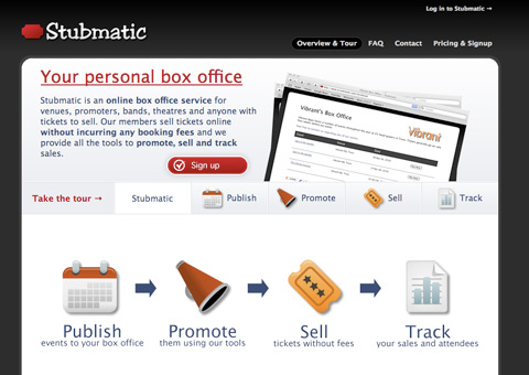
Stubmatic was an online box-office application. Their external website has two purposes: explain what the service does and get people to sign up. New visitors may only remain on your website for a few seconds, so if you don’t want to lose them you must be concise. You can do this by:
- Using large imagery and diagrams to illustrate the function of your product or service.
- Showing screenshots of your application. People will want to see what it looks like before they commit to a download or sign up.
- Providing a tour, using descriptive examples of how your service can help them solve a problem. Show a video if you can; the less effort people need to make to understand how your app works the better.
- Having the sign-up link accessible from all pages.
To succeed, the website must make the best use of the very limited amount of attention visitors will be giving it by not only informing but educating them about what your product does, and selling the benefits it provides. Stubmatic uses design elements effectively to pursue those goals.
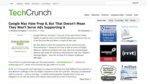
TechCrunch is one of the more popular tech blogs. Its new design removes every single unnecessary graphical element from the page. What’s left is just the content, advertising and navigation. Subtle lines and grey shades give the page structure, yet the interface is almost invisible and places content straight into the front row. For a blog that posts several new articles a day, this format is ideal because it facilitates fast and easy access to the content.
5. Measure results
Once you’ve designed and deployed your website, it’s time to measure your success. This is just as important as the first two steps because until you test how well your design performs, you won’t know whether or not it is effective in fulfilling your goals.
If your goal is to increase the number of sign-ups to your service, measure it and see if your changes are making a positive impact. If you want to increase the number of subscribers to your blog, check your RSS stats. If you want to increase user involvement, see if you get more comments or more forum posts or whatever else is relevant in your context.
You can, of course, also ask people for their feedback, and this is a very good way to check if you’re on the right track. Be careful though not to implement every suggestion people make. Everyone has different tastes and wants, so everyone is going to have a different opinion about what your website should look like. If you do collect feedback, look for patterns; see if there are common issues that crop up and deal with those.
Measuring various website metrics is a whole science unto itself and is beyond the scope of this article. But however in-depth your analytics are at this stage doesn’t really matter; the important thing is that at the very least you have some way of measuring your key objectives. You can use this information to see if you’re moving in the right direction with your design and with any future changes you or your client make.
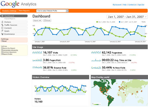
Even if you’re on a tight budget, you can use free tools like Google Analytics to get a lot of data on how your website is being used, including overlays of your pages to see what links people click on most as well as the ability to track conversion funnels.
6. Kaizen
There is a Japanese philosophy called “Kaizen,” which focuses on continuous improvement using small steps. When you work on your website, you should be thinking of Kaizen because the version you’ve just published is not the final version. There doesn’t even have to be a final version.
You can always make improvements, and the very nature of a website will allow you to introduce these at any time. This is because a website isn’t a magazine that you print and sell: once a magazine copy is out of your hands, you cannot make any changes or fix any spelling mistakes or errors. A website, however, sits on your server: if you find a mistake, you can fix it right away. In the same vein, you can introduce gradual improvements and updates to make your website more effective in serving its function.
Using the results of your measurements, you can identify problem areas. Perhaps your visitors cannot find the RSS feed link, or your bounce rate is too high or an important page on your website isn’t getting enough visits. Whatever the problem is, there will always be a way to improve things.
Conclusion
The main gist of strategic design is simply common sense: you’re making something for a specific purpose, so of course it should fulfill that purpose through its design. But it is actually very easy to lose track of your goals and end up with something that is beautiful but ultimately doesn’t work in its context. It’s very easy to fall into the trap of implementing the latest design trends just because they look attractive or shaping a section of your website to resemble another website that you really like without first thinking about why you are doing it or how it fits in with the purpose of your project.
Avoid falling into these traps by thinking through every design decision you make. Why is this button this color? Why are we using tabs? Why should we use icons here? Once you get into the habit of questioning your every design decision, the whole process will become much more focused. Think about the product or organization you’re representing. Think about the target audience and your brand. What will work in this context? What is expected? How can you use design to best fulfill the website’s purpose? Don’t just build a beautiful website: make a website that really works.


 Try ProtoPie AI free →
 SurveyJS: White-Label Survey Solution for Your JS App

 Register Free Now

