Improving Reviews And Testimonials Using Science-Based Design
Reviews, testimonials and word of mouth are winning the war in branding. A sea of research is out there about social proof and what to do and what not to do about soliciting customer reviews. It’s overwhelming to read and digest it all, let alone to know which nuggets are gold and which are fool’s gold. For a designer or business owner or marketer, knowing who or what to listen to can be difficult.
Here’s what I like to do: Find data! I like to find really smart researchers who are in the lab studying the topic du jour, interview them about their work, and then tell you all about it. Using the magic of science to improve how we solicit customers for feedback, testimonials or reviews can be a saving grace to those who would like to share happy customer reviews and remedy any lackluster experiences — in the best way possible, in fact: without sacrificing good UX or losing valuable customers.
We can learn so much from the subject of reviews, especially now that experience design (or customer-focused design) is emerging and becoming a force of its own. Through its ethos of bettering customer experiences, we can start to deliver experiences that make people smile. These happy users may then tell everyone else about those positive experiences.
But let’s not move too fast. Let’s talk more about that science I mentioned. It’s the key to making sure your review experience solicits, captures and expresses what your audience thinks — and authentically feels — about your products. Throughout this piece, I’ll dive into two studies that will help bridge the gap between marketing, design and customer service in ways that are truly eye-opening, as well as show how this research applies in the wild. What I hope you’ll see is that designing a strategic platform for reviews and having a strategic marketing and customer service experience in effect for making reviews happen the right way will help keep your customers singing your praises!

The Science And UX Behind Reviews
What do research into post-traumatic stress disorder (PTSD), design and writing online reviews all have in common? Well, not much… except for one little connection that I learned of after talking with Dr. Sarah Moore, a prestigious consumer researcher at the University of Alberta, Canada. When Moore and her research group looked at clinical psychology research on how journaling helps to alleviate PTSD symptoms, they noticed that journaling helped some sufferers experience amazing curative results, while others still suffered. Moore explained to me the difference: People who wrote using what researchers call explaining language (by which they sought to understand and evaluate their traumatic event) recovered better; however, when they ruminated on and relived their experience via journaling, they tended to get worse or stay the same.
The Takeaway
Using this knowledge to drive her own study (PDF), Moore looked at how people felt during and after writing positive or negative reviews. She determined that writing positive reviews using explaining language — “I feel ______ because x, y and z,” or “I think this because x, y and z” — made the reviewer feel less positive about the experience. Conversely, writing negative reviews made reviewers feel less negative when using the same explaining language.

Moore explained this phenomenon with her experience as a child watching the movie Jurassic Park with her sister. “We were terrified of that movie,” she said chuckling. “But then someone explained to us that all those ‘bone-crushing’ special-effect sounds were created by breaking ice-cream cones in toilet bowls, and then we weren’t scared anymore. It unpacked the fears for us and made us less afraid.”
How To Make It Work For You
Her results are interesting, but you may be wondering, what are the implications for UX design? When a business uses reviews to build awareness or shares testimonials to create positive social proof, there may be a better way to design the experience, guided by her research. Perhaps restricting the option to write reviews on a desktop computer might help. Composing reviews only on a desktop computer would force positive reviewers to settle down a bit and perhaps enjoy their positive emotions a bit longer before unpacking them and potentially tarnishing their positive experience.
Remember that, according to Moore’s research, the more one gushes, the more apathetic they eventually become about the experience. But what about the positive effects of negative reviewing? Also, remember that negative reviewers benefitted from ranting because unpacking their frustrations left them (thankfully) less frustrated. Let me share three actionable tips to take you across the finish line and apply her research to your design strategies.
Tip 1: Changing The Paradigm Might Be The Key
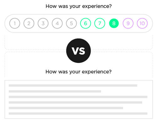
Designing a desktop version for reviewers, as well as a simpler mobile version, might be a good way to encourage happy users to quickly share five stars or two thumbs up, while the unhappy campers could go home and let it all out on a review platform that affords more depth. Providing a platform for reviewers to easily offer a five-star rating, as opposed to a long-form review space, will help you maintain positive social proof without sacrificing the potential post-review apathy that Moore’s study highlights. After all, you want a positive reviewer to remain positive and continue to be a brand ambassador for your company.
Tip 2: Persuasive Copy Can Be Helpful
Numerous researchers have noted that online reviews, whether positive or negative, are highly emotional. This is why persuasive copy can be helpful. To get the most out your potential customer’s reviews, ask specific questions; for instance, if you operate an e-commerce grocery service, perhaps ask specially crafted questions that encourage positive reviewers to be blunt and precise and less emotional, while using more in-depth questions for those who are unhappy. This could be achieved by having a review platform that serves up varied questions based on the reviewer’s initial star rating.
Or what if your review platform served up only canned questions, with a rating scale of 1 to 10? This might alleviate a positive reviewer’s potential apathy, while still allowing the negative reviewer a space to vent, forgive and, hopefully, forget.
The key thing to remember is that the more positive reviewers unpack their emotions about their experience and explain it thoroughly, the less they will feel attached to the positive emotions they had. This, of course, feels counterintuitive, right? Don’t we want customers to gush on and on about their positive experience with your brand or product? Yes, but not too much. By unpacking their positive emotions too much, your customers might lose sight of their love for your brand or product, Moore explains. It’s a strange phenomenon but one we must consider.
Tip 3: Solicit Fact-Based Customer Feedback Or Testimonials
Another creative approach is to solicit fact-based customer feedback or testimonials. Storytelling may well be the ultimate weapon, but it only works in certain areas of a brand’s overall strategy. So, let’s not inadvertently shoot ourselves in the foot by asking “Why?,” “How come?” and the like. Try using a scale from 1 to 10, and add a box for customers to check off, asking, “Would you use our product again?” Or, “How many stars do you give the product” for various aspects such as reliability, ease of use, sturdiness or whatever applies to your circumstances.
Moore concluded in her final study that using explaining language makes reviewers “less likely to retell their experience in the future.” So, with that in mind, use your design and copy wisely to make sure that happy users and not-so-happy users walk away thinking and feeling more positive about your business, regardless of the emotions behind their sentiments or the platform on which they’ve expressed them.
The UX Shangri-La Of Online Review Experiences
Timing is everything, right? I mean, how many times have you seen a would-be comic with a great joke up their sleeve bomb because their timing was just no good? I’ve seen this happen on the improv stage and in the boardroom, and now there’s science to back up the importance of timing for reviews and testimonials. Just last year, Dr. Zoey Chen, a researcher at the Georgia Institute of Technology, analyzed more than 65,000 restaurant reviews on Yelp and discovered that “reviews that are closer in time to the consumption experience are more attributed to the actual product experience than to reviewer motivations.” Let’s unpack that.
Basically, what happens is that when we go to Yelp and seek out social proof for that up-and-coming bistro down the road, we tend to have a negativity bias, which means that we unintentionally focus on negative reviews. In fact, Chen’s study hinges on the research discovery that more than 60% of customers consult online reviews before making a purchase. As Nielsen Norman Group also reported with the same study:
“Pity the product or retailer that consumers don’t like: While most online consumers (59%) said that they are not more likely to share a negative product experience online via Twitter or writing a review, 41% would.”
The Takeaway
What Chen’s work suggests is that business owners can battle this negativity bias if they ask their happy patrons to write a positive review on the spot and to indicate in the review that it’s happening in real time. Her findings show that the closer a review is to the time the patron experiences it, the more that readers of that review will value it.
Reporting on an interview with Chen, the Georgia Institute of Tech notes the following:
“…positive reviews could be considered less informative than negative ones because the writers might be perceived as bragging about the good decisions they make in their lives. “Their motivation for writing might be self-enhancement, signaling their expertise,' she says. 'But negative reviews are seen as reflecting more about the product or service than the lifestyle choices of the writer. Therefore, they tend to be seen as more credible.'”
How To Make It Work For You
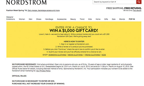
Chen conducted a variety of lab experiments, outlined in her work featured in the Journal of Marketing Research, showing that consumers unintentionally seek out this sort of real-time review and value it more when making purchasing decisions. Offer a coupon, freebie or some incentive to encourage customers to review on the spot. She also suggests that patrons use explicit phrases like, “I just had the most amazing lunch this afternoon at Bistro X,” or “My service today at ABC Auto Body was so stellar…” Whatever your hook, make sure it’s a sinker!
Let’s Be Mad Scientists And Make A Frankenstein
OK, we have a lot of research to use, but how do we make it all work together? Let’s look at some examples of businesses that are doing it right and wrong. Maybe we can pick up what they’re throwin’ down.
The Big Wigs
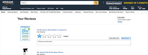
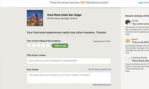
The Amazons and TripAdvisors of the world don’t care: They’re happy to let you submit a review anywhere, anytime, via mobile or desktop, selecting how many stars you want to give the product, with the space to write a long rant or commendation. This breaks all of the rules we’ve learned from Dr. Chen and Dr. Moore, but these types of businesses (mostly) sell other people’s stuff, like Yelp. We can safely say, then, that you shouldn’t do this for your business unless you’re confident that every step of your customer’s experience is delightful.
The Other Guys
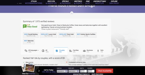
Hard Rock does something interesting. On the Hard Rock San Diego website, the review section is so hidden that finding it took me about four whole minutes — true story! That being said, once I did, what I found was the snippet shown above, with very few options for interactions. All you can do is view “verified” reviews. There’s no explanation (that I could find at least) as to what “verified” means or where these reviews come from. In fact, you cannot submit a review here — just view reviews. The establishment has aggregated its reviews and given itself a grade — an 81 out of 100, or a B-. Not too shabby. And it makes sure to surface the most powerfully positive review, as well as some details regarding their most appreciated amenities. Good to know. If you’re interested in the best balconies in San Diego, you’ve found your spot.
The bigger question is whether patrons are interested in this when choosing a hotel? Would surfacing just the “facts” that you choose to give customers enough fodder to make an informed decision about your product’s social worth? Make sure you know that, first and foremost.
The Actions-Speak-Louder-Than-Words Technique
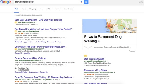
As we’ve touched upon, it’s imperative to understand how potential customers encounter your business when performing an organic Google search. There is a way to moderately control this experience by using this social proof technique. For instance, if you’d like to surface the high-level facts about your overall reviews (similar to our Hard Rock example), try employing Google’s rich snippets. This way, when one searches for, say, your grandma’s apple pie recipe, it would look like this:

Rich Snippets allow you to surface product pages from your website, too. This way, organic searchers can see how many people have reviewed your product and can see the average star rating. Potential customers will now have a window to view all of the nuts and bolts at a glance. In addition, much like Dr. Chen’s work suggests, this provide them with an up-to-date aggregation of your company’s social proof.
The Hunting-And-Gathering Technique
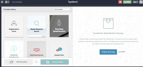
Here at Digital Telepathy, I use Typeform in a myriad of ways to solicit reviews from coworkers and external clients regarding content, our blog and more. My favorite aspect of Typeform is that reviewing is made super-simple with the templates. Typeform’s Customer Satisfaction Survey template is exactly in line with the research that my newfound researcher-friends have concocted: Keep it simple, and use 1 to 10 scales and visual cues to encourage disclosure, but in a very light, easy-to-digest manner:
Another factor to consider is how your audience is experiencing your website. Are they on smartphones, desktops, laptops, tablets or game consoles? You can surface this in your Google Analytics reports, under the “Advanced Segmentation” section. Why is this important? Well, if your customers are heavy smartphones users, making customer-focused areas of your website responsive would be a good start, but perhaps making room for reviews that are smartphone-friendly would help, too.
Or, if you’d prefer not to take on the bulk of that social proof, personally interview your top 10 customers. Ask them to tell you their story, and then turn that into an in-depth testimonial. Make sure it’s honest, and even include negative aspects of the experience.
Reevoo studied the data behind negative reviews and concluded the following:
“Sixty-eight percent of consumers trust reviews more when they see both good and bad scores, while 30% suspect censorship or faked reviews when they don’t see bad scores. Shoppers who go out of their way to read bad reviews convert 67% more highly than the average consumer.”
Final Thoughts
Obviously, there are many options for a designer to consider. Hopefully, after seeing Dr. Moore and Dr. Chen’s research applied to some modern examples, as well as some insights into what other businesses are doing, you now have enough juice to power your social proof. Once you do that, it’s time to turn that into an impressive review experience, with a little less friction, because having a positive experience with any brand is worth talking about. And when people talk about you or your products, listen carefully and manage those reviews to your advantage — from start to finish.
Further Reading
- Infinite Scrolling: Let’s Get To The Bottom Of This
- Get the Scrolling Right
- Reapplying Hick’s Law of Narrowing Decision Architecture
- Advanced Navigation With Two Independent Columns
- Takeaways From Mobile Web Behavior
- How I Built The One Page Scroll Plugin


 JavaScript Form Builder — Create JSON-driven forms without coding.

 How To Measure UX and Design Impact, 8h video + UX training
 Register For Free
 Get a Free Trial

